WIP - Steampunk Sniper Rifle
So, I'm pretty excited about my first school assignment this year, a Steampunk gun! I finished up the hi-poly earlier and thought I'd share for some criticism and other ideas. I will be starting the low-poly pretty soon, so I'm still open to some small tweaking ideas :P
Here it goes,


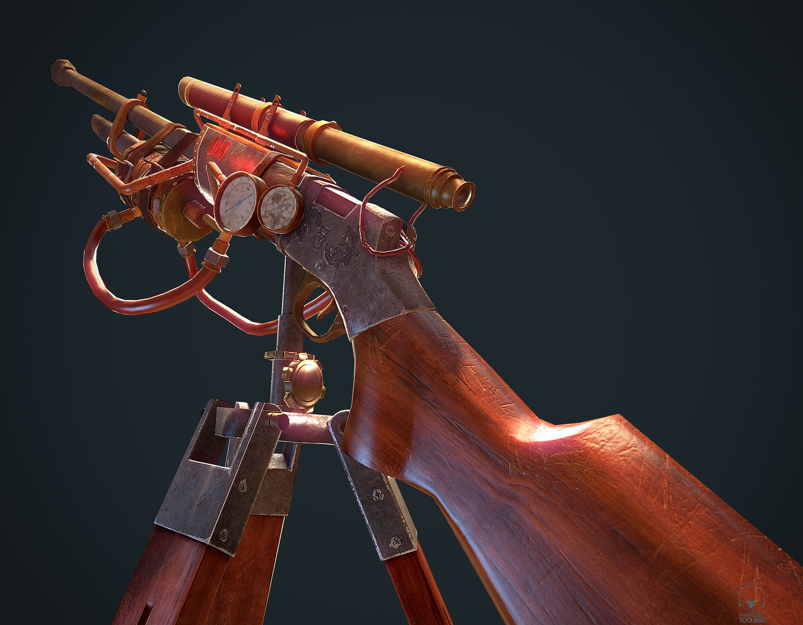
The still renders are finished, here's one (more down the thread):
(yes, I will be adding some engraving to the metal pieces to add more details)
Here it goes,


The still renders are finished, here's one (more down the thread):

(yes, I will be adding some engraving to the metal pieces to add more details)

Replies
Only comment I have is the lower hoses that go to the tank and valve are kinda chunky. They don't have an elegant curve to them. From the 1st image the back one in particular.
These are the kinds of questions that should be evident through the design. Otherwise it reads like this comic:
http://www.harkavagrant.com/nonsense/batchofcomicssixsm.png
Okay, for the wires that go to the scope, they serve to 'power up' the night vision or other scope electrical shenanigan this gun has.
As for the steam tank, basicaly, it's a raygun that overheats. Whenever you fire too many quickshots (4-5), the two bigger tubes that come from the tank on each side automatically pop off to let the steam vent*. This means that the ''reloading'' animation would be the player connecting the tubes back.
The other pipes and tubes are for various pressure readings & esthetical purposes ;P
I plan to model a forearm and to some little FPS animations to present it in my portfolio!
Okay, I cheated a bit and recycled the hand of my previous character but meh. Hahaha.
It's obviously not finished, it lacks a lot of polish and a bit of reproportioning. I'm not gonna spend too much time on it, as the gun is my main focus, but I'll still give it some more love
I still think it looks a bit odd, but hopefuly it won't matter much later on, as it is not the focus of the piece x)
I'm curious to know what all those pentagon shells are, it looks like you've got some shells that are stacked but quite a few that aren't? I was gonna suggest stacking more shells if you can, but I've no idea what everything goes to.
WIP of the bake. It's going so-so, I have some artifacting issues, but nothing I can't correct in photoshop I think. The more circular things (the scope, tank, gauge (not pictured)) come out odd since they're so low poly, but I'm already busting the triangle limit so... yeah :l
I'm also afraid I'm gonna have to re-do some of my uv packing, because I made the mistake of not putting the two gauges on top of each other, thinking I'd have enough resolution. That wasn't the wisest move I made. Anyhow, here's the picture, and the revised uv packing (with the gauges in red).
Well then you got me. From my knowledge edge padding will bleed into other shells which causes issues. I guess there are ways to get normal maps to render properly without edge padding, or at least vary little. I am not aware how though.
The reason his uvs are so packed is because he baked each piece separately and then put them together in photoshop because he used xnormal.
Its a bloody long process doing it that way but it does mean you get a little bit more texture space because you can allow your uvs to be closer together.
Hahahaha, touch
I actually usually bake 2-3 pieces that are far from each other directly in 3DS Max, saves me the extra process of putting it in another software. Xnormal is nice, but I like to have more direct control over my cages.
I think I'm going to have to work on a lower poly version for something like a different LOD mesh because I'm waaaay over the assignment's limit of triangles, which is around 6k. I'm currently near 8k : s
I know I could remove all the non-seen faces on the FP view, but I'm pretty sure I have to give out a turntable anyway so... I'll have to see about that.
Anyhow, It's around 8k tris, (around 6k is the limit for the assignment) and I had the idea of removing the scope and... 6150 triangles! I also fell in love with the scope-less version of the gun, for some reason.
Pictures!
Still, I did the tripod and continued working a bit on the textures. Still open to criticism and advice on what's not working quite right ;P
The ''reload'' looks terrible because I rigged it wrong and I can't move the left arm forward. Eh, it gets my point across, which is what I wanted. x)
Yes, you're right about the hues, I never really thought about the wood issue. I'll also try to see if it'd be better to have more blue-ish hues for the metal.
See:
All the specular settings are the same on the gun and the tripod. Thing is, the gun's stock s is fine!
I really have no idea why. The map is not the problem either =_o
Update: The problem IS within the map, except that it apparently occurs at the importing into Marmoset. The map is fine in photoshop and it shows good in 3ds Max:
But whenever I import it in Marmoset, I get this:
What gives? o_o
Anyway, sent an email to Marmoset about that.
In the meantime, I finally got around making something somewhat decent with the Xoliul Shader.
The shot with the Xoliul Shader is looking pretty rad.
Anyhow, here's my final still pictures. Marmoset is so awesome.
Also you might want to consider changing the curvature of the larger hoses slightly. They get very flat in the mid. I'm assuming the larger hoses are rubber. Also, the color on the large hoses are right in between looking like your wood or brass. Maybe change the color and spec on this to define the material type.
It's getting better every time. Keep it up!