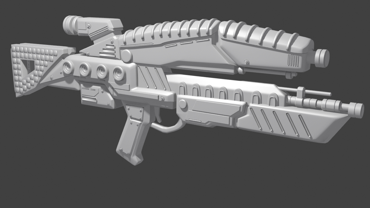
Mass Effect M7 Assault Rifle

I started this a couple of months ago and the most recent progress I have made on this prop is the hi poly. I have many other projects that I'm working on and have ideas for currently, but I am focusing on a little at a time so as to not be overworked. Any way I would really like some feedback, as it is for most, very helpful for my progression as an artist. Thank you in advance!
Replies
The original has places with high detail (barrel construction, scoper area, battery) and places to rest your eyes (top curve, front grip). Yours has neither. You've made the barrel and scope a series of simple cylinders, not having any interesting milled shapes, and you've cluttered up the resting areas with floaty whatsits.
In other words: your actual model is very uninteresting, and then you overcompensated with nondescript floating details.
dial it back. You know how to model, now show us a clean model from concept and some purdy textures on a lo res.
To me the rails you added to the top look like they serve no purpose, and same thing with the geo added to the bottom where the M7 goes. There is nothing wrong with deviating from the concept, but it should be thought out and purposeful. To me it seems like you just threw that stuff on while modeling without actually thinking much about it.
Hope that makes sense.
I do agree that there is some geo out of place which I have gone through and changed. In fact there is a lot of that unnecessary geo no longer on the model. Today is the first day I have gone back to this prop in about a week and made changes based on others' feedback. So with that said I very much appreciate your feedback and will be posting some new screens within the next couple of days.
Dude you're missing out. Ugly guns or no, it really it a wonderful franchise.
Been working in between projects, but I made some updates to the hi poly. I have unwrapped the low poly so the next time I post there will be textures. Thanks in advance for the feedback.