Home 3D Art Showcase & Critiques

UDK SCIFI SLUM Art Test

Hey guys,

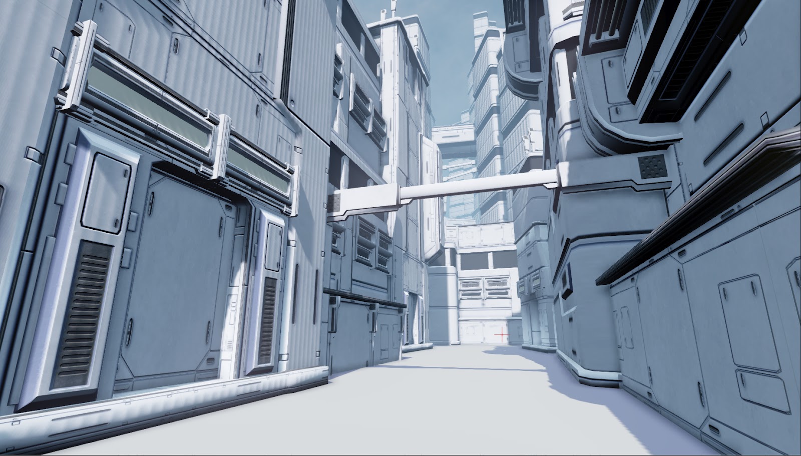
In the past two days I started a new scene, another scifi slum to see how far I can go with the use of modular textures and a few high poly props here and there. Anyway going for a cyberpunk feel with one solid hero prop and a really good alleyway.

Otherwise I have 8 days left to finish it so comments and critiques PLEASE!!!

As of right now there are NO lightmaps and no spec purely looking for composition at this stage.

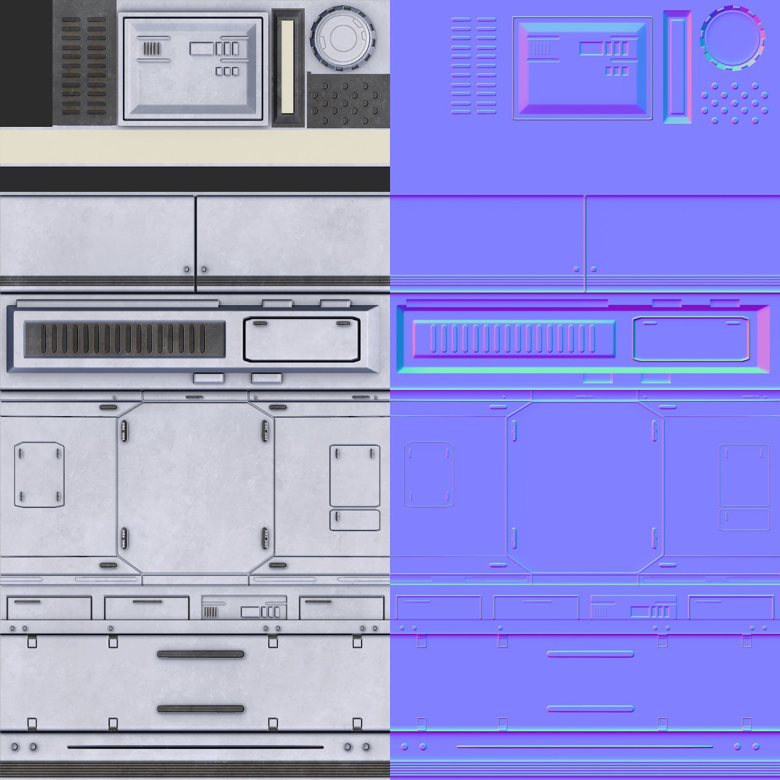
Here is what I got so far and right now I'm only using one texture:
scifislum.jpg
ModularWall_CLR.jpg

Replies

  • reverendK
    Options
    Offline / Send Message
    reverendK polycounter lvl 7
  • jk_virginia
  • reverendK
    Options
    Offline / Send Message
    reverendK polycounter lvl 7
    Seriously, though. looks like it'll be awesome. you'll have to kick Jeff for me when you see him up there.
    I do see a couple of texel density issues on the right side - but probably nothing that'll be too apparent when there's more going on in the texture. What did you have in mind for fleshing out the details of the scene and for the hero prop? any references yet?

    EDIT* you might benefit from breaking up the empty space at center/top with some more bridges/vertical support things - but again that depends on what additional details you already have in mind for the scene.
    and ATM its much more clean scifi (star trek, mass effect etc.) then cyberpunk - but again...needs details yet..just keep that in mind while moving forward
  • jk_virginia
    Options
    Offline / Send Message
    Haha for sure. Yeah these are pretty rough I will have to go back in and do a second uv pass when I make the lightmaps anyway. I mean I am thinking sheet metal, chain link fences, garbage, marketplace near the back, also lots of wires haha. As far as the hero prop goes I still have no idea but I am looking for good ideas just haven't found anything that sticks out yet. Oh I know a floating truck....oh wait haha!
  • wester
    Options
    Offline / Send Message
    wester polycounter lvl 13
    Solid stuff jake! Since it's all still wip i'll crit the composition.

    I dont know how bogged down to the concept you have to be but it would really be nice if you had some elements sticking out from the walls. The space is very vertical, so having some horizontal signs or lights sticking out from the walls would really add some more visual interest. This would be especially helpful over the doors since i can't really tell what's a door and what's a wall.

    Excited to see the progress you make on this!
  • jk_virginia
    Options
    Offline / Send Message
    Thanks for the crit Wes, Yeah so there really is no concept more of a style I have to follow so anything goes as far as modeling and composition. I think I will definately tackle the doors and signs next as well as some elements to make it look a bit more pieced together like corrugated metal and things of that nature.

    More updates soon!
  • toxic_h2o
    Options
    Offline / Send Message
    toxic_h2o polycounter lvl 8
    dude, how do you get it all done!? Nice work though, tell Javier he is slacking.
  • jk_virginia
    Options
    Offline / Send Message
    I tell him all day haha jk. Basically no sleep or social life haha.
  • Lephenix
    Options
    Offline / Send Message
    Lephenix polycounter lvl 6
    Really nice work. By the way you change your signature: CHARACTER ARTIST- JUGGERNAUT GAMES
    You are an enviro artist i saw on your portfolio, which is nice also.
  • konstruct
    Options
    Offline / Send Message
    konstruct polycounter lvl 18
    COOL - Sub-friken-scribed
  • jk_virginia
    Options
    Offline / Send Message
    Hey guys,

    another quick update just added some wall detail and objects to break up how clean the scene was looking anyway comments and critiques appreciated as always...up next Im going to really tackle the textures.
    scifislum.jpg
  • Grimmstrom
    Options
    Offline / Send Message
    Grimmstrom polycounter lvl 7
    This is looking really nice, the only thing standing out for me at the moment is a few curved areas that could do with a few more edges to improve the silhouette and there's quite a few edges that look really sharp in comparison to other edges near them that are getting complimented by the normal map. examples of this are the ledges at the sides of the steps and the frame around the door.

    Anyway keep up the good work, and best of luck with the art test
  • sziada
    Options
    Offline / Send Message
    sziada polycounter lvl 11
    nice work, can't wait to see you add some color to your scene.
  • jk_virginia
    Options
    Offline / Send Message
    Hey guys a big update comments and critiques please! I included a shot with and without post proscessing.
    Jakes_SciFiSlum.jpg
    Jakes_SciFiSlum_NoPP.jpg
    T_ModularWall_CLR.jpg
    T_ModularWall_SPEC.jpg
  • JamesWild
    Options
    Offline / Send Message
    JamesWild polycounter lvl 8
    I really like it without the post processing. I think the fog does a great job on its own of separating out the layers of the scene without very sudden DOF and the colours are stronger without such heavy processing.
  • Add3r
    Options
    Offline / Send Message
    Add3r polycounter lvl 11
    JamesWild wrote: »
    I really like it without the post processing. I think the fog does a great job on its own of separating out the layers of the scene without very sudden DOF and the colours are stronger without such heavy processing.

    Would very much agree with James statement. This is awesome though, the atlas work is impressive (also working on a level with atlasing, so I can definitely appreciate the work going into this). Keep it coming man! I really like how the colors pop in the non-post-processed image, and the fog is a little harsh and looks almost too fake in the post processed version.
  • jk_virginia
    Options
    Offline / Send Message
    Thanks for the comments guys I will be doing another lighting and post processing pass soon once I add the floor and a few new props.
  • agentfx
    Options
    Offline / Send Message
    Looking great. Makes me want to make a fun UDK scene. The texture maps seem very "dirt brush photoshopped" which is a good base, but I'd like to see some wear like water stains downward movement dirt & grime. Vents and drains often have a type of wear that should their use. Just something to think about. keep up the good work!
  • jk_virginia
    Options
    Offline / Send Message
    here is another update last one for today... tomorrow I tackle Decals and polypainting sand on the street level. The decals should add more grunge and garbage to the scene, Also some cool graffiti and neon signs. Then on Wednesday I finalize lighting and PP. So keep the critiques coming!
    slums.jpg
  • aobond
    Options
    Offline / Send Message
    aobond polycounter lvl 7
    looks great man, for this kind of scene do u start making the textures first then start blocking or the other way around? sorry for the trivial question :|
  • jk_virginia
    Options
    Offline / Send Message
    Not a problem at all for this scene I made the modular texture first because all the props use that one Texture then I simply UV mapped all the objects to that texture.
  • konstruct
    Options
    Offline / Send Message
    konstruct polycounter lvl 18
    Have you thought of making some damaged pieces with the texture set? Ive never seen it done before with one of these texture sets. You could take one of your models and bash it up and tell a story behind the fiction of these assets. You could do panels all haphazardly placed, or shelled outward, revealing beam work, or some other kind of structural hull underneath. Maybe even piles of junk, stacked up at the base of the buildings in some places.
  • jk_virginia
    Options
    Offline / Send Message
    I think that is definately possible I mean I already have the beams and the panels coming off is just making a seperate model...Ill give it a try! As far as the garbage built up at the bottom mostly relying on decals as I am trying to keep the amount of textures down.
  • jk_virginia
    Options
    Offline / Send Message
    Here is another huge update tomorrow is my last day to work on this so let me know what you think!
    slums.jpg
  • konstruct
    Options
    Offline / Send Message
    konstruct polycounter lvl 18
    very cool! the decals really took this a long way!

    I think you could do some junk piles with the texture set you have! Like a bunch of metal slats leaning up against a wall, or maybe you could just make a bunch of separate pieces, and then you could arrange them in several different configurations. Almost as though someone had piled up a bunch crap so its out of the way.

    Also I think your ground is too light. I think things might feel more grounded if that was a tad darker.
  • wester
    Options
    Offline / Send Message
    wester polycounter lvl 13
    Are you going to add any color to those emmissives (however you spell that)
  • jk_virginia
    Options
    Offline / Send Message
    @Konstruct: Thanks! I definately agree with the ground and the trash piles if I have the time I will try and make some junk pieces I can lay about in certain areas

    @Wester: They have a slight blue tint should I up the saturation?
  • wester
    Options
    Offline / Send Message
    wester polycounter lvl 13
    I was thinking something like this. You want to really push your light color especially on a sci fi scene. The lights are typically quite vivid and not very subtle at all. Adding those light colors and variation of colors helps to pull the eye around the scene as with what you have it all seems kind of noisy and hard to focus.

    Since it's a sci fi scene players will rely heavily on lighting to help guide them as alot of the things arent recognizable other than a door. But if you light everything well with the intent to both lead a player and showoff your art you'll have a really strong piece.

    Also add little point lights to create pockets of light where you have those signs to help illuminate the edges.

    test-24.jpg
  • jk_virginia
    Options
    Offline / Send Message
    That's an awesome example Wes I will do that definately guides the eye.
    So by tonight I should have that and some trash piles as well as some mesh painted ground to add some dirt !
  • roosterMAP
    Options
    Offline / Send Message
    roosterMAP polycounter lvl 14
    So much progress so quickly! Nice composition.

    I think the flags/sheets could be brightened up a bit, or have a light shinning on them. Right now, they're very hard to notice. Also, increase their saturation.

    I dont think the green smoke works with the red light. Id go wth dirt brown.

    Love where this is going! Keep it up!
  • Kon Artist
    Options
    Offline / Send Message
    Kon Artist polycounter lvl 8
    looking awesome. The only thing I can think of right now is, maybe reversing the colors on the flag to the *left* (white background and brown head) for better contrast. Look forward to seeing the final beauty shot.
  • aajohnny
    Options
    Offline / Send Message
    aajohnny polycounter lvl 13
    Its coming along, nice stuff... I think the textures need a lot of work. (idk if I missed anything, idk if its a placeholder or not) keep goin!
  • jk_virginia
    Options
    Offline / Send Message
    @ roosterMap: Thanks, I will experiment with the lighting
    @Kon Artist: Thanks I will experiment with the flags
    @aajohnny: Thanks! what part of the texture is most noticeable or in need of attention?
  • aajohnny
    Options
    Offline / Send Message
    aajohnny polycounter lvl 13
    No problem. The Door texture for sure is the most noticeable for me, the ground as well.
  • jk_virginia
    Options
    Offline / Send Message
    OK cool I will work on those first. I plan on vertex painting dirt on the ground as far as the door goes I could remap it or mess with decals but I will update as much as I can tonight.
  • Kon Artist
    Options
    Offline / Send Message
    Kon Artist polycounter lvl 8
    If your looking at this from a level design perspective as well, you might want to take into consideration how your directing the player through your level (^^^wester post)

    Anyways, I took a minute to play around with a few ideas.

    1. I can't read anything in the scene... but I know what an arrow is:) It's green and screams go here.

    2. This becomes the focal point of your beauty shot, which is dead center, which isn't very interesting. But you know what is interesting? 'what's around that slightly dim lite corner in the back'

    3. by moving the green sign back and slightly covering up the arrow, you can build the players curiosity, then maybe reward then with something cool hidden back there.

    4. I added some color and lights to your boxes to add a little visual rhythm to your scene. (see image 2)

    5. and reversed the flag colors
  • jk_virginia
    Options
    Offline / Send Message
    Last update for tonight...more tomorrow.
    @Kon Artist: I like the placement of that beam with the sign on it in the back area tomorrow I will have an updated shot of that. :)
    slums.jpg
  • Orangeknight
    Options
    Offline / Send Message
    Orangeknight polycounter lvl 5
    I think a major thing you could get in is things like lights on wires going across and stuff. You should spend this next day getting that atmospheric look to hide the slightly unpolished textures. See stuff like this is cool, you need these nice lights but to get that slum look you should have some nice shadows.
    lijiang-china-at-night.jpg
  • jk_virginia
    Options
    Offline / Send Message
    Oh thanks Yeah I think a lot of that lighting especially using fill light will fix my shadows
  • Darkmaster
    Options
    Offline / Send Message
    Darkmaster polycounter lvl 11
    This piece has come a long way since I first saw it!!

    I think that the main thing that I would do to really push this scene further is draw the viewers eye by using some kind of warm/cool contrast. Pretty much right now, everything is pretty safely inside the same hue range. I would really bump this further and push your warms warmer and your cools more saturated. Unless you are looking to go for a more desaturated Gears of War type feel...

    Anyways, that's just my take. I would just really push those colors further, and I think that you will really have something awesome here!!
  • Darkmaster
    Options
    Offline / Send Message
    Darkmaster polycounter lvl 11
    Here is an idea. Just a quick paintover, really pushing your colors further!!

    slumsre.jpg
  • jk_virginia
    Options
    Offline / Send Message
    Hey everyone,

    So I finished the art test. I will still be tweaking the lighting and post just to really polish the seen in the next few days. But here is what I turned in! Thanks for all the crits more are welcome as I will continue working on the scene.

    JakeVirginia_Final1.jpg
    JakeVirginia_Final2.jpg
    JakeVirginia_Final3.jpg
  • Benton
    Options
    Offline / Send Message
    I think it looks amazing, but the yellow panels on the far left of the pic need a bit more damage. Other then that, well done.
  • nathanbarrett
    Options
    Offline / Send Message
    nathanbarrett polycounter lvl 6
    It's always awesome seeing a scene take shape from really humble beginnings. Great work man
  • The Lone Penguin
    Options
    Offline / Send Message
    The Lone Penguin polycounter lvl 9
    Really awesome stuff man! I know you turned it in already but one thing that keeps catching my eye is there seems to be a lightmap error on the edge of that steel roofing piece on the right side where you have that solid black edge. Good luck, hopefully you hear back good things
  • Graze
    Options
    Offline / Send Message
    Graze polycounter lvl 6
    Looking really good overall, just think the colour pallette feels a bit lifeless atm. I would suggest spending your time making the lighting better and adding more to the postprocess volume. Make the lighting SING :) good luck man, be checking back to see updates.
  • jk_virginia
    Options
    Offline / Send Message
    Thanks guys!
    @Graze: yeah I wish I had more time to focus on that for the art test but I will be spending a whole day on lighting and post processing once I get the review on my art test!

    More updates soon.
Sign In or Register to comment.