Battlestar Galactica Stealth Fighter WIP
I was planning to avoid posting this until I was finished (or close enough to start looking for polish crit), but then I ran into what seems like a major aesthetic inconsistency in my reference, so I figured I'd fish around for opinions on how to resolve it. But first, a quick "Previously, on me modeling a ship from Battlestar Galactica..."
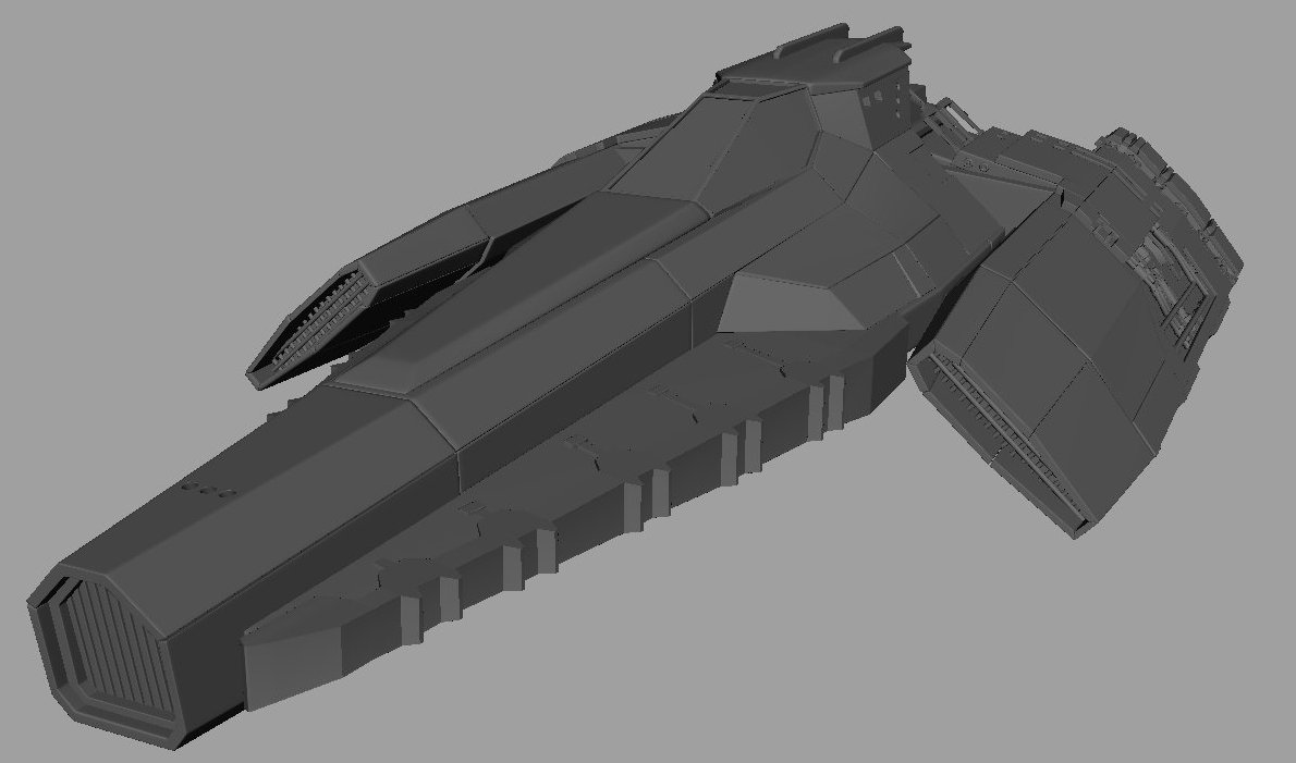
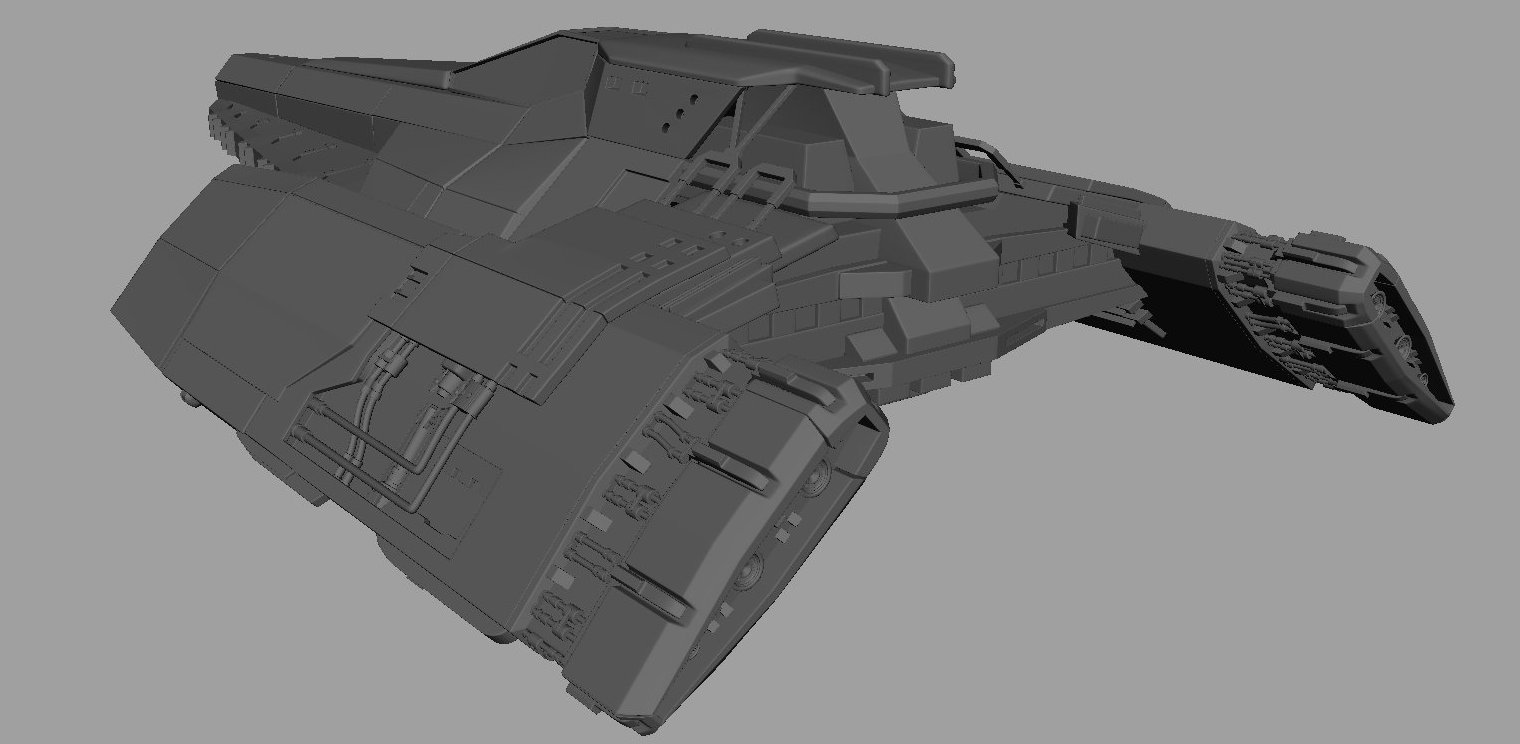
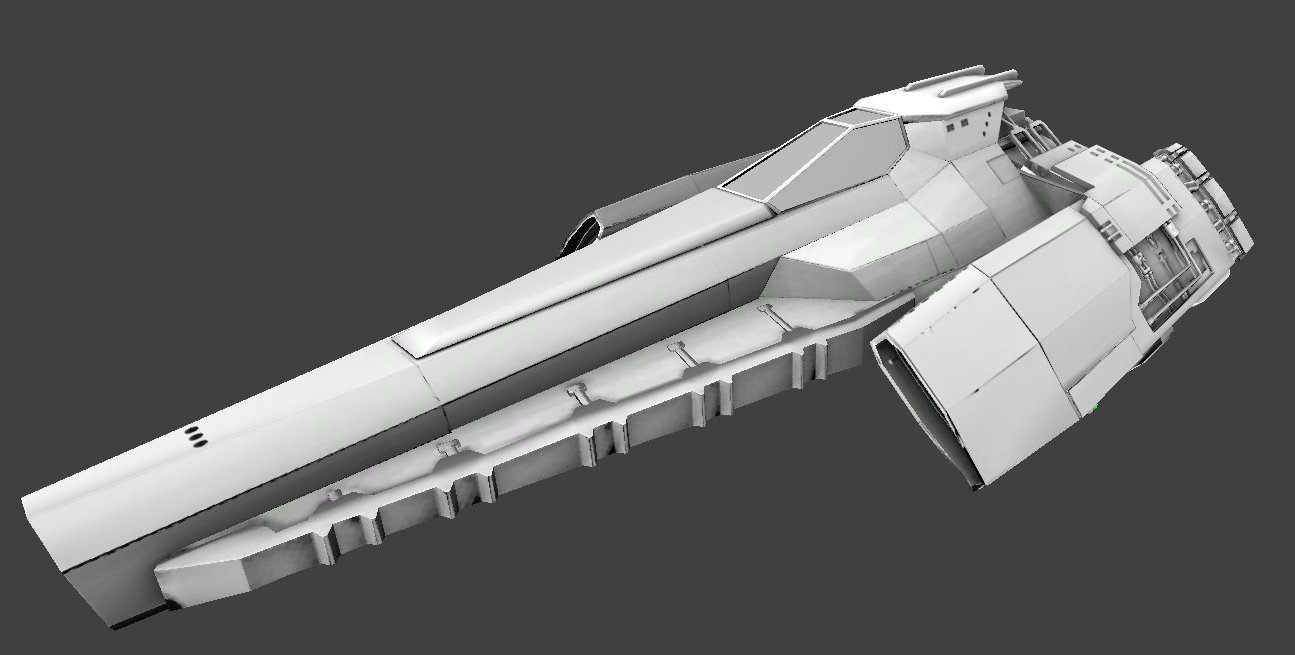
A couple Hi-Poly screengrabs.
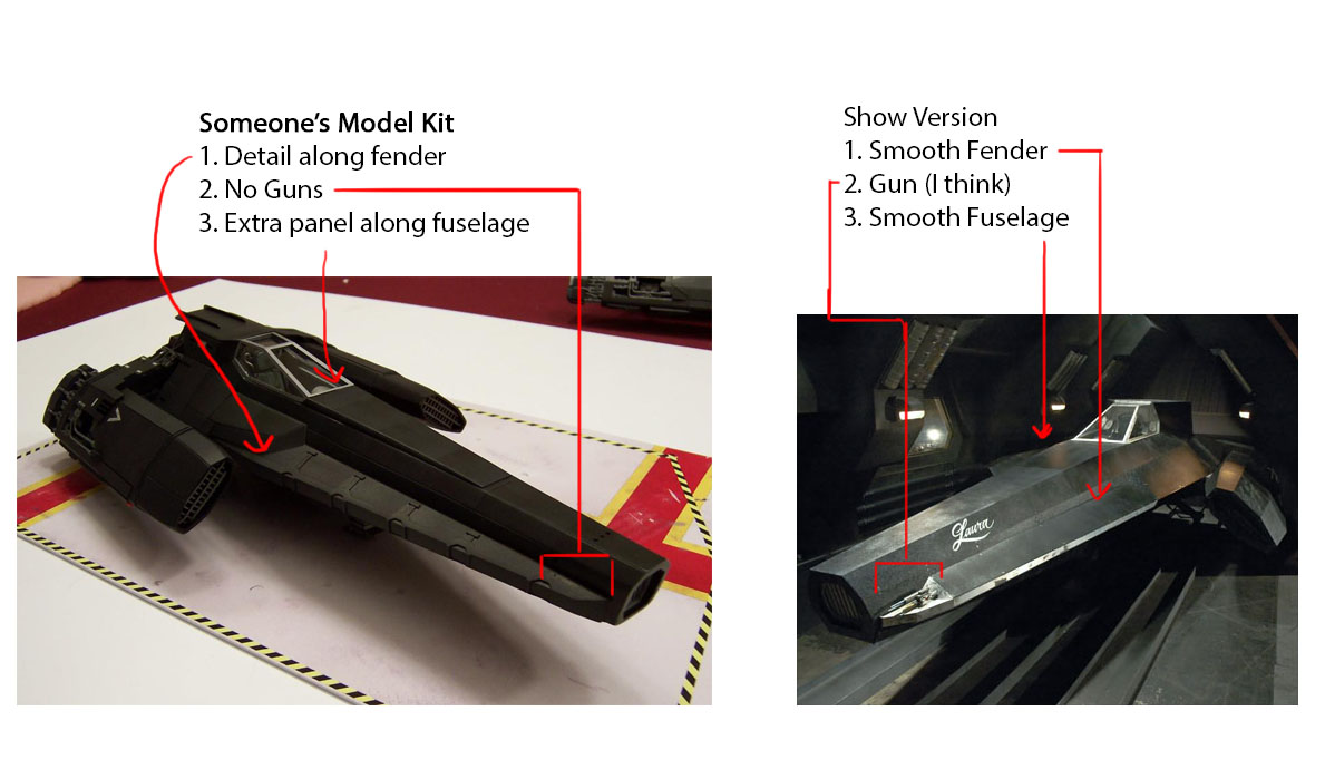
Also, before anyone calls it out, my reference for most of the modeling was someone's model kit, and my Hi-Poly was mostly done before I realized the many kinda big points where it diverged from the version onscreen, and I was very hesitant to go back and change them, especially since it would've involved removing detail (and adding one detail that I had, and still have, no good reference of). A brief rundown of the major differences.
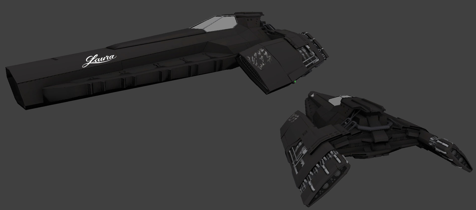
Low-Poly/Hi-Poly comparison. Low-poly is about 8,500 Tris, probably a little higher in this shot because I missed a lot of hidden faces until I found them in the UV Editor.
First test-bake pre-fixing some UV seam issues.
Extremely basic Local Color texture pass.
Now for the conundrum. From shot to shot, or from part of the ship to part of the ship, there's massive differences in the textural qualities of the material that make up this vehicle. I've summed up the big differences that I noticed below:
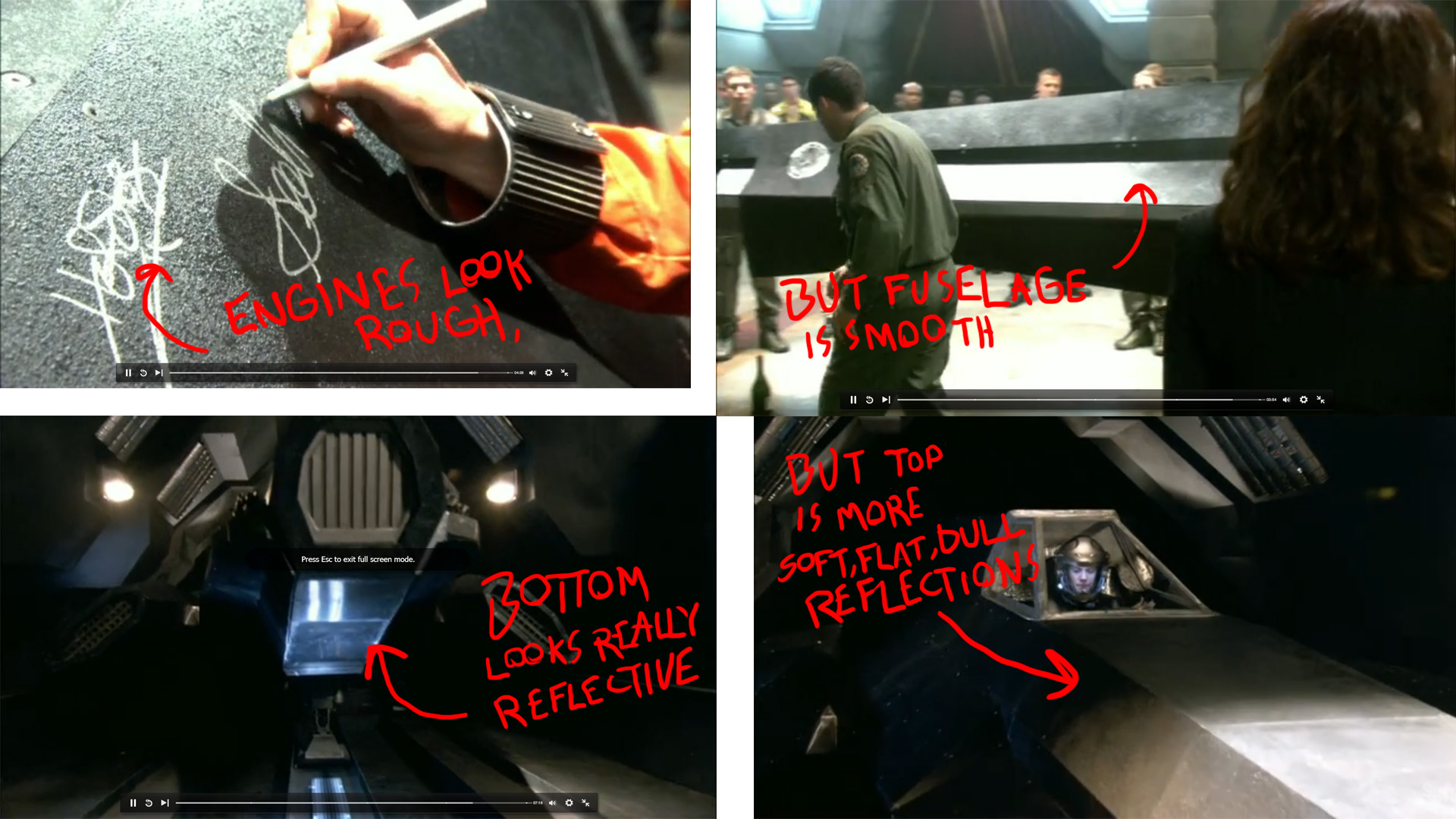
I figured I've got a couple options here. Option 1: Stick with the inconsistencies in the show. After all, the ship was cobbled together from whatever parts Galactica's Deck Gang could scavenge. Why would all the carbon composite they could get their hands on have the same levels of specularity to it? Option 2: Dial it all down to the same, average level of specularity and roughness, thus making the whole thing feel more consistent.
What are you guys's thoughts?
Any other feedback is also welcome.
More screenshots, different angles, UV's, are up at my blog.
A couple Hi-Poly screengrabs.
Also, before anyone calls it out, my reference for most of the modeling was someone's model kit, and my Hi-Poly was mostly done before I realized the many kinda big points where it diverged from the version onscreen, and I was very hesitant to go back and change them, especially since it would've involved removing detail (and adding one detail that I had, and still have, no good reference of). A brief rundown of the major differences.
Low-Poly/Hi-Poly comparison. Low-poly is about 8,500 Tris, probably a little higher in this shot because I missed a lot of hidden faces until I found them in the UV Editor.
First test-bake pre-fixing some UV seam issues.
Extremely basic Local Color texture pass.
Now for the conundrum. From shot to shot, or from part of the ship to part of the ship, there's massive differences in the textural qualities of the material that make up this vehicle. I've summed up the big differences that I noticed below:
I figured I've got a couple options here. Option 1: Stick with the inconsistencies in the show. After all, the ship was cobbled together from whatever parts Galactica's Deck Gang could scavenge. Why would all the carbon composite they could get their hands on have the same levels of specularity to it? Option 2: Dial it all down to the same, average level of specularity and roughness, thus making the whole thing feel more consistent.
What are you guys's thoughts?
Any other feedback is also welcome.
More screenshots, different angles, UV's, are up at my blog.
Replies
Calling the base textures done. Going to get started on the interior in the near future (hopefully tomorrow, but I do have a very busy tomorrow).