[WIP] Soul Calibur Lizardman "Redesign"
Update:
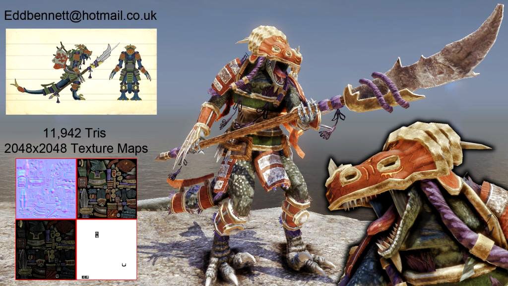
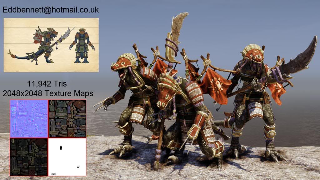
Final Piece! This character went through quite a vast change since I last posted because I decided to redesign him again. I need as much feedback as I can get on the final piece for my evaluation so please comment and also a big thank you to those who helped me previously with the stellar advice.
[ame="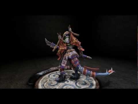 https://www.youtube.com/watch?v=065wfEIomp4&feature=player_embedded"]http://www.youtube.com/watch?v=065wfEIomp4&feature=player_embedded[/ame]
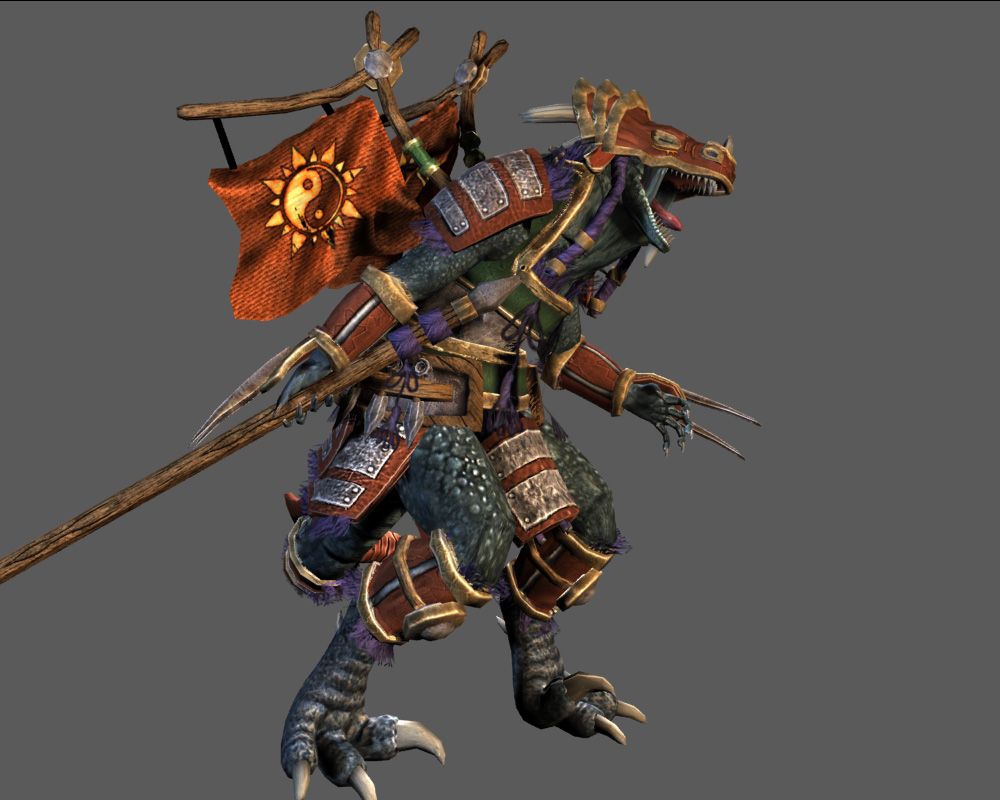
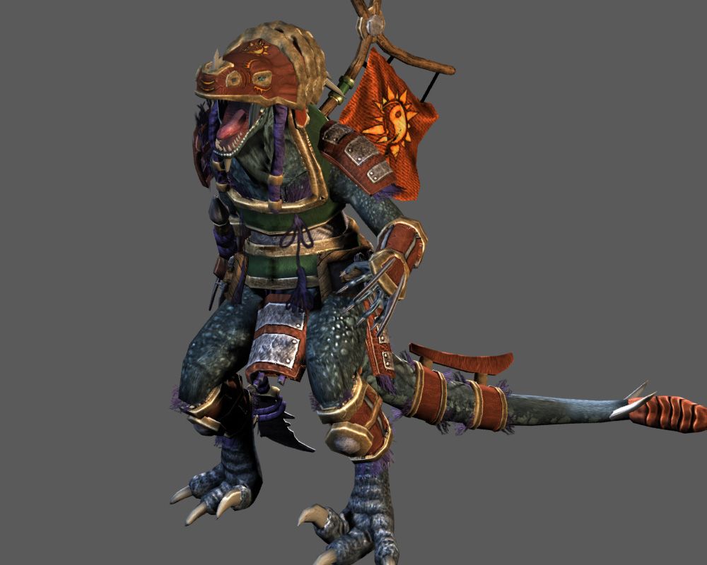
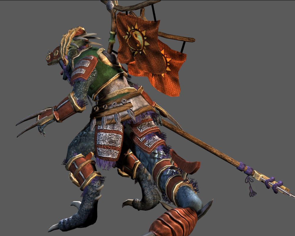
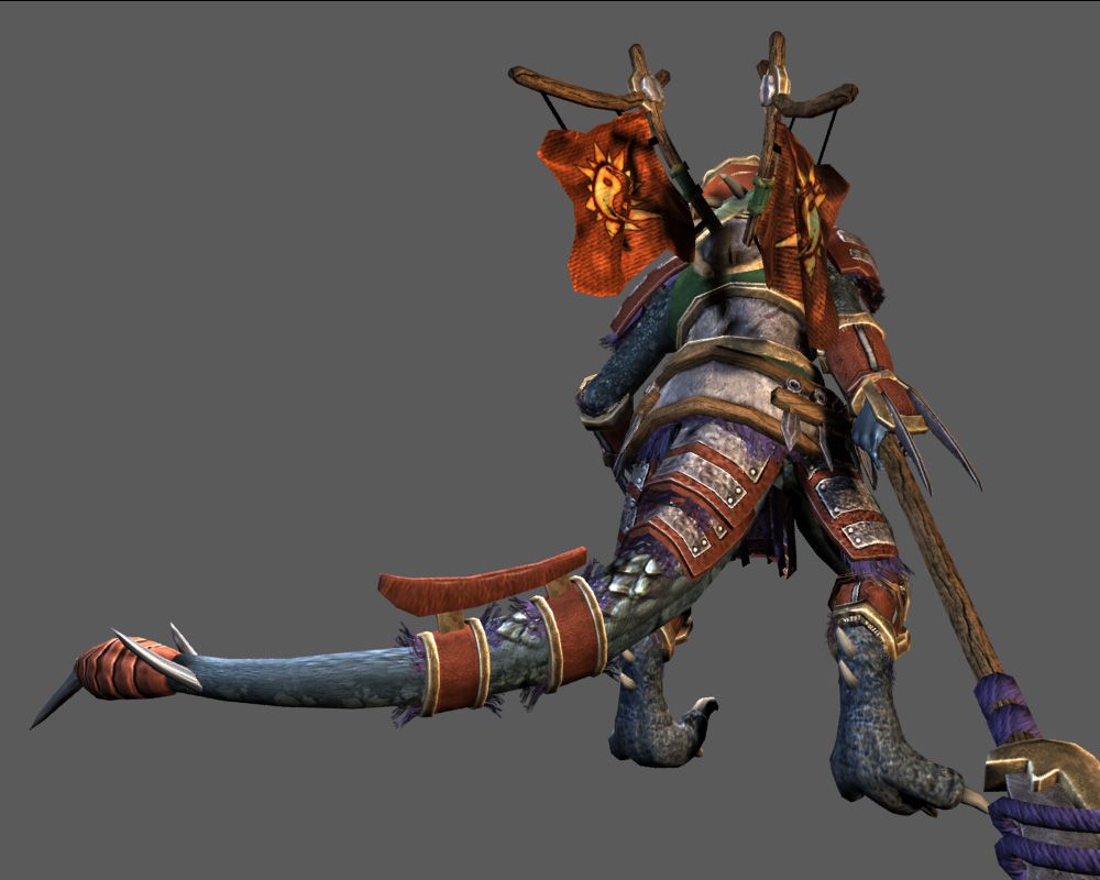
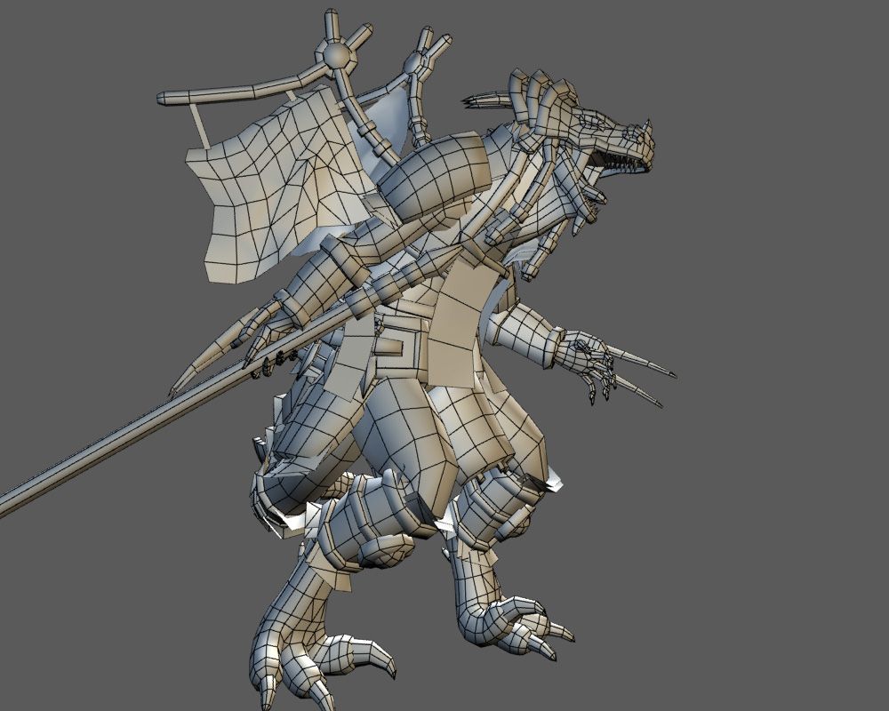
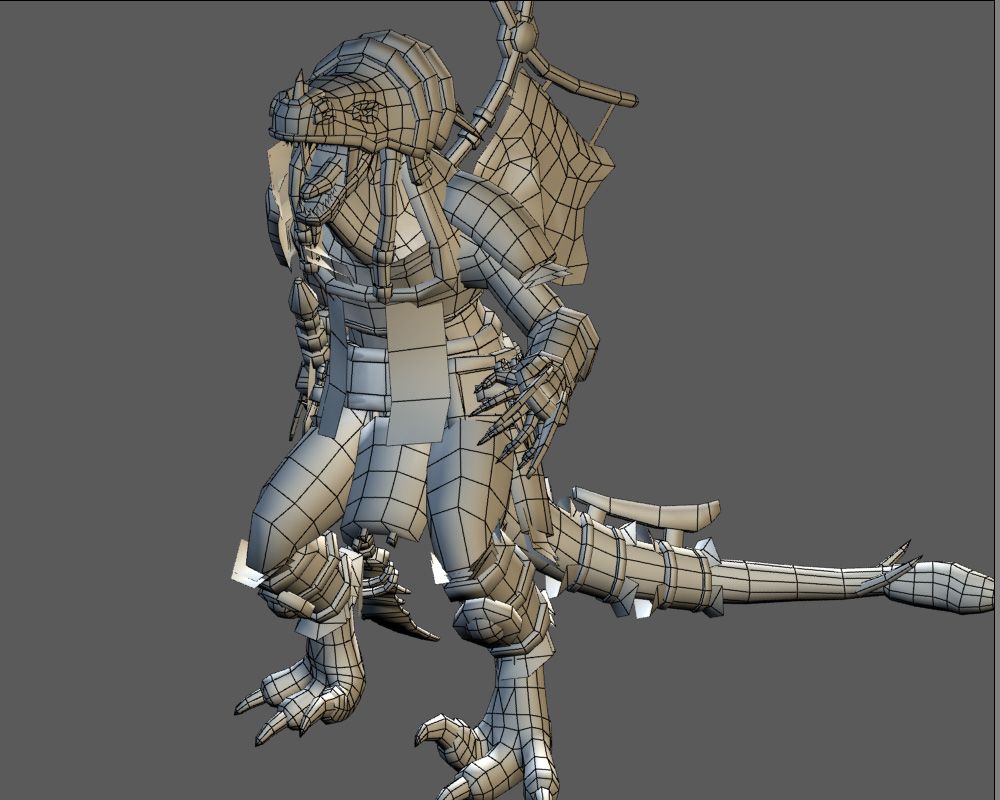
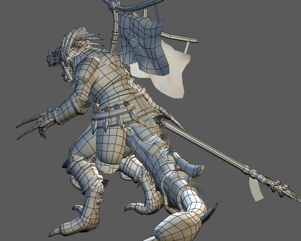
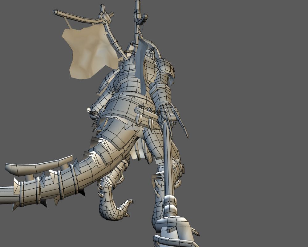
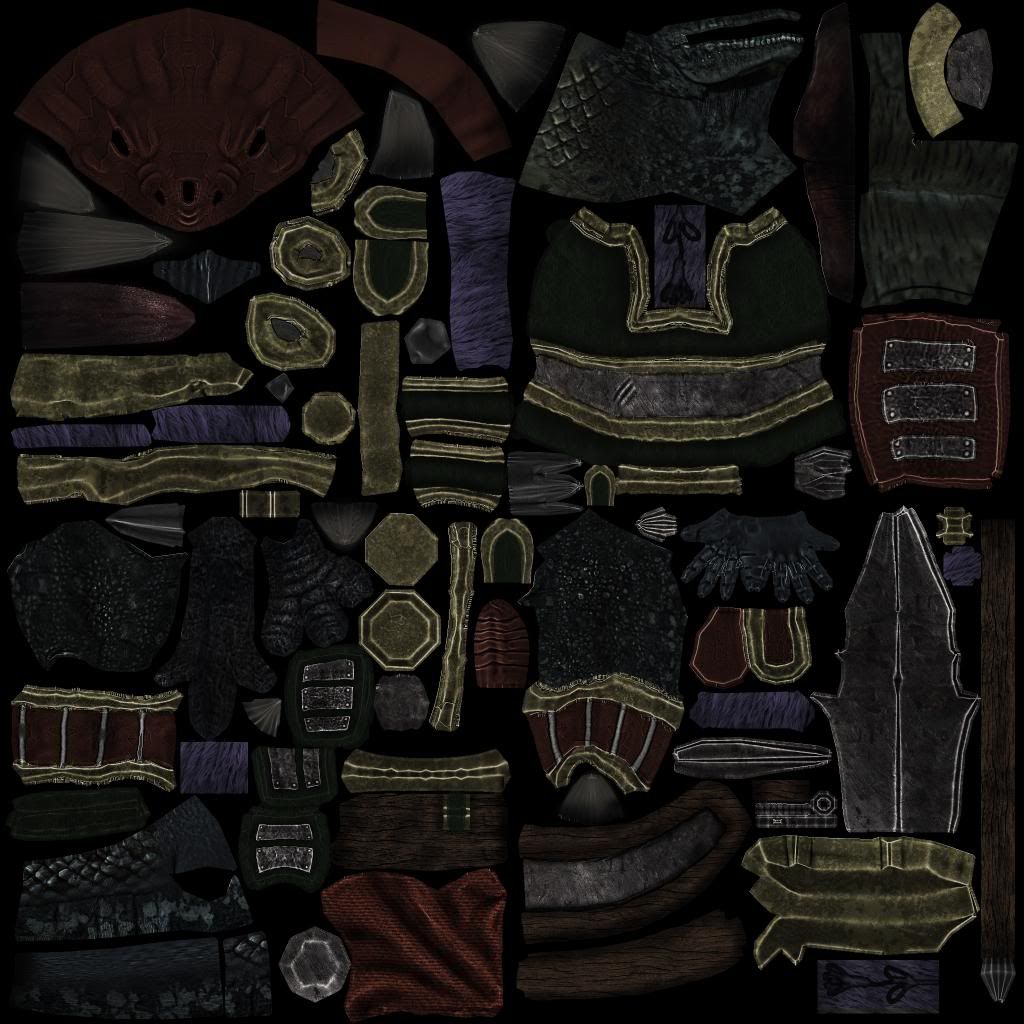
Diffuse
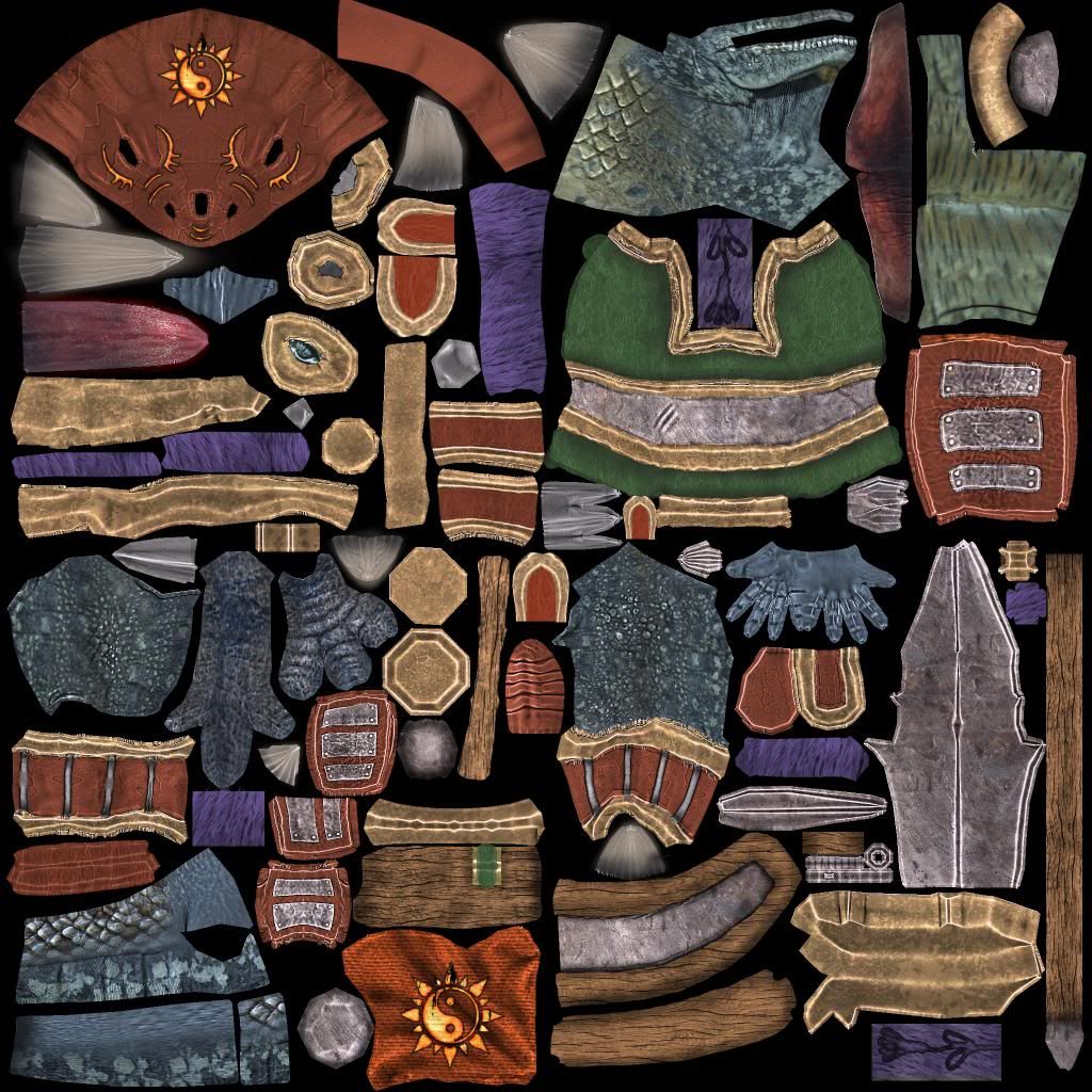
Opacity
Specular
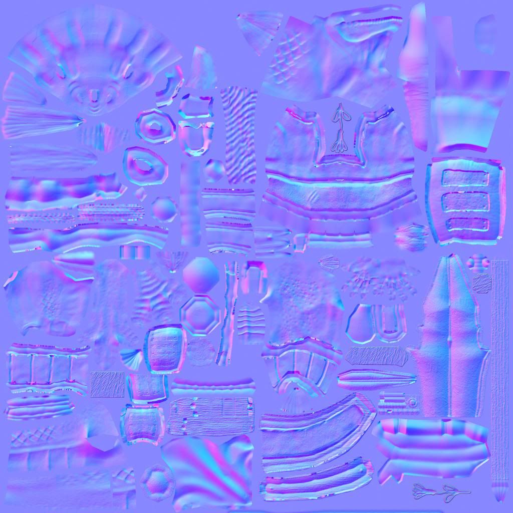
Normals
Final Piece! This character went through quite a vast change since I last posted because I decided to redesign him again. I need as much feedback as I can get on the final piece for my evaluation so please comment and also a big thank you to those who helped me previously with the stellar advice.


[ame="
 https://www.youtube.com/watch?v=065wfEIomp4&feature=player_embedded"]http://www.youtube.com/watch?v=065wfEIomp4&feature=player_embedded[/ame]


Diffuse

Opacity

Specular

Normals

Replies
Bam Bam Bam
Even the last fella isn't exactly a human, and his limbs are a bit straighter than the others, yet he looks relaxed and balanced. Your guy has super straight legs, arms, fingers, and looks like he would fall forward. If I were you, I'd try and adjust his limbs at a lower subdivision level and make him look like he's standing there. This will help with defining the muscles, and how natural he will look in the end. Good luck
with the feet theres a strange lump he has behind his metatarsals, its personal preference really but its a bit unusual, if you look at a cats feet for example you can see they lack the lump and balance on their toes.
im liking the armour, keep it up : ]
http://might-and-magic.ubi.com/heroes-6/en-US/game/creatures/sanctuary/index.aspx#tcm2113194-Maintab-1
@Paintforge
About his back, those were meant to be his rib cage/shoulder blades, I have smoothed them down. I've fixed up the hourglass shape and pulled his hips in. Tried fixing up his feet, made them larger and removed the lump. This part is troubling as he's a heavily built character he doesn't look right being too much on his tippy toes.
@Sparr
I've extended his torso and pulled his weight back a bit so he's not so hunched over forward. The tail issue is likely still present, I'll get on that later.
Using a deathclaw reference to help improve the feet.
removingthat could help spine flow, also the tail going directly into the stomach as spar said.
another thing that might be preferential, but since its based on humanoid anatomy- the length of the fingers compared to length of the palm, lengthening the palm should allow for better grip and such.
glhf
As the character is complete I now need feedback on the final piece for my evaluation so please leave a comment, good or bad. Thanks!
Please give me some feedback on the piece, I need it for my assignment for precious bonus marks!
Personally if I was being critical to myself I'd say that while it has improved a lot since the start there's still things that don't make much sense.. Perhaps the mesh is too colorful and makes him look like a big lizard man clown? The specular is just a crap rehash of the diffuse with the contrast pulled up and darkened. Does it make no sense how the armor is attached to the character in places? Is it a bit odd how I've used wood as trim on metal armor? That hanging piece of armor between his legs would probably cause chafing. It's supposed to be made of leather with metal plates but maybe it's hard to tell what material the pieces are meant to be? Anyway, please leave a comment!
:thumbup: