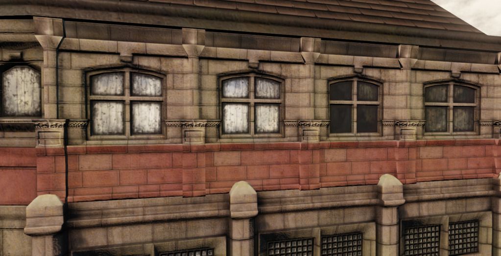
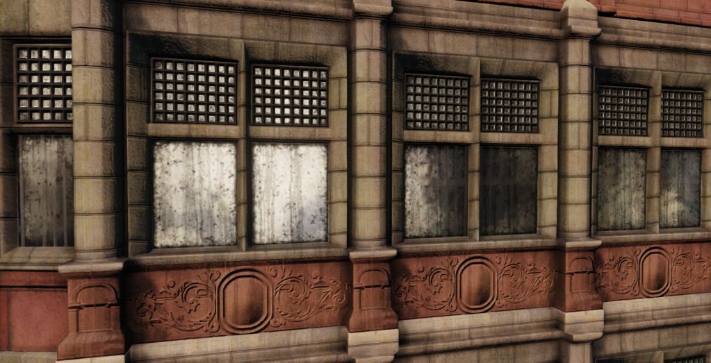
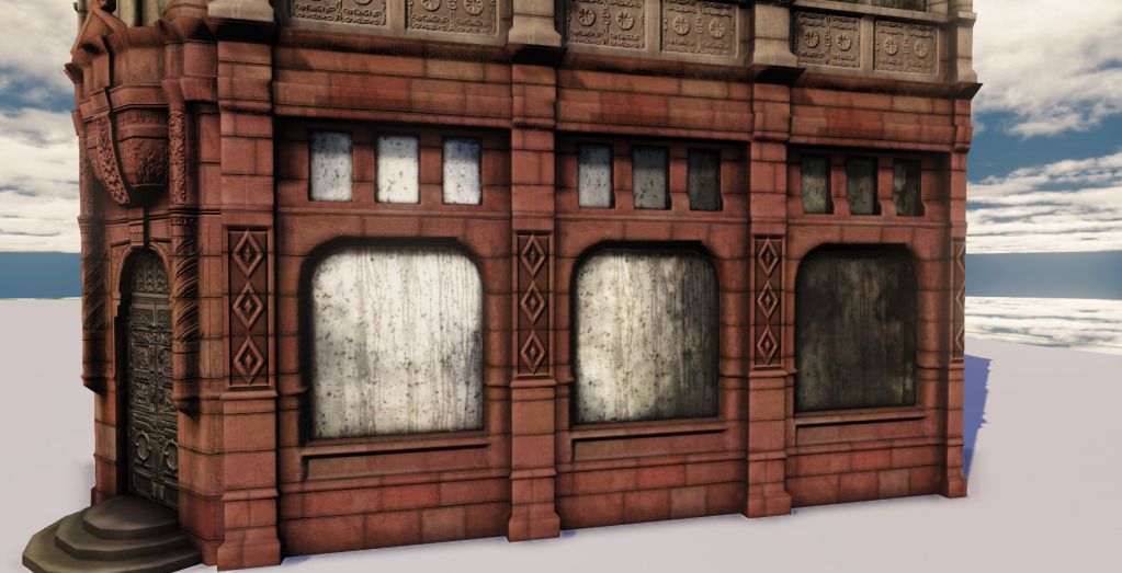
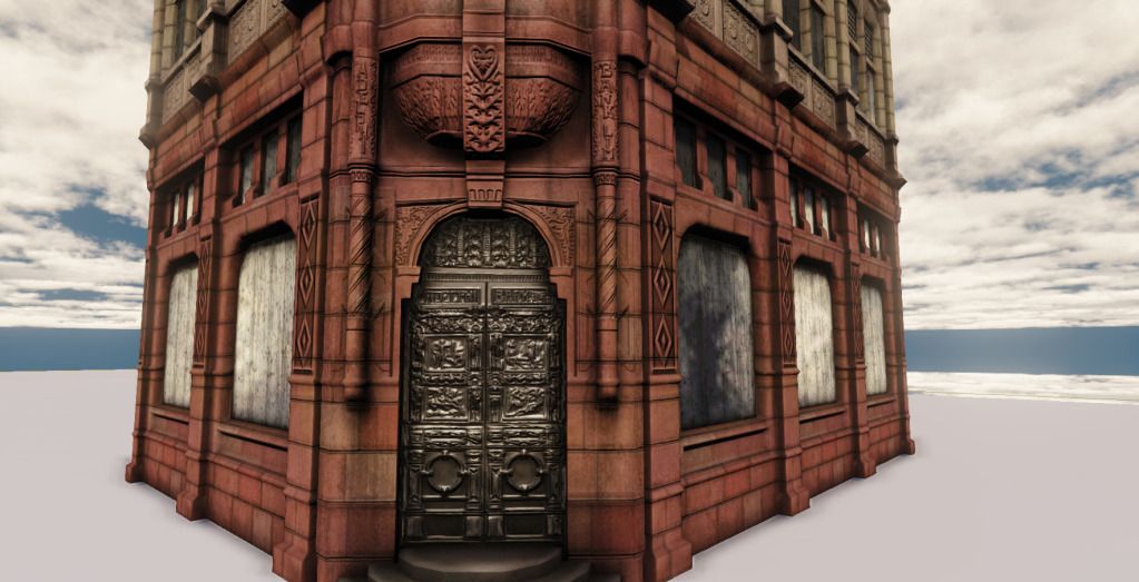
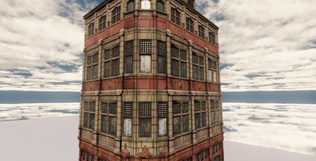
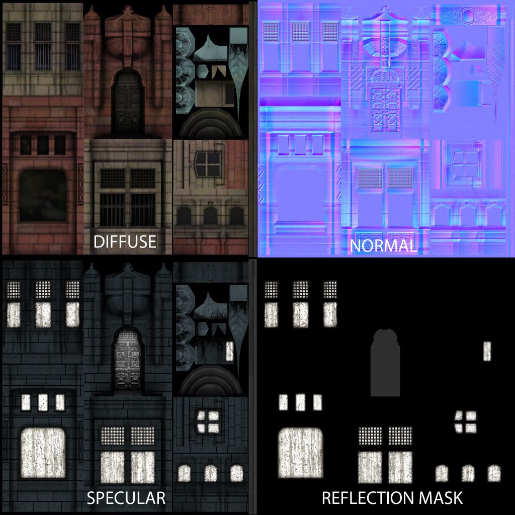
Hey guys, I've been working on some things for my portfolio and this is something I'm looking for critique on. It's a simplified version on the old Adelphi Bank Building in Liverpool. I'm just looking to make it better, so whatever input you have could help. I've just thrown in it into UDK with the default lighting.
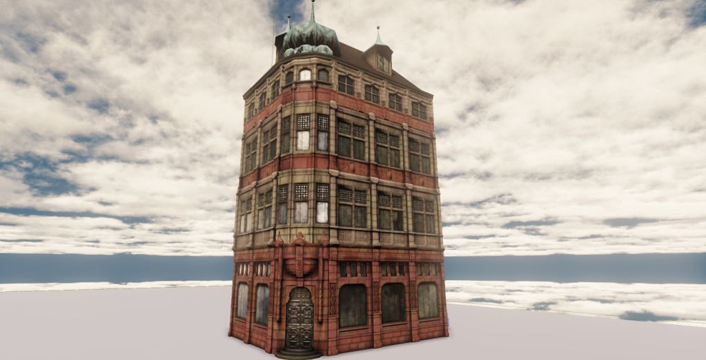
Windows are too dirty, play it smart if you want dirty windows do it more from gloss map rather than the spec, and less less evident.Some of them look like a dirty metal foil imho.
I think you could break up the big red shapes a little more in the diff. also. It all looks a little too much like a color fill and less like actual paint. more wear-fading/chipping and color variation would go a long way.
I think the spire's on the top could use more love as well.
what are you gonna do about the windows? leave them opaque/ dirty? looks to fake to me. if you wanna have the building abandoned, you could put some wooden boards inside, and break a couple of windows. or you could put curtains or windowsills. back in the day a lot of banks had curtains or sills for when the sun was hitting the employees :P
Thats an awesome idea! I didn't really know what to put int he bottom windows, but curtains sound great. I think I was relying a bit on the reflection on the windows to hide that there wasn't anything in them
Replies
I think the spire's on the top could use more love as well.
Real looking bricks (cuz they are real)
http://ftextures.com/textures/red-bricks.jpg
this is one of my references:
The red is too saturated too, and needs more brown over red.