M-79 Grenade launcher
LATEST PROGRESS:
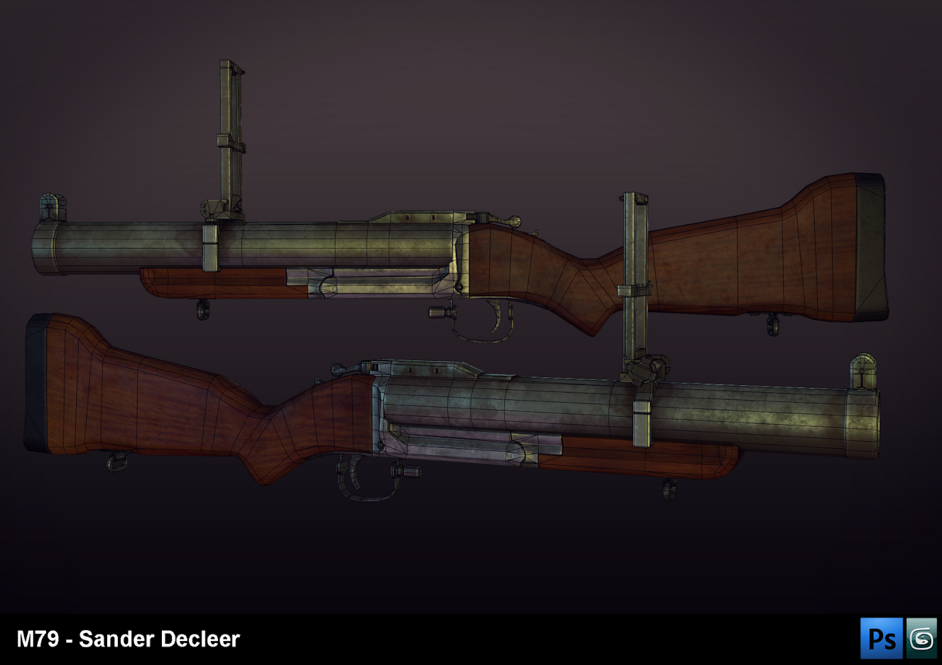
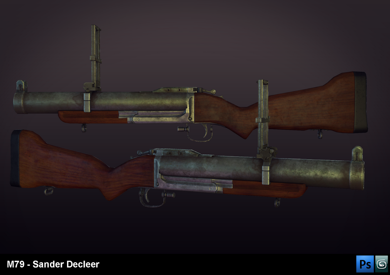
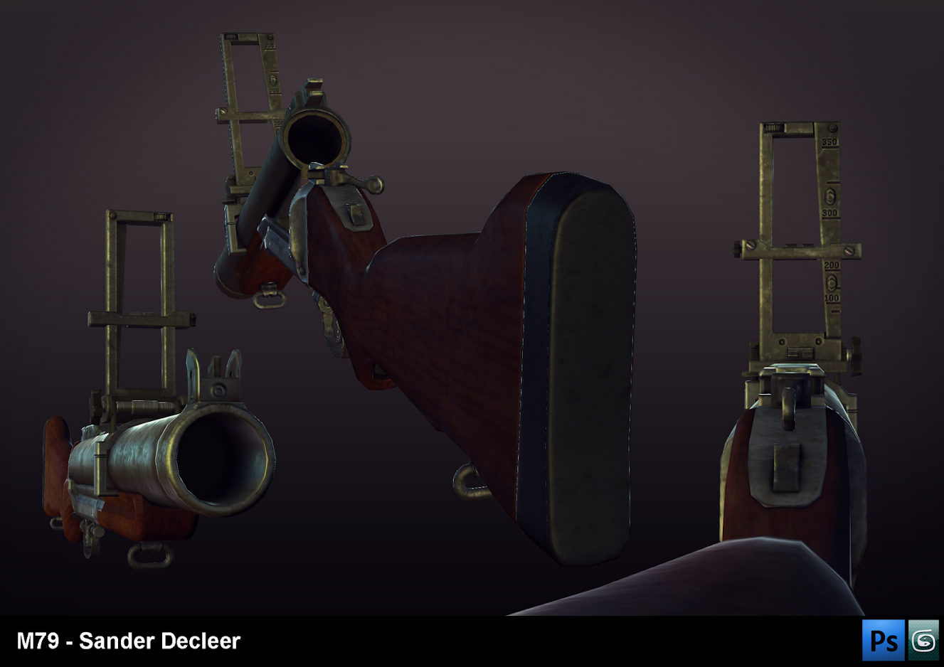
ORIGINAL POST:
Heya polycount. With school being out for summer and all, I was getting bored and thought; "hey let's make a portfolio piece instead of goofing off." Being delayed by a summer camp and a side job, I've made bits of progress over time. I'll just dump my progress up until now here for you guys to criticize. As I want this to be a portfolio piece, you can tear it apart as you wish and nitpick all you want...
I chose a gun to begin with, and the looks of the M-79 appealed to me. Here's a reference pic for you guys.

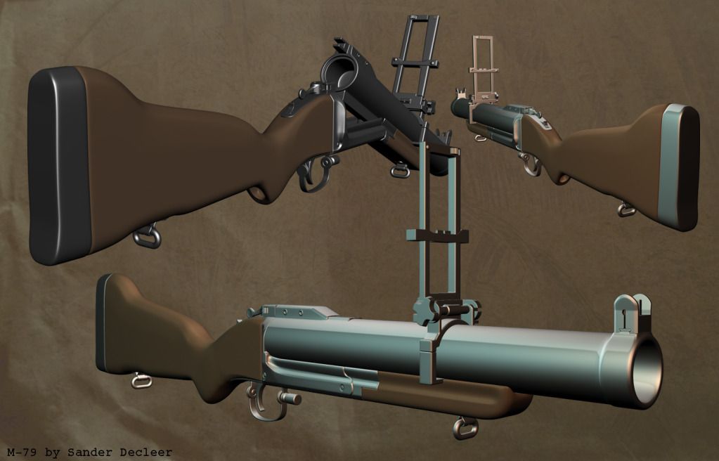
first off, the high poly, with and without wires
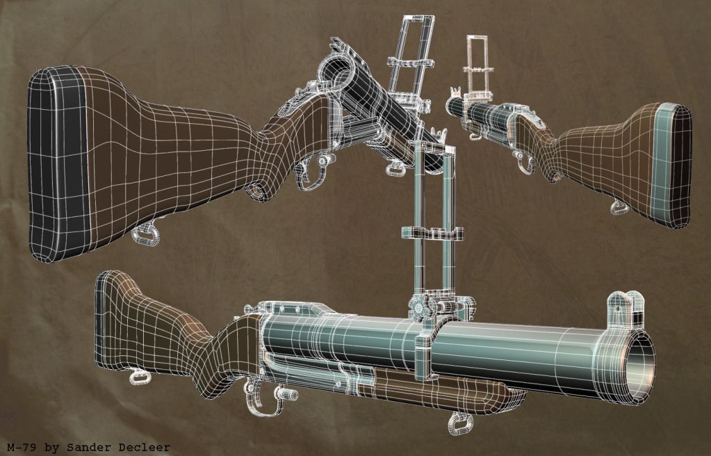
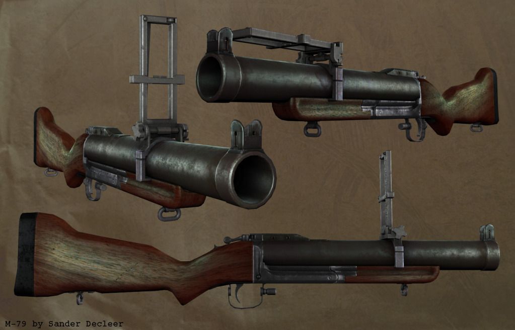
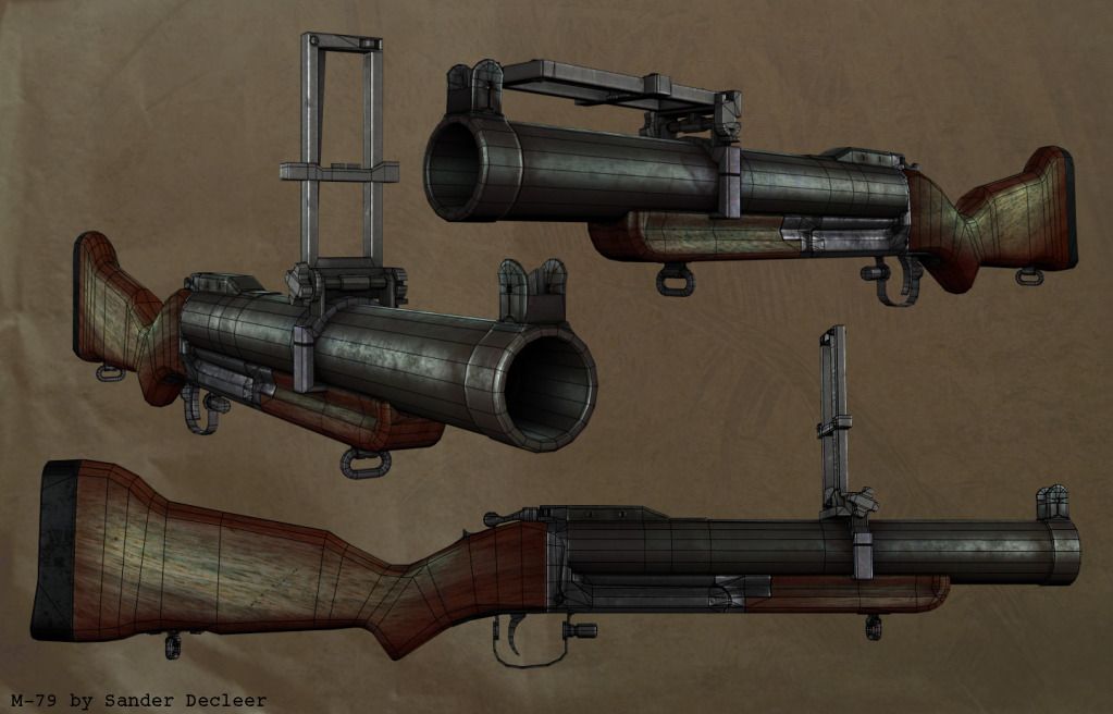
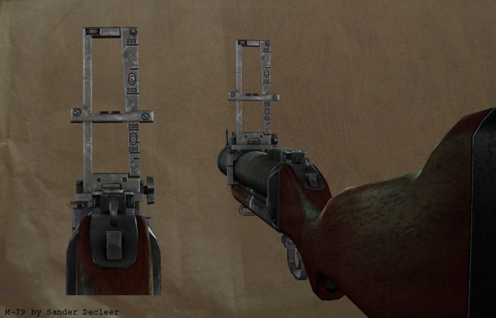
Next off the lowpoly and texture. This texture is still work in progress. Some things I wish to alter drastically are the wood (follows the flow of the stock instead of being just straight wood, as pointed out by a friend) and its specular (I was experimenting with some different colors to see what it would do). I'll also add some more wear on the metal. The glossmap is still in it's first iteration for most parts.
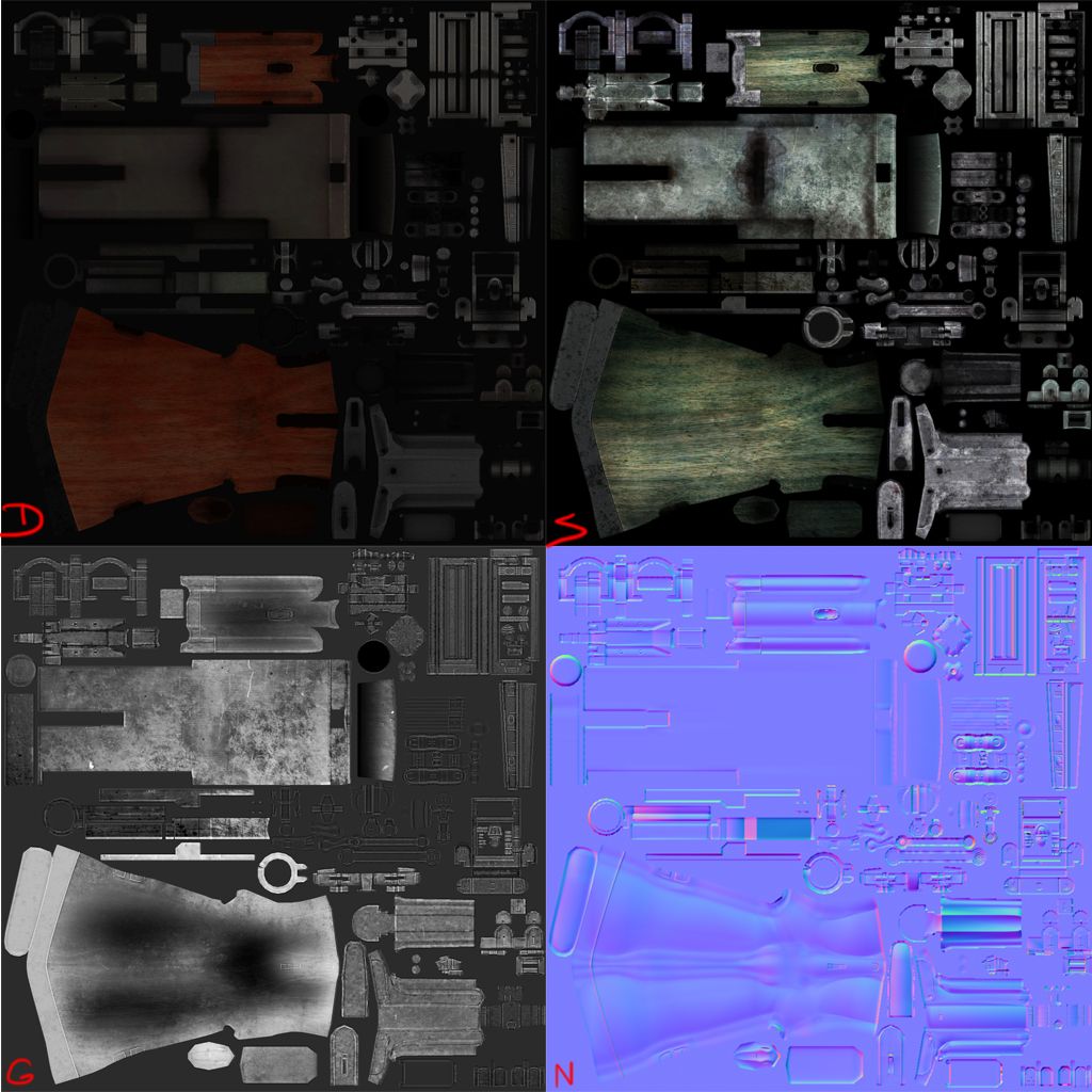
texture flats. Don't mind the basic glossmap and the color of the wood in the spec.
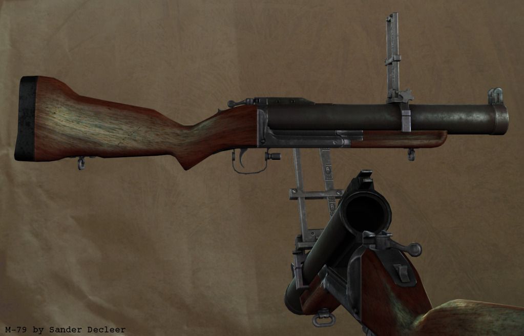
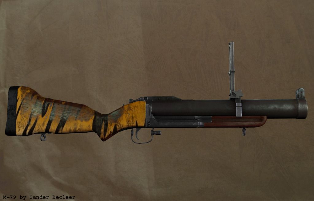
and a final image, just for fun and giggles. A quick test of a 'possible' alternate color scheme.
As I already mentioned, all comments, criticism and questions are more than welcome. Thanks for your time!


ORIGINAL POST:
Heya polycount. With school being out for summer and all, I was getting bored and thought; "hey let's make a portfolio piece instead of goofing off." Being delayed by a summer camp and a side job, I've made bits of progress over time. I'll just dump my progress up until now here for you guys to criticize. As I want this to be a portfolio piece, you can tear it apart as you wish and nitpick all you want...
I chose a gun to begin with, and the looks of the M-79 appealed to me. Here's a reference pic for you guys.

first off, the high poly, with and without wires


Next off the lowpoly and texture. This texture is still work in progress. Some things I wish to alter drastically are the wood (follows the flow of the stock instead of being just straight wood, as pointed out by a friend) and its specular (I was experimenting with some different colors to see what it would do). I'll also add some more wear on the metal. The glossmap is still in it's first iteration for most parts.


texture flats. Don't mind the basic glossmap and the color of the wood in the spec.

and a final image, just for fun and giggles. A quick test of a 'possible' alternate color scheme.

As I already mentioned, all comments, criticism and questions are more than welcome. Thanks for your time!
Replies
Side note the tiger pattern looks cool.
Any comments etc are welcome =D
check out millenias weapon tutorial as his stock is really nice http://www.polycount.com/forum/showthread.php?t=100984
[edit] - notice the use of the words wood and would... I use them often...
If you don't mind could you comment on my Christian Bale character?(the one with 22 replies)please and thank you
http://world.guns.ru/userfiles/images/grenade/gl06/m79-2.jpg
There is problem with UV's for wood but this has been fixed in the update . and also wood texture need some attention .
The metal is a bit grungy IMO, but otherwise, it looks good and you have a nice bake!
use bigger renders, different light setup
and i would lose the green spec from the wood, and lower it
but its pretty cool work dude
@PenGuin1362: I tried fixing the grain, and I believe the newer version is somewhat better than the original in that aspect. I will try to make it match even more, although my UV layout makes it hard for me.
@Bouyso: I will, thanks. Might take a look at the grunge in the metal as well, although I kind of like it now... Thank you indestructive texturing!
@Lonewolf: thanks, feels good coming from you. I know I have some work to do when it comes to presenting my work. Hints/tutorials are always welcome. ATM I'm using Xoliul with a fairly basic 3-point light set-up and some reflections. The newer (lower) version of the wood doesn't have that much of a green-coloured spec I believe? The first version had. And like I said before, I will darken the spec on the wood.
Thanks to everyone for their comments, expect an update somewhere soon!
Comments on whatever are welcome and appreciated!
[EDIT] replaced photubucket images with the ones from google+ they are a bit bigger now =D [/EDIT]
Nice looking nade launcher, loving the spec on that metal.
Are those better?
Thanks for the suggestion