[Mixamo Contest] yet another Beast!
Update 4.0
[7.31.20112]
I realized how bad the form was, mostly when you look at the side view. I haven't really figured out the correct form but here i'm iterating on it... hopefully getting closer to the most correct one.
1st pass:
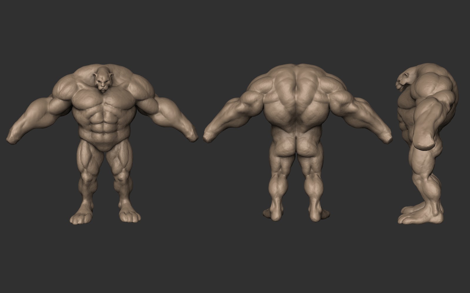
2nd pass: decreased the size of the deltoids, adjusted the shape of the lats.
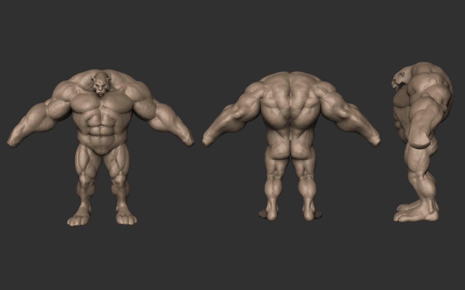
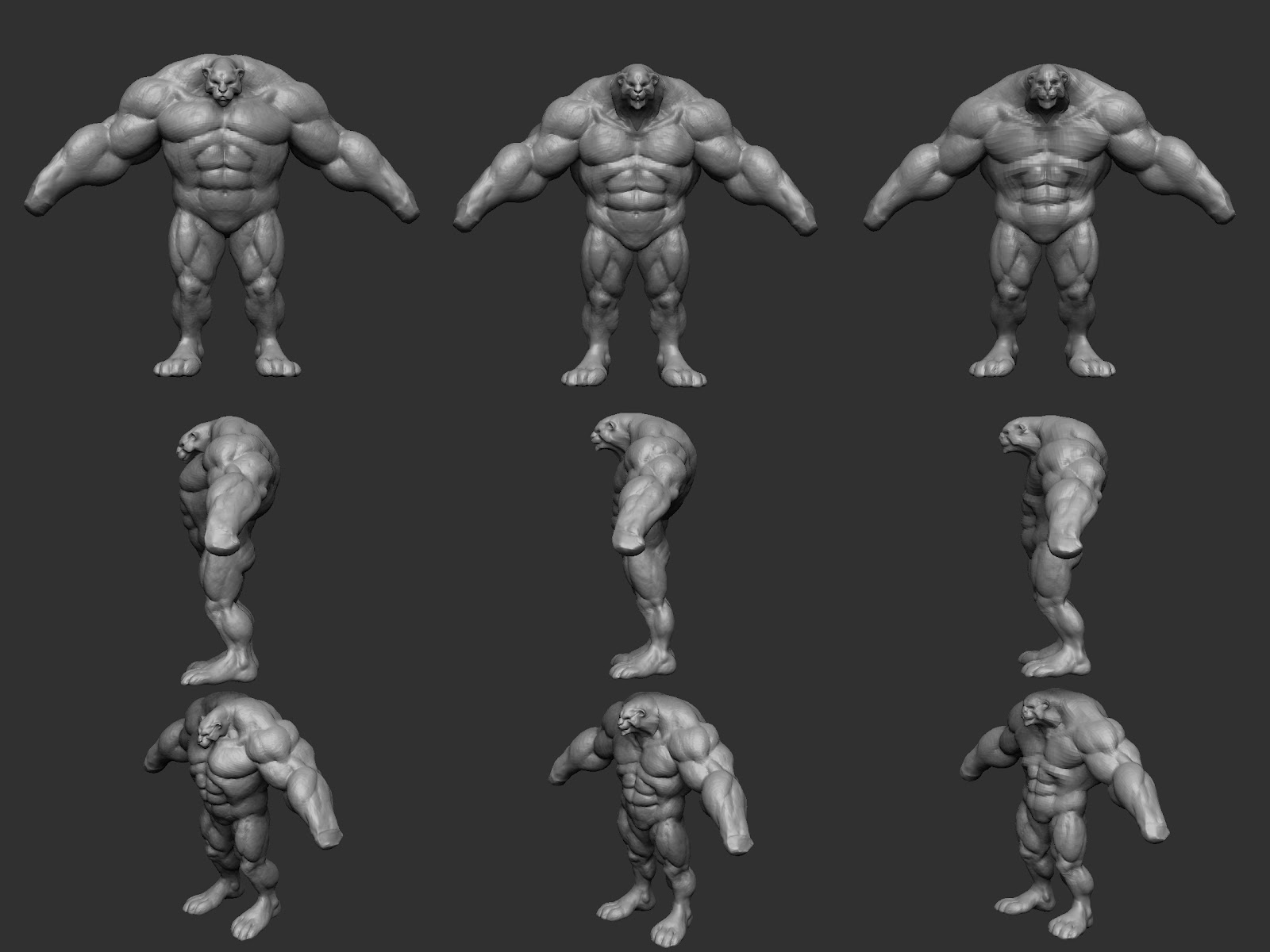
3rd pass: the 1st column is the form from the 2nd pass, the next columns show other adjustments I did. I'm not sure if his legs look better straight than bent, or his upper body should lean forward or what.
whew! last few weeks! O_O
Update 3.0
[7.29.2012]
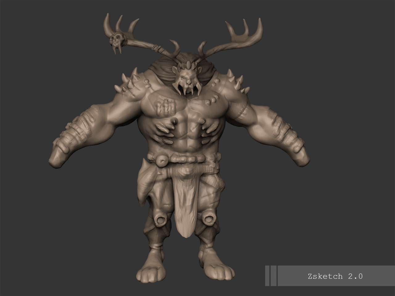
I did a Zsketch just to have an idea of how my character concept could translate in 3D.
..and here I'm trying to nail down the anatomy. I'm gonna add in the details after it is worked out.
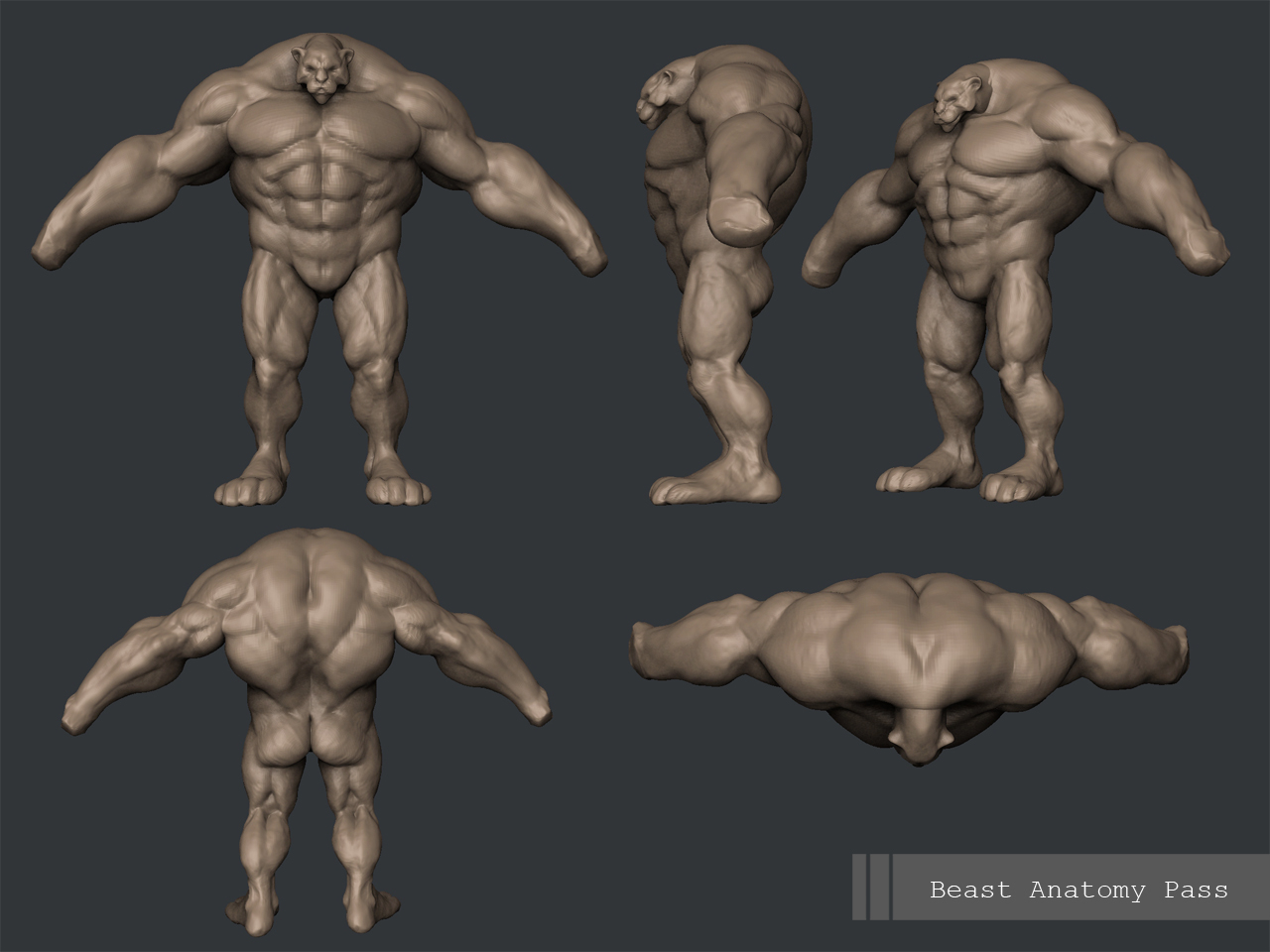
i'm having a hard time with neck because it's too short for the head, but i know it can work.
*Update* [7.24.2012]
I decided to step back and redo some sketches.
This will be close to the final concept, in consideration of the revisions that will come
from crits', comments and suggestions.
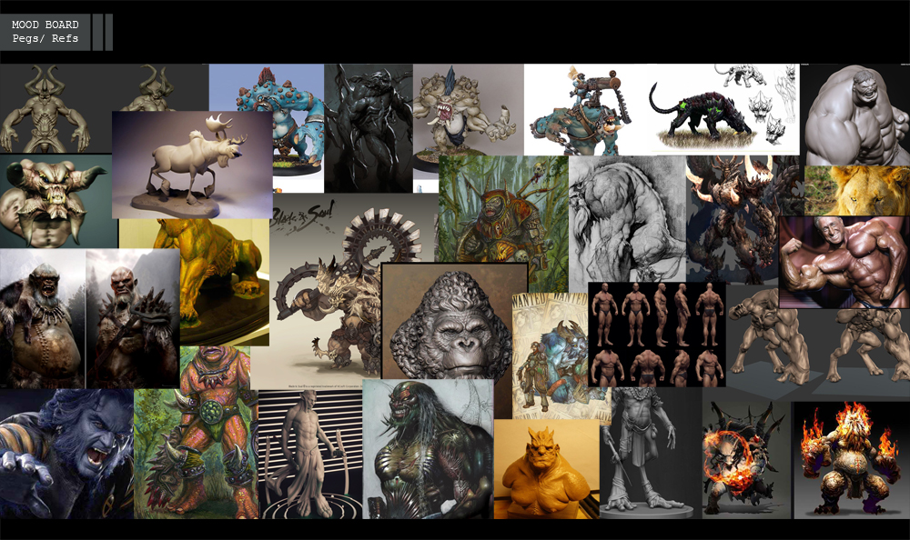
here is the mood board as well..
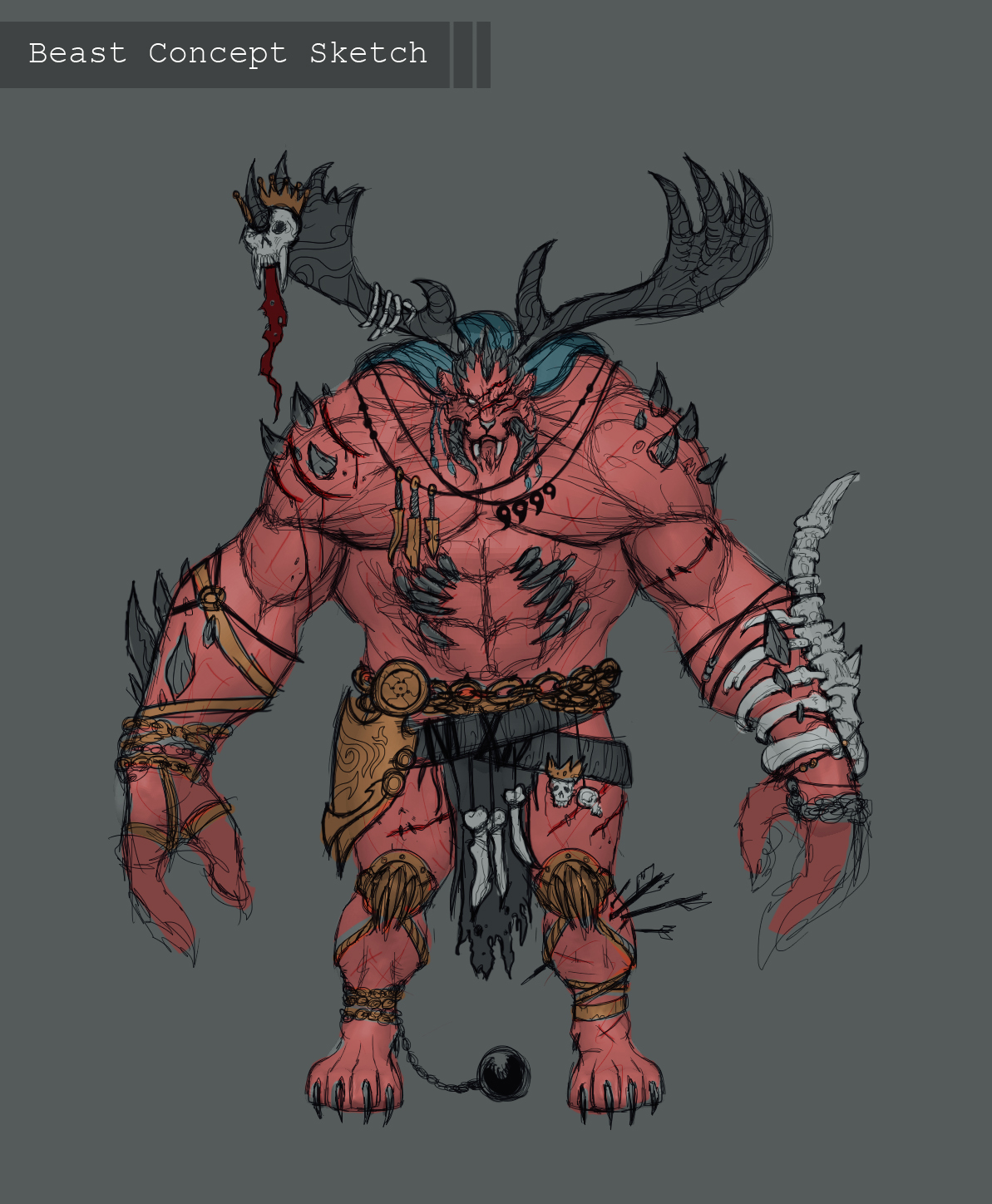
...and the concept sketch. The revisions will just be addressed in 3D.

So hi!
here is my entry for this July-August's Mixamo Fantasy Character contest.
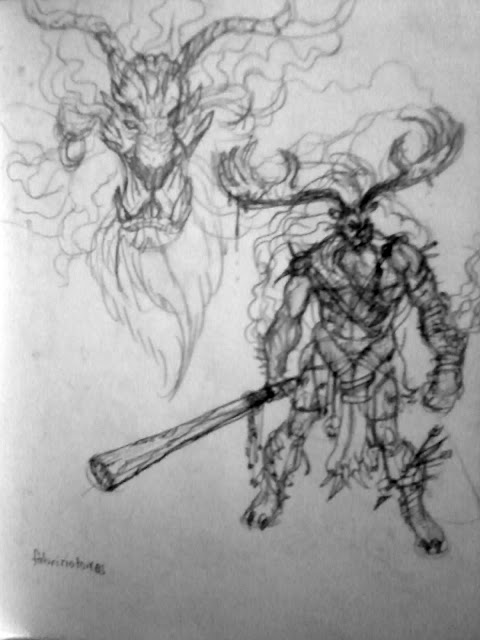
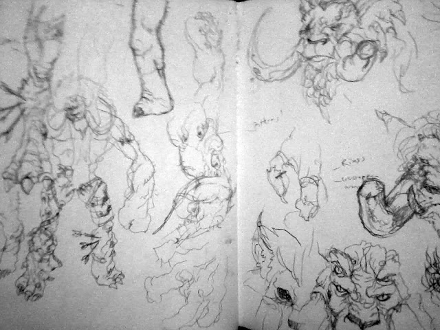
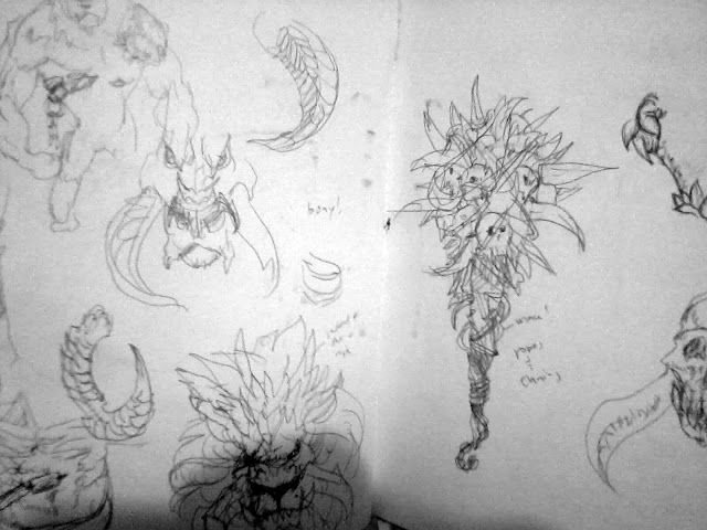
Just a few doodles for now, as I haven't really figured out what direction to go.
maybe i'd try more silhouettes to work out the design.
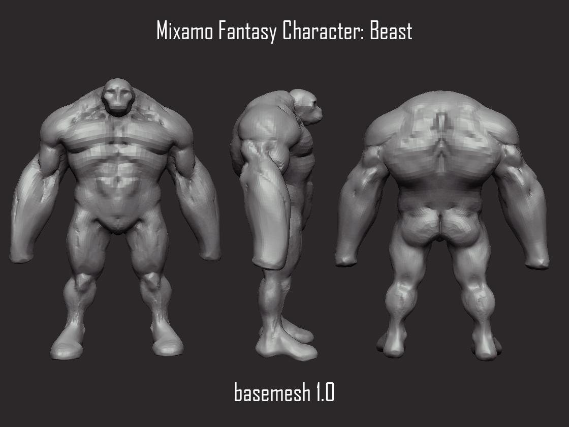
my Base mesh:
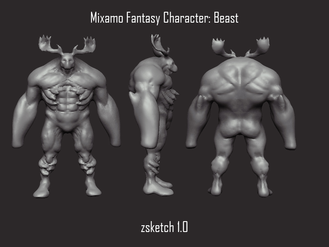
Zsketch ftw!
just tryna get loose, 'til I can really wrap my head around the character design.
as always, CC's are welcome.
[7.31.20112]
I realized how bad the form was, mostly when you look at the side view. I haven't really figured out the correct form but here i'm iterating on it... hopefully getting closer to the most correct one.
1st pass:

2nd pass: decreased the size of the deltoids, adjusted the shape of the lats.

3rd pass: the 1st column is the form from the 2nd pass, the next columns show other adjustments I did. I'm not sure if his legs look better straight than bent, or his upper body should lean forward or what.

whew! last few weeks! O_O
Update 3.0
[7.29.2012]
I did a Zsketch just to have an idea of how my character concept could translate in 3D.

..and here I'm trying to nail down the anatomy. I'm gonna add in the details after it is worked out.

i'm having a hard time with neck because it's too short for the head, but i know it can work.
*Update* [7.24.2012]
I decided to step back and redo some sketches.
This will be close to the final concept, in consideration of the revisions that will come
from crits', comments and suggestions.
here is the mood board as well..

...and the concept sketch. The revisions will just be addressed in 3D.

So hi!
here is my entry for this July-August's Mixamo Fantasy Character contest.
Just a few doodles for now, as I haven't really figured out what direction to go.
maybe i'd try more silhouettes to work out the design.


my Base mesh:

Zsketch ftw!
just tryna get loose, 'til I can really wrap my head around the character design.

as always, CC's are welcome.
Replies
I think that you should remove the bones on the legs. The rib cage could be cool, but on the legs we just wonder what the heck is that thing ?
wow, coming from you that's really motivating! I really like your work too! Thanks!
I know! haha! I realized that after a while-- crazy this guy!
I like the antlers because it gives him an easy and clear silhouette, but I guess I have to tweak it more to remove the resemblance to chopper!
I think it should have a name soon!
you're absolutely right! I kinda liked it first in my sketches but it dint work in 3D. I still have a lot of stuff to change in the overall design, but I guess im stickin to the antlers and the hulkish anatomy of the beast.
btw, your's is looking really good! really diggin the design!
@Jeffreak: Thanks!! Im not sure about the color too, I'll still play with diff combinations and palettes to see what really fits.I'm also thinking of removing the iron ball, just to make it easier to rig, esp. with the mixamo auto-rig. otherwise, ill make it bigger. hehehe
hahaha! What I really want to do is vary the sizes and types of the skulls, some human, some not. I'll do that in 3D..
the iron ball.... must be his lollipop. =O
Can I have some crits guys? Time is running up! Thanks!
other then that I just wanna see this one finnished cause I think hes gonna be kick ass,
do you have any ideas for weapons?
May I suggest a tree trunk?
As for any personal crits I may I have I would go for a more pronounced lion's mane. Give it more volume and in return it may add alot more to the character.
Other than that. It's awesome, get cracking on another update please.
hey lotet, your assassin's almost done and its looking kick ass!! congrats!
anyway, thanks for liking it, i will refine the muscles after i've finalized the form..right now it still looks awkward to me.
as for the weapon, i already have a design for it, ill post it soon!
Thanks Disarray! yea a tree trunk would really suit his size!
i like your idea of giving him a pronounced mane, ill iterate on that after im done with the anatomy. Thanks for the input!
[8.15.2012]
I haven't had enough time to focus working on my character and it's been a while since I updated my entry. I have some improvements on the form and anatomy, and some things kinda changed like the character design. It's still going to be a beast though, haven't thought of a name for it yet! Suggestions anyone?
here are a couple of screenshots and turntables about my progress.
here I thought that the legs were too short so I lengthened them..
here is the latest iteration for my anatomy pass.. with my current skill, I can't get it to the level that I was trying to get it too. So I'll just accept that and move on, I'll just continue practicing!
..and a quick silhouette turntable with the base meshes for the horns and stuff..
gonna get them into zbrush to do more sculptiing!
[ame="
[ame="
then later i'll add in the belts and straps and what not... deadline's so neaarrr!! hope I can finish it in time!
Thank you lin_firefly!
Its a great anatomy study though.
[8.17.2012]
Finally! with armors!
here are the version with armors.
1. pre-final detailed anatomy sculpt
2. Armored version #1
2.1. Silhouette
3. Armored version #2
It is neaaarrr! gotta finish this asap!
thanks lotet! I really wanted to it with the hunchback. I just couldn't get the form right in sculpting. I'm thinking of getting it through the pose. I'll find out when it's done!
btw, congrats on finishing early! your work is awesome!
The arrows stuck in the flesh are great, but the sword is a bit too muche I think... especially in the shoulder. Maybe he dosen't feel the pain, but the blade will block the joint and cut the muscles ^^.
He could also have some claws on the toes... here the feet look like Bugs Bunny's.
Anyway, if you can't finish it in time, don't give up, just finish it for yourself, and you could even improve it.
oh yes, sleep?.. i'll start forgetting what that means! haha! JK!
Yes about the sword, I'm actually waiting for someone to mention it. It makes sense that the blade will block his joint and stuff so I guess ill remove it. I just really like it in the sihouette.
still a lot of stuff to add, like claws on his feet and his hands! Thanks for the suggestions, and congrats on finishing your entry!
[8.18.2012]
Im so happy about the extended deadline! Now I won't worry about not finishing on time.
so here is the latest progress of my beast!
Changes:
1. Moved the sword and dagger to the back, as suggested by texelion and jeebs! (Thanks guys!)
2. Added a few more basemeshes for the other parts
3. Changed the Antlers
anyway, congrats to those who have finished already, and goodluck to the rest of us.
But maybe you could give him a dying pose ? Like after an harsh and deadly combat.
it looks better to me! I'm really going for the silhouette.
It's fantasy after all, and he wouldn't be a beast if he died from a mere stab by a sword.
This Beast is strong enough that swords/daggers, physical weapons would break if they hit his bones. haha!