[UDK] Abandoned building interior.
polycounter lvl 20
Hey guys, I've been working on this small scene for the last 11-12 days and I thought it might have reached that point where it deserves it's own thread.
I started this scene because I wanted something recent in my portfolio. It first started off as a lighting experiment/practice but I got carried away and did a couple of extra rooms. From then on I just started polishing it and decorating it with more assets.
Here is the latest video and screenshot.I'm nearly done with the walls/floors/ceilings and will move on to the bigger props such as beds/chairs/tables/boxes/trash etc.
[ame="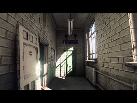 https://www.youtube.com/watch?v=Gz8Ut5mVo1U"]UDK. v0.7 - YouTube[/ame]

This is the original scene and my first version:


Here's some more screenshots of different stages:


And I've got some more videos of earlier stages on my youtube account but I won't spam them here") I'll just post one old one:
I'll just post one old one:
[ame=" https://www.youtube.com/watch?v=kzhbTGGEWIk"]UDK v0.3 - YouTube[/ame]
And here's some of the static meshes I used to create this scene. You could probably guess that they aren't the most fascinating models in the world because I did not want to spend too long on this scene. This is probably not a smart thing to do when creating a scene for your portfolio but I felt like I might be able to get away with it. Anyways, here are some that I screenshotted while waiting for the video to upload:


So yeah, all crits and comments are welcome as always, I'll do my best to fix as much as I can in the time that I've set out for this. There are some big logic problems in the scene mainly with sizes and measurements because I didn't have a real plan for this when I started it. I hope it's minor though. Thanks!
I started this scene because I wanted something recent in my portfolio. It first started off as a lighting experiment/practice but I got carried away and did a couple of extra rooms. From then on I just started polishing it and decorating it with more assets.
Here is the latest video and screenshot.I'm nearly done with the walls/floors/ceilings and will move on to the bigger props such as beds/chairs/tables/boxes/trash etc.
[ame="
https://www.youtube.com/watch?v=Gz8Ut5mVo1U"]UDK. v0.7 - YouTube[/ame]This is the original scene and my first version:
Here's some more screenshots of different stages:
And I've got some more videos of earlier stages on my youtube account but I won't spam them here
[ame="
https://www.youtube.com/watch?v=kzhbTGGEWIk"]UDK v0.3 - YouTube[/ame]And here's some of the static meshes I used to create this scene. You could probably guess that they aren't the most fascinating models in the world because I did not want to spend too long on this scene. This is probably not a smart thing to do when creating a scene for your portfolio but I felt like I might be able to get away with it. Anyways, here are some that I screenshotted while waiting for the video to upload:
So yeah, all crits and comments are welcome as always, I'll do my best to fix as much as I can in the time that I've set out for this. There are some big logic problems in the scene mainly with sizes and measurements because I didn't have a real plan for this when I started it. I hope it's minor though. Thanks!
Replies
Also how'd you keep the realistic looks along with a sensible scale of props (doorways in particular always come off as either too wide or too tall for me :S)
proportions of this room seem a little off:
http://gameartist.nl/wp-content/uploads/2012/06/screen01.png
windows are placed too high, they are too thin, and ceiling might be placed slightly too low. trim on the wall is bigger than on photo, so it also makes room feel smaller.
HNNGGG
@ScribbleHead I'll try to gather some screenshots of the setup soon. I decided to work on some other stuff on the weekend so I'll get back to it monday
@Blaisoid you're right, the proportions are a little off in nearly all of the rooms. I started it as a lighting experiment so I never really focused on it, but I guess I should try and fix it now
@benjam, correct, a good friend on skype noticed it too, should be fairly easy to fix, thanks
@scotthomer, yeah indeed, I'm surprised myself that even at this stage it's looking decent, I was expecting to make this look good with the main bigger props, but I'm not even there yet and quite satisfied. Good learning experience
@Romy, I'll post some screenshots with lightmap sizes. Most of my staticmeshes use vertex lighting, most walls use very low resolution and some( close to harsh differences in lighting) use a bit higher. But I don't think anywall is bigger than 64x64, I'll have to double check that tho.
@alexk, I'll try and write something up soon, but it's fairly basic. The main thing was to understand the lightmass system and all of it's values such as diffuse bounce, static lighting level scale, the ao settings, etc. I experimented in that first room for a day or two. Once I had a basic understanding I started tweaking how much every wall/asset bounces and the same for every light and sometimes I changed it in the material etc.
Thanks for the compliments guys, I hope to show some cooler screens soon! Crits and Comments are welcome as always!
My only crit as the thing that stood out to me was the ceiling fan looks super clean compared to everything else in the room
- you should add a soldier course on the top of the curved window frame.
- Align all your bricks and also your door frames & lift frames to them as well.
- You could chamfer the 2 outward bound brick wall corners to soften it
Would be cool to have a broken/blocked? wooden staircase just to give the illusion of the depth/verticality of the other floors. Or the door at the end of the corridor could be open so you can see the staircase going up and down.
in love with all scene
As for the level of detail on your props, I think where you are at for those sort of props is just fine. Spending 5 days on a ceiling fan that nobody is gonna give a second look at anyway is a waste of time, you don't wanna give the hero treatment to every little thing in a scene. You have pretty decent broad material definitions on your props and at a large scale that is what matters the most. It also shows that you know where to put the love in a scene to get the most bang for your buck ie the things people are going to actually feast their eyes on.
Keep it going man! And for the love of god, when youre done with this level, please make an exe that we can download and walk around in!
What is your workflow for the building? Did u do the blocking out in max or u used BSP.
I can see the the window is modular. How do cut out the wall for the rounded top?
Please tell more about the lighting setup. How many and what kind of light sources did u use?
And one more question about the brick material: Did u make a high poly version for zhe normal map, or u painted it by hand?
thanks for any info!
JackyBoy, yeah I could dirty it up a little bit, my initial thought was that no one is really going to touch it, but I guess aging does that to stuff. I actually have a little trouble deciding how old I want this building to be hehe.
@aajohnny thanks, yeah perhaps after I start placing some assets I could see where some damage on the floors will look good.
Ex-Ray, thanks, good suggestions and fairly easy stuff to fix so I'll definitely will try and do it soon
As for the staircase, perhaps I can place a new open door somewhere near the elevators, that's where they tend to be usually right?
@superfranky, thanks glad you like it.
@Z3D hehe I'm at that stage where I'm preparing to start applying for new jobs, so I have plenty of time to perhaps do a making of, just need to decide when to do that
@Cap, thanks, good suggestions, I'll try and get the other version of that room in my next video so you can see if you like that one better. The only real reason I put the peeling wallpapers there is because I wanted to try and make them haha. I'll experiment with it soon and I hope you can give some feedback on it again, thanks:)
About the level of detail on the props, I'm glad to hear that I'm not the only one thinking like that. I'm also experimenting with NOT baking normal maps for everything, because for some props I feel it doesn't make sense to spend that much extra time on a high poly etc.
@npfargp
Thank you, I did the block-out in BSP. I did start out with static mesh walls for the first room( one of the reasons some of the scale is off) and then just re-used their tillable texture to block-out the other rooms. After that, wherever I needed more complex geometry I converted it to staticmeshesh. Right now it's mostly static meshes and I'll probably convert the last bits of BSP towards the end. ( mainly because my real-time reflections for my puddle of water is not working with BSP's, will have to experiment with that some more soon )
The weekend is over, so I'll start working on it today, and I hope I'll have some updates soon! Thanks.
Out of interest, how do you activate vertex lighting on static meshes in UDK? Is it as simple as setting the lightmap resolution to 0 ?
Maffew, yeah, just set it to 0 and it will bake using the vertex lighting
Ok I've finished texturing the last part of the walls/ceilings/floors. Now I'm going to start fixing the texture tiling stuff( and stuff that's not aligning) and some of the logical problems such as the soldier course for the windows etc).
And from now on it's all static mesh work, I will have to create the objects that will fill the rooms/corridors etc.
Here's some screenshots of the corridor with all of it's errors clearly visible hehe.
I've also started experimenting with a new scene and it's lighting. Trying to create the softer shadows coming from outside:
Could we see some of the texture sheets? Can't wait to see more!
Dont get me wrong, the peeling wall paper and brick combo look good texture wise, I was commenting purely on the contrast between the hallway and room plus the atomsphere the original textures leaned towards. All your env textures look good with the exception of the hallway concrete, which I see youve already changed for the better.
You can definitely get away with not making a high poly for many things, in some situations its just not going to add enough pizaz for the time spent (stuff thats a distance prop or small on screen space, smaller props, wires, etc), especially if you can just bevel edges and edit the normals to get a similar effect. That being said, Making a HP for everything is a good way to get faster at the workflow in general. The more you do it the faster you will get, plus you will eventually run into shapes that are difficult to model and you'll be prepared for them in the future when you run into those shapes again.
Can't wait for more shots man; and if you really have time do it!
@Z3D, spectre1130: Thanks
I've started working on an old televsion model, I just picked up random reference from the internet and mixed them together. I did the high poly and low and some of the texturing. This is its current state ( the positioning in the scene of just random atm):
And did one with white noise for fun(ignore the wrong material on the wall there :P):
Are you thinking of adding some parallax mapping on the bricks, or possibly even teselation? that'd really bring them out even more so than they already are! especially on the corners. Although I haven't fully looked into parallax occlusion mapping yet, not sure if UDK supports it, teselation atm for me anyway seems a bit buggy and sluggish.
Add an interesting spec map with matching diffuse to the TV (especially the screen) to show more age. The glass should be scratched with dirt smears.
Otherwise, looks really good!
Otherwise I really dig your scene.
I've been trying to learn the UDK matinee stuff to make some camera pans etc:
[ame="
It should be almost finished. I need to add a couple more meshes still and fix some stuff, but that's about it. I need to move on to a new scene soon
Anyways here is a short little tutorial on how to dump out stills of the matinee
http://maiev.net/wordpress/?p=374
[ame="
Really good job.