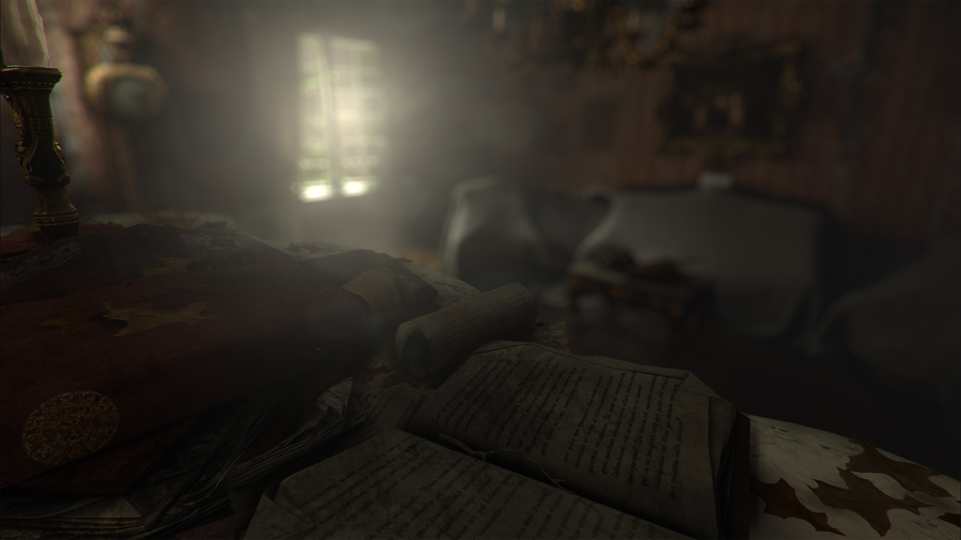
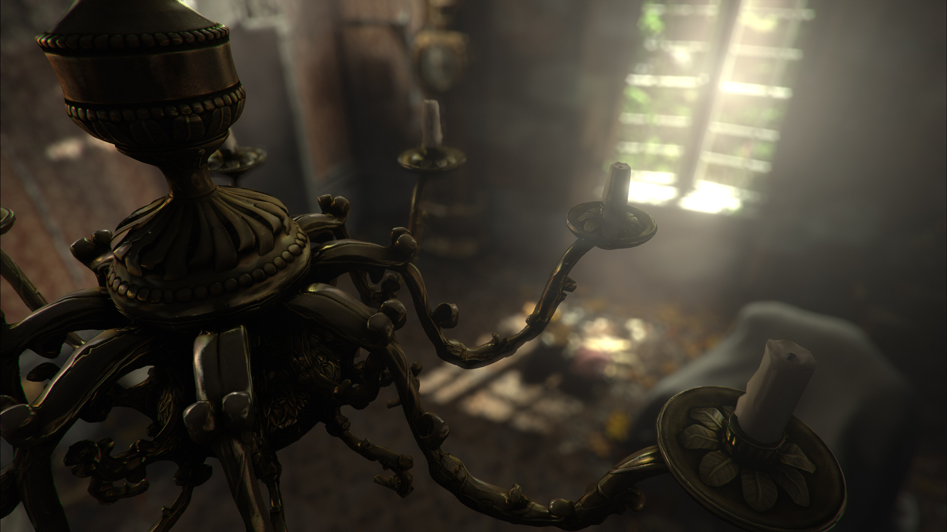
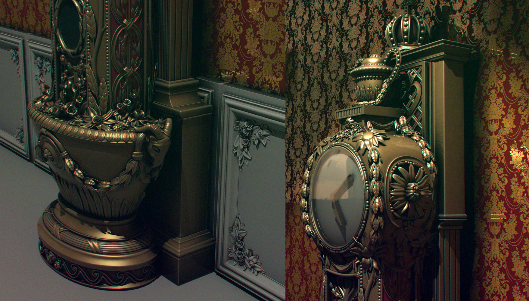
Figured I might aswell post this in its on thread, making a small environment-shot, first out is this baroque clock which will be the centerpiece so to speak. Also made the small wall panel behind the clock, and right now im building the lowpoly for both of them.
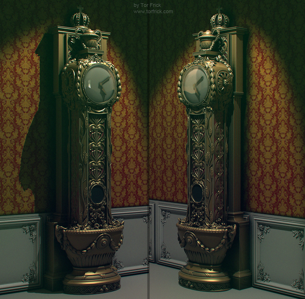
Oh Tor Frick, y u so talented. Seriously nice work. How did you do the leaves and all those details? They seem too "clean" to have been done in a sculpting program. The only thing I don't like are the hands of the clock. They seem very blocky, but I'm sure that could be fixed with the right texture.
What other assets are you thinking of adding to this scene? Keep up the great work!
EDIT: This is the first time someone used chromatic aberration on these forums the right way. Usually it's very obvious, but I didn't even notice it on yours until looking very closely.
Selaznog: thanks : ) All the leaves etc are built in modo and placed there aswell, only modo for this one, no sculpting at all. This scene is gonna be really simple, so probably just this, a wall, floor, doorway and a window+ curtain, maybe a mirror aswell.
I'm curious about his bake as well, but I'm guessing he just did a fabulous job on his low poly mesh which allowed him to get all of that detail out of his high res.
Looking great! Especially loving the wall and clock, aw hell. Loving all of it!
Thanks for the comments, the polycount is quite high for this piece, as you can tell by the silouette, there is just too many round pieces in this to make it look good without going up in polycount, right now its like 9k triangles or so, I could easily cut i down by quite alot, but then I start loosing the siouette of all the round pieces : ) Its not that roundness that gives the good bake though, I think its just the kind of details on the highpoly that transfers really well to a bake, plus my secret haxxxy baking!
Amazing work, absolutely love the style and detailing. If I was going to critic one thing it would be that because of all the detail is gets fairly noisy. If I was to put this in a scene I would look to relax the eye in some areas. A good way of doing this could possibly bleed some of those details out towards the middle.
Rockstar6: the texture rez is at 2k*2k at the moment. But it doesnt have any texture yet really, its just the basic bakes. The UV-layout is nothing special really. Just a mirrored unwrap, but i will show textures later: )
Ichll3D: thanks, I made this after a reference of a baroque clock, and Im doing the whole scene in baroque style and not rococo, Rococo is just as noisy though, just not as nice looking imho So yeah, its a bit overly noisy as a single prop, but hopefully when part of a whole it will blend in a bit more and the surrounding areas in the image will let the eye rest. Also if I pull back the noisyness its not as baroque ^^
Awesome, it looks stunning none the less. Its something I always try and have in the back of my mind when working on anything, looking at where my eye is drawn from the lines in the scene/prop and how relaxed my eyes are when looking over the scene/object. In a game your typical gamer wouldn't care, but its that subconscious detailing that makes things visually appealing even if the person looking at it doesn't understand why.
I'm excited to see what your final scene is going to turn out like! Can't wait!
moose: thanks : )) Yeah, it doesnt have a specular map at all yet, just slapped the diffuse placeholder on there and multiplied it up a bit, aswell as cubemap, so its really contrasty and wierd atm : D Not sure how dusty and worn feel im going to go for the clock yet though, or if it will still be shiny in places.
Agreed, looks great so far. Especially the base of the clock with the sheep/ram heads and roses. Can't wait to see it textured. I'd go with dark wood and gold trim. Keep it up!
It bothers me how the paint chips on the panel arent really localized. You can see peel lines travel over the bumps in the panel, I feel like they wouldnt continue like that since it's over a non flat surface.
The wallpanel kinda throws me off a bit right now. I realize that you still have work to do on it, so I might be beating a dead horse, but like Macattackk said, its obvious that you just multiplied the grunge on top. I like the detail that it adds but its just a little strong and all over the place at the minute...its really burying the awesome flower details in the corners.
For the images in your first post, how are you rendering those? It gives the scene a really "antique" look. Is that just a levels adjustment or..? I really like it.
Yeah, its just a very quick texture, will fix those things later ^^ And yes, its just some level adjustements : ))
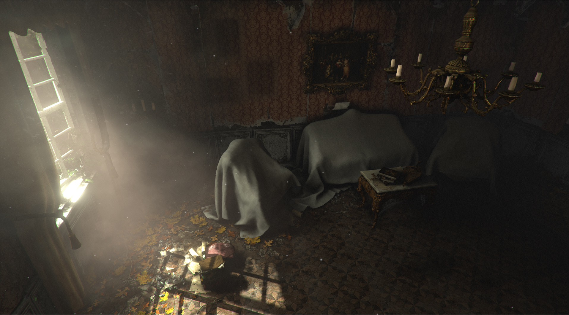
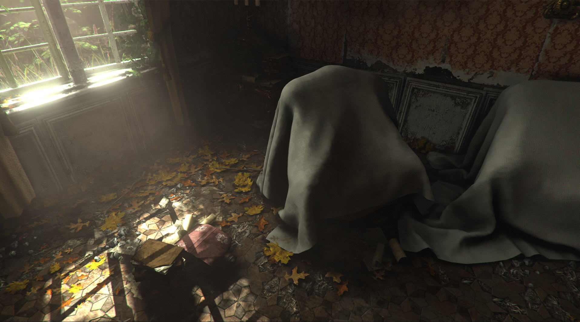
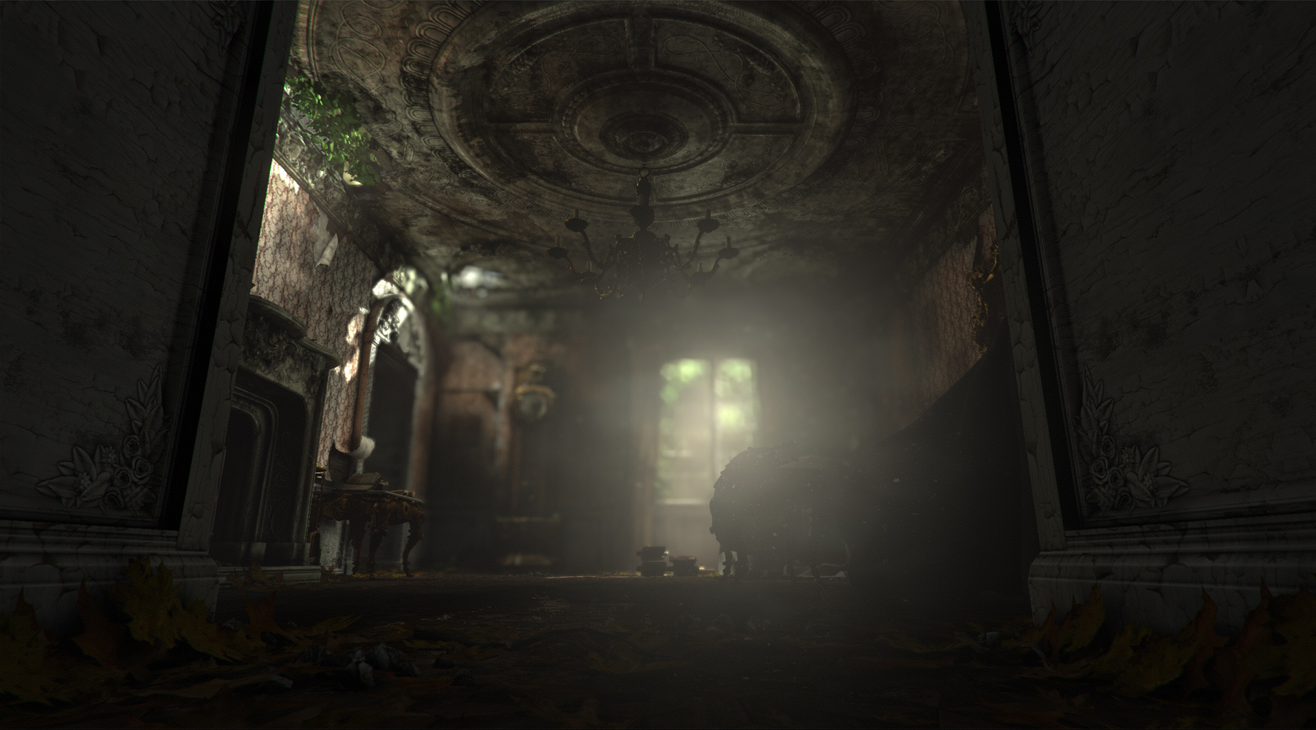
Here is a quick blockout of what im kinda going for, basically all environment is placholder and blockout sofar, except clock and panels, which needs texturing. Lighting is also very boring atm, but im trying out some stuff for the wallpapers right now, trying to get the feel of the scene a bit.
i really like the degraded look of the environment so far, I know your saying its just placeholder but i think you should take the current feel of the scene and really push it. Great work man keep it up.
Iciban: The flowers etc are built in modo, the peeled paint is made in photoshop : )
Snader: Well, like they are now, more or less, just some better texturing and shading. The latest shots I posted are from UDK : ))
Looks awesome so far! Really great job on the clock, came out excellent. Should be interesting to see what you do to fill out the environment. Do you have any ideas sort of floating around at the moment? Is it just going to be an run down standard house or are you planning on flushing out the architecture at all?
It may be interesting to let the design of the clock dictate the surrounding elements and architecture of the space.
paulsvoboda: thanks! Its not really going to be a standard run down house, since it will be baroque, but more of a baroque palace feel, but a very small scope, so not a grand hall or anything like that, just a quiet corner of a room in the palace, but still very rich in terms of decor and furniture etc. Well, the plan right now is to make the windowframe and the doorframe in detailed baroque style that fits with the woodpanels, and add some additional pieces of furniture. Maybe a mirror on the wall, maybe an overturned small table on the floor, lots of dirt and small debris and tiny rocks etc in the corners of the floor, breaking up the roof a bit to let some light come in from above, some basic foliage outside the window. Going for a very quiet and serene feel.
speedmodelling a mirror for the scene aswell. Have a bunch of things to add/fix on it, like the top piece, and more polished work around the edges. : ))
It's a very good modeling app, and I prefer it now myself, but as to whether it's "easier" or not ... well, that depends on who is using it. If you gel with Modo, it's going to be easier. Otherwise, not!
Iciban: I dont know, I personally think its superior to every other app I have used, but its a bit personal preference aswell I suppose. : ))
aajohnny: ah, sweet! Thanks : ))
Warren: everyone should be using it!
yea the reason i asked cause I seen vids of people modeling in modo. Not sure if they made the scripts themselves, but whenever they press a button. It does, lets say something in another program it would take couple steps. In modo, it took only 1 step. If you knwo what i mean
Kevin: thanks alot, glad you like it!
Iciban: well, it is fast, and easy to customise, but I am a bit biased. I think its the best app I have worked with ^^
Got the high and low done for the mirror, heres the low in UDK, sitting at almost 2k tris, hehe, got a smoothingerror on the top there to sort out, and texturing it, otherwise im feeling pretty done with it. Oh, and making a proper material for the mirror etc.
Replies
What other assets are you thinking of adding to this scene? Keep up the great work!
EDIT: This is the first time someone used chromatic aberration on these forums the right way. Usually it's very obvious, but I didn't even notice it on yours until looking very closely.
Baked it down:
Looking great! Especially loving the wall and clock, aw hell. Loving all of it!
* = noisy
| = clean/relaxing
Currently
*
*
*
|
Critic
*
|
*
|
Have you checked out Rococo?
https://www.google.co.uk/search?aq=f&sugexp=chrome,mod%3D7&q=Rococo&um=1&ie=UTF-8&hl=en&tbm=isch&source=og&sa=N&tab=wi&ei=SFXoT5jiL5LU4QSAxe2mAQ&biw=1680&bih=965&sei=SlXoT5eyNMTf4QThju2fAQ
Ichll3D: thanks, I made this after a reference of a baroque clock, and Im doing the whole scene in baroque style and not rococo, Rococo is just as noisy though, just not as nice looking imho So yeah, its a bit overly noisy as a single prop, but hopefully when part of a whole it will blend in a bit more and the surrounding areas in the image will let the eye rest. Also if I pull back the noisyness its not as baroque ^^
I'm excited to see what your final scene is going to turn out like! Can't wait!
clock is a little noisy in the spec, maybe reduce spec brightness on some of the hotter edges to lessen alias noise? little more AO in spec too maybe?
The wallpanel kinda throws me off a bit right now. I realize that you still have work to do on it, so I might be beating a dead horse, but like Macattackk said, its obvious that you just multiplied the grunge on top. I like the detail that it adds but its just a little strong and all over the place at the minute...its really burying the awesome flower details in the corners.
For the images in your first post, how are you rendering those? It gives the scene a really "antique" look. Is that just a levels adjustment or..? I really like it.
Here is a quick blockout of what im kinda going for, basically all environment is placholder and blockout sofar, except clock and panels, which needs texturing. Lighting is also very boring atm, but im trying out some stuff for the wallpapers right now, trying to get the feel of the scene a bit.
I love the abandoned and natural lighting.
Are you planning on having anything visible out of the window to the right?
Playing around a bit more with it, need to fix a whole bunch of things about the walls : ))
Snader: Well, like they are now, more or less, just some better texturing and shading. The latest shots I posted are from UDK : ))
It may be interesting to let the design of the clock dictate the surrounding elements and architecture of the space.
paulsvoboda: thanks! Its not really going to be a standard run down house, since it will be baroque, but more of a baroque palace feel, but a very small scope, so not a grand hall or anything like that, just a quiet corner of a room in the palace, but still very rich in terms of decor and furniture etc. Well, the plan right now is to make the windowframe and the doorframe in detailed baroque style that fits with the woodpanels, and add some additional pieces of furniture. Maybe a mirror on the wall, maybe an overturned small table on the floor, lots of dirt and small debris and tiny rocks etc in the corners of the floor, breaking up the roof a bit to let some light come in from above, some basic foliage outside the window. Going for a very quiet and serene feel.
http://www.flickr.com/groups/abandoned/
http://www.flickr.com/groups/47799877@N00/
http://www.flickr.com/groups/abandoned__neglected__weathered__rusty/
http://www.flickr.com/groups/urbanexploration/
I hope its of use!
If it was, everyone would be using it.
It's a very good modeling app, and I prefer it now myself, but as to whether it's "easier" or not ... well, that depends on who is using it. If you gel with Modo, it's going to be easier. Otherwise, not!
Iciban: I dont know, I personally think its superior to every other app I have used, but its a bit personal preference aswell I suppose. : ))
aajohnny: ah, sweet! Thanks : ))
Warren: everyone should be using it!
Iciban: well, it is fast, and easy to customise, but I am a bit biased. I think its the best app I have worked with ^^
Got the high and low done for the mirror, heres the low in UDK, sitting at almost 2k tris, hehe, got a smoothingerror on the top there to sort out, and texturing it, otherwise im feeling pretty done with it. Oh, and making a proper material for the mirror etc.
with the walls is the paper textured in strips over the wood...or are the rips etc decaled ontop?
Loved the modeling, uv tools, the flexible shader tree and the fast rendering(most of times)
How about showing us a wireframe of the mirror?