Home 3D Art Showcase & Critiques

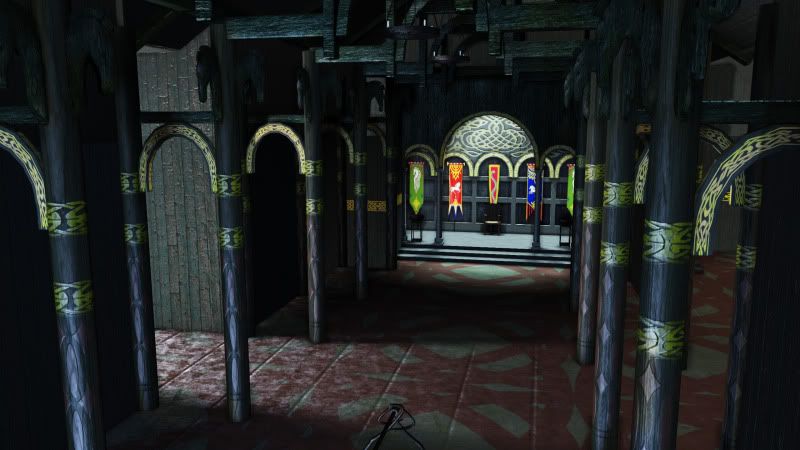
Do you recognize this?

Hello polycount peoples. Just wanted to post current progress for a final for one of my classes. I know it seems like I never finish anything but a lot of the stuff I post on here are side projects and my classes take priority over those and so they get shelved for a while. Anywho, let me know what you guys think and if it's looking close to the real deal. I still need to model a few things out and block off some of those side rooms.
Edoras.jpg

Replies

  • sipher3325
    Well since nobody commented i'll assume that nobody knows what it is. It's supposed to be the main hall at Edoras from Lord of The Rings. Guess I still have a lot of work to do.
  • BARDLER
    Offline / Send Message
    BARDLER polycounter lvl 12
    looks to skinny, and the lighting looks like florescent lights.
    3025_hall_banner_eomer_1.jpg
    Keep going though :D
  • sipher3325
    ya i have about 40 ref images of this scene and they all have different lighting...its a huge pain in the a**. My instructor stuck me with a saturated blue look. This lighting set up im using is temporary as this is part of a larger scene. I will eventually move all of this to another level.
  • Visceral
    I think its mainly the camera angle and fov that makes it looks so dull. It appears to be really small and cramped looking due to the dark lighting.

    Maybe try to widen the room a bit?
  • sipher3325
    Thanks for the comments guys. I'll widen the room a bit. As for the lighting I meant desaturated. Here is a movie screen grab that is pretty much the setup i'm going for. It's sucks because I have a few other screen grabs that show a more narrow hall than the ref you guys provided so I could go either way. My instructor told me to narrow it but I think I can widen it a bit. Still need to go back and adjust my textures.

    image16.jpg
  • WarrenM
    I see the same thing as Visceral - it feels small and cramped and the reference pics don't. I think it has to do with the size of the tiles on the floor and the thin columns.
  • sipher3325
    Made some changes according to what you guys said. The pillars need some major work (well it all does imo). I think i'm heading in the right direction. Still need to finish modeling the throne and some tables/benches. Let me know what you guys think and please point out anything you see.

    screenshot01-1.jpg
  • Tiraldric
    sipher3325 wrote: »
    Made some changes according to what you guys said. The pillars need some major work (well it all does imo). I think i'm heading in the right direction. Still need to finish modeling the throne and some tables/benches. Let me know what you guys think and please point out anything you see.

    screenshot01-1.jpg

    Much more recognisable now! Looking worlds better. Keep at it!

    Original has strong lighting at the top of the room. Yours is very dark, and that area in the original adds a lot of detail/interest.
  • BARDLER
    Offline / Send Message
    BARDLER polycounter lvl 12
    Yea looks a lot better. Just got to get those flags in there is tweak the lighting and post processing. If you look at the still you posted it has a very cold look to it.
  • sipher3325
    Thanks guys. Banners and other assets will get put in today. Going to redo the banners and bone them so I can get them blowing around a bit. There needs to be a video fly through as part of the project requirements so I think some movement in the banners and a nice dust particle will help bring this scene alive.
  • Skummel
    Wow man thats coming along nicely! Looking a lot better, diggin the desaturated look. I might add a touch of greyish blue to match it with the reference a little more
  • sipher3325
    Here is the outside of the building. Used pieces created by Skummel my partner in crime. This building has unique pieces but we don't have time to customize everything so I'm just going to use what we got and wing it.

    screenshot02-1.jpg
Sign In or Register to comment.