The BRAWL² Tournament Challenge has been announced!
It starts May 12, and ends Oct 17. Let's see what you got!
https://polycount.com/discussion/237047/the-brawl²-tournament
It starts May 12, and ends Oct 17. Let's see what you got!
https://polycount.com/discussion/237047/the-brawl²-tournament
UDK Lecture Environment
I was teaching a course at the Art Institute and wanted to do the project with them over the course of the 10 weeks and use it for my lectures. It was hard squeezing in time with FT work and the class and other stuff but I wanted to post it and see if there were any changes or things to make it more interesting you could suggest that could be done in a feasible amount of time. Overall it's maybe 50 hours of work so far and allowed me to use ZBrush and UDK which I don't get to use as much as I'd like. I was pushing modularity.
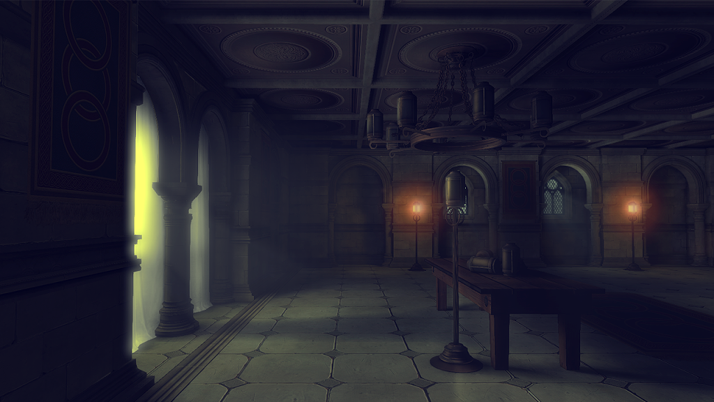

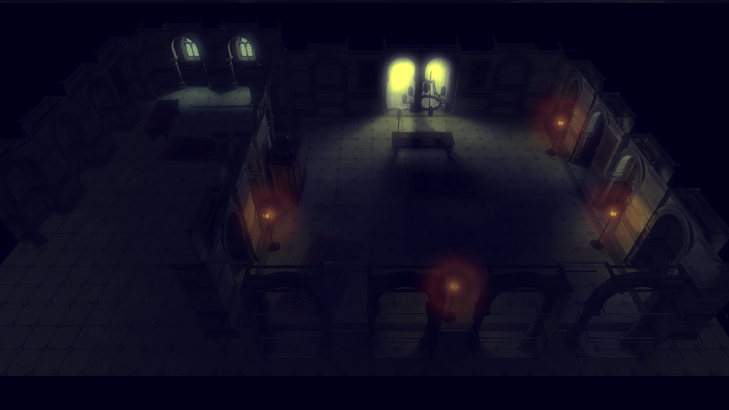

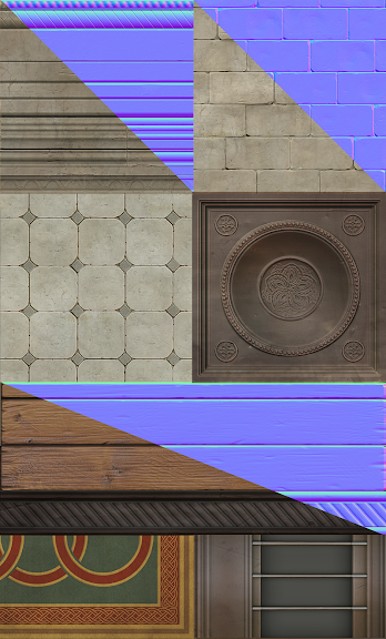
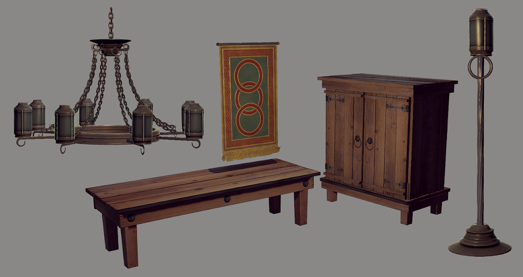
PS. After attaching the photos it does look a bit too desaturated for me.


PS. After attaching the photos it does look a bit too desaturated for me.
Replies
Get some smaller props in there! (everybody loves candles) :P