Community Directed Environment: Fantasy Exterior
**** Before you read ****
-This thread is a continuation of the ideas discussed in http://www.polycount.com/forum/showthread.php?t=98170 . I created a new thread as this is an actual project, and the last one was a discussion of ideas and possibilities
*****************************************
**** Summary ****
Hey Folks it's been a while but I'm back with the first attempt at a community Directed Environment. As I stated above this is a first try that evolved from an idea I wrote about in a previous thread. I'm going to re-iterate on what the project is quickly for those new to this:
Essentially I would like to create a small, one frame environment (as in meant to be viewed from one spot), but instead of developing the idea by myself, I instead would like to just do the creating. The actual Ideas, the art direction, and the content, would be developed by people here on this forum.
*************************
****A blurb about me******
My name is Alexander Dracott. Currently I am working as an environment artist for Sony Online Entertainment. I graduated from the Art Institute of Portland and have a huge passion for communication, environments, story telling, as well as the technical side of 3D (shaders, post effects, etc). If you want to know anything in detail feel free to ask me via a message or check out my site, www.digitaldracott.com
**************************
**** Some Details *****
-The Project is a focus on rapid development. The content will come in bursts from me, but can quickly change. Think of it as rapid prototyping.
-The idea is to do many of these, so the final product may not be taken to "full quality
-Many people here on the forum have great experience in creating content. What this project gives is to have a greater opportunity to practice beyond pure asset creation, and into the realm of art direction, and story telling, not to mention communication
-The major benefit for me is to not only interpret, and learn how to facilitate between different ideas from different people, but to learn what and where people focus on first when it comes to environments, and to give me a better understanding of how people view my work, especially when they are the ones helping to create it.
-Everything is viable to change. Nothing is 100%. If the color palette originally picked isn't working, then change is easy. This keeps things flexible.
-Anyone is welcome. This is important, not only to welcome anyone at any point to add their own opinion, but to gather people from a broad selection of talent and experience.
-I will do my best to update on weekends, and to discuss and interpret during the week
-I will be creating this environment in the UDK (it is what I am most familiar in), and its rapid pipeline will allow for rapid changes
*********************
**** Process *****
The project will go in 3 phases. Currently it is in it's first phase
-Phase one "Groundwork" This will be where we can discuss composition, color palette, as well as basic content, as well as possible thoughts to further complications. It will start with some basic composition ideas.
-Phase two "Creation" Once the basis has been agreed upon, starting to figure out what will be in the shot, what goes where, etc will happen here. Best way to think about the second stage is building a home on top of the groundwork's foundations.
-Phase three "Flesh-it-out" Finally, the shortest phase will be looking at things as a whole, thinking about what works, and what doesn't. How well the original idea is communicated, as well as some possible reflecting.
*********************************
**** Current Progress: Groundwork ****
Composition:
Well its the first post so I don't expect much, but as an exterior fantasy, my initial thoughts are towards composition and content. Instead of posting blank bsp maps, I thought instead I could post a couple of exterior images, that I personally liked the composition for, just to get the ball rolling. Mostly the idea of foreground, middle ground, and background appeal to me.
Shot 1: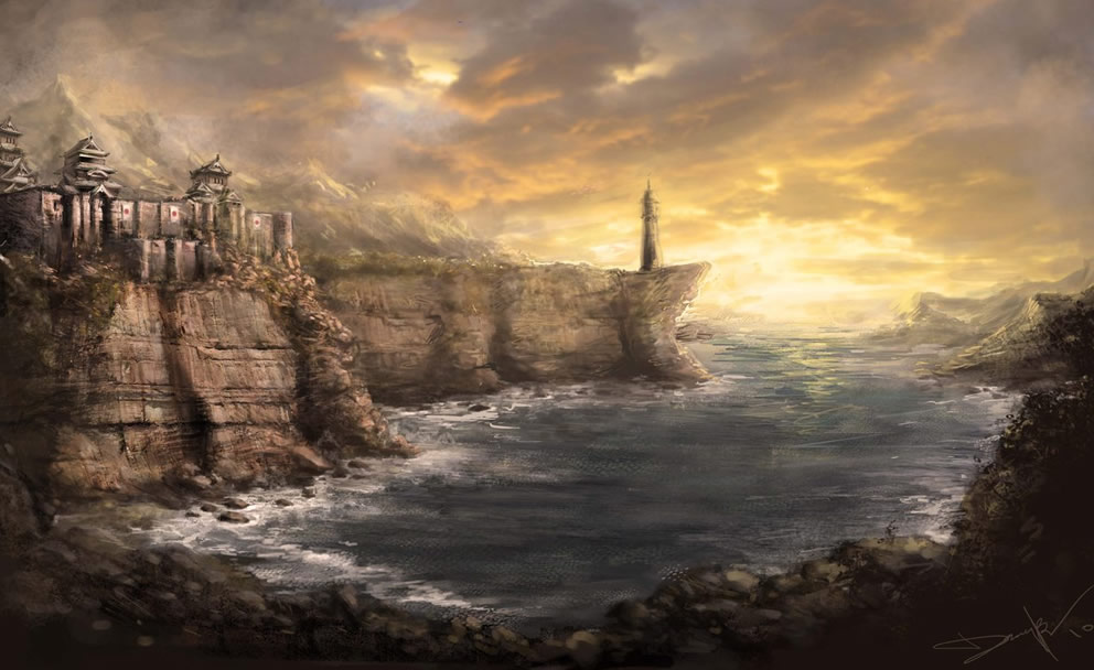
Shot 2: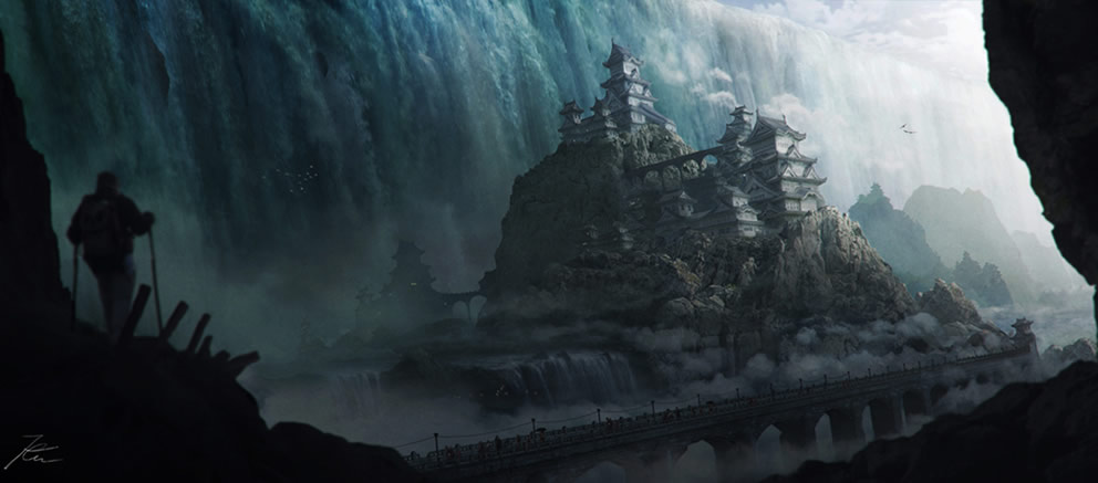
Shot 3: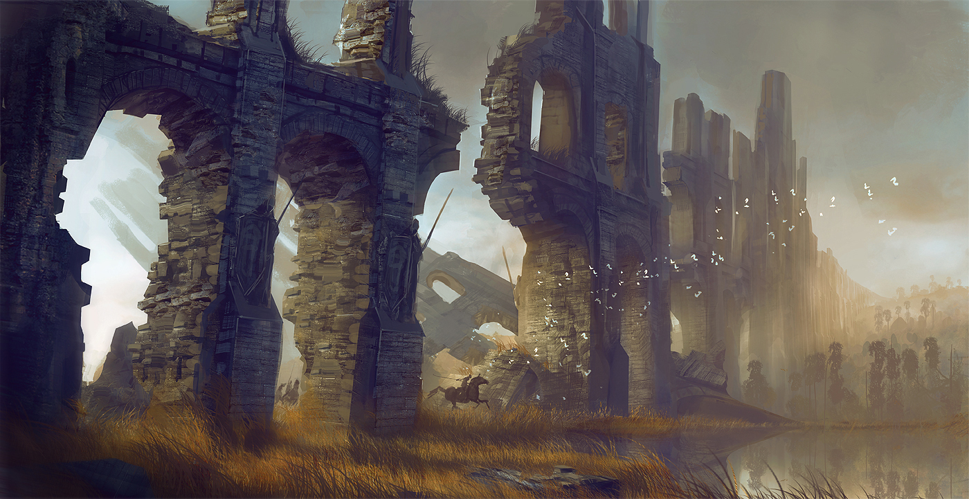
Content:
I am open to all suggestions for content. Fantasy doesn't have to mean dwarves and wizards. It can mean bioshock, it could mean crazy anime worlds. Only things I am attempting to avoid is science fiction, and real life content. As an exterior piece I would like to avoid traditional people unless things really call for it. Statues, etc, those are fine
Color Palette:
This is hard to talk about without talking about story, or emotion, as personally I find them very linked. Warmer colors (Hudson River Painters), warmth etc mean very different things from cooler, more mysterious colors. A great site I will probably be referring to at a later date is http://colorschemedesigner.com/ Awesome tool for looking at different color schemes and their variations.
****************************
As always, post discuss, talk. Lets get this ball rolling!
-This thread is a continuation of the ideas discussed in http://www.polycount.com/forum/showthread.php?t=98170 . I created a new thread as this is an actual project, and the last one was a discussion of ideas and possibilities
*****************************************
**** Summary ****
Hey Folks it's been a while but I'm back with the first attempt at a community Directed Environment. As I stated above this is a first try that evolved from an idea I wrote about in a previous thread. I'm going to re-iterate on what the project is quickly for those new to this:
Essentially I would like to create a small, one frame environment (as in meant to be viewed from one spot), but instead of developing the idea by myself, I instead would like to just do the creating. The actual Ideas, the art direction, and the content, would be developed by people here on this forum.
*************************
****A blurb about me******
My name is Alexander Dracott. Currently I am working as an environment artist for Sony Online Entertainment. I graduated from the Art Institute of Portland and have a huge passion for communication, environments, story telling, as well as the technical side of 3D (shaders, post effects, etc). If you want to know anything in detail feel free to ask me via a message or check out my site, www.digitaldracott.com
**************************
**** Some Details *****
-The Project is a focus on rapid development. The content will come in bursts from me, but can quickly change. Think of it as rapid prototyping.
-The idea is to do many of these, so the final product may not be taken to "full quality
-Many people here on the forum have great experience in creating content. What this project gives is to have a greater opportunity to practice beyond pure asset creation, and into the realm of art direction, and story telling, not to mention communication
-The major benefit for me is to not only interpret, and learn how to facilitate between different ideas from different people, but to learn what and where people focus on first when it comes to environments, and to give me a better understanding of how people view my work, especially when they are the ones helping to create it.
-Everything is viable to change. Nothing is 100%. If the color palette originally picked isn't working, then change is easy. This keeps things flexible.
-Anyone is welcome. This is important, not only to welcome anyone at any point to add their own opinion, but to gather people from a broad selection of talent and experience.
-I will do my best to update on weekends, and to discuss and interpret during the week
-I will be creating this environment in the UDK (it is what I am most familiar in), and its rapid pipeline will allow for rapid changes
*********************
**** Process *****
The project will go in 3 phases. Currently it is in it's first phase
-Phase one "Groundwork" This will be where we can discuss composition, color palette, as well as basic content, as well as possible thoughts to further complications. It will start with some basic composition ideas.
-Phase two "Creation" Once the basis has been agreed upon, starting to figure out what will be in the shot, what goes where, etc will happen here. Best way to think about the second stage is building a home on top of the groundwork's foundations.
-Phase three "Flesh-it-out" Finally, the shortest phase will be looking at things as a whole, thinking about what works, and what doesn't. How well the original idea is communicated, as well as some possible reflecting.
*********************************
**** Current Progress: Groundwork ****
Composition:
Well its the first post so I don't expect much, but as an exterior fantasy, my initial thoughts are towards composition and content. Instead of posting blank bsp maps, I thought instead I could post a couple of exterior images, that I personally liked the composition for, just to get the ball rolling. Mostly the idea of foreground, middle ground, and background appeal to me.
Shot 1:

Shot 2:

Shot 3:

Content:
I am open to all suggestions for content. Fantasy doesn't have to mean dwarves and wizards. It can mean bioshock, it could mean crazy anime worlds. Only things I am attempting to avoid is science fiction, and real life content. As an exterior piece I would like to avoid traditional people unless things really call for it. Statues, etc, those are fine
Color Palette:
This is hard to talk about without talking about story, or emotion, as personally I find them very linked. Warmer colors (Hudson River Painters), warmth etc mean very different things from cooler, more mysterious colors. A great site I will probably be referring to at a later date is http://colorschemedesigner.com/ Awesome tool for looking at different color schemes and their variations.
****************************
As always, post discuss, talk. Lets get this ball rolling!
Replies
Thanks for adding your input! Remember those 3 shots were totally just for composition, but I also agree with the feel of the colors. Any thoughts as to content, or what makes something "fantasy" ? Castles? Landscape? I am also a huge fan of using lighting to help communicate composition.
I also like the huge scale feel.
I also like the sound of a realistic composition. Reminds me of why I like some of the Game of Thrones plot lines, real human problems in a different setting. Would be interesting to try and do that. What aspects of the composition feel too "realistic"? Also I like the foreground element in the second one personally. It adds much to throw in scale (while atmospheric perspective separates the elements).
Texturing (hand painted simplified, hand painted high detail or partly/heavily photosourced, etc.)
how about proportions exaggeration amount and type of exaggeration
Saturation ammount
and other style elements
Style is a hard topic. Most of those things will probably come during the second stage of things, once actual objects are started to get blocked out. Normally I would probably figure that stuff before, but thats one of the areas I really would like to see feedback and iteration. Watching style change in an early environment creation stage is one of the goals of this project.
The color side of things I hope to see evolve as color pallet starts to get played with.
how about a monorail
kinda random but just came to mind and thought it would be cool
What kind of feedback are you looking for?
I dig the idea of some kind of flowing liquid. Adds lots of excuses for vertical compositional elements as well as framing. As for the monorail, I don't think I have ever seen a "fantasy" monorail, but I think it could be done. Not to say I am against it, but it would be a definite challenge to separate it from steam punk, though I am not against steam punk
Care to share what those elements would be? At this point I am looking for more of a discussion vs feedback. What Mr. Glowacki gave is a great example. Throwing out content ideas, possibly with the opportunity of supporting those ideas as well.
For example if castles or magic buildings come to mind when you think fantasy, or that is something you would be curious about being included (at this point anything is an option) then maybe what elements about it make you want to include it. Maybe it gives an opportunity for scale, or a detail object in the distance. The important point is that all ideas are welcome. I won't be doing it just yet but soon, Ill start taking ideas that we have talked about and shared, and start throwing them into proxy shots so we have visual reference to start discussing. Don't be afraid to find or share more images, things you like. Things that are cool. Things you don't like. Communication is key, as is making sure everyone involved has a voice.
I am currently studying Game Design and Digital Arts at RMIT, at the last year ATM.
I am a great fan of the third picture too, I would be very happy to make environment assets for this.
I got a quick question, when building this in UDK, will there be a rotating camera to show the assets? and perhaps a credits rolling down?
PacoCasares,
Thanks for swinging by and commenting! While I appreciate the excitement for the third picture, This project is not about others creating the actual art, but directing it. I did my best to outline this in the summary in my first post, but if its still not clear, please let me know. Also feel free to private message me if you want to talk more about it offline.
That being said I am glad you like the content of the third picture! I threw it up there to look just at composition rather than content, but quite a few people are jumping at it
To answer your final question, There maybe a small camera push, but it wont be very big. (maybe a couple of feet, just to show off that the shit is 3D).
http://images.wikia.com/finalfantasy/images/f/fc/FFVIII-TimberTrain.jpg
http://static.attractionsmagazine.com/wp-uploads/2012/05/mona-monorail.jpg
http://img.photobucket.com/albums/v255/hunter_firmir/830px-Ff8train3.jpg
http://img2.timeinc.net/ew/dynamic/imgs/080515/Fantasy/Thomas-the-Train_l.jpg
instead of metal it could be like an energy beam rail.
Interesting idea.I dig it. Especially the last one
The biggest challenge is making sure it stays fantasy. I don't know THAT much about differentiating between sci fi and fantasy but what I do know is that fantasy is seen, and sci fi is invisible. If an elevator is getting lifted by magic, then the magic is visible. If the elevator is lifted science (anti grav etc) then the effect is not visible. Obviously there are other things as well (robots!) but thats a different thing.So let me ask you this. What do you see when you think of a fantasy exterior piece with this train? Is this just a complimentary piece to some fantasy landscape? Is it inside a city (a la FF style)? Is it crashed? Is it traveling somewhere?
I think it would be cool seeing it travelling into some 'good' fantasy setting, or away from an 'evil' setting. So not the focus of the composition but could be a good leading line to awesomesauce..ness
I'm happy to challenge you
Remember your challenging everyone participating. Ideally more than there are now
I do like the idea of a good to evil transition. There is some great fantasy visualization between the two in lord of the rings. I cannot find the screen caps right now but where mordor/mt doom etc meet "normal" areas like rohan etc. Awesome transitions. I like the sound of that alot.
I also there has been enough of an early discussion. I'll start getting block outs done next week (working today, so I can't this weekend). More soon! Remember share this with your friends :P The more people who participate the more successful this can be.
I normally would agree (I have participated in a few that went nowhere as well. I thought this one could be different, because all it really needed was good communication, and posts on this forum (aside from my comportment, which I was prepared to give). It is understandable why you would be hesitant though
Unfortunately it is too late