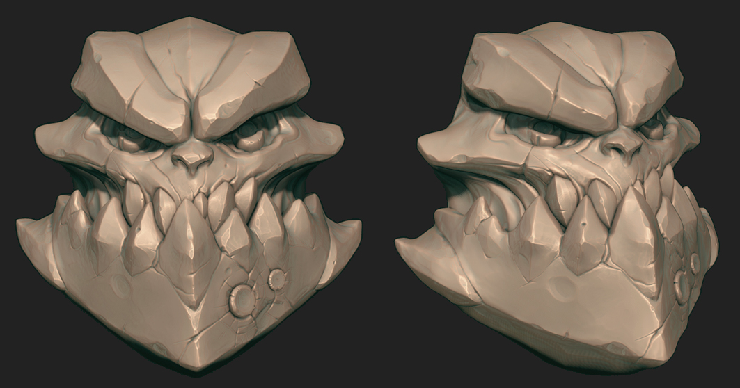
Stylised Demon Character [WIP]
Time to start another folio piece!
Wanted to do something a little different to what i usually do. So i've decided to go with a slightly stylised type of character. After doodling some thumbs and playing about in zbrush i've come to a shape that im pretty happy with.
As far as the sculpting goes, i want to aim for something like this,
Darksiders Weapon sculpt by Orb:

Here's my zsketch and a paint over of where i wanna go with it.


Wanted to do something a little different to what i usually do. So i've decided to go with a slightly stylised type of character. After doodling some thumbs and playing about in zbrush i've come to a shape that im pretty happy with.
As far as the sculpting goes, i want to aim for something like this,
Darksiders Weapon sculpt by Orb:

Here's my zsketch and a paint over of where i wanna go with it.


Replies
More sculpt progress, bevels, bevels everywhere!
Been looking at some of Josh Singh's work, he pulls that off really nicely:
http://joshsinghblog.blogspot.co.uk/
With a little bit of tweaking to the basic form I think you could turn a good character into a great character. Without an appealing basic form all the detail in the world won't help it. Josh's image you posted is a perfect example. Very simple detail, very appealing form. Really study the shapes that make up the characters you like.
Here is a quick paintover I did to highlight some simple area's I think you could push it a bit more.
Anyways, I hope it helps and doesn't come across the wrong way. Your one of the few people consistently posting work and I think with some honest critique you can really push things further. Goodluck!
- who let the bots in? *sigh*
edit - who deleted the bots? *wooo*
Personally my only areas of concern is the lower back and that the legs have more detail that the rest of the body. I'd suggest toning them down a bit. As for the lower back I'd smooth out the lower selection and add an arch into the back to add a bit more to the silhouette.
As for your colour selection I cannot fault it. I'm loving it. Keep rockin' on with this one.
Well I find the front and side of the thighs to be fine. Its just the lower section. As you pointed out the goat refs should be a major help. Looking forward to the next update.
Another update. Added some detailing to his belt and a few minor tweaks here and there. Looked at anatomy for a while last night and i can't find any muscles to remove from the bottom of the leg without it making the leg look like it can't function properly. I may have to leave it how it is or just scrap the muscles there completely and have it looking really smooth instead, thoughts?
Wretchedgoat - Thanks. The hands were heavily WIP still in previous pics, i've gone ahead and added some detail to them now though. Will probably add circular wrinkles to the knee's and give him funny curly nipples to balance the back and front out.
And here's the start of his magic book. (hexgram symbol... the demon isn't jewish as my friend thought...)
And a few minor tweaks to him - curly nips!... and knees..
Also did a material test in marmoset. This is how i'm going to achieve a decent realtime glass effect. Obviously theres a bunch of tricks that can be done in UDK but i'd like to keep the rendering side of things in marmoset for this one.
I can picture carvings into his horns that are subtle, but enhance his magical look and maybe even add similar designs to his belt and bracers. Just loose suggestions that popped up.
Can't wait to see where you go with this guy!
Anyway, i went ahead and made these potions, 500 tri's each is kinda heavy but i don't mind spending extra tri's for the glass effect. His staff and book will be on another texture sheet, and these are on their own 512x512.
Would be cool if it stayed that way and he devoured souls through the empty black hole in his belly or something.
You neither state if these are WIP or finished so I assumed they are finished.
Just wondering, but why'd you go with the hexagram when modeling a demon? I just Took a quick glance at the hexagram wiki and well: doesn't sound very demonic to me. Are you sure you weren't going for the pentagram? I know it's more of a cliche but it's because it's more connected to the whole magic/wicca/demon stuff.
Keep up the good work!
The potions were finished for now, with intent to go back to them after i get everything else lowpolyed - i agree the black holes are ugly, i'm going to saturate my AO bakes and bring down their opacity to fix that. The polycount is almost instantly halfed by removing the glass effect, if this were in an actual game i'd imagine some kind of fresnel shader could do the glass effect instead of geometry, but for the sake of a portfolio piece i'd like to keep the glass geo there, meaning that the polycount won't really shift dramaticly without losing silhouette (and the silhouette is almost too square already).
Also - i'm not sure if anybody noticed, but because of the transparent glass you can see that the cork stops without actually going into the glass - it's just resting on top. Bit of an oversight on my part and i'm going to fix that too.
*note to self, research demon stuff before putting the wrong symbols on work
edit:
Also something I noticed in the last image is that the glass seems rather thin at the neck, I'd expect it to be around the same thickness as the rest of the body, but that's just a small thing.
As for the polycount you seem to have thought about it and have a good explanation why, and I guess it's always easier to take away than add later on
Fixed the stupid error on the book:
It spins!
I lowpoly'd, baked and textured the book just now, not sure if i will keep the orange glow or replace it with blue to match the rest of his glowing stuff.. probably need to darken the inside of the lock too.
Redid the spec all over and toned down the metal diffuse. Here's the final result :
Retopo done! He's at 12k tris including his bag. I may remove some loops after baking.
I started on a staff sculpt but in a moment of stupidity i closed zbrush without saving it >.> what a fool! So i'l have to start again - probably with a better design too...
turn table video still to come.
http://www.youtube.com/watch?v=eWgbmc8vpe8