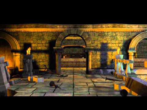
Diablo 3 Style Dungeon
I was really impressed with the art style of Diablo 3 and wanted to do something similar, yet add enough of my own style to make it a little unique. I'd love to hear some comments and crits, good or bad. I'm just trying to be a better artist, and would love to hear your opinions.


The animation is also on my preliminary environment/prop reel if you care to take a look.
[ame] http://www.youtube.com/watch?v=v5stvAjhiuI&feature=player_embedded[/ame]


The animation is also on my preliminary environment/prop reel if you care to take a look.
[ame]
 http://www.youtube.com/watch?v=v5stvAjhiuI&feature=player_embedded[/ame]
Replies
Darkness, your seen is too dark. Sure darkness is scary and having dark parts will help you keep it mysterious and creepy. However to much darkness will make the level hard to read and take down the overall quality of the level. Instead of it being mysterious in a creepy and curious way it'll be mysterious in a way where I'm wondering what the heck is going on in the seen. Imagine monsters running around in your level, it would be impossible to spot them in certain areas.
Also all the lights in your scene are flickering, even though this adds to the mood of the scene it will also get on your nerves after a while. Have some flickering but also have some static light in there or at least make it a bit more subtle.
As for the second thing that instantly stood out to me are some of the edges on your objects. Especially the railings have super sharp edges and just doesn't look right for some reason (unnatural maybe?). Adding geometry should work but it would add a lot of geometry to your scene, what you could also do is see if you can paint in a bit of a bevel onto the textures.Since you won't have any close ups in these types of games I think you could get away with faking it in textures.
Keep it up, looks great already.
the video is amazing, i will actually download it
main problems i see is that your large scale changes arent happening at the high up camera angle youve got. the reuse becomes too noticeable. try some mixmaps to blend between different materials. Try adding some localized damage to specific areas around the ground to break up the tiling.
Also, agreed with the flickering. theres just way too much of it, very large scale flickering. really tone down how much the light flickers on or off, go with something more subtle. the torches themselves simply aren't moving enough to dim that much.
also try pushing your texture shapes more, some of the textures are getting a little bland and flat along area's like the ground.
Also maybe get a splash of secondary colors? like a purple/gold tapestry on parts of the walls to break them up a little, other than that no crits, its looking really solid. What did you use to render these scenes?