[Riot Art Contest] - Gnar
Don't think I can skip this one. decided to go with Gnar....
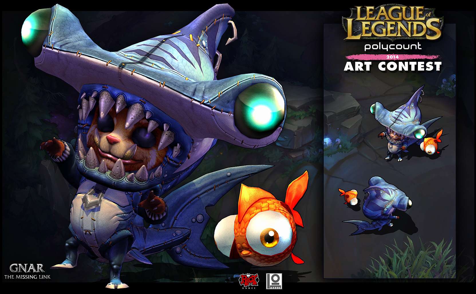
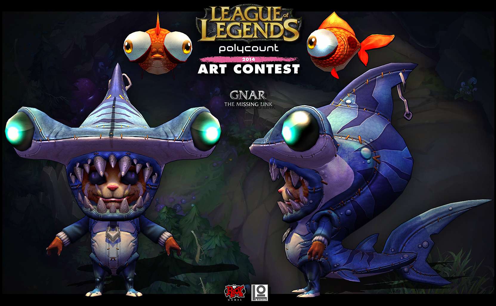
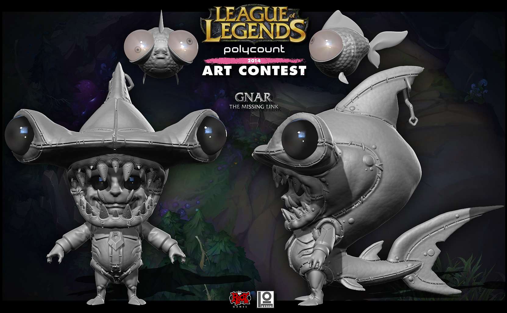
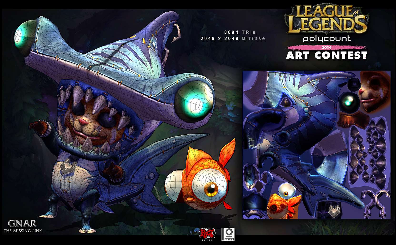
<<<<<< F I N A L >>>>>>
Think I am gonna call it here.
Decided to go for the bigger eyes on the fish and made a few texture tweeks.
Still open to crits and comments but unless there is anything crazy wrong I think I might wrap it up.
Thanks for the support and encouragement everyone.
Thanks again everyone.
<<<<<< F I N A L >>>>>>
Think I am gonna call it here.
Decided to go for the bigger eyes on the fish and made a few texture tweeks.
Still open to crits and comments but unless there is anything crazy wrong I think I might wrap it up.
Thanks for the support and encouragement everyone.


Thanks again everyone.
Replies
Emil Great to hear from you man!..Linkdin told me to say congrats on the new job... are you back?
Quick Play around.
More soon.
I am not really happy with him yet this gives you an idea of where I would like to go with him. I have done some more work on him but I will have to post up some images later.....bloody work computers.
@ JRancourt : HA. I would love to but I am not too sure if I will have time. Also I wonder what if any restrictions there are on a second character.
Quick update.
Getting smashed at work at the moment so very little time for fun stuff, but I have just been trying to fill out the costume a bit..figure out where I am going.
Thanks again everyone
I sleep now.
..more soon
Regarding making the mega form, I read the Q&A. They said that it is the same specs as the character, no hard limits, just optimize as much as possible. So you can make a second uv layout for the second char, with the same limit of 2048. But the the judges said that they would prefer if you could keep everything in one optimized uv layout. As someone asked regarding shaco-clones and jack in the boxes. but they would also understand if you sperate them from one another (If I am wrong with this I am very sorry, but the definite answer is up on Q&A).
Hope that helps, and good luck with the competition.
@ Sukotto : I agree 100% with what you are saying. At first I was going to go with a terry towelling like material but so much detail gets lost with terry towelling that I was kind of going to go with a leathery or actual shark sin vibe...which I think is cool in theory but I need to go a bit overboard with the "outfit" look to try and avoid the "an actual shark ate him" look he has at the moment. I HAVE added some stitching which I think helps a lot but I might have to dig a bit deeper to get what is in my head into ZBrush.
Thanks for the feedback.
Update soon.
Thanks again for all of the positive feedback everyone.
Started on the face. Added sleeves..stitching and more defined arm and leg connections.
More soon.
The mouth of the shark needs some more thickness I think. Looking at the reference on previous page the mouth collar is a lot thicker which seems to be what the style is about, everything is quite thick and round, "meaty" if you like. Is the costume made of fabric or actual sharkskin and/or other organic material? The latter would be quite disturbing but a lot of fun if you ask me.
Hope that was of any help. Very much enjoyed your entry at Comicon2014 and I have no doubts that this one will turn out pretty cool as well.
Bit more. I am getting no time on this at the moment but I managed to squeeze some progress in though.
Thought it might be cool if he had some derp fish for special attacks.
More soon I hope.
Nice additions on the outfit too! Very inspirational work as usual, keep it up man!
The horizontal seam you added between the sharks eyes is really nice otherwise, helps clarify that this is a costume, however it seems to be perfectly horizontal which feels a bit jarring. Some subtle curvature would do the trick.
Actually looked up the character. So he transforms into a big bad monster, that's really cool. Are you going to model that one too?
The fishes look real fun. Make them bigger!
@ Goldo_O : Thankyou, you are too kind. I think the special attack could be something like, they hunt you down and take little fish bites that weaken your opponent over time.
@ AimBiZ : Thanks. You are spot on with the feedback. I would love to make the mega version but I think I am out of time for that...bugger.
@ Dantert :
@ future-fiction : Thanks, It has been so long since I have textured like this..I am worried I am gonna mess it up....bad
@ slosh : Yeah I get what you mean. I threw a few more seams around I hope it helps.
@ Lazar : Thanks. Glad to hear it..and yep I am glad to hear his cheeks are pinch worthy
@ makecg : Thanks :thumbup:
Been busy with work, but managed to get some more done. Bakes are finished and I am ready to start texturing I need to drop[ back some of the details in the teeth but....wish me luck... I think I am gonna need it.
More soon.
Quick colour update.
more soon.
Excellent work :thumbup:
@ Goldo_O : hahaha. That .gif was an inspiration for this suit. hahah so cool.
More work. Floundering with the zip...I don't know what to do... I am sure I will think of something.
Thanks again everyone.
More soon.
re made his zipper and tinkered with some stuff...Time to start thinking of presentation shots.
more soon.