King's Quest V - Merlin's House
polycounter lvl 7
Last summer I started this piece and put it off forever since I got picked up at Turn10, but being that there's competition now, I should probably stop slackin and get crackin ")
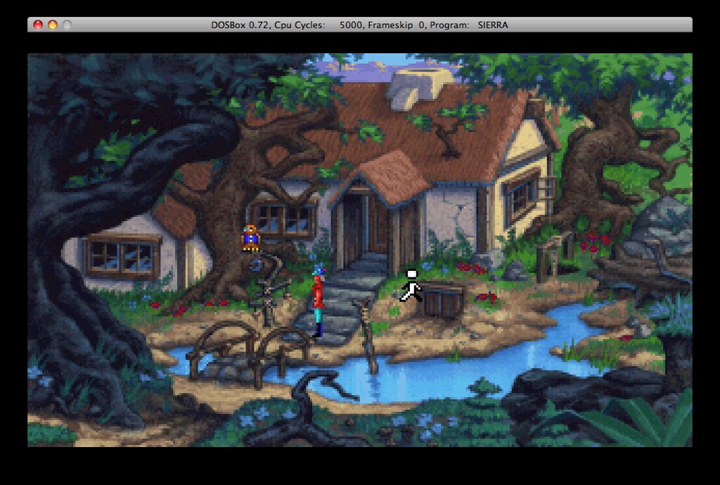
The scene is from the old Sierra sprite game King's Quest V, and this is one of the very first environments in the game.
UPDATE
Everything is sculpted, but this is the low poly version - going to bake, and bring into UDK to light this sucker and then on to my favorite part - textures!
Scene so far (deleted old crappy pic)
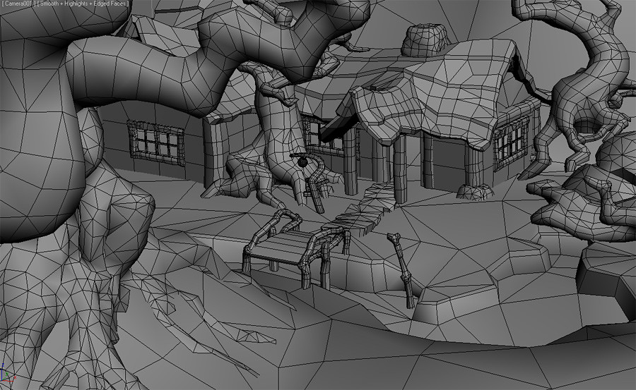
(going to tuck in foreground tree's belly!)
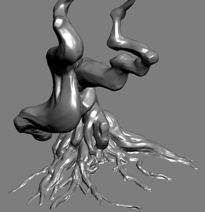
Foreground tree
The scene is from the old Sierra sprite game King's Quest V, and this is one of the very first environments in the game.
UPDATE
Everything is sculpted, but this is the low poly version - going to bake, and bring into UDK to light this sucker and then on to my favorite part - textures!
Scene so far (deleted old crappy pic)
(going to tuck in foreground tree's belly!)
Foreground tree
Replies
Now get back to work you sleep deprived fool! I want to see a finished spaceship from you :P
and don't forget to itterate your saves :P
Mix of high poly and low poly stuff (need to start baking - everything but the ground has a high poly version now, and all retopo'd)
Keep with it, and it'll be a nice piece to have.
Ahem.
Ahem.
Just a small update...
(forgot to mention, it's not done yet. I'll post more progress pics later too
Good stuff!
And a light pass is definitely in order. STOP READING MY MIND. lol
Looking forward to seeing how you composite the final shot.
Anywho:
You were off to a really good start by making the thatch roof more interesting, for example, but somehow you seem to have lost interest in properly detailing and texturing the closeup of the hut.
The perspective is hard to read, because we see the path all the way to the bridge and can't really tell how far it is away. (E.g. by letting it curve a bit and have overlaps where it disappears over a little crest. Right now there is zero detail for a pretty long distance so I'd either detail the space between the fore- and middleground or hide it. )
The foreground takes up a huge part of the image but is blurred , which is kind of irritating. And then the background is out of focus, too, which usually only happens with macro photography or a focuspoint much closer to the camera than here.
So far, for all we know, we could look at a miniature hut, here.
If you want to have such a big scene and separate the layers better, you might want to work a bit more with color value/saturation/fog or have something cast a shadow on the foreground. (Though I kind of like the dreamy mood that you have going on by doing it your way and using color value [edit: I meant hue, of course -.-] quite bravely, it's just a bit too much for my taste, with all the glow and bloom and blur going on, almost if you wanted to hide your textures and models or wanted to show off the post effects of your engine instead of the scene. Even the hut is kind of blurry. [It might be an artistic choice, too, of course and maybe I'm just old fashioned. )
For example some of the leaves in the trees around the house are too dark and push into the foreground and the saturation is pretty much the same for the whole image.
Now I seriously didn't come here just to piss on your parade and I almost let it be.
But I just can't help and think that you got sidetracked here and lost your initial vision for the project. Unexpected outcomes are cool, too, of course and it's not like the image is horrible. But maybe you want to revisit it some day and put some more work into it.