Demo Reel WIP Thread - Ork Killa Kan
Hey guys, me again. I need to start working on something other than my fantasy town...so I'm doing something sci fi for my second demo reel piece!
It's going to be an Warhammer 40k Ork Killa Kan because a.) their freaking sweet and b.) I fuggen love orks.
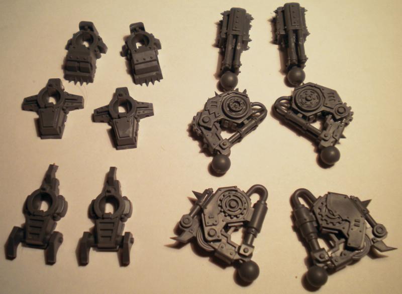
So far, I've been using reference of the parts via bitz websites, but I might actual buy the real life model of this so it's easier.
This is the goal:

With a style similar to this:

(by Jonathan Fletcher...the man is a genius, I swear)
Today I modeled the foot and leg, mainly using this pic for reference:

Once I clean it up a bit more (tie off the tops of the cylinders, hunt for unnecessary polys, etc) this leg will be at 1500 tris.

(EDIT) I am not baking a normal map, that's why I don't have all the details. Everything is going to be hand painted, with overlays of grunge materials.
Is 20k tris reasonable for a vehicle you could use in a current gen console game (like Halo)?
Anyways, hope you guys don't mind me having another thread (didn't want this in my fantasy one because that would just get confusing)
Thanks!
It's going to be an Warhammer 40k Ork Killa Kan because a.) their freaking sweet and b.) I fuggen love orks.
So far, I've been using reference of the parts via bitz websites, but I might actual buy the real life model of this so it's easier.
This is the goal:

With a style similar to this:

(by Jonathan Fletcher...the man is a genius, I swear)
Today I modeled the foot and leg, mainly using this pic for reference:

Once I clean it up a bit more (tie off the tops of the cylinders, hunt for unnecessary polys, etc) this leg will be at 1500 tris.

(EDIT) I am not baking a normal map, that's why I don't have all the details. Everything is going to be hand painted, with overlays of grunge materials.
Is 20k tris reasonable for a vehicle you could use in a current gen console game (like Halo)?
Anyways, hope you guys don't mind me having another thread (didn't want this in my fantasy one because that would just get confusing)
Thanks!
Replies
Here's an update
***EDIT***
I don't think this really deserves a bump because I havent done much so I'll just pop this right in here :P
Some more work (shoulderpads/backpack engine things)
And here's a wireframe
Next step is going to be deciding on what types of arms to add. After that, I'll do the UV's/clean the polys off, and get this bad boy ready for rigging.
Comments and crits welcome
PS: How are the renders? Should I keep that setup for final wireframe renders? This will be on my website, so please, tell me if it's presentable
Comments and crits welcome:
The model looks great, only small thing that is bothering me is that it seems like the shoulderpads don't really seem to have some sort of connection to the body or a place that they are attached to.
@Joe, yeah I noticed the same thing. Thanks for pointing that out. On the actual model there doesn't seem to be any supports there, so I'll have to improvise.
UVing is taking absolutely FOREVER. Took me hours and all I managed to lay out was half an arm. I'm hoping I get faster at that.
In the mean time, today I tried painting a hypothetical metal texture. It's not a piece on the model, just a shape I made in PS. A dry run, if you will
Things for my next metal attempt:
-More contrast
-Rust drips
-Figure out how the hell to do the sides of a metal panel.
Any critiques you guys have would be greatly appreciated. Hopefully in a few days this guy will be UV'd and ready to rock and roll
Thanks!
EDIT: A couple more tests/colour variations
Thanks, that's a really good tip. On my next test I shall try that out. I don't want to get too colourful with just the basic metal material though, as there will be lots of glyphs, words and maybe a pin-up ork girl painted on
Thanks for all the positive feedback, it's very encouraging
Finished the UVs today and holy shit that took forever
How does the layout look for the body? I plan on having two 1024x1024 maps and another smaller map for the weapons. The UVs on the right aren't the final layout yet. Trying to figure out a way to fit them better still.
I did a SUPER rough pass of the colour scheme on the lower jaw.
I went with the metal colour from the fourth piece in the first picture above ^
It's sort of yellow/purple.
Not sure if want.
Any colour scheme advice would be hot.
Other materials on this model:
-Painted metal (red, yellow, or white)
-dark metal (for large pieces)
-light metal (for smaller pieces)
-tattoos/decals (for more colour variation)
Gonna get a little nerdy on you here- do you know what clan you're going with? That really becomes important when it comes to color scheme and symbols you use (if you care about lore at all). The moons you've got there are part of the bad moonz, which are very yellow dominant. When I played I ran with the evil sunz since red makes vehicles go faster- I'm not sure if killa kans count as vehicles though.
Whatever the case- make it Orky!
Edit: Just to add- you can always do whatever colorscheme you want and say it's part of a feral ork clan. Dunno if using symbols would jive with that though.
Good Work man !
/is it rendered with Turtle ?
My main colour concern is for the pieces that aren't yellow, though I think I decided that I'll tackle the painted bitz first and then find a metal colour that matches nicely.
@Alphavader: poly paint for texturing? Ehhhh I don't know...seems like it might be a bit of a hassle. I'm much more comfortably with photoshop right now
And it was rendered in mental ray and that last screenshot was mayas viewport
So, I would like your guys' thoughts on the metal texture as well as the painted metal texture (the only textures Ive done so far)
Also, does the rust look enough like rust?
And does my metal look too much like stone?
thoughts?
Visceral, thanks, and here's an update
Rather than doing an entire environment for him, I decided on a display base sort of thing. Here's the concept and the base after it
Here's an update on the texturing so far
And I was playing with a spec map. Thoughts? I dont want it to distract from all the painting I'll have done, but it does look pretty nice
And here's a preview of my dark future. Wish me luck.
dat intimidation.
Thanks for looking!
Today I worked on the arm, and I'm happy with how it's looking so far (can't wait to get a spec map on everything after)
On the left is my original painted texture, and on the right is the same texture but with a galvanized metal texture overlayed. What do you guys think?
(if it looks too rocky right now, with the spec I'm sure it will look more like metal)
Texture samples look steady so far. I'd suggest to just block in the colours of everything before being concerned about material definition. Define the layers of paint, metal etc first.
EDIT: Dooh! I missed there was a second page. Well, hope my little crit was helpful or something...
Looks like steady progress on those textures so far. Will watch with interest.
Update time! First of all, I scrapped the first base I made and decided on an ork fort instead. Here's the ref
And here's the stuff I've made
And here's where my textures are at so far. Still a bit more to do on the body, and I need to figure out a way to separate peices so they dont looks so noisy.
Crits and comments welcome
Also really like the idea of making some terrain for it to be on, I guess a bit like how the models are
Sweet work, keep it up.
Anyway, looking awesome. Looking forward to more!
Some great hand painted textures which just backs up the character of the killer kan (Also I noticed you've controlled yourself and have not added any OTT blood splashes everywhere).
Keep us updated with future progress man!
For making things less noisy you should consider where your focal points are and adjust values accordingly. Think about where scratches, dirt and tear would be instead of putting it all over the place.
You should definitely start at the paint chipping. Those parts are doesn't suit the stylized theme. You should simplify them.
I think the main issue comes down to lighting though. Right now it's pretty even all over it. You could experiment with baking down light or simply darken down areas that you'd like to push backward.
I can recommend this article from the Dota2 team about how they handle values to make the characters read well.
http://media.steampowered.com/apps/dota2/workshop/Dota2CharacterArtGuide.pdf
@l.croxton: My advice for you is go easy on the hand painted texturing; holy crap it's time consuming! Only put details where you need to, because it can get really noisy really fast (that's one thing I would do differently if I were to re-do this)
Your tank is coming along nicely by the way, very orky
@MeintevdS: Hm...I think I forgot to change brightness and saturation on the low res texture...the higher res one is the sort of darkness I'm aiming for. Should be an easy fix
@Di$array: Thanks! Actually, I completely forgot about blood splatters...Maybe I'll add a little bit to the saw blade
@AimBiZ: Thanks AimBiZ for the great advice. I had a look through that Dota2 art guide and it was very useful. I think I'll try and find a way to make another texture that overlays my diffuse via a layered material, and then I can use that to add AO and colour variation to break up the noisyness (as well as a gradient)
Finished texturing all my prop pieces! Only took two workdays or so (it probably shows that I rushed to get these done...but these aren't going to be the focus so I'm not too worried about that.)
Diffuse only...Probably add a spec if I have time to. Also, tonight as a reward I'm gonna have fun and build some more structures with the pieces I have
(EDIT: Hope it's okay I put the polycount guy on that sign...everyone in this community is a huge help so it's a bit of a tribute I guess. I can take it off if you'd like me to though)
One thing that stands out to me is the hose on his right arm. It's very striped at the moment. If you're going to paint it, maybe just put a few scratches on the part that sticks out the furthest like he scraped it along a wall or something.
Overall I did this entire level in a week, which I'm pretty happy about even though it's mainly cubes
[ame="
I'm having troubles with the specular right now...It looks fine in maya, but in UDK it's super soft on everything, like all my pieces have softened normals.
Spent all day making a flamethrower...Totally worth it, because Im way more comfortable with UDKs Cascade
Let me know what you think
Changes I need to do:
-stretch the flames at the beginning so they look more liquid
-have them go up near the end of the flamethrower
-add a light