The BRAWL² Tournament Challenge has been announced!
It starts May 12, and ends Sept 12. Let's see what you got!
https://polycount.com/discussion/237047/the-brawl²-tournament
It starts May 12, and ends Sept 12. Let's see what you got!
https://polycount.com/discussion/237047/the-brawl²-tournament
Staffs Uni Dinosaur/Mech
A university project requires a prehistoric creature to be modeled, mechanical elements can be introduced, or a completely mechanized dinosaur can be designed and created.
For this project it was decided that a half organic, half hard surface model would be created to allow the model to show strengths in both areas.
The ankylosaurus dinosaur was chosen, as it is a well known armoured species from the prehistoric era.
The idea behind this choice was due to its link to weaponizing a dinosaur, why not use one that was already armoured!
A design sheet can be seen below:
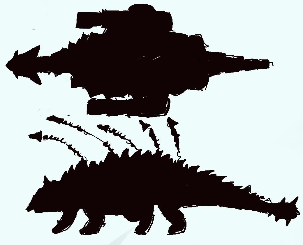
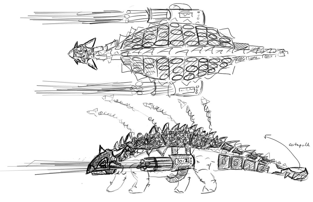
Below Original Ref: http://ikechi1.deviantart.com/art/Ankylosaurus-200449289
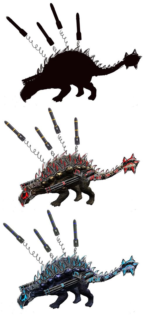
These images were used to give a basic theme to the model, other reference sheets were created to allow a further understanding of mechanical shapes and form, and are on my university forum thread, showing the stages of development.
The following image shows the reference images used to create the base organic part of the model, main image reference : http://titanosaur.deviantart.com/art/Tosk-The-Ankylosaurus-179383498
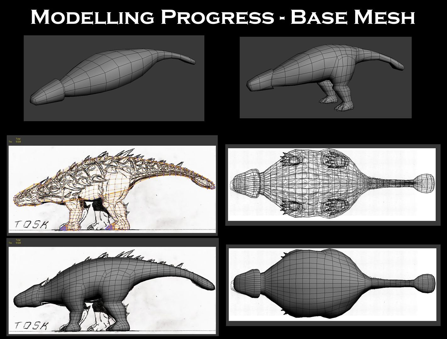
Since the base mesh was created, further additions were made to theme the creature more towards the "mech" aims at the beginning of the project, these changes can be seen below:
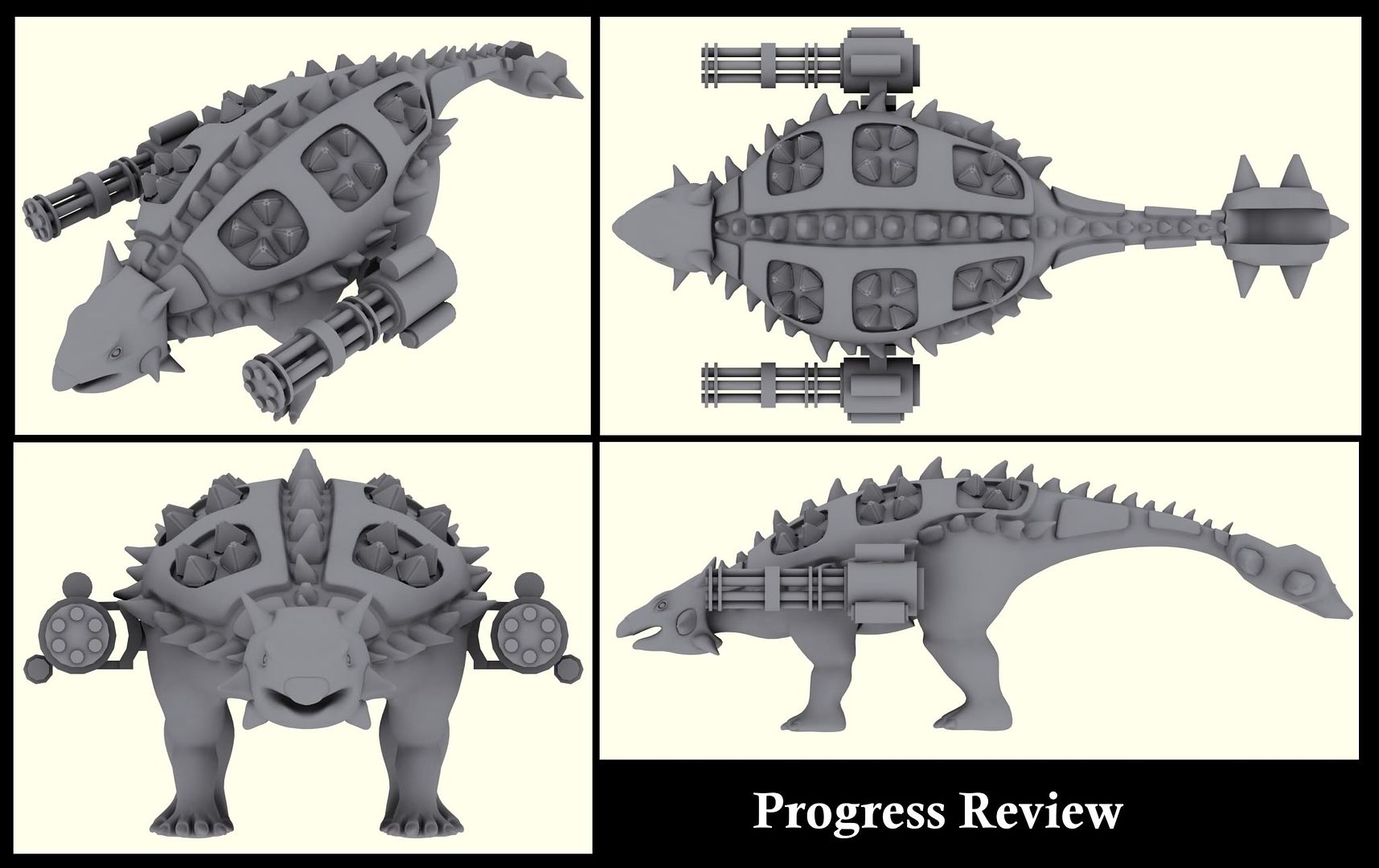
A few criticisms i have so far are that the spikes along the back and sides when viewed from above, show their original cube shape, using cylinders instead could fix this problem.
They spikes are instances of 2 seperate spikes, scaled and deformed to give a larger variety with a smaller UV space when texturing.
The original design to armour the creatures face will be scrapped, as it stops me being able to show organic detail that could be added in zBrush.
Also, some problems arose whilst creating this design, where the ammo cases were sitting over the hind legs behind the weapons, covering a huge area of what would have been sculpted muscle tone and scales for the creature, leaving even less organic surfaces on the model, therefore, this was removed.
However, the problem now arises as to the placement of the ammo chain from the side weapons, they could lead under the belly of the creature, or they could be edited to appear more Gauss Cannon like, or Railgun-esque, meaning no ammo crate, and even more futuristic themes!
What do you think?
For this project it was decided that a half organic, half hard surface model would be created to allow the model to show strengths in both areas.
The ankylosaurus dinosaur was chosen, as it is a well known armoured species from the prehistoric era.
The idea behind this choice was due to its link to weaponizing a dinosaur, why not use one that was already armoured!
A design sheet can be seen below:


Below Original Ref: http://ikechi1.deviantart.com/art/Ankylosaurus-200449289

These images were used to give a basic theme to the model, other reference sheets were created to allow a further understanding of mechanical shapes and form, and are on my university forum thread, showing the stages of development.
The following image shows the reference images used to create the base organic part of the model, main image reference : http://titanosaur.deviantart.com/art/Tosk-The-Ankylosaurus-179383498

Since the base mesh was created, further additions were made to theme the creature more towards the "mech" aims at the beginning of the project, these changes can be seen below:

A few criticisms i have so far are that the spikes along the back and sides when viewed from above, show their original cube shape, using cylinders instead could fix this problem.
They spikes are instances of 2 seperate spikes, scaled and deformed to give a larger variety with a smaller UV space when texturing.
The original design to armour the creatures face will be scrapped, as it stops me being able to show organic detail that could be added in zBrush.
Also, some problems arose whilst creating this design, where the ammo cases were sitting over the hind legs behind the weapons, covering a huge area of what would have been sculpted muscle tone and scales for the creature, leaving even less organic surfaces on the model, therefore, this was removed.
However, the problem now arises as to the placement of the ammo chain from the side weapons, they could lead under the belly of the creature, or they could be edited to appear more Gauss Cannon like, or Railgun-esque, meaning no ammo crate, and even more futuristic themes!
What do you think?
Replies
plenty of cool military vehicles you can use for armor/weapon ideas. Right now you just have some random stuff placed on top of it. try and figure out how a person might use current fabrication methods and armor design to fit out a dinosaur.
At the same time you prolly should think about how this armor would affect the actual movement of the dino. Having miniguns on the side seem impractical because its based ont he direction the dino is facing. a 50 cal. mounted on top with a rotating turret would seem much more useful. like this sorta.
just examples of armor/weapon design to think about. since a human probably wouldn't ride one of these, in a sense it would be a drone like design.
stryker
http://3.bp.blogspot.com/-gXbp4QyeYJo/TuUfaGplzyI/AAAAAAAAXKg/w1UX5palOEs/s1600/info2.jpg
bradley
http://www.wartoyz.com/Merchant2/graphics/00000001/80202-m3a2-bradley-460.jpg
btr-82
http://www.defencetalk.com/pictures/data/4999/BTR-82.jpg
I do agree that the side miniguns limits the maximum spread of fire, the prisms on top of the model (although not shown) currently open out into missile launchers, similar to SSM batteries, or SAM sites. This was the original aim under the name "artillery-saur" later changed as artillery is apparently not any long range ballistic weapon, only large caliber guns.
The tips towards using current military vehicles as reference, although valid does not fit with the "futuristic/sci-fi" art style in the brief :[
I have created a mood board on the desired mech style for the non organic sections (as well as research into horned lizards for the non organic) but will have to share it later tonight as im currently not on my home computer.
Btw if the miniguns were mounted on a spherical mechanism, this could solve the range of fire problem, the current placement of the weapons was meant to be abstract as the art style is sci-fi and im trying to steer clear of current military design. I'll post that mood board asap to give a better understanding (it was created last night so that today I could do further paintovers for brush detail based on the theme)
Im still toying with adding a metal gear rex style rail gun/nuke launcher instead of a minigun (to add assymetry)
Thanks again, lots more to look into for inspiration now :-)
mech1 - http://2.bp.blogspot.com/_oDZwk6r5oBk/S22osDFakCI/AAAAAAAAAEA/hmOWex43nhA/s400/grey_mech_rawwad_copy.jpg
mech2 - http://img.ffffound.com/static-data/assets/6/1840ec76b1cf4fc60fd03e0ef9ce43d61d543386_m.jpg
mech3 - http://fusionfilter.com/wp-content/uploads/2010/06/UN_assault_mech_by_flyingdebris.jpg
mech4 - http://www.deviantart.com/download/71961793/Metal_Gear_Rex_Concept_by_lord_zannin.png
mech5 - http://media.tumblr.com/tumblr_l2vukfMqhK1qaw5yz.jpg
mech6 - http://behance.vo.llnwd.net/profiles/83046/projects/149405/830461227214700.jpg
mech7 - http://www.3dlinks.com/images/gallery/gallery7/eva_unit2_05_by_Pixel_Reborn.jpg
mech8 - http://farm3.static.flickr.com/2472/3579063040_914b051c0b.jpg
Research / Desired Theme for non organic elements:
Ill post some paintovers on here, and if anyone feels the creativity juices flowing! have a go and make a suggestion or paintover i'm more than open to help with developments!
heres some progress shots:
The unwrap needs arranging in the texture space, but thats a job for tomorrow, massive headache atm!!
Alphas - Ross Inglis (Hex) and mokthemagicman (dots)
Head's looking a little too bumpy compared to the rest of the body. It's fine having details in the skin but to the point where it affects the silhouette might be a little too much.
Ill give a go at using the slash 3 tool, and some cuts to add a bit more non uniform detail, especially in the leg area as it seems massively under detailed in comparison to the head.
I have heard of dino riders, it was one of my reference sheets on my university forum thread
Hi Scott thanks for the comment =] this isnt actually representing the final unwrap resolutions as i had to fit it within the texture space, it was all over the shot, also lot of the seams were removed today!
Heres a print screen of the projection with several (but not all) fixes to xNormals map generation:
Thanks for the feedback everybody, glad your enjoying the progress =]
I hope to begin the diffuse, add more detail to the legs (maybe some cuts and wires under the skin?) and calm the facial detail a little, it might be worth posting a picture of my original head sculpt to give an idea of where it began, as it was a lot worse than it is currently, the top was similar to the bottom!
Until tomorrow!
Try multiple bakes in 3ds Max and xNormal (how do you calculate your distances in xNormal?)
Test your normal maps in your game engine (UE3/CE3/Marmoset) as you have it in Max from the looks of it. Most likely it will look different in engine
What size of texture maps are you allowed?
The model is being aimed at use for animation with UDK so ill be testing the normals there soon! Ill throw some screens up once ive tested UDK (although the model wont be using lightmaps as it will be dynamically lit, so it might look a bit sketchy)
The base mesh was pretty lumpy and you didn't take the time in the beginning to really push the anatomy where it needed to be before you sub-divided and rushed to the tiny details. Because of this it lacks weight and definition.
The last image is a HUGE red flag. You put human heels on a dinosaur, 90% of the animal kingdom walk around on their toes with their heels in the air. This particular dinosaur is no different... especially in the front "feet" which are arms like the rest of the animal kingdom.
As you study creatures you'll find that there are a lot of similarities even though they look drastically different on the outside, birds have arms adapted for flying, same joints same digits nothing drastically different from humans or other animals except their proportions. What people mistake for a backwards knee in the legs, is actually just a raised and elongated heal in most animals. Bear are more like humans in that they actually walk heal to toe, and because of it they run really really funny when compared to other animals.
Elephant feet would be a better study than human feet. Elephants walk around on their toes also. Even though their leg looks like a massive tree stump they walk on their toes with their heals elevated. There is a big fatty pad under the heel as a shock absorber but most of the weight/locomotion is borne by the toes.
So when you think, dinosaur feet are just like my feet, they walk heel to toe just like I do! You're way off and need to study the subject a bit more.
A simple anatomy error like this is going to be harder and harder to fix the deeper you get. Which is why its so important to block in the big stuff early on and really dig into the research side of things.
Don't feel too bad, a lot of people mistake front appendages for legs, and assume human feet are the basis for all animal feet.
thanks again =]
Since the last post a new projection was completed, diffuse maps were created, the miniguns have been textured and everything was animated and exported to engine.
To make the game asset work animsets, animtrees, physics assets and various codes were created/edited allowing the creature to be playable within UDK
The following video shows the Breakdown:
[ame="
If you want to help test the creature and post feedback here, download the .exe below (requires UDK 2011-08 or higher):
http://www.gamefront.com/files/21598455/Artillery_saur.rar
the more critique the better i'm looking forward to continuing with this creature after May, so ill keep tabs on this thread, untill then please check my other polycount post about surrealism in games:
http://www.polycount.com/forum/showthread.php?t=98164
The shader needs working on, as at the moment it literally just plugs a few maps into places, uses fresnel for rim lighting etc (emulated metallic shine)
Any testing of the product from the download link supplied would be amazing
thanks
thank you all!