Home 3D Art Showcase & Critiques

[CE3] Island of the Dead (my first environment)

polycounter lvl 7
Offline / Send Message
Macattackk polycounter lvl 7
Hello everyone, so normally im a character artist but I want to try my hand at doing an environment to see if I enjoy them more.

This is my first environment so any tips and crits are welcome.

Here is the concept which is an old 1883 painting by Arnold Böcklin called Island of the Dead:
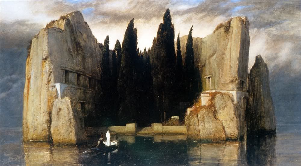
Arnold_Boecklin_-_Island_of_the_Dead_Third_Version.jpg

Current Progress:

1-7.jpg

2-6.jpg

3-5.jpg

4-4.jpg

5-4.jpg

6-5.jpg

7-4.jpg

8-1.jpg

Replies

  • kio
    Offline / Send Message
    kio polycounter lvl 16
    cool project - did you know böcklin did various versions of the painting ?http://en.wikipedia.org/wiki/Isle_of_the_Dead_(painting) might give you one or two addiotional ideas :)
  • Macattackk
    Offline / Send Message
    Macattackk polycounter lvl 7
    yea i was checking those out. apparently this one was his third version which he was contracted to do by a rich widow. the boat depicts her and her husband going to the island of the dead together in their caskets. pretty cool history.

    i chose this one because it seems to be the most interesting and most dramatic of them all. though after you said this i relooked at them and i may decide to add more sea rocks via the fifth version. also im wondering if i should add a rock wall like in the fifth version as well? currently im thinking that the rock wall detracts from and clutters the focus which are the trees. the simpler wall blends in more with the ruins and adds more solitude to the picture. here it is if anyone has an opinion:

    The_Isle_of_the_Dead_1886.jpg
  • Santhem
    I like the piece alot, and you seem to have quite a good start.
    One thing i like about the original piece alot is that it really kindof pops out of the water, and has this dark deathly hole in the center.

    I did a very quick paintover with some possible corrections to the shape. feel free to use them at will depending on how close you want to stay on reference. For me the most important thing id change is the lines going in/lines going out thing, that really makes the original piece pop, imo.

    *polycount forum upload doesnt work for me, so here's an link*
  • Macattackk
    Offline / Send Message
    Macattackk polycounter lvl 7
    ok yea youre totally right but heres the thing. in maya this was way more correct like what youre talking about. but when i imported it into cryengine, the field of view is very different so theres much heavier distortion and im not really sure what to do about that.
  • Macattackk
    Offline / Send Message
    Macattackk polycounter lvl 7
    alright I changed the field of view and made some adjustments to make it look closer to the concept:

    IOTD2.jpg
  • AsaNYC
    Offline / Send Message
    AsaNYC polycounter lvl 15
    One of my favorite paintings; can't wait to see your progress!
  • Macattackk
    Offline / Send Message
    Macattackk polycounter lvl 7
    thanks AsaNYC, yea this painting is simple yet extremely effective.

    heres an update. did most of the pre-texture modeling. I added coffins to each of the rooms as my interpretation of what would be in there. Will have to add more once I have vegetation textures.

    im planning on hopefully animating the trees to be blowing in the wind. I may add a boat and that white cloaked character standing on one of the pillars next to the stairs.

    The close-up pictures are from the characters point of view in the engine. The last picture is from maya without the trees to show the layout.

    IOT_main.jpg

    IOTDclose1.jpg

    IOTDclose2.jpg

    IOTDclose3.jpg


    IOTD_close5.jpg
  • Macattackk
    Offline / Send Message
    Macattackk polycounter lvl 7
    ok here is my material/layout planning. ive decided im going to expand the level a little deeper and add a hedge maze after the forest goes on for a bit. It will end at your coffin. Once this is done I plan to make a video of the character swimming up to the island and going through it.

    island_of_the_dead_planning-2.jpg
  • DennisGlowacki
    Offline / Send Message
    DennisGlowacki polycounter lvl 7
    sweet concept, ill be keeping an eye on this.
  • Keg
    Offline / Send Message
    Keg polycounter lvl 18
    I think you should have the boat texture separate from the coffin texture. I think a decent contrast and finish to the types of wood would be a better suited route to go.
  • Mark Dygert
    I like all the planning you have done and the progress is coming along great, keep it up!
  • Macattackk
    Offline / Send Message
    Macattackk polycounter lvl 7
    update: main thing i did was finish the maze room so the layout of my environment is complete. ive also colored some things in to get a feel for shapes and tones and also added a really early and basic tiling texture for my ruins. im still going to add cracks to the normal map and add dirt/grunge to it.

    the pictures show the front area and the maze room+hallway leading up to it. the hedges will be added later. the last picture shows my scene layout in maya.

    anything i should fix before i start sculpting the rocks?

    @DenninsGlowacki: thanks!

    @Keg: I agree. I have room on the bottom part of my 1024 wood texture for what i think should be a darker more finished wood for the boat, like in the concept.

    @Mark Dygert: Thank you!

    Pictures:
    islandofthedead1.jpg

    islandofthedead2.jpg

    islandofthedead3.jpg

    islandofthedead4.jpg

    islandofthedead5.jpg

    islandofthedead6.jpg

    islandofthedead7.jpg
  • Andy H
    Offline / Send Message
    Andy H polycounter lvl 8
    Can we see the wireframes? :)
  • Macattackk
    Offline / Send Message
    Macattackk polycounter lvl 7
    gonna add more polys to some places, like that rock on the right in the front view. alpha planes to the trees, vegetation, etc.

    islandofthedeadwire1.jpg

    islandofthedeadwire2.jpg
  • Computron
    Offline / Send Message
    Computron polycounter lvl 7
    I love your blockout process.
  • Razorb
    Offline / Send Message
    Razorb polycounter lvl 15
    ooo awesome project! and looking nice so far :)!
  • jimmypopali
    I was going to ask for a top down view because looking at the painting, it just looks like a half-circle area. Thanks for clearing that up.

    It looks great so far.
  • Macattackk
    Offline / Send Message
    Macattackk polycounter lvl 7
    well ive added a lot.

    -finished the maze layout
    -added a bunch of textures
    -added my first vegetation item

    no textures here are complete. none have specular and most dont have normal maps yet.

    i will eventually get rid of the trees and place modular ones in their place so i can easily animate them and add alpha planes.

    the rocks obviously need more to the diffuse, like actual color variation and they need more sculpting, especially that front one. and the rocks that stand by themselves need to be less contrasty and detailed. might add more geometry to the rocks since theyre kinda jagged

    Computron: thanks, yea this style of blocking out where i want things made it a ton easier

    Razorb: thank you!

    jimmypopali: thanks!

    islandofthedead_front-2.jpg

    islandofthedead1-2.jpg

    islandofthedead2-2.jpg

    islandofthedead3-2.jpg

    islandofthedead4-2.jpg

    islandofthedead5-2.jpg

    islandofthedead6-2.jpg

    islandofthedead7-2.jpg
  • Macattackk
    Offline / Send Message
    Macattackk polycounter lvl 7
    ok so ive done some work on the trees. ive specifically made 3 modular trees and spread them around. planning on making 2 or 3 more variations to fill in the rest.

    here they are. its basically the original mesh with alpha planes sticking out of it. the alpha planes use the same texture, just with alpha testing:

    trees.jpg

    So my current major problem is that the way ive made the rocks is not working. Im using a 4096 diffuse map and 2048 normal map for all the rock parts and the diffuse map is just not high res enough and looks bad texel density wise.

    Im deciding i need to make all the rocks modularly but i have no idea how to split it up correctly and still make it look like the painting. I also need to use these same pieces on the rest of the environment. Here is my guess on how to split it up. Does anyone have any better ideas on how to do this?

    modular.jpg
  • Macattackk
    Offline / Send Message
    Macattackk polycounter lvl 7
    update:

    mostly a vegetation/trees update. added a new grass type too. I used to have a light weed type but i felt it detracted too much from the ruins. at the end ive posted 2 pictures with the light weeds. should I leave it in?

    probably going to add one more vegetation type thats a weed with some flowers or something

    gonna do the rocks a completely different way so I got rid of the rock texture

    ruins texture is nearing completion though i want to do more with the sculpt. the coffin right now has normal map and only cavity maps in the diffuse.

    still messing around with bark options. probably gonna add 3d moss next. ill have 2d moss as a blend texture in the rocks.

    any critiques?

    iotd1-2.jpg

    iotd2-1.jpg


    iotd4.jpg


    iotd6.jpg

    iotd7.jpg
  • Macattackk
    Offline / Send Message
    Macattackk polycounter lvl 7
    update: everything still needs a little bit of work. vegetation is the most done currently. definitely gonna add decals to the rocks. going to add moss blend textures to bark and the ruins parts. moss blend texture needs to be better as well


    1-3.jpg

    2-3.jpg

    3-2.jpg

    4-1.jpg

    5-1.jpg

    6-1.jpg

    7-1.jpg
  • Macattackk
    Offline / Send Message
    Macattackk polycounter lvl 7
    hey so im having trouble getting the specular to show up on my blend texture. does anyone know how that works exactly. the blend texture is the moss in the rock walls. i have my specular in my diffuse alpha like the documents say, yet it wont show up. cryengine is also not letting me tile my blend texture. it just has it at a default amount of tiling, which is 1. i need it to be higher since my texture is low resolution.

    also, does anyone know how i can get that area below the trees to be darker like in the painting? is there a way to subtract light from certain areas?
  • Ged
    Offline / Send Message
    Ged interpolator
    sorry dont know cryengine but I just thought Id say its good progress and I think the trees could do with more shape/texture as they are quite an important feature of the island like this second big tree from the right but with a darker leaf obviously.

    topiary.jpg
  • Macattackk
    Offline / Send Message
    Macattackk polycounter lvl 7
    @Ged hey thanks for the comment. ive changed the trees to have more shape by adding extra little spires on the sides and took out the opaque inner part and just made many shells of the alphaed out version of the texture. better?


    made the front part of the island to look much more like the painting by making the water more calm and reflective. also changed a lot of the lighting to bring out the shadowy dark parts in the painting. ive made a lot of changes to most of the textures and added decals to the rocks. fixed the trees to be more like actual trees and also added flowers.

    planning on adding urns in places to add my own artistic flavor to make it a more flushed out environment

    it seems like the rocks could use something else but im not quite sure what. they just seem a little empty to me. any suggestions? the other thing im annoyed about with the rocks is the fact i cant have a color map for the unique details in my second normal map. i have 2 normal maps, one for high density details for up close and one for the large unique details that make up the rock. in the dark, the normal map isnt visible at all so the rock faces dont look as good. in the sunlight you can see the unique details which make it much more like rock. i guess this is a limitation i gotta deal with as part of using cryengine.

    i also am not happy with the way the rock blends into the ruined structural parts that hold the coffins. in the concept theyre the way i have it, but it just doesnt look right in game. maybe have moss in between where the rocks meet the ruins?

    1-5.jpg

    2-5.jpg

    3-4.jpg

    4-3.jpg

    5-3.jpg

    6-3.jpg

    7-3.jpg

    8.jpg

    9.jpg

    10.jpg

    closeup-2.jpg
  • ZacD
    Offline / Send Message
    ZacD ngon master
    Woah, nice update, the new colors go so much better together and with the scene.
  • marq4porsche
    Offline / Send Message
    marq4porsche polycounter lvl 9
    This is really looking sweet! I love the color choices and you're following the artwork very nicely. My main crits are that your grass stands too tall and doesn't have much variation. Squash your height by half and you'll be fine I think, because right now it stretches too much. Also you can have a few more strands bending as well. Your normal map for the rock also comes across as being too strong in the first shot especially with that lighting. Tone it down some so it can look a bit more natural. Overall it's starting to look great, really nice work.
  • Macattackk
    Offline / Send Message
    Macattackk polycounter lvl 7
    update! ive now decided that im not going to do a video and am instead going to optimize the level for the certain screenshots i have here, so any critiques on composition would be great. ill probably have one more shot which shows more of the maze.

    things i still need to work on"
    -finishing up diffuse textures, especially urns
    -adding candles
    -making water less blurry by getting rid of the default cryengine gunk from it (does anyone know how to do this?)
    -changing the bark texture to something more subtle
    -possibly adding more shape to the trees, something about them doesnt seem right
    -(optional) adding the white cloaked figure in the concept to the front shot

    @ZacD thanks dude!
    @marq4porshe thanks for the critique! i have shortened the grass and added light/dark versions that are randomly spread together. better?

    IA6AY.jpg

    7ec2B.jpg

    r6C8Q.jpg

    KeMOD.jpg

    m9r5G.jpg

    zf8JH.jpg

    iZzpm.jpg
  • marq4porsche
    Offline / Send Message
    marq4porsche polycounter lvl 9
    It is far too dark now to see anything, play with the environment color so it's not pitch black.
  • SinisterChef
    I agree with marq4, being ominous is one thing but its another when it's too dark to comprehend whats going on. Other than that its coming along solid mate keep it up!
  • Macattackk
    Offline / Send Message
    Macattackk polycounter lvl 7
    el updato, i messed with the ruins to have less straight lines so it looks more natural. added candles to add more interest and light to the piece. also added vertex colors to a lot of things. im constantly rearranging things as i go along too.

    next things to do are add the white cloaked figure, finalize all textures, try adding some nicks and damage spots in the mesh of the ruins. at that point itll be pretty close to done.

    questions:
    -how can i get rid of the grimey texture in the default cryengine water?
    -i tried adding a subsurface scattering map to the candles but nothing happened, is there something i have to turn on for that to work?

    @marq4porche yea youre right, i lessened the amount of black fog there is and also added candles which provides interesting scattered light. though its still hard to see in the distance, i think it looks cool that way.

    @SinisterChef whats up man! cool to see you posted in my thread before we met at polycount meetup.


    xDwRE.jpg

    KRBy4.jpg

    bw3Pg.jpg

    KVxxA.jpg

    AtlqW.jpg

    2LQGx.jpg

    2UOT2.jpg

    T4q8s.jpg
  • Macattackk
    Offline / Send Message
    Macattackk polycounter lvl 7
    well ive been working on the sculpt for the white cloaked figure which I will use as a character prop and put in the front next to the stairs and in some of the other shots.

    All of them will be in the same pose since they are sculpted to be in only one position. They wont have a face, itll just be dark shadow where their head would be under the cloak.

    Here is the sculpt so far. A lot of places are still wobbly and unformed, especially the bottom part of the cloth that hits the floor.

    Anyone have critiques on the style and cloth flow before I refine it and add a cloth alpha to it?

    vDSS7.jpg
  • snake85027
    Offline / Send Message
    snake85027 polycounter lvl 18
  • Computron
    Offline / Send Message
    Computron polycounter lvl 7
    Did you cloth sim that? Looks way too big and loose for my taste. Envrironment turned out way better than I had expected. :thumbup:
  • Macattackk
    Offline / Send Message
    Macattackk polycounter lvl 7
    thanks snake85027!

    @Computron nope, 100% dynamesh from a sphere so far. What do you mean by big and loose, it needs more and tighter folds? Thanks for the compliment! Still tons more to do though. Mostly redoing a lot of it as I have learned a ton during the process of making this and have a more keen eye now.
  • ParoXum
    Offline / Send Message
    ParoXum polycounter lvl 9
    I like the progress you made over this page, the trees especially and the rock went over big improvements.

    The inside area and basically all the shots taken from the inside are less interesting at the moment, they lack the calm and imposing feeling of the main picture, and the light streaks over those pictures is distracting.


    Btw, you should be able to get rid of the diffuse pass on the ocean by lowering the Tiling value in the ocean material, and increasing the detail tiling against it to keep the normal bump. Changing other values might be necessary as well. Seems like removing the diffuse texture doesn't affect the material on my outdated version here.
  • njc6425
    the drapery on that first sculpt looks insane :)
  • Macattackk
    Offline / Send Message
    Macattackk polycounter lvl 7
    @ParoXum hey, nice to see a cryengine expert like yourself post here! and thanks! I definitely agree with what youre saying. at this point its a little late to change too much. I shouldve made a concept, but this was my first environment so I now understand how to go about things next time.

    Ive messed with the water shader a ton but i think the only way to truly get rid of the grime in the water is to make my own water shader, which im unsure if im going to do.

    @njc6426 thanks dude!

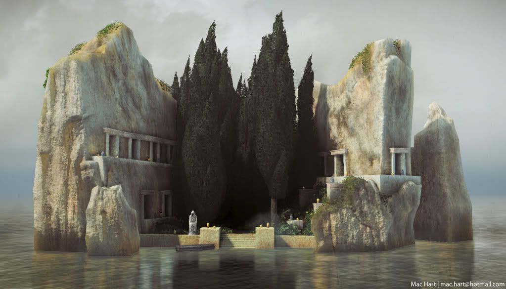
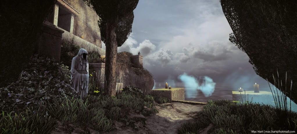
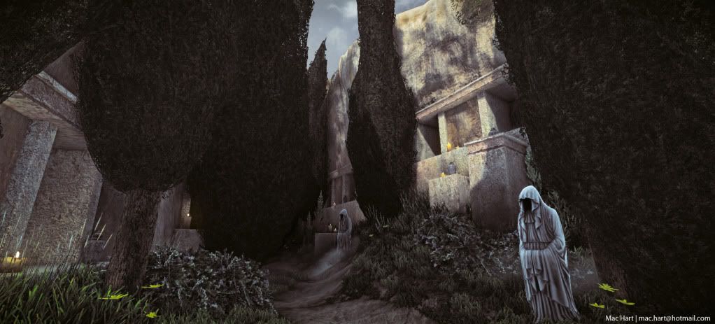
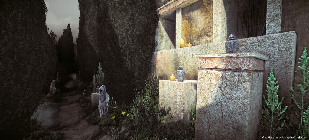
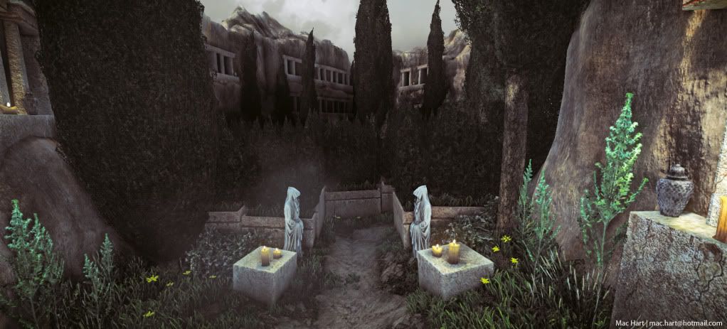
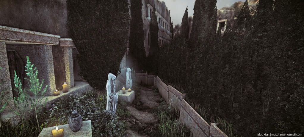
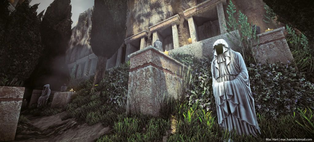
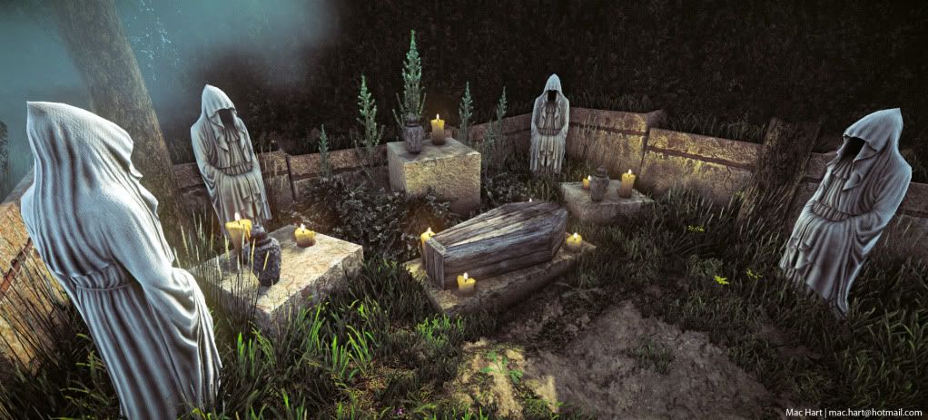
    ok well heres another update. The prop characters still need more done with the diffuse, this is strictly just AO and cavity maps right now. And I know that some of the cloth mesh doesnt flow with the cloth correctly, especially in the back

    I made changes to the trees by making them waaaaaay less polys and adding little leafy bits to help the silhouette. still needs better organization for them and maybe more in some places but this is just a first pass. Also added a trail which i think gives it a feeling of being a real place inhabited by man. Also fixed a lot of scale problems. Still tons more to do lol. I just keep understanding environment art more and more as I do this and have to keep redoing things.

    P.S. does anyone know how to get custom vertex normals into cryengine. does the crysis 2 sdk have it? my flower bushes look very crappy because of the way the normals are. i need them to be going out in a spherical way but it wont import the normals :(

    1-7.jpg

    2-6.jpg

    3-5.jpg

    4-4.jpg

    5-4.jpg

    6-5.jpg

    7-4.jpg

    8-1.jpg
  • Blaisoid
    Offline / Send Message
    Blaisoid polycounter lvl 7
    hmm, i'm not sure if these are supposed to be sculptures or actual entities?
    at the moment they kinda have features of both.
  • marq4porsche
    Offline / Send Message
    marq4porsche polycounter lvl 9
    I like the feel of the scene now it looks great. Blaisoid is right, the level of detail in the figures makes it hard to tell if they are sculptures or not. Hopefully the diffuse texture will help with that.
  • Darkleopard
    That sculpt 0_o awesome
  • Macattackk
    Offline / Send Message
    Macattackk polycounter lvl 7
    @Blaisoid and marq4porsche yea i meant them to be people that bring on a feel of being statuesque. I feel like it helps with the solemness of the piece, though i agree as far as diffuse details they look too much like actual statues. Im going to try to bring out the threads more in the cavity map and add dirt and what not to the cloth which will hopefully make them seem like statuesque people and not straight statues..

    @Darkleopard thanks! yea tried to make it as interesting and designy as possible. I enjoy the way it turned out
  • Razorb
    Offline / Send Message
    Razorb polycounter lvl 15
    cool atmosphere ;o! got a vid of what its like to walk around in? would be interesting to see that.
  • schneller
    Offline / Send Message
    schneller polygon
    Mac, this is coming along great! Cool painting you are working from.

    I wouldn't mind more dirt/patina on the figures. Right now they almost look to0 bright to me. Maybe try sampling more of the beige color from the stones?

    Keep it up!
  • Sandro
    Oooh lovely lovely colors.
Sign In or Register to comment.