The BRAWL² Tournament Challenge has been announced!
It starts May 12, and ends Oct 17. Let's see what you got!
https://polycount.com/discussion/237047/the-brawl²-tournament
It starts May 12, and ends Oct 17. Let's see what you got!
https://polycount.com/discussion/237047/the-brawl²-tournament
Treasure Chest [WIP]
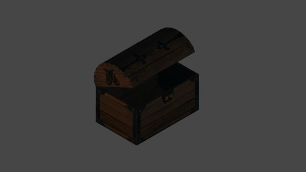
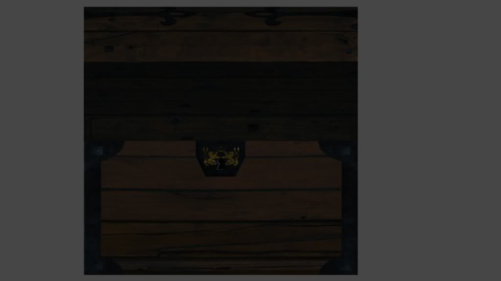
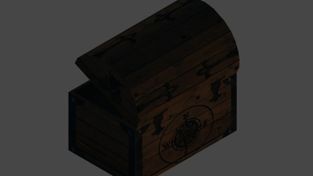
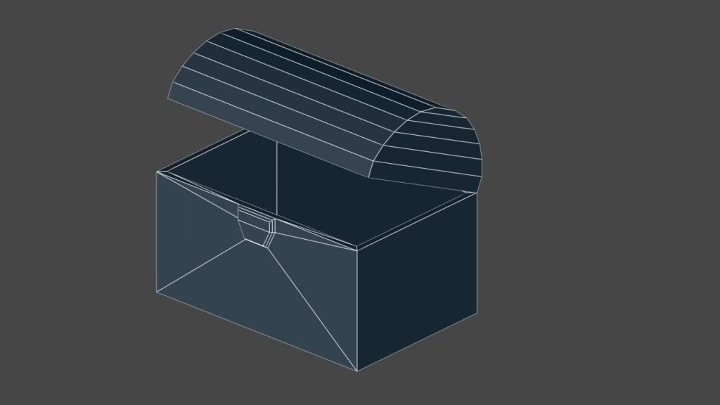
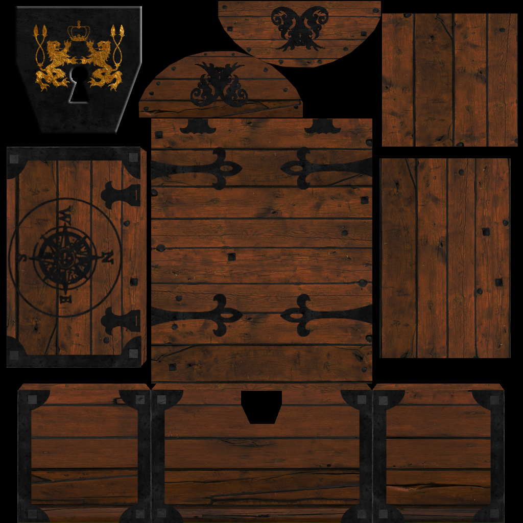
Here is a treasure chest that Ive been working on. It has 60 polygons, 1024x1024 diffuse and normal mapping, and rendered with a few lights in 3ds Max. Any comments or critiques are greatly appreciated.


Replies
Background info:
This project was inspired by a imperator_dk who felt that another piece I was working on was too high for my skill level and suggested I create something simple like a 60 polygon treasure chest, so I did (not out of spite by the way). This is my first normal map using Teddy Bergsman's Ndo Photoshop script tool and second normal total. No, this is not my first project and no I am not in school (graduated). I am by no means a master as you can see and I consider myself a life long student. I wanted something with a fast turnaround so I used a few textures from CGtextures, some photo refs, and some line creations in Illustrator. Honestly, from research to current I have put in about 15 to 18 hours.
Gold and chamfering edges are great ideas, but I want to stick to the constraints of 60 polys. I guess I could put in a single plane with normal bumping. I was thinking of a blinding bright light but wanted to show texture.
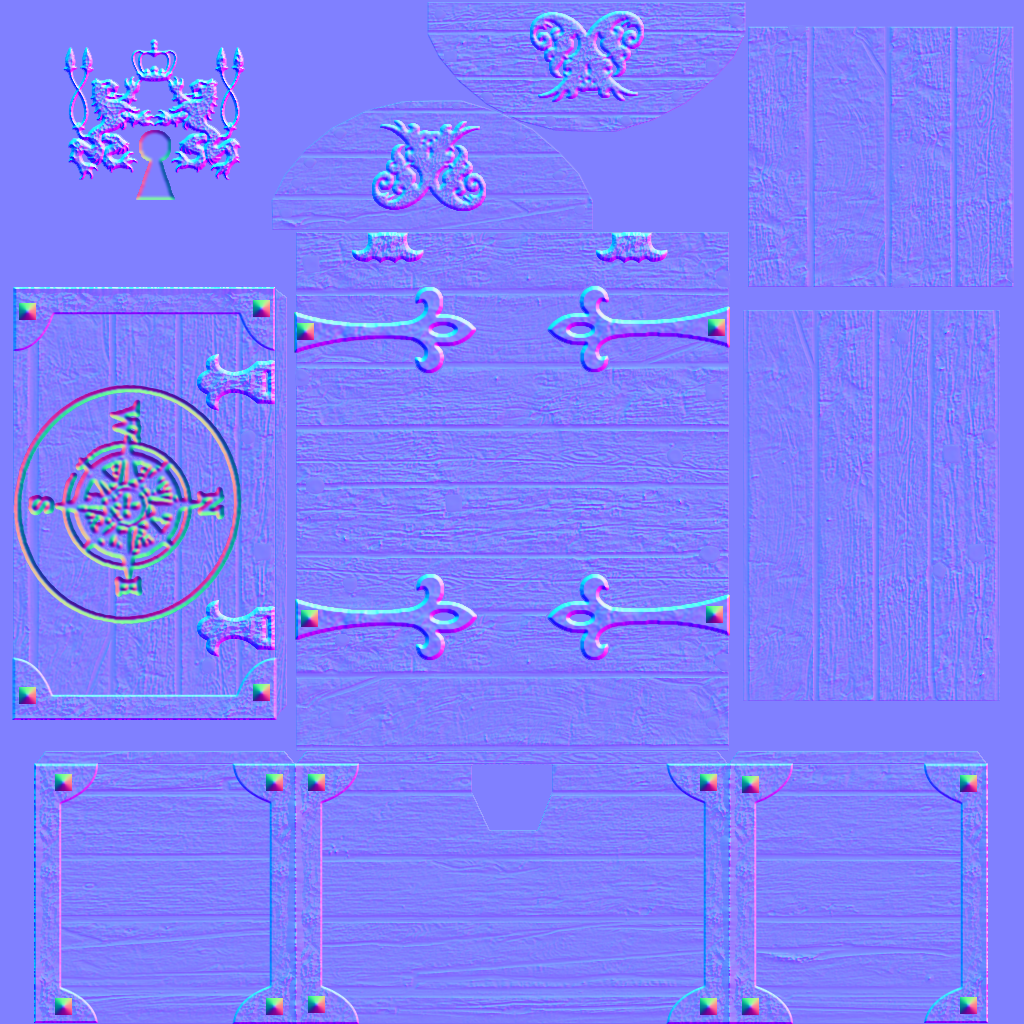
Here is a normal map only image:
Also, can you emit some light so we can see the textured detail in more clear?
2) There is a bit of a logic problem with the construction, the lock is to hold the lid securely in place right? But there is no hardware or locking mechanism on the lid.
3) Typically the outer edges where reinforced with metal, this was to prevent people from being able to pry away at weak spots. The way you have it on the lid, planks nailed to planks seem very easy to pry open and doesn't make a lot of structural sense.
Additionally, Your normal map looks very hacky, too much noise overall and the grain is too deep compared to the depth between the planks.
Finally, I recognize the cgtextures wood planks and that is never something you want someone to do, at the very least you want to be adding some overlays, modifying the colors, etc.