Home 3D Art Showcase & Critiques

Robot (WIP)

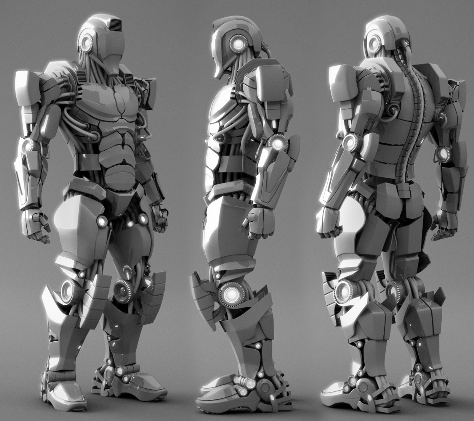
This is my first time posting and my first hard surface model I hope you guys like it. Any feed back would be great. Thanks
Blog_Back.jpg

Replies

  • Alterboy
  • Barnstable
    Very nice design and execution. Looks Gundam inspired. The knee pads kind of look like they would be shock absorbers rather than just armor. From all the armor, I would assume this would be a combat robot.

    My only point of concern is that those hoses sticking out from the sides of the abdomen wouldn't be very practical. When I saw them, I thought from an engineering standpoint, "why would an engineer tuck all the other hoses away, and leave just those 6 out there to catch on something?" It wouldn't take much to secure them to the body, and I see no practical reason why an engineer wouldn't do so.
  • c0ldhands
    Offline / Send Message
    c0ldhands polycounter lvl 15
    Good execution, there are some design areas though that bother me. Overall plating looks very thin and flat, specially the abdomen parts, they could literally stick out more. The feet dont look that appealing as the rest of the body, plus that he does not have toes :(
  • Alterboy
    Thanks for your feed back cOLdhands and will get on those changes.
  • PLyczkowski
    Offline / Send Message
    PLyczkowski polycounter lvl 14
    Anatomy is a bit off, neck and legs should be longer. Though it's a robot, it would still look better with proper anatomy.
  • Alterboy
    Thanks PLyczkowski for the input and I will make those changes thanks alot.
  • Alterboy
    Thanks alot barnstable for all your technical observations and input and I will try and figure out a way to make those hoses anchored somehow or remove them.

    I am glad you noticed that the knee pads are suppose to be more like shock absorbers and not so much like the armour for protection that was actually on purpose.

    My influence was all over the place anything and everything that could have possibly inspired me or seen in the last while.

    My son loves iron man so I think there is quite a bit of that in there.

    Thanks again for all your suggestions.
  • ajr2764
    Offline / Send Message
    ajr2764 polycounter lvl 10
    Very cool design, has some interesting shapes. When I first looked at it I saw a little of Iron man in there and slightly it resembles some of the design of Issac's suit in the Dead Space games. I totally agree that the legs need to be a bit longer but overall this is a well executed model especially it being your first hard surface.
  • Thriller Theater
    Good job dude! I agree on the position of the arched cables down from the chest is little bit troublesome apart from that no crits from my part. I also like the proportions, the thigh and hip are a little bit short but the knee point is in a good position. Looks cool!
  • A.Kincade
    Offline / Send Message
    A.Kincade polycounter lvl 9
    Awesome!! Pure awesome.
  • torontoanimator
    it looks quite awesome, im assuming its inspired by crysis? I do agree the legs could be a bit longer, but its a robot, so you decide its anatomy :)
  • ScoobyDoofus
    Offline / Send Message
    ScoobyDoofus polycounter lvl 20
    Hey nice work! I'm just going to briefly echo a few of the comments previously posted:

    Longer legs and slightly longer neck!
    Toughen up the armor pads on the entire torso. Tubes are cool and ok, but not right under the arms.
    His feet are a bit plain, and it looks like he's wearing Robo-Nike's.
    You've got a lot of small lights in positions that look like they should be bolts/fasterners of some kind. All those tiny highlights really take attention away from other, potentially better, areas of interest.
    Hands are a little too small.
    The spine is a bit plain. You could really push the design and shapes there to make something way cooler.
  • Alterboy
    Thanks for all the great feedback and I will get on those changes as soon as possible.

    Carlos
Sign In or Register to comment.