Obsolete Robot
Hey all,
Just wanted to get feedback/ ideas for a little on the side project im doing at the moment.
Here is where the idea started, http://hackberryhollow.com/2009/09/15/robot-concept-art-1%E2%80%94wait-robots/
Hope the guy doesn't mind me using his concept slightly. I want to make this robot look "old"/ rusty, broken, unloved.
Alot of it will be in texturing, scratches, dents, burn marks, dripping oil etc.
So here is the High Poly so far (and some close ups). Still working on bits here and there to break up symmetry, and then onto the Low.
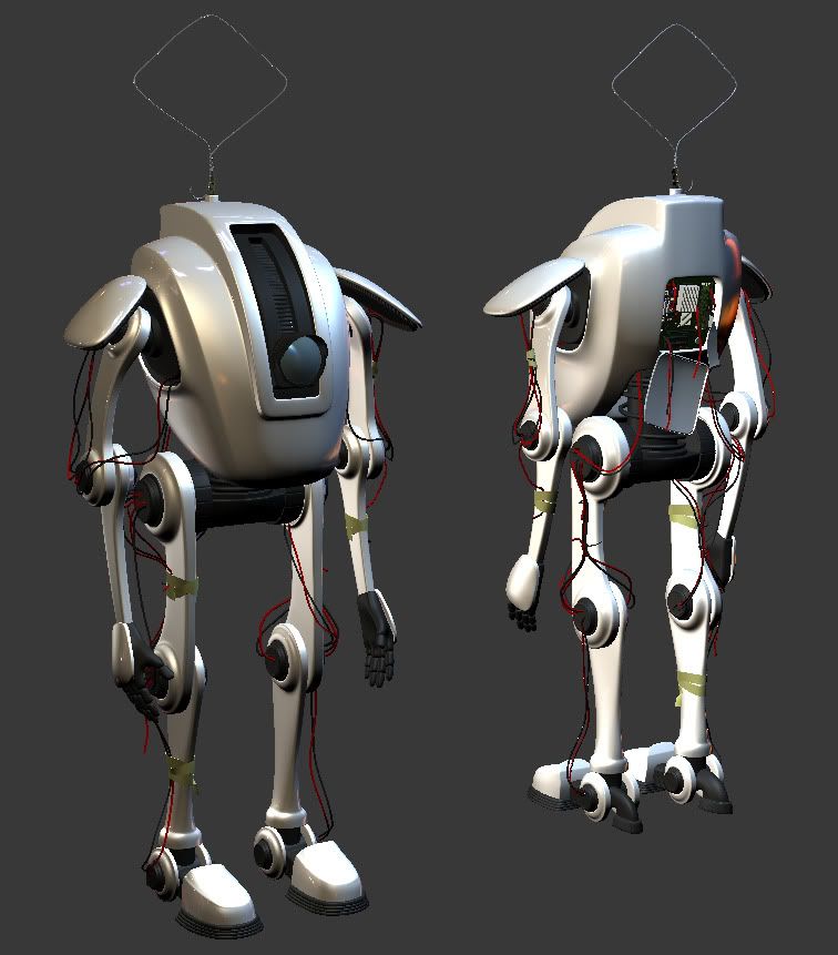
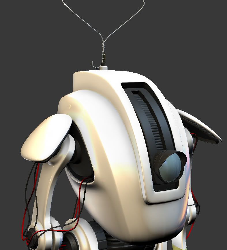
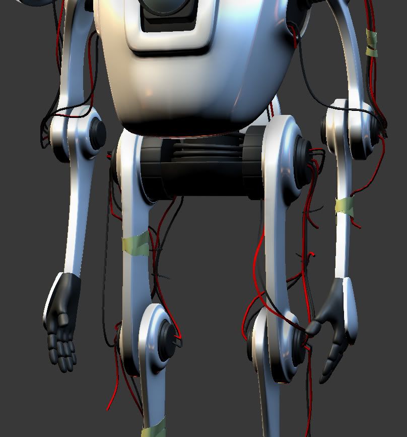
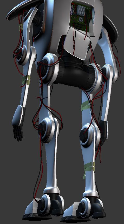
Hope you all like, im about 3 days into this so any feed back is welcome.
Just wanted to get feedback/ ideas for a little on the side project im doing at the moment.
Here is where the idea started, http://hackberryhollow.com/2009/09/15/robot-concept-art-1%E2%80%94wait-robots/
Hope the guy doesn't mind me using his concept slightly. I want to make this robot look "old"/ rusty, broken, unloved.
Alot of it will be in texturing, scratches, dents, burn marks, dripping oil etc.
So here is the High Poly so far (and some close ups). Still working on bits here and there to break up symmetry, and then onto the Low.


Hope you all like, im about 3 days into this so any feed back is welcome.
Replies
I think you could go a bit further with bits that have got damaged or lost and replaced with home made pieces.. maybe a shoulder pad, the hand pad.
this is a bit extreme, but I love the shoulder repair on this guy : http://www.keiththompsonart.com/pages/sequester.html
also the central spine area you have a coil maybe add a few more loops to it so its more visible.
If the arms were a tad shorter it would give the impression they can tuck into the main body.
Things I noticed and thought about immediately.
1. Simple smooth Body
2. Complemented with the use of wire dangling all over the place which is interesting to look at.
3. Accented with a recognizable coat hangar contrasting the future look while not over doing it.
Only area I would put more attention into is the Lens. You have an opportunity to make that really cool and deep like a camera lens. If it remains just a shield with some spec, I think it looses potential as a good focal point.
rooster: thanks man! yes thats a cool pic! Would love to do some stuff like that! i'm making a Frying Pan as a shoulder pad, so i'll post that up when i get home and let you guys have a look.
kendo: Thanks man, yea i might be able to make the arms abit shorter, i'll give it ago
dv8ix: LOL yeah its is pretty funky!
swampbug: Thanks heaps man! nice comment, yes, i'll definatly add the Lens, will look SICK!!! and yeah i hope the frying pan doesnt over do it at all but we will see. Thanks again man!
I'll get up an update tonight, in a few hours, and hopefully you guys will like it.
It's very interesting to see what someone else did with the concept with no context or background behind the design. You should have asked though, I could have sent you a more recent and detailed version of it:
Hackberry Hollow is a collaborative project by four artists. So far all we have is concept art for it, posted weekly to the blog linked above, but once released (should be fairly soon) we're hoping to experiment with just what is actually possible with web comics as a medium for storytelling.
My guess is you found this through Google and simply lifted the design. Since this is a portfolio piece, that's perfectly fine, we don't care. If you want to push the "old and loved" look you may consider adding some cosmetic damage, such as tears in the hands revealing moving parts underneath and cover him in smudges and fingerprints.
By the way, the registration system on this forum doesn't work. Since I was not able to create a new account I just used one from bugmenot. I have no clue who Janice Walton is. I figured someone would want to know.
Have fun!
As promised here is an update, let me kno what you all think?? too much or over the top???
Why not think about some heavy damage to all that smooth casing? Like a part cracked or broken off, some busted corners, etc...
Lowpoly's going to be tough on this one with all the wires and tape, can't say I envy you
I don't think those 2 bits of tape would make a very long term fix for the pan tho, it's weight seems too much. if it was me fixing the robot I'd use half a roll of duct tape on it :P
^ This.
It's a cool adaptation though. The original concept is neat to give you an idea, but you're really running through a lot with it, making it your own. And that is to be commended. This thing should be really cool when its textured.
That could be kind of cool, yes?
Xoliul: Thanks mate! Yes i'll be "smashing" the smooth body in zbrush or just in max with soft select like i have tried below as a test
Looks cool! will be good to have some deepish scratches as well.
rooster: yeah good point, i added some more tape, it will look alot better once textured, it will look tighter and more stable
Two Listen: thanks mate, really. Lots of fun to "design" stuff here and there. Cant wait to texture it myself
Thegodzero: Yes im updated the hands abit, i think this is far as i will take them.
Harry: Thanks thanks thanks thanks! lol
Two Listen: Good ideas! i tried the fork, but it didnt fit for my own personal taste, but it was totally worth a try!
poopinmymouth: Ghetto parts! ha! Hopefully these hands are better. other wise i'll have to re make them with some different design. Happy to have you postng on my work
Here are the pics! Might have to work on the foot more, but i believe i'll start the low poly very soon! (the little green things are gonna be wires like this:http://pix.crutchfield.com/kb/solder1.jpg but abit frayed and stuff
Thanks So much guys! really appreciate the Comments!
http://www.emeraldinsight.com/fig/0490320109001.png
http://www.robotmatrix.org/images/RobotHand.gif
http://ployer.com/archives/upload/2006/05/hand1%20robot-thumb.jpg
http://www.wired.com/images_blogs/wiredscience/images/2008/06/11/_mg_6818.jpg
http://www.ifi.uzh.ch/groups/ailab/people/gomez/pictures/robotHand10.JPG
http://tevami.com/gallery/honda_asimo.jpg
I might give this one a go, http://tevami.com/gallery/honda_asimo.jpg
Hopefully it will turn out well, will update again soon, in the mean time, ive been thinking about some colour schemes, I want to go with the Green in that above concepts, with yellow and white accents. I dont really want to go basic white and black..... seem boring to me.
and a cracked lens!
In any case have a look on this robot hand (Shadow Project), it has realy nice looking fingers
http://upload.wikimedia.org/wikipedia/commons/c/c5/Shadow_Hand_Bulb_large.jpg
http://www.sfb588.uni-karlsruhe.de/textdateien/English%20Version/robots/media/305/shadow_hand2.jpg
Here is a pic! I'll get more done shortly! and then on to texturing :poly122: