Home 3D Art Showcase & Critiques

Tzeentch Pillar Dohickey

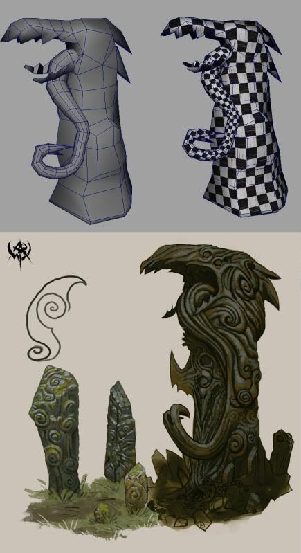
Back with another WAR project. Im doing this for a class assignment. The guidelines were to do a statue of sorts, such as a fountain lady with pouring vases, gargoyle, jumping fish, etc.. So instead of just doing a character model and just throwing a stone or bronze texture on it, im going to be sculpting a small monolith to the Raven God. (woot!) Here is the basemesh, about 2 hours in at the moment. I wanted to throw it up on PC before i take it into ZBrush so i can get and comments or helpful hints early. Only difficult part is i only have 1 pic of concept art, so im modeling off that. The proportions are a known issue, currently working on makeing them fit the concept more closely.
Cheers!
tzeentch.jpg

Replies

  • Havok
    Options
    Offline / Send Message
    Havok polycounter lvl 14
    Looks pretty good dude. Seems like the teeth (more noticably on the bottom set) could be a bit sharper and curved like they are in the concept. The swirly detail could make or break this piece so get 'em right!!!
  • JohnnySix
    Options
    Offline / Send Message
    JohnnySix polycounter lvl 16
    To keep it looking like stone, you should maybe follow the concept closer with the tongue and have it blend into the body more, if it was really stone ( even if it is evil black chaos magic stone ) the thin hanging tongue would likely snap off when being chiselled.

    Though just having typed all that and looked at the concept again, the base of the tongue is thin and curling upwards, so all that I just typed could be dismissed (if you weren't going for realim).

    2c
  • DarkNocturne2002
  • Pope Adam
    Options
    Offline / Send Message
    Pope Adam polycounter lvl 11
    Snout's a bit longer on yoru model than the concept. Alligator like, whereas the concept drawing is more eagle like. There's a small chunk on the lower right side of your model.. 4 quads that are extruded. Could probably ditch those since it's not in the concept and just have the outer topology of the cylinder match the silhouette instead.

    I took a couple minute and did a quickie version of the way I would lay out the topology as one piece instead of using two separate objects ofr this guy. The concept shows him clearly as one single piece of wood. Although the tongue does extrude at the bottom, it is completely connected otherwise throughout the body, and only implied - carved in - to the side once it extends past the jaws. Doing it like this would save tris, match the concept a lot better, and make the normal mapping process a whole lot easier.

    asaacopy.jpg

    forgive my discepencies around the jaw area. Concept shows a disconnected jaw where I didn't have time to model in the gap between the top and bottom - trying to illustrate the tongue

    Good start, however I reckon if you're going to follow a concept piece like this that you should do your absolute best to match how it looks in order to show that you are capable of very closely matching concept art.

    cheers
  • VikingJim
    Options
    Offline / Send Message
    Not really update worthy but what the hell. I just messed with the geo a bit to keep a more consistant form with the concept. UV'd too. Now into zizzle brizzle!
    01.jpg
  • JasonLavoie
    Options
    Offline / Send Message
    JasonLavoie polycounter lvl 18
    Do you use a custom checkerboard texture? Looks like drawn on marker (kinda looks cool).

    Anywho... I'm wondering why your branch / vine that is curling has more uv space then the trunk itself, since the trunk has more detail (and more pixel density).

    As for the shape, I like 2 better, the leafs seem to flow much better then number 1. (just the little curve is cool).

    Edit: Oops, didn't look at it long enough. I like the vine curl in number 1, but I like the top leafs in number 2 (both the very top and where the vine starts).
  • VikingJim
    Options
    Offline / Send Message
    yeah, custom checker of some fancy chess set. Its marbled. :)
    My origional z brush sculpt exploded, so i decided to re shape the mesh itself, heeding the suggestions and combinging the tounge bit along with the rest of the body, as well as fixin the shape of the beak. here is the sculpt as of now. There are some noisy bits to smooth out, but this is only like 1 hour in or so.
    1-3.jpg
  • wester
    Options
    Offline / Send Message
    wester polycounter lvl 13
    you should use this opportunity to really exercise your hand painted skills. This project could really come out good with a nice hand painted texture. It also falls pretty close to the idea behind the concept.

    unless you are strongly against it. good start though. the sculpt looks promising

    i'm sure it's a nice break from senior proj though ha.
  • VikingJim
    Options
    Offline / Send Message
    The Capture for this went remarkably smooth in all honesty. There is just a green film right now as the diffuse, letting then normal and cavity to the work. However the sculpt itself i feel suffers from the dreaded z blobbyness. Its suppose to be done tomorrow night, so I may resculpt it this evening or just rework it after its turned it.
    Have at it fellas!
    3.jpg
  • Orgoth02
    Options
    Offline / Send Message
    Orgoth02 polycounter lvl 9
  • VikingJim
    Options
    Offline / Send Message
    Orgoth, you're astute and impecable verbal prowess is unmatched by any mere mortal man.

    Anyway, added some swirls in the diffuse, it helps it out significantly i feel.
    3-1.jpg
  • GugloPWN
    Options
    Offline / Send Message
    In the concept it was a little top heavy and this model seems more grounded. Sides seem a little straight too. I kind of liked the pitted stoney look of the earlier grayscale texture.
  • Reverenddevil
    Options
    Offline / Send Message
    Reverenddevil polycounter lvl 9
    Hey man, the texture is killing your sculpt and normal info. What res texture are you using it looks like a 128 or maybe a 256, extremely blury and dirty feeling. I would just apply the normal and AO to the model and see how it looks and then a simple flat color to let the details shine through and the maps do their jobs.
Sign In or Register to comment.