Home 3D Art Showcase & Critiques

Sabretooth

polycounter lvl 15
Offline / Send Message
Firebert polycounter lvl 15
Still working on this for the GA Comicon Challenge, and wanted to get some much desired PC crit. Not really happy with how the texture is coming out, and i think i'm losing a lot of form in the back area especially so I plan on exaggerating some areas... still got a week left. Let me know your thoughts. oh and the blood right now needs major tweaking... kinda sorta really sucks atm.

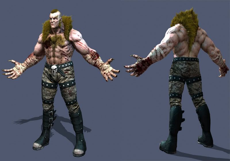
Lowres bake w/diffuse, spec, normal
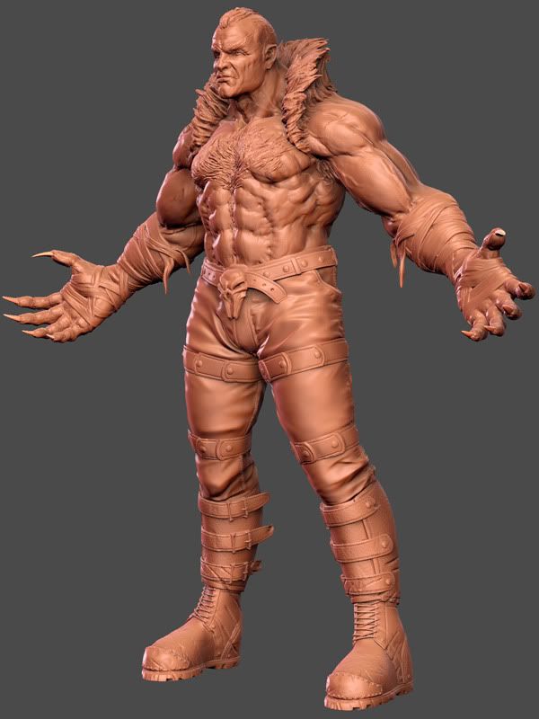
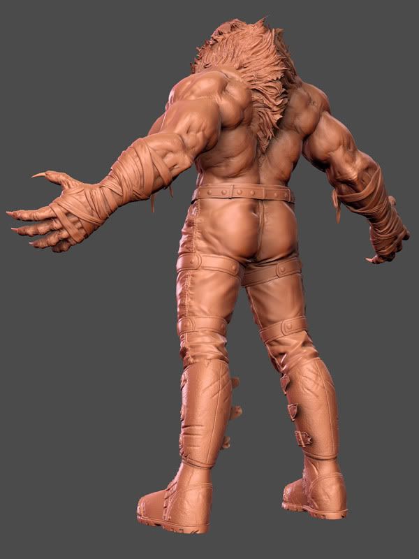
sabre081709.jpg

High res sculpts
sabertooth_final_front_LR.jpg
sabertooth_final_back_LR.jpg

Replies

  • jocose
    Options
    Offline / Send Message
    jocose polycounter lvl 11
    Maybe it's the lighting but the skin looks pretty white right now. Maybe it would help if you tanned him up a bit? Right now he kind of looks like a vampire.

    Oh, and btw, overall, this looks awesome.
  • Ged
    Options
    Offline / Send Message
    Ged interpolator
    the hair also looks a bit like the colour of baby pooh, a bit more blondeish would be cool
  • BradMyers82
    Options
    Offline / Send Message
    BradMyers82 interpolator
    yeah, I see what you mean about your texturing progress. Here are my crits:
    The camo designs (blobs) are too small. They just add noise atm, so scale them up.
    A lot of the edges are being lost. Did you do edgeing on the diffuse and spec? Even if you just ran the "find edges" trick in photoshop, this would help greatly.
    I agree, the skin is looking too blue and pale atm. Skin has a surprising amount of color variation. You could check out ancient pigs tutorial for some ideas: http://www.pig-brain.com/tut01/ap_facetut.pdf
    The blood itself looks good imo, but its placement does not. How did the blood get there? I would guess, he clawed at someone, so I would guess a lot of it would be on the hands (fingertips especially) and forarms. I'm not digging the really big patch of blood on his chest btw. But yeah, blood placement is really tricky.
    The hair needs more color variations, needs to be lighter and more desaturated I think. I'm not sure how you painted it, but save most of the brighter colors for the specular and leave the diffuse much darker, like Tyler shows here: http://www.tylersart.com/thor.html
    Everything you have done with this character has been great so far. Don't worry, the textures will develop. A few changes, tweaking, and adding subtle details can make all the difference in the world. Good luck!
  • boyluya
    Options
    Offline / Send Message
    boyluya polycounter lvl 10
    I agree with BradMyers82 about the the camo designs. Maybe you could make it bigger cause from afar it looks like dirt. But still, awesome entry for the comicon.
  • VikingJim
    Options
    Offline / Send Message
    Kick ass, Sabertooth > Wolvie.

    One thing though, the tops of his hands are far more bloody than his palms, and if he is scratching people like a giant kitty, his nails, fingers and palms would be a bit more saturated with the fluids of the unfortunate. The sculpt however is superb sir.
    However i do suggest Big ol' chops or a big ol' handlebar moustache.
    Great work!
  • PureWall
    Options
    Offline / Send Message
    looks awesome, i like what you did with him. I would put some blood on those steel toes, i would be kickin' in faces. sculpt looks really good, the hair turned out really well. i agree about the cameo, i thought i was dirt till i read that.
  • Firebert
    Options
    Offline / Send Message
    Firebert polycounter lvl 15
    screenshot1.jpg
    _____________________________________________________________

    jocose: yeah dude, this was all in MR, and i don't know what it is, and in all my years of working in maya, i have never understood some certain things about how it handles the camera because if you compare this update with the one i posted yesterday, the focal length is diffinetley different. anyway, that's neither here nor there... just ranting... but yeah man! i totally agree about the vampire-ism... it's slowly getting better.... thanks though man... i'm glad you like em!

    Ged: hopefully this is a little more on track... i agree, too orange-yellow-rusty before

    BradMyers82: thanks for all the tips and great crit brad! i took a lot of what you said to heart and made some changes. i'm still not done with the skin, but i'm glad you decided to throw in your two cents dude. :)

    boyluya: i hope the came pops a little more now... you are so right... very dirty looking before.

    VikingJim: dude! that would be awesome! i am so going to do that today... i'm glad you pointed that out with the bloody kitty palms :P don't think i'll have time for the mutton/mustache idea, although i agree, i should have done that... still gotta pose and do the layouts and i'm leaving town before the deadline, so i don't have a lot of time left

    PureWall: yeah dude, i'll toss some blood on those boots... smart thinkin' :)
  • dur23
    Options
    Offline / Send Message
    dur23 polycounter lvl 19
    Marmo Render looks way better.

    A couple things that are bothering me.
    1: No back pockets!
    2: Belt buckle needs to be casting some nice ao shadows on the pants.
    3: In the sculpt you have little bits of cloth dangling from his forarms. Put them in the low!
    4: This one is totally just an opinion, but i think the pants should be a little baggier around the straps, better silhouette, ya know?
  • n88tr
    Options
    Offline / Send Message
    His forehead looks too big. I remember him from the movie not having such a huge forehead. I could be wrong though.

    His forearms and biceps look too big. Make his chest bigger to even out his huge upper body.

    Looks great so far!!
  • LEViATHAN
    Options
    Offline / Send Message
    LEViATHAN polycounter lvl 11
    The bare areas are covered in blood spatters and grime, yet his pants and boots are so very clean. The hair might be too green, but I don't know how accurate it is compared to the movie.
  • Firebert
    Options
    Offline / Send Message
    Firebert polycounter lvl 15
    thanks for the replies guys. dur, i took all your comments and tried to work them in... still working on presentation shots and playing with some poses over the weekend.
    oh and i tried to keep the blood to an absolute minimum... it was just too over the top man....
    presentation_sabretooth.jpg
  • MoP
    Options
    Offline / Send Message
    MoP polycounter lvl 18
    Not bad!
    The highpoly looks awesome to me.

    You seem to have lost a little of that awesome in the texturing process - his flesh right now looks really red to me, like he's sunburnt... also the specular is way too strong, it looks more like plastic than flesh.
    The fur looks too yellow/green, it should be more in line with his skin tone, you should unify that stuff to make it more cohesive and contrast better with the cloth. Right now it looks like he's wearing some sort of fur collar instead of it actually growing out of him.

    Also the colour of the bandages around his hands looks really weird, like it's packing tape or something, if it's meant to be medical bandaging it should be lighter and more matte (less specular) - I think this would contrast better with his skin anyway.
  • dejawolf
    Options
    Offline / Send Message
    dejawolf polycounter lvl 18
    MoP wrote: »
    Not bad!
    The highpoly looks awesome to me.

    You seem to have lost a little of that awesome in the texturing process - his flesh right now looks really red to me, like he's sunburnt... also the specular is way too strong, it looks more like plastic than flesh.
    The fur looks too yellow/green, it should be more in line with his skin tone, you should unify that stuff to make it more cohesive and contrast better with the cloth. Right now it looks like he's wearing some sort of fur collar instead of it actually growing out of him.

    Also the colour of the bandages around his hands looks really weird, like it's packing tape or something, if it's meant to be medical bandaging it should be lighter and more matte (less specular) - I think this would contrast better with his skin anyway.

    yes, fully agree with the skin tone/fur colour. it needs some adjustments.

    something like this:

    skintoned.jpg
  • BradMyers82
    Options
    Offline / Send Message
    BradMyers82 interpolator
    Firebert: Nice progress! That adjustment dejawolf made is spot on I think. If you can get it looking just like that, you would be golden. It really makes a big difference. You have a few more days until comicon is over, and I can't wait to see the final product!
  • whats_true
    Options
    Offline / Send Message
    whats_true polycounter lvl 15
    He seems kinda greasy all over. And for someone that is wading through snow, the bottom of his boots dont show it as well. .
  • Firebert
    Options
    Offline / Send Message
    Firebert polycounter lvl 15
    thanks for the crit guys... i made some adjustments, but i haven't made any more marmo renders... that'll take no time flat anyway.... ALOT of the redness from the that last update isfrom the skin shader in marmo... if i switch it to phong, it looks way different. same goes for the spec... so i need to adjust that as well with the sliders......

    whats_true... do you have some suggestions for what you are talking about? are you referring to the texture on the boots and how it relates to the pedestal or how the position of his feet on the pedestal don't feel sunken in snow?

    since i got in from work, i have been messing with poses and making texture adjustments. this is what i have in mind for my beauty shot.... still very WIP
    sabrecover1.jpg
  • whats_true
    Options
    Offline / Send Message
    whats_true polycounter lvl 15
    Yeah, that's what I was referring to. Treading in the snow, he would have some type of mud or residue caked onto it more. If its not a standard for him but a all around texture, then never mind me.
  • Super
    Options
    Offline / Send Message
    Super polycounter lvl 18
    It's a solid peice of course, but the anatomy is so weird. It seems all too common with game characters nowdays. There are random bumps and holes.. necrotizing fasciitis maybe?

    I guess he's a mutant though.. *shrug*.
  • Firebert
    Options
    Offline / Send Message
    Firebert polycounter lvl 15
    still working on it, but i think this is getting closer to what i'm going for in the beauty shot. let me know if it's way out of control, etc. etc.
    sabrecover1-1.jpg?t=1251566614

    whats_true... thanks man... i hear ya now... i did think about making his boots covered in snow, but since it is only a pedestal, i didn't think it would be too sound to build it into the texture... and i didn't want to cover his boots in a lot of mud and make him totally dirty... just in a few spots.... i would work the snow into the pedestal shot, but since the rules don't want you to mess with this image other than level type adjustments, i think i may just try to make his boots feel a little more sunken into what is the snow on the rock since you brought up a good point of his relation to the pedestal :)

    Super.... yeah... all just style preference really. if i was making something a little more along the lines of like colossus, hulk, thor, any big buff character, i would lessen that type of look, but since he's a crazy killing machine, i wanted his anatomy to look a certain way with the basic forms but all kind of weird stuff happening. i dunno, we'll see what happens with the judging... besides, there's no hope of coming anywhere close to faraz mobin's entry... he's got that shit in the bag
  • Sage
    Options
    Offline / Send Message
    Sage polycounter lvl 19
    His hair looks green instead of blond. It might help to shift the diffuse to a more brown tone. Leave the spec color as is and see how the two look together.
  • Firebert
    Options
    Offline / Send Message
    Firebert polycounter lvl 15
    welp... finals have been submitted. thanks for the help guys. time to revamp my portfolio and get back to work on the quake marine.


    PRESENTATION SHOT
    41-game-3d-art-4477-1251737485-image.jpg

    CONSTRUCTION SHOT
    41-game-3d-art-4477-1251608694-image.jpg

    TEXTURE SHEETS
    41-game-3d-art-4477-1251686612-image.jpg

    REFERENCE SHEET
    41-game-3d-art-4477-1251686632-image.jpg
  • farazmobin
    Options
    Offline / Send Message
    dude.the final is looking really great, congratz on a great finish dude.
  • JasonLavoie
    Options
    Offline / Send Message
    JasonLavoie polycounter lvl 18
    No offence firebert, but that beauty shot looks pretty "meh"... everything else looks fricken awesome, but man, that whole radial blur thing and all that noise in that one shot, I recommend you either drop that shot completely, or re-do it... because it is REALLY killing the overall quality of this piece.
  • Firebert
    Options
    Offline / Send Message
    Firebert polycounter lvl 15
    jason, you are so right man... i am going to revise it later... not very "beauty" like :poly124:

    edit: awww snap... i'm a polygon... :baby:

    edit, edit: bah, i just deleted it... it was just flatout bad
  • killingpeople
    Options
    Offline / Send Message
    killingpeople polycounter lvl 18
    his eyes are too white!
Sign In or Register to comment.