Home 3D Art Showcase & Critiques

Hallway Texturing Practice

polycounter lvl 11
Offline / Send Message
Wiktor polycounter lvl 11
Hi!
I've been in a real art lump lately, so I decided to go back and practise some more basic modeling and try a new approach on texturing.
I checked out racer's amazing (!) metal prop texturing tutorial over at: http://vimeo.com/3779494
Seriously, if you feel like you could improve your texturing, check it out! He goes over some really interesting techniques that I hadn't thought about before, and it's entertaining to watch. :)

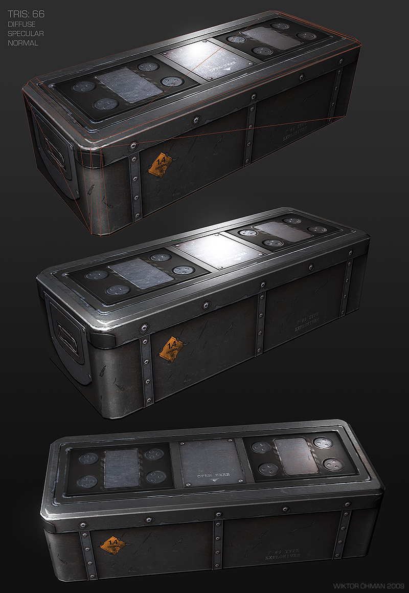
This is how it turned out:
Military_Crate_by_beere.jpg

Then I decided to keep working on this theme and make an entire hallway.
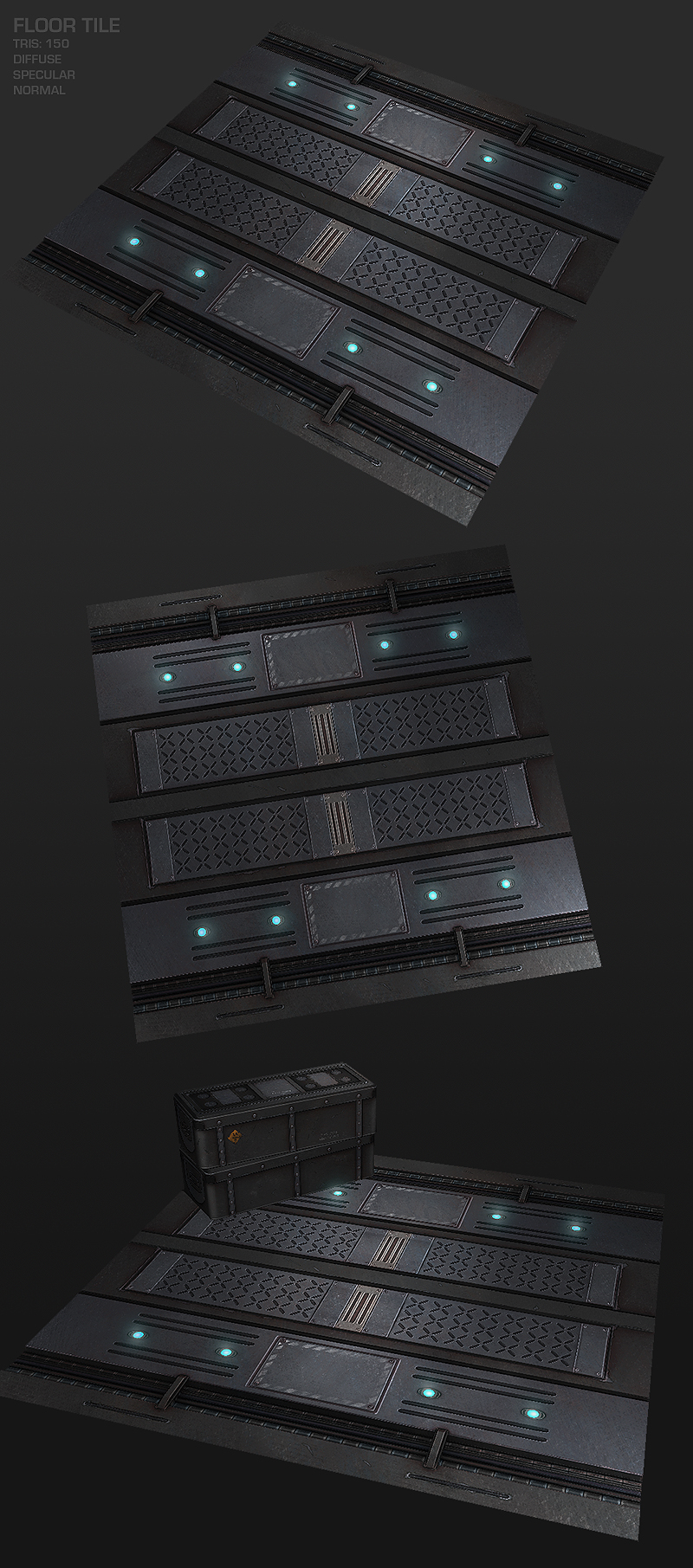
Right now I have 1 tile of the floor done, and this is what it looks like:
Military_Floor_by_beere.jpg
This floor was heavily inspired by Ben Bolton's (http://www.benbolton.com/) style.

I feel this was a good thing to do, because I felt I was getting stuck in my old style, which I had some problems with. And thanks to this practise, I'm getting a lot more comfortable with hand paiting my textures.

I hope you'll like what I have so far, and I'm looking forward to come crits! :)

Replies

  • [HP]
    Options
    Offline / Send Message
    [HP] polycounter lvl 13
    I like the crate, but I guess the scratches are a bit exaggerated, also you used too much stroke. like the stroke is totally black, when it should be sort of a transition of the two materials, to give the feeling of wearing of. On the other hand, it kinda gives it a peculiar style that I end up enjoy to look at, clean and sci-fi style.

    I don't really like the floor texture tho, neither I liked Ben Bolton's one. Also, it's not somewhere where I'd like to walk either, I would probably slip and fall at my second step, way too much stuff going on.

    So, having said that, It's some pretty cool stuff! I always dig your stuff and style Disting, you're one of my fav artists around here! :) Keep up
  • Wiktor
    Options
    Offline / Send Message
    Wiktor polycounter lvl 11
    [HP] wrote: »
    I like the crate, but I guess the scratches are a bit exaggerated, also you used too much stroke. like the stroke is totally black, when it should be sort of a transition of the two materials, to give the feeling of wearing of. On the other hand, it kinda gives it a peculiar style that I end up enjoy to look at, clean and sci-fi style.

    I don't really like the floor texture tho, neither I liked Ben Bolton's one. Also, it's not somewhere where I'd like to walk either, I would probably slip and fall at my second step, way too much stuff going on.

    So, having said that, It's some pretty cool stuff! I always dig your stuff and style Disting, you're one of my fav artists around here! :) Keep up

    Thank you very much HP! Those are some very kind words! :)

    About the floor, yes, I got those comments from other people as well. That's why I decided to make another tile that's a lot more clean and simple which will be the main tile, and then this really detailed tile will show up every 5 or 6 tiles. I think that'll make it look interesting. :)

    About the stroke. Yeah, I tried a bunch of stuff, but this is what looked the best of what I tried. I'm glad you like how it turned out though, even if it doesn't look totally realistic.
  • SHEPEIRO
    Options
    Offline / Send Message
    SHEPEIRO polycounter lvl 17
    the issue i have with the crates scrathes is that the edges are too dark, let the material differences and normal map do the work
  • dactilardesign
    Options
    Offline / Send Message
    dactilardesign polycounter lvl 10
    A part os shepeiro crit, I think that the textures are great.
    Good job.
  • P442
    Options
    Offline / Send Message
    P442 polycounter lvl 8
    The crate to me looks cool, like it should be in the new Prince of Persia game from last year. The floor tile look pretty good too. I would probably even make it cleaner (less scratches) if you plan on it being a generic tile. But dude, why is is your floor tile 150 tris?
  • Wiktor
    Options
    Offline / Send Message
    Wiktor polycounter lvl 11
    P442 wrote: »
    The crate to me looks cool, like it should be in the new Prince of Persia game from last year. The floor tile look pretty good too. I would probably even make it cleaner (less scratches) if you plan on it being a generic tile. But dude, why is is your floor tile 150 tris?

    Thanks man!
    I might reduce the scratches a bit as you suggest. Thanks! :)
    There are some height differences that aren't seen very well from those angles, but it'll be visible when running around in the hallway.
  • ElysiumGX
    Options
    Offline / Send Message
    ElysiumGX polycounter lvl 18
    I like this style. Nice work.
  • gamedev
    Options
    Offline / Send Message
    gamedev polycounter lvl 12
    My only feedback on the crate would be to darken / add dirt to the base of it so it blends better w/ the ground. Its quite a hard transition right now.

    Cheers,

    Tyler
  • JasonLavoie
    Options
    Offline / Send Message
    JasonLavoie polycounter lvl 18
    Yuh man, I'll be using reacer's tut shortly as well. Your work so far came out great though, really looking forward to what you're going to do for the walls.

    Keep it up!
  • Wiktor
    Options
    Offline / Send Message
    Wiktor polycounter lvl 11
    Thank you all for your crits so far!
    Right now I'm texturing the 2nd tile that'll break up the intensity of the floor, and then I'll start working on the walls.
  • Wiktor
    Options
    Offline / Send Message
    Wiktor polycounter lvl 11
    Second tile.
    What do you think?

    291geo5.jpg
  • Bad Spleen
    Options
    Offline / Send Message
    Hey Disting,
    That is good quality work, very clean and precise with a nice choice of palette. I do however, have some suggestions.

    -The texture looks a little too precise. As though you made the texture in photoshop using layer blending style, and copying and pasting of patterns (the crosses for example) I would add some extrememly subtle variations to the texture, perhaps slightly offsetting some of the crosses, or have some noise along the straght lines.

    - What sort of texture sizes are you using? Though you could argue that todays game engines can easily handle large texture sizes, they are often used on "high importance" objects in games, such as characters. For environments, its better practice to use more polygons, if it allows you to use less textures. The box you made is 66 tris, and the top of the box is one large texture it seems, even though the texture is symetrical on top. This could be achieved using half the texture, UV'd onto two polys. This would mean sacrificing the "open here" on the box, however this detail is so minor, that it will have little impact on the overall look of the object. I mean heck, add an 8 poly handle to the box to add more details, these would be details that would change the sillouette (spelling?) of the object and add more intrest.
    The same could be said for the floor tile. The texture is in strips, you could easily split the poly into 2 or more strips, and mirror the details.

    I don't know whether or not you are in the industry, but these are the sort of practices that benefit the entire game you may be working on (being more efficient wherever possible) and if you're not in the industry, showing the knowledge that you understand the requirements of a game, is more appealing to a potential employee, than just photoshop skills.

    Keep up the good work.

    Adam
  • Joshflighter
    Options
    Offline / Send Message
    Joshflighter polycounter lvl 9
    I like how it doesn't seem to be too repetitive but yet, it still has that really interesting feel to it. :)
  • Wiktor
    Options
    Offline / Send Message
    Wiktor polycounter lvl 11
    Update:
    mrtvlw.jpg

    @Joshflighter: Thank you very much. :)
  • fearian
    Options
    Offline / Send Message
    fearian greentooth
    I'm liking this alot! how much of the floor is mesh and how much is normal/displacement maps? I'm guessing the ridges over the wires are mesh at least.
  • carlo_c
    Options
    Offline / Send Message
    Thats looking really good so far. Nice clean texturing, what size maps are you using?

    I would say at this stage maybe to start thinking about ideas to break up the grey colour palette or it might end up as a scene quite grey. I've made that mistake myself hehe.
  • P442
    Options
    Offline / Send Message
    P442 polycounter lvl 8
    Looks good. Like Carlo_C suggests, breaking it up would add interest. I would just use decals saying "TO HANGAR BAY" or some stuff like that. You could also add powerboxes or surveillance cameras/turrets; junk like that.

    BUT, since your goal is texture practice, I think you've already accomplished what you set out to do.
  • Wiktor
    Options
    Offline / Send Message
    Wiktor polycounter lvl 11
    @fearian: Thank you! There's not much detail on the lowpoly floor mesh. The only detail is the sink where the cables are, and the ridges over it.

    @carlo_c: Cheers! I'm using 2048 at while I'm working on 'em, but will downsize to 1024 when putting them in the engine, hopefully.

    @P442: Thanks! Yeah, I will start adding decals once I have the ceiling made. Thought I'd have cables hanging from the ceiling and signs on the walls etc.
  • crazyfingers
    Options
    Offline / Send Message
    crazyfingers polycounter lvl 10
    be nice to see a faint bluish glow around the lights, you could even just bake it into the texture to save resources.

    You might want to make the metal with the cross hatches on the floor loop all the way across your texture. Right now it looks like you'd have to "hop" across the floor for traction and it's a little too busy for a floor.

    There sure are a lot of lines that all go to the same vantage point. An arch-like shape on the walls or slanted lines would do a lot to break up your scene a little bit, although i do like the overall design and detail flow. Don't change much, just a hint of non-rectangular shape would add a lot.

    That said it looks very nice. Clean and techy, dig it. This is definitely the kind of stuff i could see going into a current gen game btw.
  • Wiktor
    Options
    Offline / Send Message
    Wiktor polycounter lvl 11
    be nice to see a faint bluish glow around the lights, you could even just bake it into the texture to save resources.

    You might want to make the metal with the cross hatches on the floor loop all the way across your texture. Right now it looks like you'd have to "hop" across the floor for traction and it's a little too busy for a floor.

    There sure are a lot of lines that all go to the same vantage point. An arch-like shape on the walls or slanted lines would do a lot to break up your scene a little bit, although i do like the overall design and detail flow. Don't change much, just a hint of non-rectangular shape would add a lot.

    That said it looks very nice. Clean and techy, dig it. This is definitely the kind of stuff i could see going into a current gen game btw.

    Thank you very much for the crits. I did as you said, and made the ceiling curved. A bit archy.
    I hope you like it so far. This is just an undetailed test btw.
    1evtk1.jpg
  • SHEPEIRO
    Options
    Offline / Send Message
    SHEPEIRO polycounter lvl 17
    very nice, for a full environment i would suggest making a structural support to add every two sections, and a corner peice so that you can T junction each end, I would leave major colour variation up to lighting cant wait to see more
  • Wiktor
    Options
    Offline / Send Message
    Wiktor polycounter lvl 11
    SHEPEIRO wrote: »
    very nice, for a full environment i would suggest making a structural support to add every two sections, and a corner peice so that you can T junction each end, I would leave major colour variation up to lighting cant wait to see more

    The structural supports would be separate objects, you mean?
    Oh yeah, I'll definately make a corner piece and also a door.
  • c0ldhands
    Options
    Offline / Send Message
    c0ldhands polycounter lvl 15
    nice to see new stuff from you Wiktor! it turns out to be a great hallway. Only comment would be that the walls look to much like the floor. Keep up the good work!
  • fearian
    Options
    Offline / Send Message
    fearian greentooth
    Nhow I see the ceiling in place I can see a scene coming out of this! Add in those crates you had, some wires and other scifi fillers...
  • tarickTDS
    Options
    Offline / Send Message
    Like this stuff, very dark and futuristic looking, nice palate :poly124:
  • Acid_
    Options
    Offline / Send Message
    Looking forward to seeing this completed, really a good update on your old texture work. You too are one of my favorite artists :D.
  • Wiktor
    Options
    Offline / Send Message
    Wiktor polycounter lvl 11
    Thank you guys! I really appreciate your kind words. :)

    I began texturing the ceiling today, and I'll hopefully have an update later today.
  • Wiktor
    Options
    Offline / Send Message
    Wiktor polycounter lvl 11
    This is the ceiling so far.
    Having some tiling errors though.
    j17osw.jpg
  • crazyfingers
    Options
    Offline / Send Message
    crazyfingers polycounter lvl 10
    Looks good, I kinda figured the big squares would be lights though...

    3912-Maple-Ceiling-Light-Crown-Molding.jpg

    But it's your scene dude, not sure what light source you have in mind, making those squares lights seems like it would be simple and effective though if you haven't considered it already. Good luck with the rest.
  • JasonLavoie
    Options
    Offline / Send Message
    JasonLavoie polycounter lvl 18
    I think having those squares as lights would be too over-powering for the scene, so far it seems more ominous then that.

    Disting, maybe quickly try and export the ceiling model / texture into Crysis and see how the normals react in there, I know sometimes maya (for me personal) can play some havok on how it displays normals sometimes.

    Dumb question, but does the edge of your normal map have any indications that it dips down (if that makes any sense), maybe that would be causing the tiling issue.

    Either way, great work man, saving these into my inspiration folder. Nice, clean, futuristic work.
  • Wiktor
    Options
    Offline / Send Message
    Wiktor polycounter lvl 11
    Thank you for the idea crazyfingers. I tried it, but it turned out to be over-powering for the scene, just like Jason Lavoie said.

    I managed to fix the normal map issue. Was a quick fix in photoshop. :)

    Here's the update. Not much difference, but I hope you like it!

    2mx1u7l.jpg
  • ParoXum
    Options
    Offline / Send Message
    ParoXum polycounter lvl 9
    Nice work !

    I'm curious about the little blue lights' sort of reflection on the floor, how did you make it ? PS ?
  • Wiktor
    Options
    Offline / Send Message
    Wiktor polycounter lvl 11
    Thank you!
    They're just blue-ish lights in Maya. :)
  • mLichy
    Options
    Offline / Send Message
    Very cool stuff. I like your texture work alot, although it looks like there is too much spec painted into the diffuse? Either way, I like the style. Thanks for the tut too.
  • beartraps
    Options
    Offline / Send Message
    beartraps polycounter lvl 8
    Looks pretty badass, itd be cool to have some bloom or fog where the lights are on the floor to give some atmosphere.
  • TychoVII
    Options
    Offline / Send Message
    TychoVII polycounter lvl 13
    Perhaps make every other panels a light, or every 5 panels.
  • Thegodzero
    Options
    Offline / Send Message
    Thegodzero polycounter lvl 18
    Why is the paint chipped... on the ceiling? Always ask yourself why your doing something like chipping off paint. If its sticking out all on its own hell yeah it would be chipped, but if its 6 ft up and sticks out a centimeter id say the chances of being chipped would be VERY low. By doing shit like this you help tell the history of the space better.

    Where is the main scene light coming from? Where would be the best place to have it come from to make it more dynamic?

    Mlichy is rite on with the spec in your diffuse, once you get the main scene lights in it will look really weird might as well nip it in the but now.
  • killingpeople
    Options
    Offline / Send Message
    killingpeople polycounter lvl 18
    Thegodzero wrote: »
    Why is the paint chipped... on the ceiling?

    so he can reuse the texture as a floor or wall! :poly142: (i dunno)
  • Joshflighter
    Options
    Offline / Send Message
    Joshflighter polycounter lvl 9
    Wow, puts my modeling to shame. It turned out beautiful! Good job!
  • imb3nt
    Options
    Offline / Send Message
    imb3nt polycounter lvl 14
    so he can reuse the texture as a floor or wall! :poly142: (i dunno)

    Dancing on the ceiling at zero gravity.

    Thats what i think.
Sign In or Register to comment.