Asset Development
polycounter lvl 9
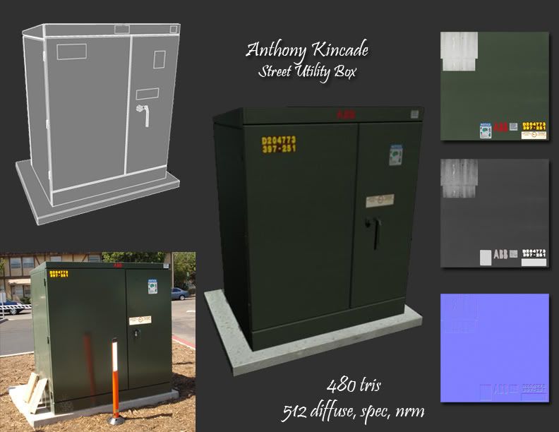
Been working on one prop every class. We have about 3 hours to start from a concept image and recreate the main item from the scene with some guidelines. Max tris 1500. Max tex 512 x 512.
In this case we had a choice between some street utility boxes. Here is what I got in the given time.
Any c & c welcome
In this case we had a choice between some street utility boxes. Here is what I got in the given time.
Any c & c welcome
Replies
The normal map looks like you just ran your diffuse through the photoshop filter. It isn't bad to use the filter but you have to determine which parts of the texture need to be normal mapped. Right now i don't see enough details to justify a normal map or a spec map. If the box had some more wear on it there might be some more detail to show and push in a specular map or normal map.
To fix the blurry textures if your working in maya each texture has a filter applied to it by default when you bring them in so under the file attributes for the texture there's a Filter type which you should turn to off. Also under your render settings you can make adjustments to get a clearer sharper image by upping your Anti-Aliasing quality and changing your Multi-Pixel Filtering to Lanczos should give you some crisp results.
If your using Max in your render settings under the Renderer tab there's Antialiasing change the filter to Catmull-Rom and this should give you better results as well.
Hope that helps good luck.
- Wilex - Thx as well. If I looked at this image I would normally say, yeah this doesn't need too much normal for the fact that the box was so clean. There was quite a few choices where the normals would have been really important so it was mandatory to have them all in there for each piece. As for the spec, it was givng me a tough time getting to look right. I think I need to darken most of the spec except the brighter stickers.
Good to know that stuff about the blurry textures. I use Maya a lot and I'll make sure to remember to change that stuff next time I bring in some textures. I don't use Max that often but also good to know.
Thx for the advice and comments.
You can probably lower it down some more by making a really low poly cube sticking it over top of your current model and then transfer map the normals to get rid of all the excess loops making the doors and cracks.
Also I'd throw some dirt down on the bottom left corner and on the side like in the reference and recheck that placement/size of the serial codes on the upper left side. but that's only if you're getting nit picky
Speed can make all the difference when in the work place, some studios work on really tight schedules so 3 hours from start to finish is a nice guide from what I've heard. I could be wrong though.
Not too bad, like others have stated the normals/spec could use some love but I think that comes from lack of any real interest in the ref image. It's just kinda boring. Something like this would benefit from just doing another pass on the texture/model and adding some character to it, graffiti/mud/grime/dents/scratches, which would give you a lot more info to use in your spec/normal; not to mention strengthening the overall piece in the process.
Hell, with a bit of love and some ingenuity you could probably find a spot for it inside of your warehouse.
-Mark
Don't mean to hijack your thread Anthony ol' buddy, but to pitch in my 2 cents, you modeled accurately to the photo but you can always push more of that for entertainment value. Subtle details such as stains, chippings, even paint can tell a story, or like Mark said, Grafitti.
Here's the box I did for Emers class as well, I decided to throw white paint on the outer box and chip it, making it look worn.
This stuff is good practice, and you're headed in the right direction. I'd say if you run out of time, don't worry just go back into it later. It's better to spend more time and nail the texturing, etc down instead of leaving something halfway done. Keep it up!
- mark - Yeah you missed this one. I'm sure he'll let you make it up. There was quite a few "good story" type images but I wanted to make sure I picked one that someone else was not using. Not sure if I can use it for the warehouse because it's really made for outdoors, but I'll keep it mind. Could make for a cool thing to grind on from off a ledge or something.
- kaburan - Yep. Good ol' Emer happy fun time.
Thanks for the advice and comments. Much appreciated.
Here is what I have so far. w.i.p....
Here is the concept I'm working from...
C & C welcome as always.
C & C welcome.
Here the concept that I have picked. If I'm not mistaken it is a High Elf weapon from Warhammer.
the electrical box looks good. I would add some subtle dirt on the bottom of it. and for stuff thats made out of sheet metal like this, i usually overlay a subtle normal map to get large dents out of it. I dont know if its a secret or not, but ill post it anyway, i use like a normal map that was made from an actual tin baking tray or something. Its good for that kind of stuff because it has large dents as well as small dents so it has a good frequency of details. and it will always help with sheet metal stuff like yours because it will catch the light better.
anyway. I wouldnt chip SO much paint off of it. A lot of people do that, and it makes it look very gamey. I used to do that a lot, i still do sometimes. But, in moderation its good, just dont go over the top with it and chip and scratch every edge.
the medical cart looks weird because ive never seen anything like that before. Id imagine it would be made of plastic though, not metal. and its too noisy and scratched up. its just a personal thing, but i hate when people throw blood on stuff, i dont know, its just me.
but yea, you should really consider using some kind of game engine that uses spec/reflections because its not showing up at all in your renders, plus your render (for the medical cart at least) is coming out reeeeally blurry like youre not using any filtering. try marmoset.
as for modelwise, you have some loops that serve no purpose really. like on the medical cart, you have 3 loops going at a 45 angle near the top and 3 loops going horizontal near the middle. really, you only need 2 loops. that woudl cut down the count by a lot and you would not notice the difference.
this 3 hour thing sounds interesting, but dont limit yourself if you dont finish, finish it later at home or something.
for metals, make the diffuse rather dark. and let the spec/reflection do the work. this is where youd really need to use a renderer that uses the spec well.
good luck on the axe thing, looks cool.
you're using full normal maps.. but only for very small details(scratches and bumpyness)
you're missing out some really good uses for normal maps. the cart's wheels, diamond plating, slits in what would be the working area
that street utility box is in essence a box. you could probably get away with making it 12 polies + normal map... mirrors edge got away with it anyway >_>
secondly the presentation could use some work
the rendered images are rather blurry.. the cart rendered at this size can have every onscreen pixel be a real pixel (the render is about 512 pixels high and your texture is 2x that)
if you're doing work for a single project it might also be wise to get some sort of base layout for the presentation images like for instance these 2 images:
http://www.dark-winter-studios.com/images/rufus/rufus1.jpg
http://www.dark-winter-studios.com/images/kolt/kolt2.jpg
my advice would be to do one model slower this time, and try to get it as perfect as possible in a reasonable amount of time, instead of getting something done as fast as possible and it turning out kind of meh.
doing things fast will happen, but if you try to force it you might end up with some really bad habits of cutting corners where you shouldn't
- renderhjs - Glad you think the modeling is at least ok. Yeah I'm pretty bad with texturing, lighting, etc. Trying new methods and having a hard time getting stuff to look right. Never really thought of it being plastic but now I'm sure that would've been a better choice.
- sir Howard III - Yeah thanks to Wilex I now know why my stuff is turning out so blurry. Not only could I render out larger and bring down, also I need to turn some filters off when I applly my textures. I now know where this is located and will continue to put it into practice to get crisper textures. Also need to figure that Marmoset thing out to get some better renders.
- snader - Believe me I'm not trying to cut corners. I'm limited on time and my skill and efficiency level are not quite where I would like them to be at this time. I am definetly reflecting on what I've been doing and what is and is not working. I see what your saying about missing out on the good uses for the normal maps. Will attempt in future projects.
Thanks everyone for the comments and suggestions. I will do my best to immplement these things with this next project and see if I can get a better result. I appreciate the time and the help.
C & C welcome.
Think we can get some shots at different angles?
I would like to see it rotated as well.
matches the concept pretty decently, just need to work on sharpening up the textures and getting your various maps working well with each other.
- Quokimbo - yeah I'll post some different shots when I get home from class tonight.
- PixelMaster - the textures are at 512. I will go back and add more in the spec and diffuse.
Thx for the comments and advice.
Here is what I have so far on the model. 1024 textures and the tri limit is 2000. Sitting around 1500 tris atm. Will post some updates on the textures soon.
c & c welcome.
- Rick.
I don't think you've modeled the top of the trash bucket accurately from the photo reference, speicifically that top part where it's like an extruded square shape that bevels back inside. The photo shows it being a little rounder and not so deep of a bevel. You c an see the hsape of it on the yellow trash can from the inside of the bottom of the lid.
One other small thing is the handles. The ones you've modeled are just attatched to the top, but the photo shows a small indent in the lid beneath them that would be pretty easy to model in and wouldn't take many poly's if you removed some of those loops from the wheels, u can still keep your tri count low.l
I think that the bottom of the can tapers a bit too drastically in your model. In the photo they are a little more striaght up and down with a very slight taper.
off to a good start sir
- Rhinokey - I get what your saying about the stickers. Makes sense.
- RickFX - I had lower poly wheels before hand and changed my mind to go higher. I'll switch them back.
- Sir Williams - I see what your saying about the taper. Will make it more straight up. I'll add those indents under the handle once I switch out them wheels. I didn't really look at the underside of the yellow one. That helps me understand it a little better. Good idea.
Thx for the advice and comments. Will add these updates and post some texture shots soon.
Had to turn this in today. Got as close as I could. Could be better but I think it'll do for now.
C & C welcome. Thanks again for the advice.
right now they look very very similar to the photo reference (most likely this was your goal, and good job) but I think you could revisit these cans and add your own character to them with grunges, duct tapes, dents, sun damage etc to make them more your own.
good work anthony
Thanks again for the help. Much appreciated man.
Did you model the hole in the top or just paint black?
What about adding some horiz loops and bulging them out a bit?
You could probably do away with the axle if you moved the wheels closer to the bin.
If you look at your ref you can clearly see it. It's like the one thing seperating them. GL
E
Yeah, you should also lower whatever plastic texture you've got going on on these areas. Like the spongy esque thing you find on the trash can.
- stimpack- Will address with new spec.
- Adam - I see what you guys getting at. Make a more gradual transition. Its too tight/compact right now. I will change when I update that spec.
Thanks for the advice and comments. Much appreciated. Will update soon.