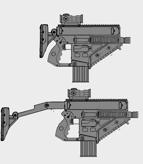
nice, Im digging the compact triangular shape. Is that a flashlight or something at the end with the barrel inside the top part? is the barrel the obvious bit on the end?
liking the rest that slides in/out instead of folding, just make sure there's a good way of securing it in that position because there'll be a lot of force in it..
not so sure about the compact mode, there seems to be little space for the thumb, maybe make the rest horizontal instead of vertical when collapsed
and a teensy nitpick.. im not thinking the round grip fits the straight angles of the rest..
that would probabyl be classed more as a micro assault rifle than a sub machinegun. The magazine is very long (front to back) indicating a long round.
If you want technical crits, the way it is, when the bolt retracts it would be stopped by the trigger group. The trigger group has to be dropped below the bolt's path or the whole thing needs to be made longer (if you want it to be able to plausibly operate)
outside of that youve got some details whose purpouse is unclear, but if its for aesthetics then yeah.
Yeah, a stock like that would usually be straight, only if you did that it wouldn't be in line with the barrel so it wouldn't perform too well irl. A little redesign might be in order
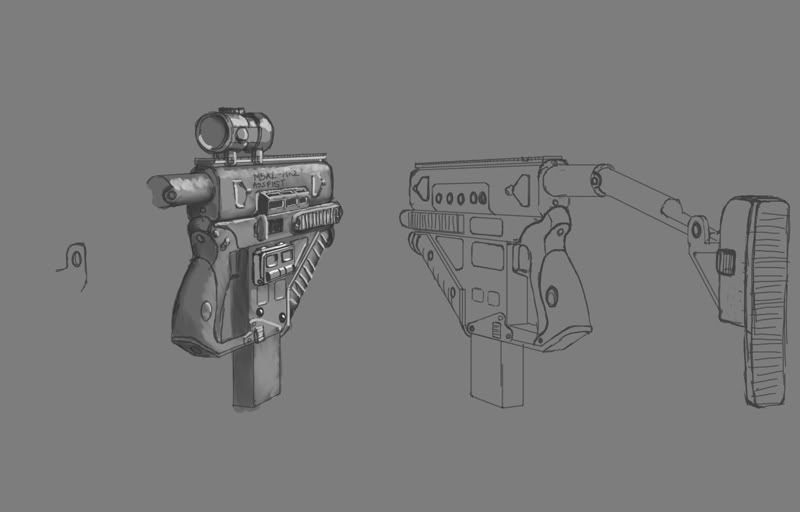
here's the next butt stock iteration. The triangular piece is a cheek rest that will pop down into the bar. I'm imagining that the whole butt stock will spring out into place at the push of a button. kind of like the guns in mass effect.
I have an update. Thanks for all the feedback so far!
For the stock I'm combining ideas from a lot of guns. It's kind of like the folding stock of an uzi, combined with stocks that slide in and out. I know it'd be more realistic to have a stock that folds over, but I thought it would be cool to have an animation of the stock shooting out like an opening umbrella.
I also was looking at modern guns like the Kriss.
I had tried making the magazine and ejector port shorter, to make it more of an SMG, and I didn't like it as much. So I guess it's now a micro assault rifle. And yes, the round part above the barrel is a flashlight.
Well anyway, I Know people on here have strong feelings about guns, so if I'm way off I know you'll tell me
Your expanding stock needs a latch or something to keep it from sliding back in. The purpose of having a cool folding stock is to show a neat mechanical process, right? So give it some sort of visible spring-loaded bit that pops into place and bears the stress of the recoil.
You're changing a lot of the shapes from your earlier sketches in what looks like an effort to make it more modeling-friendly, particularly on both grips. You had a much nicer, flowing shape in the original concepts that you should stick with.
hey guys thanks for the feedback, it's giving me a lot of ideas.
@Martin: yeh, I love the Kriss. That was the gun that got my mind moving on this design.
@Ghost: You're right on all of that. I was taking too many short cuts, and I'm going to make those fixes. In my own defense, I was really really hung over. So no more modeling on new years day for me.
love the design, only thing I would like to add which has to do with the functionality is that i don't see the need for a scope if its a close combat weapon, other wise it would need a muzzel for long range. A good suggestion may be to add a granade launcher as an attachment since it can be pretty compact and instead of being a scope it could be a sight post which may look the same.
keep up the awesome work, I love the details.
-edit
ok, its a flashlight... its would still be cool to pack in a granade launcher inthere some where, but i guess your way ahead on the design to retrack to that. think about it for your next design, yeah.
Some thoughts, i know this one's an older concept but its the only straight side-on view
Rails are way too small to accept any existing accessories, tube on top seems to have no purpouse (highlighted green) and should have chamber and action placed in it. Magazine's still way too wide to be suited to an smg round what's the nondescript chunky box thing on the magazine well do?
Even with these crits the action of this thing is most likely physically impossible due to the positioning of the fire control system relative to the presumed position of the bolt and hammer. it could be plausible if you redesigned it as an smg firing from open bolt position with a simplified action, but your current lack of mechanism to lock the bolt in the rearward position indicates it isn't open bolt, and the general "expensive" look of it contradicts the idea of designing it as an open system.
Yeh there's a lot I already don't like about this gun, but I think it's worth finishing. I have big plans for my next one. I have a reverse shot of the gun now. Not much progress on that side.
@Harry: Thanks for the paint over. The green part is the housing for the collapsible stock and the flashlight. I went ahead and decided to call it a micro assault rifle like you suggested. As for the other stuff, I'll try better next time. But I do appreciate your feedback. And I agree my rails aren't really there yet. I'm going to work on those some more.
@Electro: It's just for my portfolio. I want more experience designing and building next gen guns.
@walknTalknMonkey: Thanks! I might not do the scope, I'm not sure if i want to go for iron sites or a projection site of some kind. I'm thinking lazer on one side of this gun, and grenade launcher on the other
There's a lot of stuff that is kind of half done still, I wanted to make an update tho so you could see my latches and slide action on the collapsible stock. I gave it a little hook like on an umbrella arm. the idea being that it will slide in and a bar will snap up and hold it into place. The latch on the rear will pull the bar down shooting the spring loaded butt stock out.
Really WIP, I'm leaving town for the evening tho, and wanted to get more feedback. I'm hooked on you guys.
for future designs, start with a bullet, then design (or steal an existing design) for a bolt, then add a fire control group (ie trigger, hammer, sear) and the rest will come naturally.
First a slim one at the top, with the cocking handle thats supposed to be pushed forward?
Then an ejection Port and Cocking which is smaller and fatter (which would be correct in this case)
and then theres another ejection port beneath it.
three ejector ports: For contra style three way bursts.
just kidding. There's only one ejector port, the other two levers do something else.
the top one is a lever attached to the collapsing stock. its for pulling the stock forward to collapse it again.(Mostly I put that in to show the motion of the butt stock arm sliding into the housing. I may put some other kind of handle on it if people think it's too confusing.)
the middle is an ejector port.
the bottom thing is a lid to a computer display screen. I kind of fashioned it off of a ejector cover for a m-16, because i wanted to keep it "gun" looking.
you guys should chill , not every gun in games is 100% correct, sometimes its just to make them look cool , people that usually play fps arent like "OH BUT THE EJECTOR IR WRONG LOLOLOL" . Just come up with a cool design that has some functionality and do it.
i guess in terms of design youre right, but each part can pretty much gain credebility with some thoughts about function.
same things apply for anatomy.
though some "design" might appear stylized, they always have the same underlying structure, functionality.
as you can see the thing with the ejection port confused people, cause you used similar known shapes, for all of the 3.
if you´d change the top and the bottom ones and leave the middle one as it is, it might be more hm lets say beneficial imho.
oh and the screen opens like a DS, so that soldiers can play animal crossing while they are bored. maybe it will sync up with the internet so that you can update your twitter after you get a sweet kill?
As always, thanks for the feedback. I like to know what people are thinking.
ok I'm not sure if it's showing up in the pics as well, but the floating screws above the top rail are recessed screws that I see in rails on google images. They will be recessed when baked down into normals. I just don't want someone going "your screws are sticking up out of the top of the rail LOLOLOLOL."
I just realized that my rails are too small, i scaled them up, and you'll have to take my word for it because I don't want to post another 3 pics. I'll put it in next update.
Now hurt me with your crits. UGH UGH. YEH! OH GOD! HURT ME!!!!! I NEED IT!!!!
you guys should chill , not every gun in games is 100% correct, sometimes its just to make them look cool , people that usually play fps arent like "OH BUT THE EJECTOR IR WRONG LOLOLOL" . Just come up with a cool design that has some functionality and do it.
I dont mean to come off as a dick, just trying to put it in perspective here, but nobody would lift an eyebrow if someone started giving anatomical crits on a fantasy character. I was sharing my knowledge with him in case he wanted to go for functionality. It's no longer unclear what his intentions are and you might notice I haven't posted about it since i became aware he was going for looks only. So "chill"
Thanks all for the crits. I'm getting into the messy part: The normal map baking. 5341 triangles on the lowpoly mesh.
I've got some obvious problems with the TS normal maps, and I'll be fixing those over the next few days. I also need to repack the UVs very badly, there is a lot of wasted space on my sheet. But I'm sure you guys will let me know if I'm doing anything completely wrong.
@Harry: believe it or not, I do appreciate your advice, and I even used your rail cross section in 3DS to fix it. I think as long as it's "art" I have to try and find a good balance between what looks cool and what is functional. If I don't implement 100% of your crits into the design, I hope it doesn't come across like I didn't listen.
@Everyone else: Thanks for the feedback. It helps a lot.
I'd be cool to see if the foregrip could fold out too for use when the stock is folded in, when I look at the overall design I think it would add to it very nicely.
Hi all, I have a new bake. These are the normals straight out of x normal, I still need to do some cleanup work.
@Odium:I'm not sure what was up with the last one, but i reset x normal and then changed it to x+ Y - Z+. I think the normals look right now. I still have a hard time telling sometimes
@sir-knight: That's a sweet idea! I may see about working that into the next iteration. I kind of have a goal tho of "finishing" this model and textures by the end of the week. That way I can start on another and make it even more bad ass. We'll see what happens.
Hi I didn't really want to update yet, but I figured I'd get some feedback. I rendered it off with Mental Ray, using TS normals. I did some tests using OS normals in a game engine, I thought those came out a lot better but I didn't get to control the lighting and camera and things as much in engine... what to do....
I'm working on the projector sight in Sub D right now. Plan to lowpoly and bake normals tonight.
Cool design man. Really like the values you're wrapping up. The specular is fairly nice, and the color blocking is working well. Nice work!
When I first saw it, I thought of this guy....
[ame]http://www.youtube.com/watch?v=CdAbshyL2zU[/ame]
i'd like to see a version without the collapsible stock/flashlight, and just rails there instead (and maybe rails connecting the flashlight/stock unit? also for come reason i keep seeing the light and thinking camera.
6168 triangles for the gun and sight. I Think I'm going to add more detail to the hi poly on the sight. I'm afraid it still reads as a big box. I ditched the green look.
I changed a lot of what I was doing with AO. I think it looked harsh and hamfisted in previous images. Hopefully now it's cleaner, but not too clean? I'm sure you guys will let me know
firebat: Awesome vid. I think I watched it ten times. No matter what, I don't think the imaginary guns are going to be as squirrly and cool as the ones people make in real life
Emugod: Thanks for the ideas. I think I'm going to stick with this design for now. I think the flashlight looks like a camera because subconciously I wanted to make a 3D version of my PV GS 250 but with a gun
I agree with odium (there's a rarity!). Something looks kind of weird - is one of your channels flipped? I'm having a hard time figuring out where the light is in the scene. Try flipping the red or green channels (one at a time).
The Reflex sight needs to not have that arcadey reticule, and needs something more subdued. Putting some subtle color into the metal will make it look nicer. Tighten the spec-map, too. Look at EQ's guns for some examples of strong material definition. Check out Killzone 2 for their reflex sight.
yeah I feel like you might have a some smoothing group isues- as well as the spec map might not be crisp enough.
could you post a grey material screen cap of your model, as well as your textures?
I could also see this being a presentation issue. the backgound, render settings and/or lighting can often make or break a piece.
To crit what you have:
I like its silouete a lot, but I cant help at think that there are just too many big flat forms, with high frequency detail shapes slapped on top. try going in, and chopping up that one big from that the handle is attached to. maybe a buldge for the clip, or a deep inset behind the front grip. I think you might have a tendancy to get married to your block-in forms, and your method for going high poly is to just drop detail ontop w/o taking care of making the block-in form a cohesive shape that makes those details sing.
Fierbert- that gun is tits. I`m not a gun person by any means, but I totally want to pick up a few of those, so when things get nasty I can get down to business.
about the normals issue, the only thing that really sticks out as "weird" is the front grip thing on the bottom of the barrel. the one thats angled at 45 degrees. it seems like its inverted or something. probably just the smoothing groups.
soooooo much wasted space on the texture page though, you could probably double your res by overlaying UVs, i can see so many pieces that are duplicates of one another.
the diffuse doesnt seem very crisp right now. i dont know if its your res or what.
its probably the lack of a spec map.
i really like this weapon, make a kickass texture for it.
Hey guys, I'm at work so I can't post any progress pics (but I can surf the web? WTF?!). Thanks for the useful feedback.
The main thing is that I'm putting it in Object Space normals in the end, so I'm giving it totally unique UV coordinates. I know, it's probably super ghetto to work on it in TS normals for so long when I mean to put it into Object space.... lessons learned.
@Konstruct: "I like its silouete a lot, but I cant help at think that there are just too many big flat forms"
Right on man. I think you nailed many of the things I struggle with. I'm going to put a lid on this, and then start brainstorming another weapon with all that feedback in mind.
@00Zero: There is a spec map. I know I need to really flush this out more. My next images will be from in-engine using Object space maps. I think I'm getting much better results from OS and Overgrowth displays things tons better than max.
@Ghostscape: I'm pretty sure the channels are correct. After putting out Object Space normals and putting them into Overgrowth, I'm beginning to suspect that TS and 3DS max are the culprit. Not trying to blame this on the tools, just saying I'm getting better results from OS maps.
thanks again guys, more images within the week hopefully.
I got distracted by real world stuff for the past week, and progress was slow going.
So I'm using xnormal to bake Object Space normals. I put the gun into wolfire's phoenix engine.
The nvidia plugin doesn't do object space, from what i can tell. So I'm not able to put in all the details that I had before. Still trying to figure out what to do about that.
thanks for all the feedback, this has been a really educational thread for me.
Replies
not so sure about the compact mode, there seems to be little space for the thumb, maybe make the rest horizontal instead of vertical when collapsed
and a teensy nitpick.. im not thinking the round grip fits the straight angles of the rest..
If you want technical crits, the way it is, when the bolt retracts it would be stopped by the trigger group. The trigger group has to be dropped below the bolt's path or the whole thing needs to be made longer (if you want it to be able to plausibly operate)
outside of that youve got some details whose purpouse is unclear, but if its for aesthetics then yeah.
With taking the time to draw these like this, modeling will be a breeze.
I was going for something a little like an uzi folding stock combined with a sliding thing. I guess it didn't really come off.
I've got some plans to address this and the thumb space in collapsed mode issue. I'm at work right now so i can't really touch it
thanks all for the feedback. It helps a lot. I'll post an update tonight.
I have an update. Thanks for all the feedback so far!
For the stock I'm combining ideas from a lot of guns. It's kind of like the folding stock of an uzi, combined with stocks that slide in and out. I know it'd be more realistic to have a stock that folds over, but I thought it would be cool to have an animation of the stock shooting out like an opening umbrella.
I also was looking at modern guns like the Kriss.
I had tried making the magazine and ejector port shorter, to make it more of an SMG, and I didn't like it as much. So I guess it's now a micro assault rifle. And yes, the round part above the barrel is a flashlight.
Well anyway, I Know people on here have strong feelings about guns, so if I'm way off I know you'll tell me
not meaning to double post, but i just found this pic, and it gets a lot of shapes I was working from in one go.
http://images.google.com/images?hl=en&q=Picatinny+Rail&btnG=Search+Images&gbv=2
Your expanding stock needs a latch or something to keep it from sliding back in. The purpose of having a cool folding stock is to show a neat mechanical process, right? So give it some sort of visible spring-loaded bit that pops into place and bears the stress of the recoil.
You're changing a lot of the shapes from your earlier sketches in what looks like an effort to make it more modeling-friendly, particularly on both grips. You had a much nicer, flowing shape in the original concepts that you should stick with.
@Martin: yeh, I love the Kriss. That was the gun that got my mind moving on this design.
@Ghost: You're right on all of that. I was taking too many short cuts, and I'm going to make those fixes. In my own defense, I was really really hung over. So no more modeling on new years day for me.
Thanks so much!
keep up the awesome work, I love the details.
-edit
ok, its a flashlight... its would still be cool to pack in a granade launcher inthere some where, but i guess your way ahead on the design to retrack to that. think about it for your next design, yeah.
Rails are way too small to accept any existing accessories, tube on top seems to have no purpouse (highlighted green) and should have chamber and action placed in it. Magazine's still way too wide to be suited to an smg round what's the nondescript chunky box thing on the magazine well do?
Even with these crits the action of this thing is most likely physically impossible due to the positioning of the fire control system relative to the presumed position of the bolt and hammer. it could be plausible if you redesigned it as an smg firing from open bolt position with a simplified action, but your current lack of mechanism to lock the bolt in the rearward position indicates it isn't open bolt, and the general "expensive" look of it contradicts the idea of designing it as an open system.
Is this for a game/mod in particular? Can't wait to give people a good dick fist.
Yeh there's a lot I already don't like about this gun, but I think it's worth finishing. I have big plans for my next one. I have a reverse shot of the gun now. Not much progress on that side.
@Harry: Thanks for the paint over. The green part is the housing for the collapsible stock and the flashlight. I went ahead and decided to call it a micro assault rifle like you suggested. As for the other stuff, I'll try better next time. But I do appreciate your feedback. And I agree my rails aren't really there yet. I'm going to work on those some more.
@Electro: It's just for my portfolio. I want more experience designing and building next gen guns.
@walknTalknMonkey: Thanks! I might not do the scope, I'm not sure if i want to go for iron sites or a projection site of some kind. I'm thinking lazer on one side of this gun, and grenade launcher on the other
There's a lot of stuff that is kind of half done still, I wanted to make an update tho so you could see my latches and slide action on the collapsible stock. I gave it a little hook like on an umbrella arm. the idea being that it will slide in and a bar will snap up and hold it into place. The latch on the rear will pull the bar down shooting the spring loaded butt stock out.
Really WIP, I'm leaving town for the evening tho, and wanted to get more feedback. I'm hooked on you guys.
THANKS!
http://www.thefirearmblog.com/blog/wp-content/uploads/2007/11/picture-11-7.png
Question:
Why do you have 3 Bolts/ Ejectionports?
First a slim one at the top, with the cocking handle thats supposed to be pushed forward?
Then an ejection Port and Cocking which is smaller and fatter (which would be correct in this case)
and then theres another ejection port beneath it.
but i can only see one mag? hm
just kidding. There's only one ejector port, the other two levers do something else.
the top one is a lever attached to the collapsing stock. its for pulling the stock forward to collapse it again.(Mostly I put that in to show the motion of the butt stock arm sliding into the housing. I may put some other kind of handle on it if people think it's too confusing.)
the middle is an ejector port.
the bottom thing is a lid to a computer display screen. I kind of fashioned it off of a ejector cover for a m-16, because i wanted to keep it "gun" looking.
same things apply for anatomy.
though some "design" might appear stylized, they always have the same underlying structure, functionality.
as you can see the thing with the ejection port confused people, cause you used similar known shapes, for all of the 3.
if you´d change the top and the bottom ones and leave the middle one as it is, it might be more hm lets say beneficial imho.
but thats just me.
As always, thanks for the feedback. I like to know what people are thinking.
thanks for all the crits so far.
Now hurt me with your crits. UGH UGH. YEH! OH GOD! HURT ME!!!!! I NEED IT!!!!
Amazing.
Anyways, keep up the good work! Can't wait for it to be done.
I dont mean to come off as a dick, just trying to put it in perspective here, but nobody would lift an eyebrow if someone started giving anatomical crits on a fantasy character. I was sharing my knowledge with him in case he wanted to go for functionality. It's no longer unclear what his intentions are and you might notice I haven't posted about it since i became aware he was going for looks only. So "chill"
I've got some obvious problems with the TS normal maps, and I'll be fixing those over the next few days. I also need to repack the UVs very badly, there is a lot of wasted space on my sheet. But I'm sure you guys will let me know if I'm doing anything completely wrong.
@Harry: believe it or not, I do appreciate your advice, and I even used your rail cross section in 3DS to fix it. I think as long as it's "art" I have to try and find a good balance between what looks cool and what is functional. If I don't implement 100% of your crits into the design, I hope it doesn't come across like I didn't listen.
@Everyone else: Thanks for the feedback. It helps a lot.
Hi all, I have a new bake. These are the normals straight out of x normal, I still need to do some cleanup work.
@Odium:I'm not sure what was up with the last one, but i reset x normal and then changed it to x+ Y - Z+. I think the normals look right now. I still have a hard time telling sometimes
@sir-knight: That's a sweet idea! I may see about working that into the next iteration. I kind of have a goal tho of "finishing" this model and textures by the end of the week. That way I can start on another and make it even more bad ass. We'll see what happens.
thanks again everyone!
Also, i would look into mirroring some of those bits that are identical on both sides.
Hi I didn't really want to update yet, but I figured I'd get some feedback. I rendered it off with Mental Ray, using TS normals. I did some tests using OS normals in a game engine, I thought those came out a lot better but I didn't get to control the lighting and camera and things as much in engine... what to do....
I'm working on the projector sight in Sub D right now. Plan to lowpoly and bake normals tonight.
thanks for all the feedback so far.
When I first saw it, I thought of this guy....
[ame]http://www.youtube.com/watch?v=CdAbshyL2zU[/ame]
thanks all for the feedback and crits.
6168 triangles for the gun and sight. I Think I'm going to add more detail to the hi poly on the sight. I'm afraid it still reads as a big box. I ditched the green look.
I changed a lot of what I was doing with AO. I think it looked harsh and hamfisted in previous images. Hopefully now it's cleaner, but not too clean? I'm sure you guys will let me know
firebat: Awesome vid. I think I watched it ten times. No matter what, I don't think the imaginary guns are going to be as squirrly and cool as the ones people make in real life
Emugod: Thanks for the ideas. I think I'm going to stick with this design for now. I think the flashlight looks like a camera because subconciously I wanted to make a 3D version of my PV GS 250 but with a gun
Here's a shot with just ambient, and then my normals.
The Reflex sight needs to not have that arcadey reticule, and needs something more subdued. Putting some subtle color into the metal will make it look nicer. Tighten the spec-map, too. Look at EQ's guns for some examples of strong material definition. Check out Killzone 2 for their reflex sight.
could you post a grey material screen cap of your model, as well as your textures?
I could also see this being a presentation issue. the backgound, render settings and/or lighting can often make or break a piece.
To crit what you have:
I like its silouete a lot, but I cant help at think that there are just too many big flat forms, with high frequency detail shapes slapped on top. try going in, and chopping up that one big from that the handle is attached to. maybe a buldge for the clip, or a deep inset behind the front grip. I think you might have a tendancy to get married to your block-in forms, and your method for going high poly is to just drop detail ontop w/o taking care of making the block-in form a cohesive shape that makes those details sing.
Fierbert- that gun is tits. I`m not a gun person by any means, but I totally want to pick up a few of those, so when things get nasty I can get down to business.
soooooo much wasted space on the texture page though, you could probably double your res by overlaying UVs, i can see so many pieces that are duplicates of one another.
the diffuse doesnt seem very crisp right now. i dont know if its your res or what.
its probably the lack of a spec map.
i really like this weapon, make a kickass texture for it.
The main thing is that I'm putting it in Object Space normals in the end, so I'm giving it totally unique UV coordinates. I know, it's probably super ghetto to work on it in TS normals for so long when I mean to put it into Object space.... lessons learned.
@Konstruct: "I like its silouete a lot, but I cant help at think that there are just too many big flat forms"
Right on man. I think you nailed many of the things I struggle with. I'm going to put a lid on this, and then start brainstorming another weapon with all that feedback in mind.
@00Zero: There is a spec map. I know I need to really flush this out more. My next images will be from in-engine using Object space maps. I think I'm getting much better results from OS and Overgrowth displays things tons better than max.
and thanks, glad you like it.
@Rasmus: Will do.
@Ghostscape: I'm pretty sure the channels are correct. After putting out Object Space normals and putting them into Overgrowth, I'm beginning to suspect that TS and 3DS max are the culprit. Not trying to blame this on the tools, just saying I'm getting better results from OS maps.
thanks again guys, more images within the week hopefully.
So I'm using xnormal to bake Object Space normals. I put the gun into wolfire's phoenix engine.
The nvidia plugin doesn't do object space, from what i can tell. So I'm not able to put in all the details that I had before. Still trying to figure out what to do about that.
thanks for all the feedback, this has been a really educational thread for me.