Home 3D Art Showcase & Critiques

Environment work for student game project

keyframe
Offline / Send Message
EbolaV keyframe
Now i want to show something too. I currently working with some other students at the games academy on a rail shooter and i make there the environment now for 2-3 months. Its wip but crit is welcome :) there exists a second scene but i dont know if i should post images because i want to change that scene. arg the images are a little bit blury dont know why :\

scene_01_01.jpg

scene_01_02.jpg

scene_01_03.jpg

scene_01_04.jpg

Replies

  • Mark Dygert
    Options
    Offline / Send Message
    Hi, some pretty neat stuff there =)

    Crits:
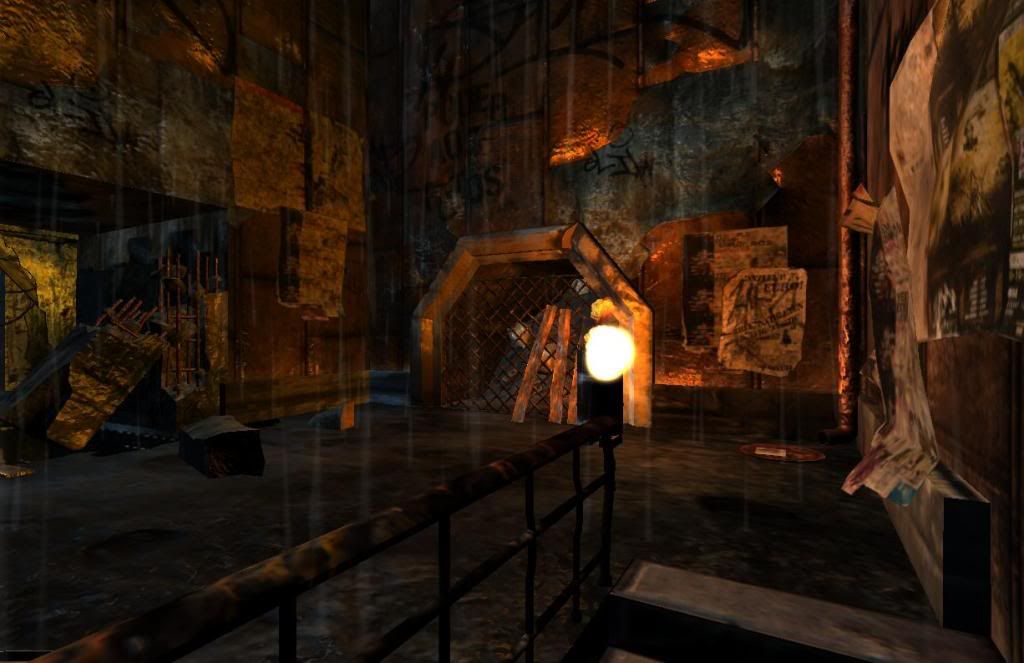
    - The placement of some of the props doesn't make sense, for example the broken pillar in a doorway that it could never have fully supported?
    - Some piles of rubble could be added around the broken pillars (I see an attempt on one pillar?), there are large sections that have been broken but the representation of where that stuff went, is not made.
    - The wood textures are bright and new. As wood ages it desaturates.
    - Bevels could be added to a lot of hard edges to smooth them out. Those soft edges don't add too much to the overall poly count but the visual impact can be pretty significant.
    - I'm not sure if the large thing in the center of the center screen shot is a puddle with a crazy reflection, or a whole in the floor?
    - Is it raining? Some of it appears to be inside?
    - What engine is this using? Looks kind of UE3 but I can't say for sure...
  • SHEPEIRO
    Options
    Offline / Send Message
    SHEPEIRO polycounter lvl 17
    biggest problem in my book is lack of texture detail and/or texel density inconsistancy
  • svcoyle
    Options
    Offline / Send Message
    I really like the mood and atmosphere of the scenes. I do however have to agree with Shepeiro about texel density inconistancies. Also a lot of the textures seem over saturated. Especially the rebarb in the concrete pillars in the second pic
  • EbolaV
    Options
    Offline / Send Message
    EbolaV keyframe
    thanks Vig :) we work on Vision engine not so cool like UE3 :(. yeah some of your crits were on my list to change. yes thats crazy reflecting thing is a puddle from the beginning of the project xD i want to change that when i get the shader that i want (dont know how to implement :\). Its outside and its raining, the only part what is "inside" is that where the broken pillar is. that the broken pillar does not make realy sense is right its more to take cover from the enemys. hm dont know what i could use instead of the pillar for a big coverage :\
  • EbolaV
    Options
    Offline / Send Message
    EbolaV keyframe
    thanks SHEPEIRO and svcoyle. youre right with the texel density. at the start of make this first scene i dont realy know much about texturing etc. now my faults from the past will kill my sleep xD i try to rework that at first :)
  • Matroskin
    Options
    Offline / Send Message
    Matroskin polycounter lvl 11
    looks pretty cool as for the student project, it would be cool to run there ;)

    Agreeing with all said b4, I want to add that lighting could be adjusted better.
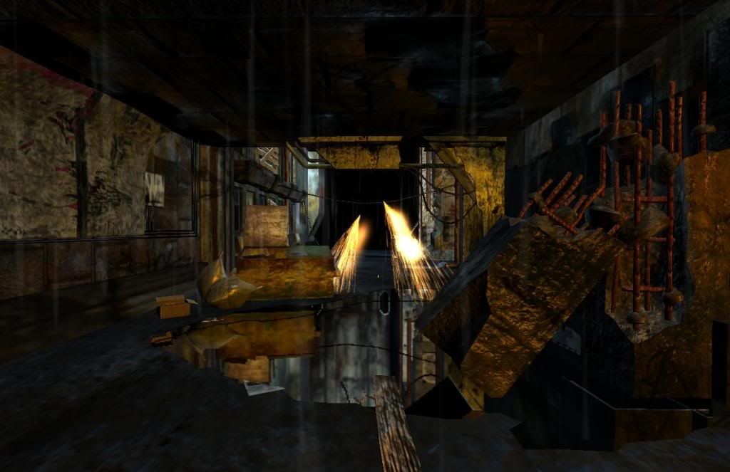
    Especially in the 2nd shot there seems to be too much of visual noise, it is hard to see where one can or can't go.
    I think that lighting on the current floor should be different from the bottom floor that is seen through the hole. That should help to make hole more visible. Also the whole room could be darker but several stronger point lights could guide the player.
    You also need to have light sources meshes in the level, otherwise light is coming from nowhere.

    anyways, good start!
  • Minos
    Options
    Offline / Send Message
    Minos polycounter lvl 16
    Not bad but it looks very messy. Players will probably get completely lost in there. From the screenshots I can hardly tell where I'd be supposed to go/do or what's going on there.

    I highly recommend Hourence's The Hows and Whys of Level Design book. It's a wonderful little book that covers everything from design to lighting and texturing. You can read an excerpt/buy it here:
    http://book.hourences.com/
  • cparrish
    Options
    Offline / Send Message
    cparrish polycounter lvl 18
    I like it but details aside getting your palette under control and correcting the lighting could go a long way.

    just a thought:

    junk.jpg
  • PixelMasher
    Options
    Offline / Send Message
    PixelMasher veteran polycounter
    yea, like others have said, its just too much overall visual noise, creating a distracting vibe. I would say the greatest weakness is the lack of material definition and inconsistent texture res.

    It looks like you are photo sourcing some and trying to create other textures from scratch, I would recommend going one route, for something like this photo source would probably be best.

    the lighting is pretty even through the scene, try using pools of shadow to insinuate detail and add nice contrast to it. use light to guide the players eye.

    looks pretty decent for a student project, with some tweaks it should turn out dope. also I definitely second minotaur on the level design book, its fantastic.
  • EbolaV
    Options
    Offline / Send Message
    EbolaV keyframe
    thanks for all that crit. i think i post soon some new pics and hope it will be better =) if anyone dont know what a railshooter is (like some of my teachers here :D) its a shooter where the player changes between action scenes and move on a static path given by the game. maybe someone know time crisis 4, house of the dead etc. our game plays in a future where the richs and the army controls everyone and you start in the slums as a half cyborg half human soldier and the army tried to kill him, now he is pissed off :D. but enough spaming its only a student project. i show you some of my hp models, hope you like them :)

    exit.jpg

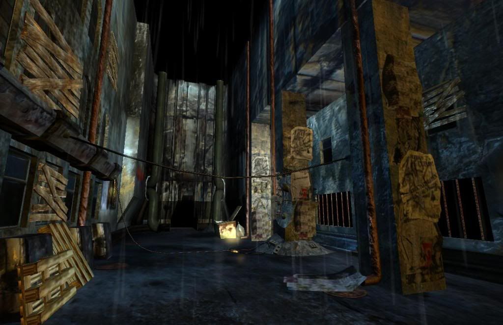
    thats the entrance from the first picture i have posted.

    hydrant.jpg

    yeah a hydrant wohoo ^^

    barrel_02.jpg

    that is a kind of barrel which maybe could explode. will add more scratch etc. details with photoshop created normal i think
  • Orgoth02
    Options
    Offline / Send Message
    Orgoth02 polycounter lvl 9
    Looks interesting
  • John Warner
    Options
    Offline / Send Message
    John Warner polycounter lvl 18
    hey man, this is kinda cool. it's actually a lot closer to being great than i think is first apparent.

    yeah, there's a LOT of visual noise. i would say that there's 2 things that you need to do, and this will be nice. in general, just find some stuff on color theory. there's a good photoshop painting tutorial kicking around out there that gets into a lot of it... but i can't find it.

    in general, i dont know what the hell to look at.

    squint your eyes and look at it. look at the lights and darks. see how their evenly distributed all around the image? this is a bad thing. your focal point should have the most contrast in the scene, and everything else should be relatively unified.

    same with color. there needs to be some color contrast going on here. these are dreary shots and they would look great if you had a very limited color pallet that was blue. you dont need to wory about the natural colors of objects -- in a really really blue scene, wood can be relatively blue and still look like wood -- it just needs to be subtley offset... well.. even that is up for debate really. there some great monocrome paintings out there. in my opinion, i would make this WHOLE scene blue, and have those orange lights and strong points of interest. don't fall the orange light off TOO much.. make the visual interest orange, and that's it.
  • EbolaV
    Options
    Offline / Send Message
    EbolaV keyframe
    thanks john for your comment. i try to make it better. After working on some hp models for the game, lessons and a lot of playing sacred 2 :) i have a little update. hope you like it guys.

    scene_01_05.jpg

    scene_01_06.jpg

    scene_01_07.jpg

    scene_01_08.jpg

    scene_01_09.jpg
  • ElysiumGX
    Options
    Offline / Send Message
    ElysiumGX polycounter lvl 18
    Like John_Warner pointed out, I don't know where to focus. The images have high saturated colors, and the lighting doesn't help direct my eyes. It's just very cluttered. Work on setting up a soft ambience for the scene. And then use contrasting colors to light areas of focus. Use light sources cleverly.
  • EbolaV
    Options
    Offline / Send Message
    EbolaV keyframe
    thanks Elysium. here some small changes. added some lightsources and change the color of the "windowroom" from green to little blue not easy to manage all the lighting colors etc. but its my first environment i try to keep your crits in mind. i have to rework soon the second scene from our game. looot to do :) you guys helped me a lot. polycount rockz :thumbup:

    scene_01_10.jpg

    scene_01_11.jpg
  • Lee3dee
    Options
    Offline / Send Message
    Lee3dee polycounter lvl 18
    since i've never used the vision engine, i cannot see any hard shadows in the pictures compared to the image that the engine website shows.
    57_BMLightsAndShadows.jpg

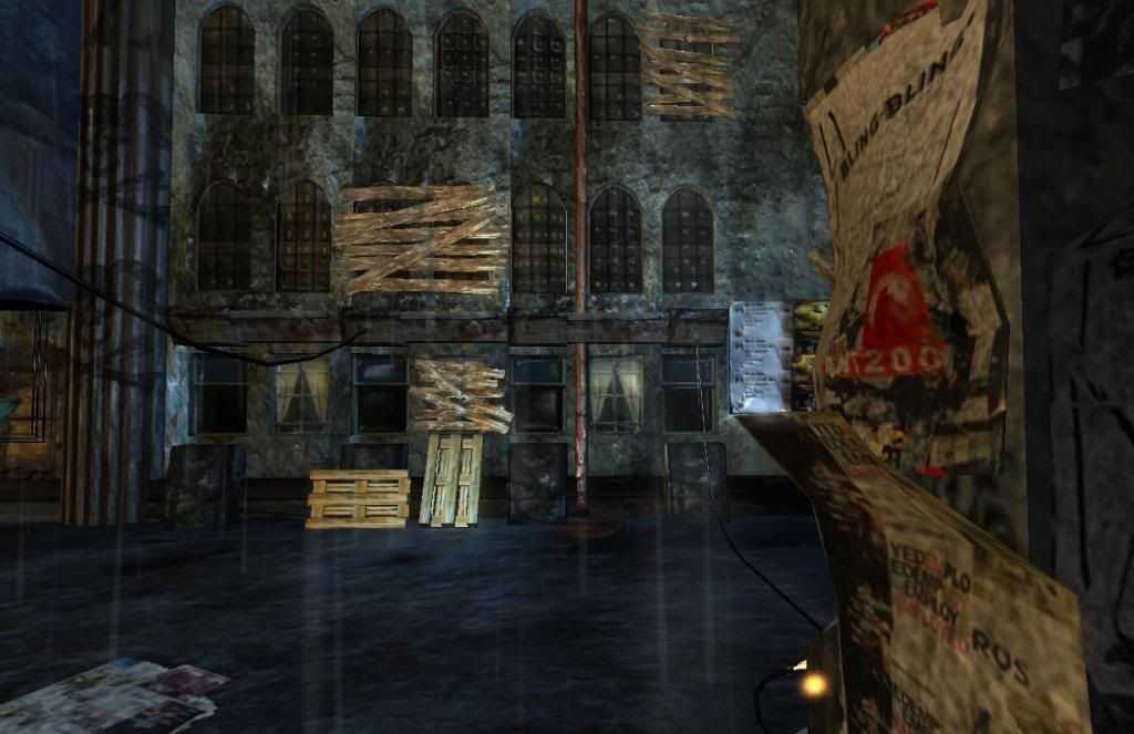
    See how in the image above they use different lights to create atmosphere, I think tweaking the lights would help the scene a lot. for example in there's a window in image scene_01_11.jpg on the left side that emitting a yellow light, there would be a small hint of yellow on the ground where the light is hitting the area below it.

    Some of the normal maps are really bothering me, did u used the photoshop filter. :(
  • EbolaV
    Options
    Offline / Send Message
    EbolaV keyframe
    yes i know the the engine expamples. youre right i have to work more on the lights and shadows. the windows for example emits light but to small. i have the photoshop filter for normal maps but currently i prepare the maps in photoshop and load them into crazybump and use the settings. you think i should use the filter?
  • Toast
    Options
    Offline / Send Message
    Toast polycounter lvl 11
    It looks more than just that. That last picture you posted (scene_01_11.jpg), the pipes on the left are "floating", the light is uniform - the same light intensity for the ground is happening on the walls at the top of the picture.

    It seems you have a strong ambient light on somewhere which looks to be uniformly lighting everything which is what you don't want.
    Work on setting up a soft ambience for the scene. And then use contrasting colors to light areas of focus. Use light sources cleverly.
    I think John_Warner said it perfectly.

    The scene looks nice though and texturing is good.
Sign In or Register to comment.