Home 3D Art Showcase & Critiques

Latest Character

Noonie
polycounter lvl 17
Offline / Send Message
Noonie polycounter lvl 17
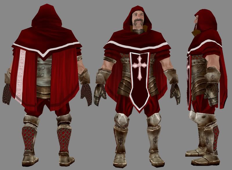
So I finished up this model recently and figured I would drop him for some critiques. He was from a 48 hour game jam at our school. I would say 3 solid days of work put into him, and I used a photo as a base reference for my face painting.

1956 Tri's

inq_color.jpg

wires (minor proportion changes but geometry is the same.)
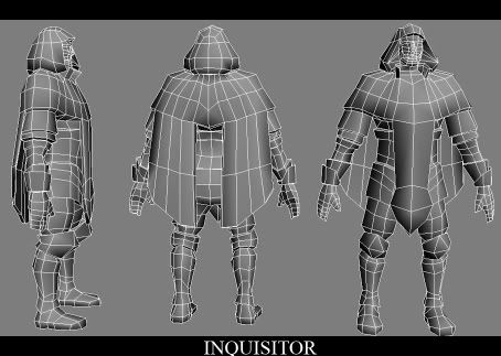
Inquisitor_wires.jpg

Replies

  • Skizot
    Options
    Offline / Send Message
    Skizot polycounter lvl 18
    lol paladin!

    othere than a bit of weird skinning on the inside of the hands, and the legs just looking odd (don't know why) it's pretty good...


    also trim that mustache a bit it's lopsided
  • noritsune
    Options
    Offline / Send Message
    noritsune polycounter lvl 17
    I disagree, I think the legs are the nicest part of this. I think the metal material looks convincing, and the detailed netting on the back of the calf is a nice touch.

    You could improve this by painting in a LOT more ambient occlusion (which would be a huge boost), desaturating and dirtifying the red cloth, and rethinking those s-scroll decorations around his midsection. They look childish and doodly right now; you could find a photo reference of baroque decoration if you dont feel like designing your own.
  • character
    Options
    Offline / Send Message
    character polycounter lvl 18
    i think noritsune is right about the S designs. probably the weakest part of the model. would you mind posting the textures as well?
  • ebagg
    Options
    Offline / Send Message
    ebagg polycounter lvl 17
    I think overall it's pretty strong. However I don't think you have enough of the overall lighting in mind. The head/chest/shoulders area should be brigher, whereas the insides of the cape should be much darker, the guy's face should have a lot of darker shadows since it is under a big hood. That tiled texture for the palms totally flattens that area.
  • Noonie
    Options
    Offline / Send Message
    Noonie polycounter lvl 17
    Hey guys,

    Thanks for the feedback. Good points on the doodles. The whole things textures were done pretty fast so youre all right on that count, they do feel weak now that its been pointed out to me. I think in my haste the lighting wasnt done as well as I would like either. Im going into a coma this weekend to celebrate my graduation but Ill definitely make the adjustments you all have noted. Thanks again,

    -J
  • Noonie
    Options
    Offline / Send Message
    Noonie polycounter lvl 17
    Ah yes heres the texture. I should also mention this was a shared concept that I did with a friend of mine from school, Ron Bravo. We both contributed to his look then I did the modelling and texturing.

    inquisitor.jpg
  • cholden
    Options
    Offline / Send Message
    cholden polycounter lvl 18
    Pretty nice, but the metal highlights are really muddy. I noticed on the model shot, but the texture confimed it. If you were to redo those extra sharp, and give the overall texture a final pass, he’d look pretty good.

    Recognize the chain mail style. wink.gif
  • Noonie
    Options
    Offline / Send Message
    Noonie polycounter lvl 17
    Yeah =) I learned it from the example from Mythic. It's too hot not to use. Was that your stuff?
  • Daz
    Options
    Offline / Send Message
    Daz polycounter lvl 18
    i think you need to work on your UV layouts. You're not using the straight lines that pixels provide you with at all. If this texture had to be reduced to be significantly smaller it wouldn't hold up too well. I think you could look at straightening up some of the pieces. I also think that's a crazy resolution disparity between the face and the rest of it. And why on earth would you have a light source hitting the *side* of the face?

    Other than that this piece has potential.
  • Mark Dygert
    Options
    Offline / Send Message
    I have to agree with Daz, it looks good and you have some skill but your UV layout needs work. I like that you prioritized certain pieces and made them bigger than others so you can pack more detail into that part of the texture, such as the face. But it cost you, the fleshy parts of the arms come off really low res, you have facial hair and stubble but no arm hair viens or deep shadows on the flesh part of the arms? I think you could shirnk the neck down quite a bit to make room for the fleshy arm bits. The neck won't really show texture stretching that bad since there isn't much detail.

    I also think you need to paint a shadow the hood would cast, on the face. Also like daz pointed out it might help the face to repaint the lighting with your light coming from the top. You might want to bake some lighting into the texture and overlay it on your texture to get an idea of how each piece is being lit.

  • Rick Stirling
    Options
    Offline / Send Message
    Rick Stirling polycounter lvl 18
    I really like it, but the colour compositoin needs to be considered. At a distance all the reds tend to blend into one another, so you lose the overall shape. Even just recolouring the upper arms would help a lot.

    I like the massive cloth cock.
  • Sandbag
    Options
    Offline / Send Message
    Sandbag polycounter lvl 18
    it's kind of a silly nitpick, but it's very strange that a medieval style knight would have nordic rune characters on the back of his hood/cape.
  • Noonie
    Options
    Offline / Send Message
    Noonie polycounter lvl 17
    Hey all, thanks again for taking the time to shoot me some feedback and critiques.

    Daz: I had never really been told much about the layout of UV's except to not waste space. What you said makes a lot of sense. I will definitely try to straighten out my Uvs from here out. I figured there must be a reason why people did it the way I see so often, now I know. As for the face, I was just in a rush and painted based off my reference lighting. I will go in and change it to top lighting and get those shadows in there.

    Vig: Thanks for the compliment. After laying out the arms so small I kinda wrote them off for high detail, I agree they dont match up to the face. Great point on the neck and thanks for the baking technique link. Ive done it once or twice for class but Im still not comfortable and could use a guide.

    Rick: Cloth Phallus. Not what I had in mind but.. ok. Thanks. =) I think there is definitely a consensus on fixing the arms. I was hoping my cloth had gotten better on this one, I may not be understanding the suggestions. Do you think more contrast? I dont want to push it too much, if anyone has a good link to show me an example of some hot cloth I would be very grateful.

    Sandbag: I have nothing to say... you caught me =) It was because the few Latin Characters I found looked pretty dull to add to the cloth =) Can I get a creative license nod on that one?
  • conman44
    Options
    Offline / Send Message
    All i can say is i love it.
Sign In or Register to comment.