Hey all. Im pretty new here but so far Im digging the forums. I popped this in the what are you working on forum but things move so fast in there its hard to get feedback sometimes. So here goes.
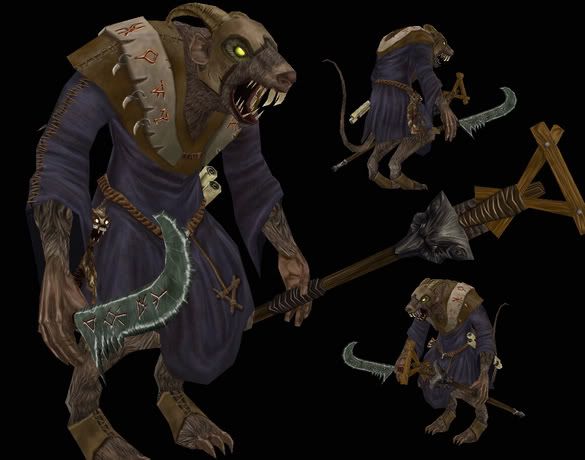
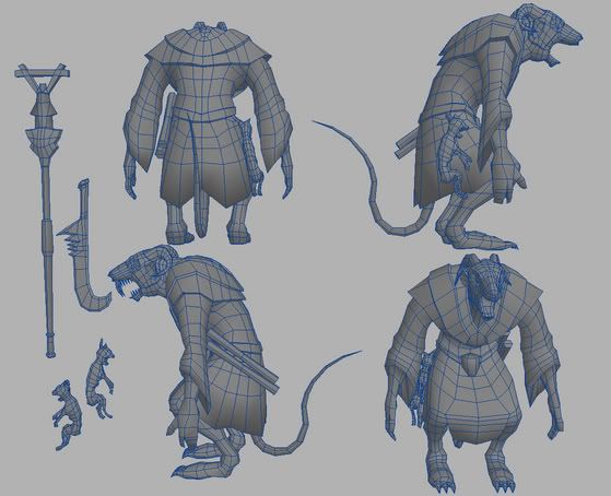
4739 tri's, basic diffuse maps and a flat screen cap from Max.

Original wires:

Replies
The dead cats are a nice touch..good job
For example, two large two front gnawing teeth instead of the Saber tooth Tiger teeth you gave it. Also the other teeth shouldnt be so pointy, bring them down more realistically, like canine teeth.
Adding the hump in the snout that rats have would help a LOT with the look. This image is silly example, but shows the exaggerated snout hump
http://www.starcostumes.com/prodimages/MCVA682.jpg
Oh, and dirtier texture, lots of stains especially more towards the lower sections.
Overall, its pretty good, but the face needs some more attention.
low odor / jamaludin: yeah I think that the robe needing some pop has been the main critique on him so far. Ill go in and tighten up the arms part too, I got a little stretching from my texture and was under a time crunch for graduation to finish this one.
Sectaurs: Ive never really used sharpen Ill give it a shot. Thanks
Seantree: I plan on it. Its one of the companies I would like to work at.
Cholden: Yeah the Skaven are vry stylized in the warhammer universe. Its based off their mmo they are developing, which is a tabletop war game. Very cool stuff. I think they still have the piece I used as inspiration on their website in the concept section. As for the textures I think youre right on. There does need to be more dirt on the bottom of his robes and stains.
Thanks again guys.
The character looks pretty good, I would listen to the comments here. The concept is on my website if anyone else wants a look.
http://lucas.hardi.org
Nice Roland model btw, I need to get around to finishing those books.
For the horns on the head... in the concept on the Mythic page the horns are much longer and curl more. I think part of what makes it look like the horns are part of the head rather than the helm is that they are the same brownish tint as the head and body where in the concept its more of a redish color over all.
The helm is also a banged up metal, not leather. That will also help distinguish between the horns on the helm and the actual head.
So very dirty. He looks freshly groomed. Think of him as just climbing out of the water. I'm also looking at the concept again and see that the exposed skin has alot of veins and some cuts and stuff.
Other than that its going good. You've had a great improvement over the past few weeks. Good job man.
hope the job search is going well, phx az represent!
Well here goes the update. Thanks again for all the feedback and critiques by the way. It's been awesome.
Very nice work.
The model and texture are great, but just push it. push it real good.
To take it to next level, imagine what that evil filthy rat bastard would look like after not washing for 3 weeks and being on the march. The rain makes mud that hes walk through, that dries into his fetid matted fur, that gets damp, then anoher layer of mud over the top of that. This of the scabs and open sores.