[UE4] The Mummy Tomb, 3 week project.
Here is the final result:
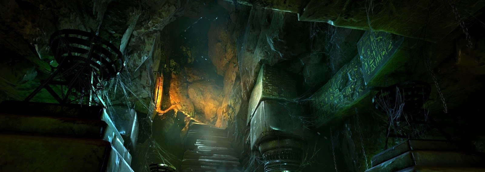
More at the end of the thread ((:.
First week done!
Inspired by The Mummy (1999) and the art of Rise of the Tomb Raider I have 3 weeks to do this environment for a school assignment called "advanced production project".
The project is halftime so its more like 1.5 work weeks.
This weeks goals where to get the scale and proportions right in maya and make modular assets.
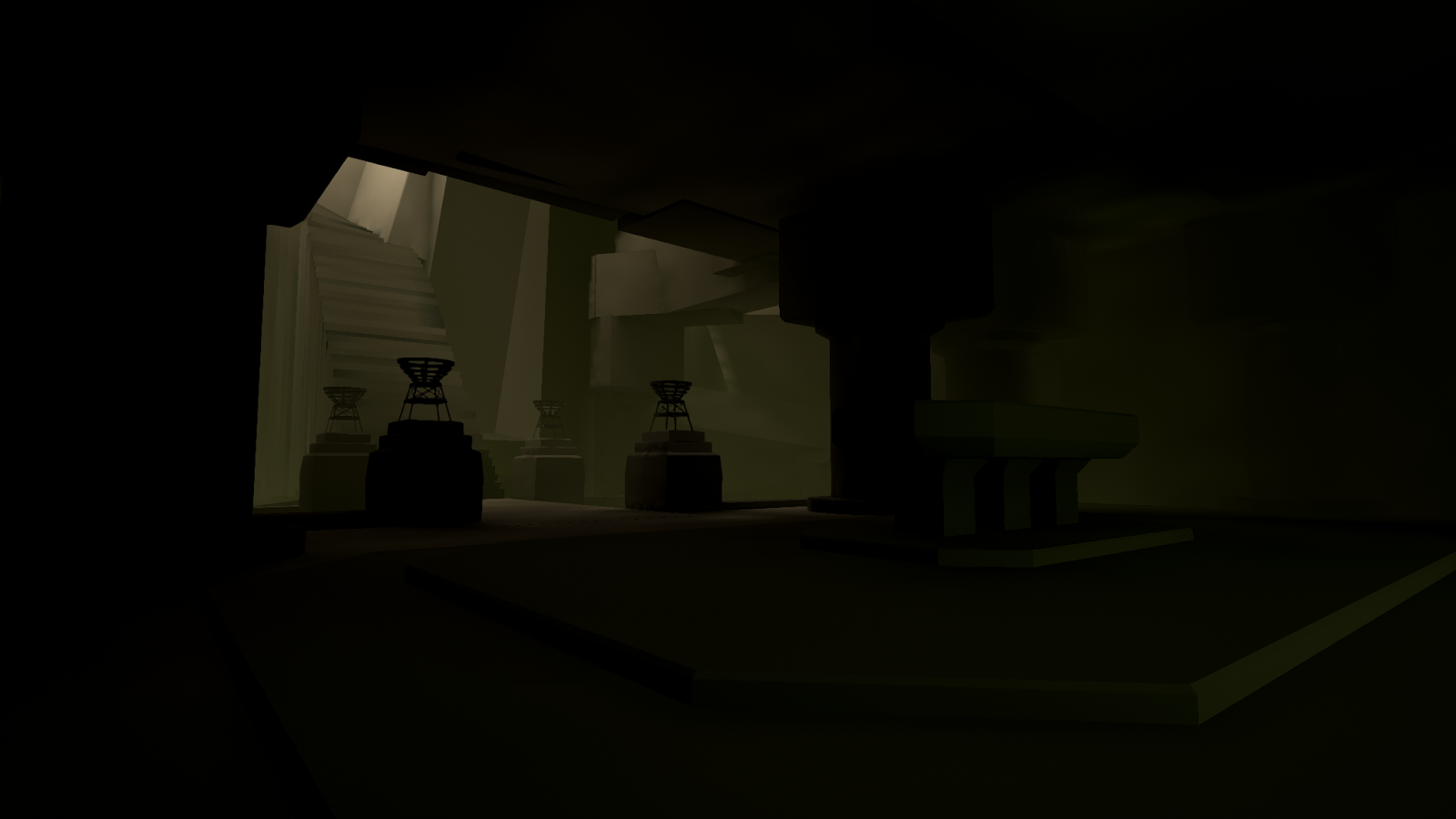
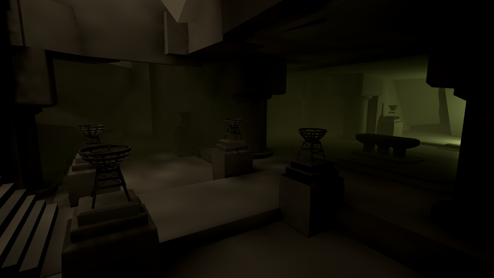
Also getting it all into Unreal Engine 4, blocked it out with some rough lighting.
Next week is high poly, baking and starting with textures.
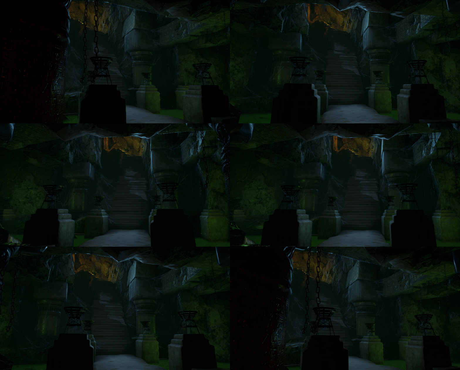
Image in the upper right is screenshot from Unreal and the rest are paint overs to find the lighting, mood and colors.

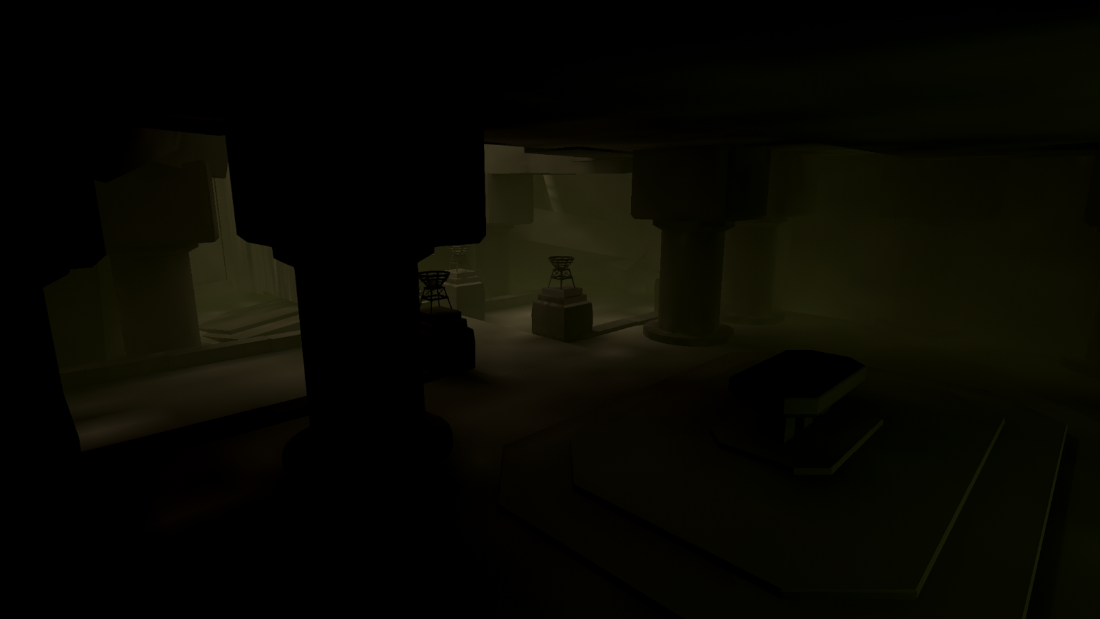
Screenshots from UE4
For more images look at my blog. I will keep updating the progress here as well.
Feedback is always appreciated! ((:

Replies
A fast update on the progression of the tomb.
I did high/lowpoly and baked it out for a rock, pillar and altar.
Need to redo the altar but I can start to see whats needs more attention and what parts that wont.
Still trying out some different lighting, this lighting is a bit to bright.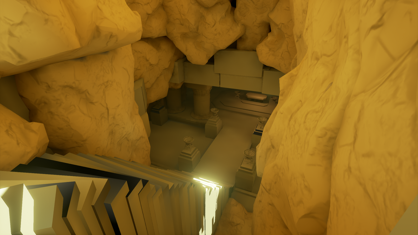
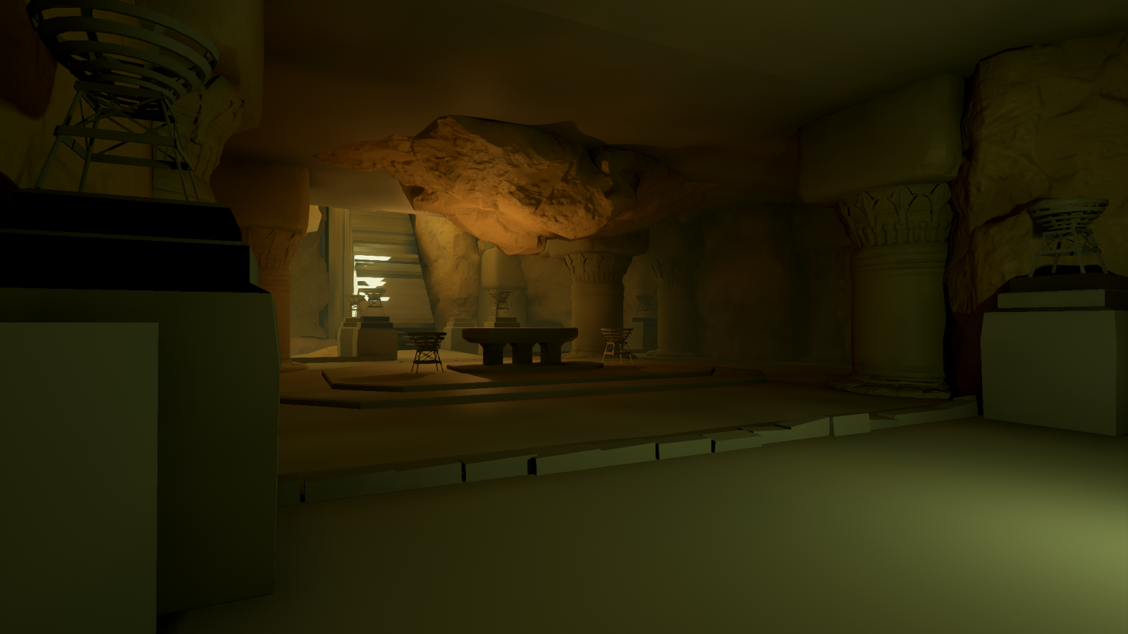
I am a bit curious how you gonna choose for the albedos of your meshes with these color schemes ( i mean the yellow-green-ish lighting)
I will follow this great work
@Telerak Thank you! With the 3d blockout as background I use a lot of multiply layers to try different shadow shapes and then colordodge with little color to light things. Then photobasing to get textures/more idees and then overpaint that on one layer where I balance it out. I would recommend checking out Titus Lunters tutorials on youtube and read about his workflow. He has a lot of nice artists and art resources to check out as well.
Week 2 done!
Then texturing everything giving it wear and tear. Then some spider web and piles of sand (might do the sand as a terrain material and sculpt piles on the floor.)
So next week I will finnish with material deffinition and variation. Lighting and final baking of it. Vertex paint for sand on all objekts and maybe and upvector shader for the sand as well.
Story telling elemets and atmosphere and add things as i go to make it cohesive.
Feedback is appreciated.
I learned a lot from this project, like thinking more about texel density earlier and locking down cameras for beauty shots during the blockout to be able to focus on the right details and composition elements.
I had a lot of nice feedback from great past students of the school. Thank you!
Next week its on to a new project.
Stellar mood ! I love it
Great work!
@octostra Thx (: . Yeah the cameras where set a bit late but now when the 3 weeks are over I used what I had. What would you have liked to see more of? Always nice to get some more opinions on what I could have improved.
Nicely done. For some reason, PBR tends to look good when it's glossy. Just check out the Subway scene from UE4 demo package. Remove the glossiness from there and it looks worse. So I think this turned out pretty well. Maybe turn in down just a bit.
@Sharur Thx! Yeah, I had some difficulties with it. Did some material instances where I started to tweak the values a little. But I would have like it to transfer straight from substance painter.