The BRAWL² Tournament Challenge has been announced!
It starts May 12, and ends Sept 12. Let's see what you got!
https://polycount.com/discussion/237047/the-brawl²-tournament
It starts May 12, and ends Sept 12. Let's see what you got!
https://polycount.com/discussion/237047/the-brawl²-tournament
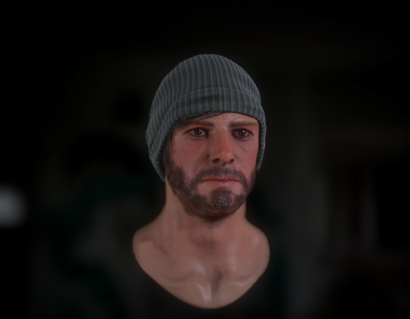
Another Generic Guy
Just updating my portfolio again, After finishing a stylized character I thought I'd go for realism again, I started on him about a week ago and I've started work on the rest of the body.:


Beard still needs a little work.


Only really just started on the body. though the head isn't finished, I'm still looking for crits on all areas.


Beard still needs a little work.


Only really just started on the body. though the head isn't finished, I'm still looking for crits on all areas.
Replies
I need help though, my Zipper curve brush orientation is rotated to wrong way, I want the teeth to point inwards rather than along the surface, does any one know how to do this?.
Make a plane. Turn off the "curve mode" in the stroke palette. Draw out an instance of the brush on the plane and rotate the middle polygroup 90 degrees. Make this a new insert curve brush.
That may give you a desirable result. Sometimes I just go to a traditional modeling package and fix it there... doesn't take too long.
Thanks for the tip, I decided to just take a loop of faces further out from the edge taht were pointing in the right direction and move the zipper into the right place when I was happy. It wasn't perfect but some use of a grab tool fixed it up.
EDIT: oops forgot to say: Absolutely love the face and where this is going in general. And that is a super nice hat. :poly124:
I'm not talking specifically about the quality of your work...so far so good. But overall, the design of the person doesn't make any sense. Adding the prosthetic legs on just for the sake of adding them on at the even more to the problem. I think you are setting yourself up to have a hard time detailing the character without some general idea in mind for what you want to do. It really does show that in the WIP.
I would suggest you just think more about the background of the character..that way you are adding purposeful details that support him, instead of it feeling like "another generic guy."
Even in one of your previous threads, "Post Apocalyptic Survivor," your character already felt more cohesive because you had that theme in mind.
I hope this helps. Good luck!
There's a lot I'm gonna change to (hopefully) make it work, the legs need bulking in some way, probably gonna replace the feet with boots to ground him a little more, change the shorts and jacket to fit a robotic theme etc..
At this point it's just experimenting.
Thanks for the feedback, I'll see if I can make it fit together a little better before I completely abandon the legs.