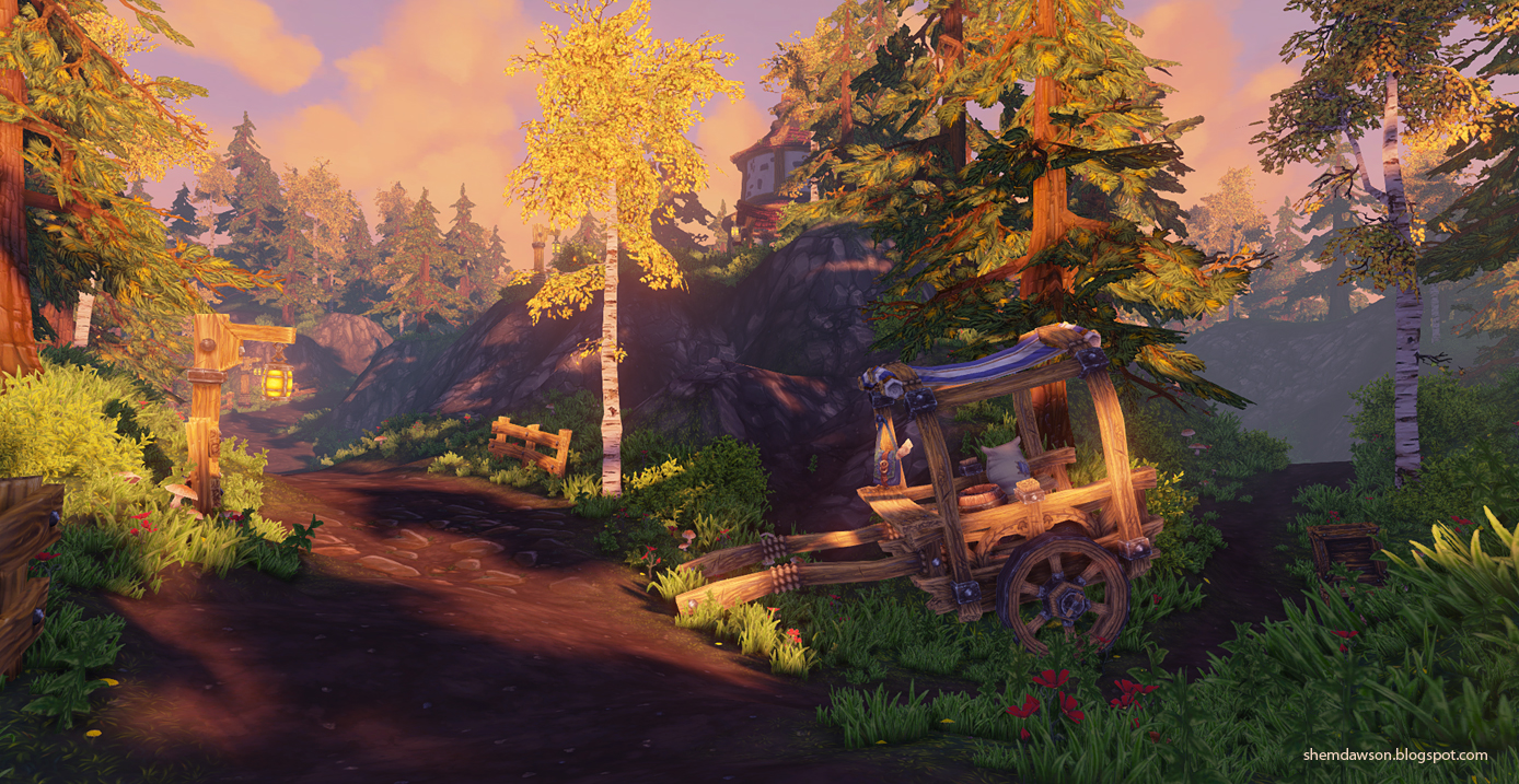
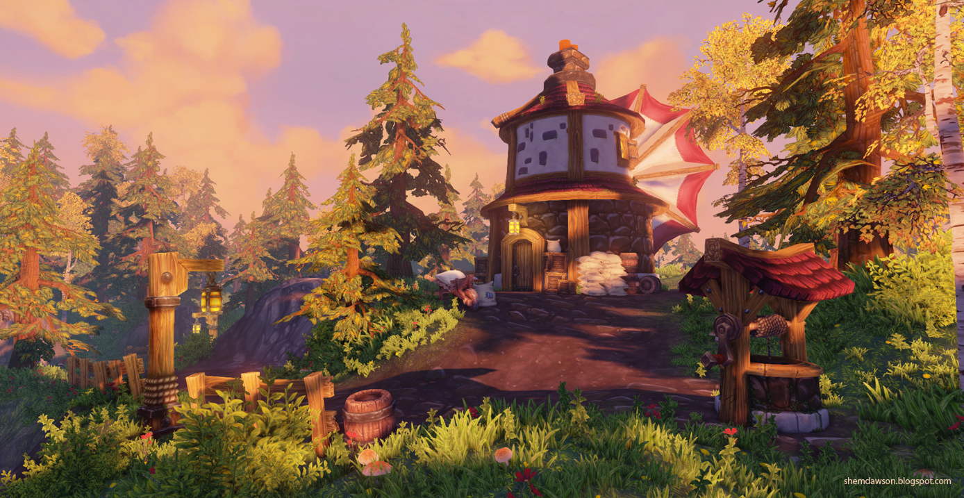
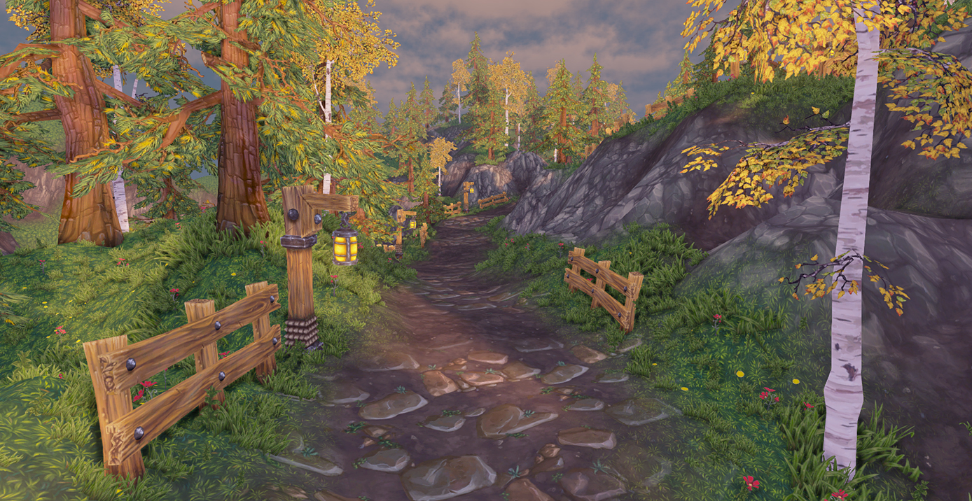
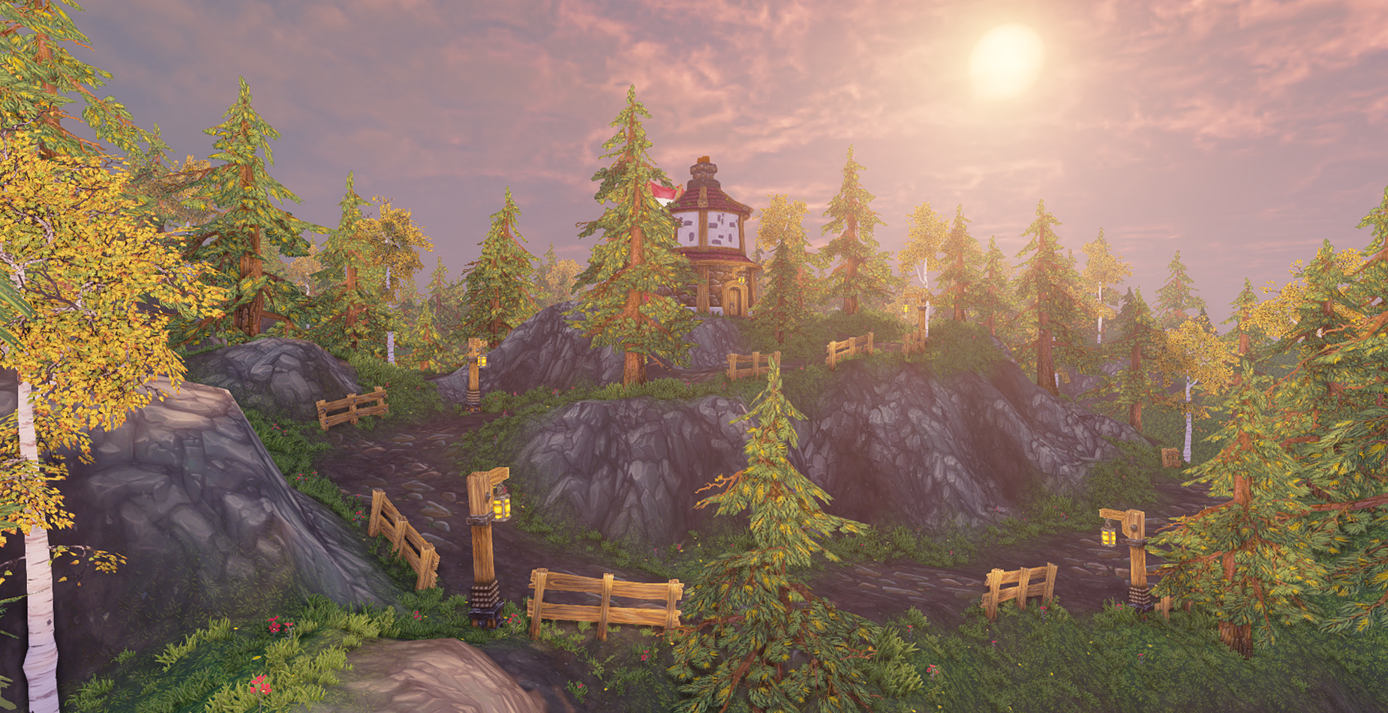
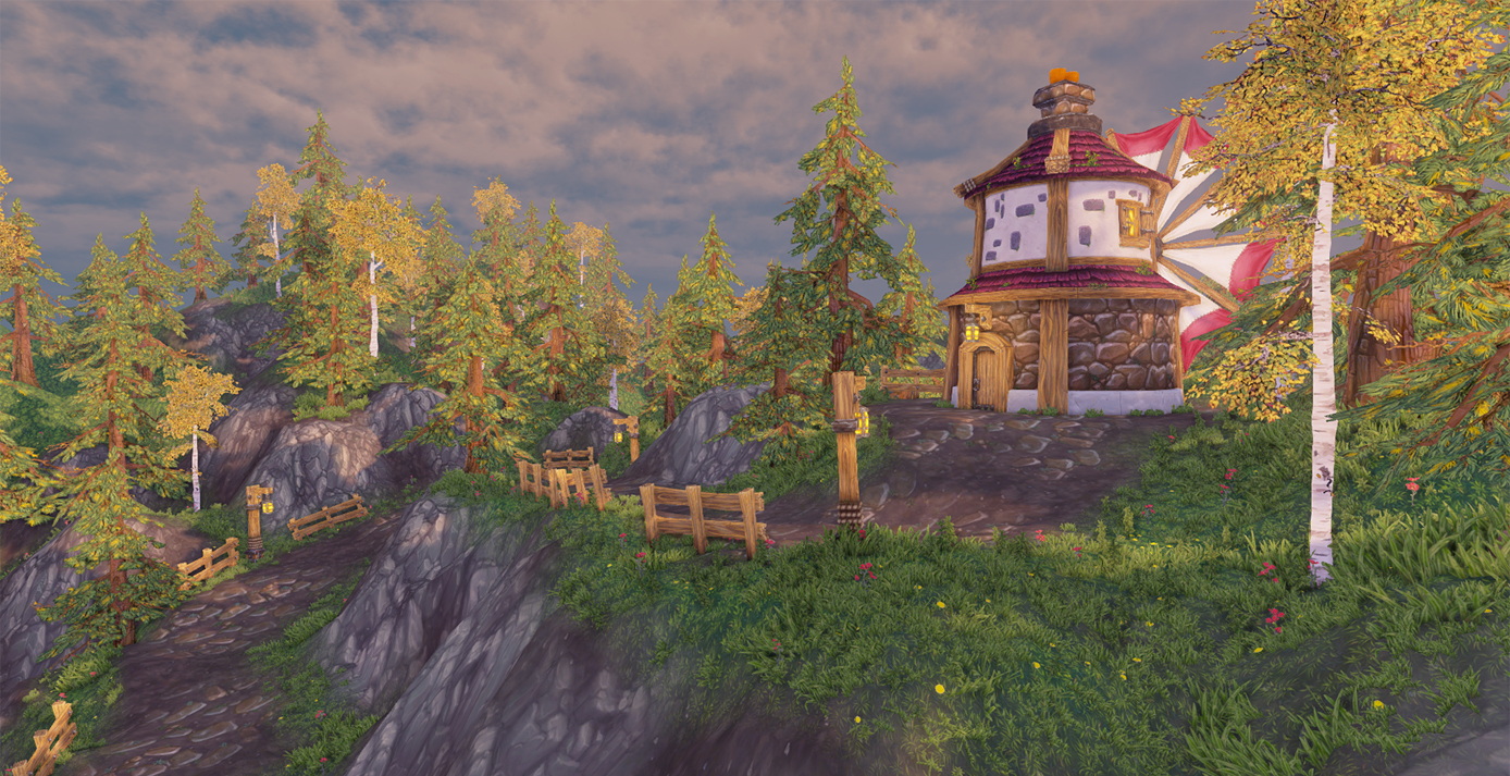
I thought I'd post some WIP shots of a personal project I'm working on. I'm making a low poly painted environment in UDK - diffuse painted textures only. Still heaps to do, I'm wanting to add in some more elements to create some story around the mill and the lighting and lighting effects need some love, more foliage bushes etc are also on the list. I'll be painting a custom sky-box and clouds too. I'd like to have a play with adding some effects like dust/pollen in the air and chimney smoke too.
Only thing I would critique is that the whites are to bright (especially the birch) it's popping out to much for my taste.
Also the enviroment textures seem to be much more lovely than those on the mill. The upper part feels really unfinished.
Dude holy shit thats amazing.. only thing that stands out is the white tree.. texture seems alot less detailed.. and bright.. kinda looks like it has emissive on it. (but doesnt).. dont over do the particles.. keep it subtle.. WELL DONE!
I thought that tree looked familiar hahaha.. I remember the trees from your other thread!
I agree with what Warotic said about the white tree. I would try painting details as if the top layers of that bark have peeled, showing different shades of bark.
Also the pathway seems to have patches of stones separated by a big patch of dirt as it goes up to the mill, like an A-B-A-B pattern. It looks like you've vertex painted a tiling dirt texture, and a tiling dirt texture with stones. See what it looks like as just the tiling dirt with stones texture maybe.
Hey thanks for the feedback guys, @Snafubar7 - thanks for taking the time to grab that ref too great to have some keen fresh eyes on stuff. I totally agree about the Birch I've dulled the whites a bit and also increased the contrast and color a bit to bring out the peeled bark bits to be more apparent and it def. looks a ton better. I'll post up some shots with the next round of additions
Oh just caught your comment on the path, yeah its two textures I thought it might be nice to blend it up a bit but you're right I think it its a little too patched ill have a play with it.
Really nice stuff so far. The actual rendering of the textures are nice.
One thing that jumps out is the lighting is really flat. I would get more contrast in the lighting.
Adding some distance fog would help too. Make it a dark color in your sky to solidify the sky to the scene.
In addition to that your value separation is non-existent. So desaturating your scene you can see how everything is almost the same value of grey. Adjust those some so that the mountains, ground, etc all have a decent amount of separation.
The texture taken by themselves are really well done and have a nice style to them, but the overall scene looks kinda flat and doesn't make justice to your work
I'd also experiment with making your own skybox with some nice stylized clouds as the default udk sky really doesn't fit with the rest imho
I was about to comment on the same thing that Jeff mentioned. Since it's all low poly painted, use the lighting and effects like fog for atmospheric perspective to create depth and focus.
Not sure if the scene has lightmaps, but you could definitely create contrast that way. Use it to bake AO only (if you don't want the lighting baked) to make the objects separate from each other.
Agreed but with one caveat and this is just my personal opinion.
If it's not meant to be interacted with, it shouldn't be as bright/contrasted as the player. You can still separate things by varying values of objects - we just tend to gravitate towards the lightest parts of a composition. So if it's not important for the story, it probably doesn't need to be very bright.
Great stuff, I'd also recommend if you sculpted these at all - Try blending using the height map for a more believable transition between.
I agree with everything Jeff said. I think the sky should be more colorful, or more saturated. It looks like the default UDK skybox? I could be wrong but maybe make it more less cloudy and more blue. Textures are great, the whole environment is but the flatness takes away a lot easy fix though!
Hey thanks for all the thoughts and comments guys its really helpful, yep as I originally mentioned I'll be getting rid of the ugly default sky-box for some painterly clouds, I think this will also help make the top half of the scene look more finished.
@ Jeff Parrott - Thanks for the paint-over Ill definitely take that on board when I do my lighting/lighting effects pass
Looks awesome. The only thing I can say that has not been said already is that I think it would look nice get some geometry in the cliffs to make them look more prominent. And if you do it right it may be lower poly then the default terrain's count which looks very high compared to everything else.
Quick question Shem, did you create the terrain inside UDK? I'm about to start working on a scene and I've never really done terrain in a practical way.
Thanks for the comments guys, @JoshVanZuylen good suggestion, I was thinking it may be nice to add some large rock geo around some of the cliffs to add some variation.
@Snafubar7 Yup! I used the terrain editor tools in UDK for the ground.
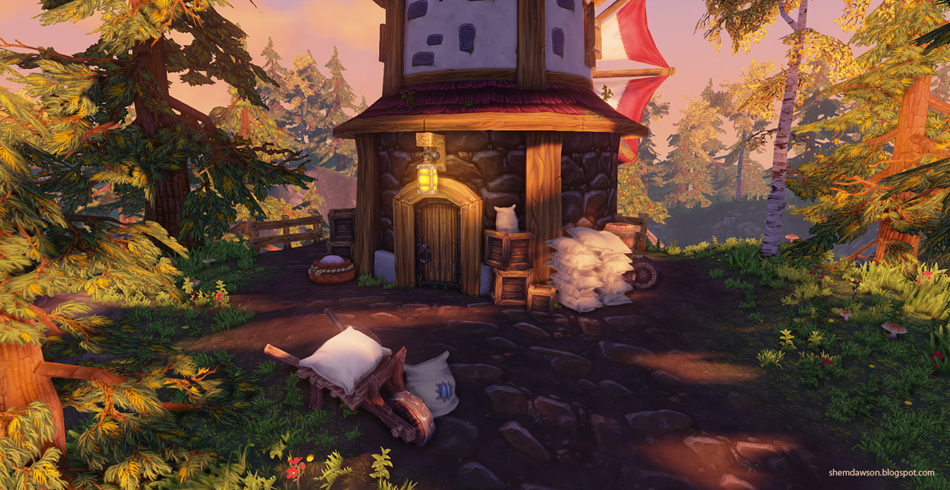
Ok! next round of updates to share, I had time to finish up some more foliage and get a sky-box painted up, I also started to tweak lighting, adding some contrast to fore/mid-ground and getting some light fog in, I think its working enough for now, I'll do another pass on it once all the props are done. Next on the list are some more props to add around the mill area to make it a bit more interesting! Thanks for checking it out
Thanks for the comments guys! @Razorb yeah I hear ya I've been a bit hesitant to punch it up more until I've finished dropping assets in but I guess in hind-site its far enough along that it probably wouldn't matter much if I did.
Thanks Perzik yeah the feedback from everyone has been great I'll definitely keep working on pushing the lighting. I'm adding some extra assets around the mill for the next update, I'll make sure the lighting is looking more final when I post up the next shots
I have some lighting updates! I was planning on putting in some more assets first, butttt, I got side tracked into it Thanks again for checking it out!
I will increase the contrast a bit, also the tile size on trail is too big, should be smaller. You need to clarify also the focus point, i guess is the tower/house building. Apart from that, looking good. Keep it up
@ wirrexx and Fenyce, For sure I'll definitely put up some breakdowns when its all finished up.
@ silver_hoodlum, thanks for the crits, I'm putting in some more assets around the mill next up so hopefully that should give it more of an obvious focal point and hopefully add a bit of story. I'll experiment with the path tiling and see how that looks.
@ Jeff Parrot, Glad you're liking it, your feedback was really useful
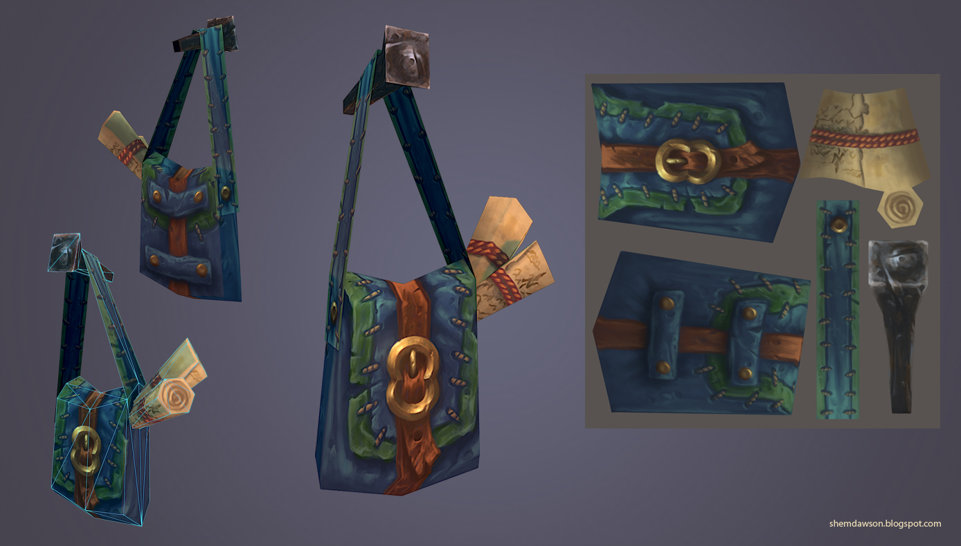
Small update, I had some time to make a few of the smaller props, I'm also wanting to add a cart of some sort and some flour sacks. I'll post up some more scene renders with the props in soon.
I'm very open to other good ideas for props that fit the theme too so fire away if you think of anything
Small update, I had some time to make a few of the smaller props, I'm also wanting to add a cart of some sort and some flour sacks. I'll post up some more scene renders with the props in soon.
I'm very open to other good ideas for props that fit the theme too so fire away if you think of anything
Thanks for looking!
Looks amazing at the minute,
Prop wise I think you could do with a Well and maybe a mail box of some kind... give it some backstory!
The textures (and recent flats) are very reminiscent of the texture work at 38 Studios on "Copernicus". I spent half my time there as a world-builder, doing terrain sculpting and painting, and these textures fit right in with that family of work. If I didn't know better, I would assume those were just texture release notes from one of our texture artists. So, take that as a compliment; I felt like we had some fantastic painters there.
Jeff made some good points about value separation and while it's improved the depth of the scene, I still think it can be pushed further. Tonally, your hues are (mostly) warm so I still think there's some things to be done here concerning separation. A lot of your objects still seem to mix or blend with the object behind it. I feel like the lighting is warm, the fog is warm, the sky is warm, and a lot of the textures have similar hues as well.
Some color contrast would help here. I would consider reworking your lighting a bit to aid in the overall read of the image. I'd like to see more richness in the shadows, right now there's a lot of indirect bounce lighting and your shadows are washing out. During sunrise or sunset (can't decide what this is), the shadows tend to be heavier than they are at mid-day. Right now, there's a lot of ambient light splashing around and it's eliminating those moodier darks. Maybe pull down the number of bounces (1, 2 tops)? Your environment color could go a bit darker and cooler, though it's hard to tell if that's the issue or if there's just too much indirect light bouncing into the shadows. Finally, maybe consider changing some of your sky coloration? If you want to maintain a similar feel, I would at the very least rework your horizon color a bit because the yellows don't sit very well against warm wood, warm green leaves, and the yellow leaves. Work the gradient a bit more as well, the value is fine along the horizon but toward the apex I think you need to get a bit darker and more rich with your color and saturation.
Not sure if you've tried it but you can also play with your fog to capture that atmospheric scattering. Play with your inscattering color and your opposite light color (as well as terminator angle) so that you can fake the atmospheric coloration that happens toward and away from your directional light. If you're not familiar, about 1/4 down the page: http://www.hourences.com/tutorials-ue3-fog/
Are you able to post some lighting only shots on the next update?
How about...
A bench, flower pots, vegetables (like a little garden?), yeah, I know, it's a mill, but somehow I need to think that the person who works there also lives there.
A birds house, somewhere in the trees....
This looks really fantastic! Definitely one of my favorite hand painted projects!
The only thing that stands out is the rock you have seems very "terrain-ey" and 2 dimensional. The texture looks fantastic, but they could use some model support. I would maybe model out some modular rock pieces and lay them along the rocky cliffs to help break that soft hill look, create some paralax and give a nice jagged contrast to the soft dirt road.
@Endfinity Jon - Wow, thanks for the compliments on the textures, I checked out your project and its looks amazing (and a lot of fun!) thanks also for taking the time to do some in-depth notes, this will be a massive help for polishing and ill try to implement them over the weekend.
@Andy H - thanks and no prob for the flats, I hope they are helpful
@Fenyce - Great ideas for props! thanks for the suggestions
@wester - thanks heaps for the kind words, and I totally agree on the rocks, I'll add some modular rock formations to the asset list! (oh boy its starting to get long heh).
Replies
Only thing I would critique is that the whites are to bright (especially the birch) it's popping out to much for my taste.
Also the enviroment textures seem to be much more lovely than those on the mill. The upper part feels really unfinished.
Can't wait to see where this is going!
I agree with what Warotic said about the white tree. I would try painting details as if the top layers of that bark have peeled, showing different shades of bark.
Also the pathway seems to have patches of stones separated by a big patch of dirt as it goes up to the mill, like an A-B-A-B pattern. It looks like you've vertex painted a tiling dirt texture, and a tiling dirt texture with stones. See what it looks like as just the tiling dirt with stones texture maybe.
Everything looks awesome, keep it up!
Oh just caught your comment on the path, yeah its two textures I thought it might be nice to blend it up a bit but you're right I think it its a little too patched ill have a play with it.
One thing that jumps out is the lighting is really flat. I would get more contrast in the lighting.
Adding some distance fog would help too. Make it a dark color in your sky to solidify the sky to the scene.
In addition to that your value separation is non-existent. So desaturating your scene you can see how everything is almost the same value of grey. Adjust those some so that the mountains, ground, etc all have a decent amount of separation.
The texture taken by themselves are really well done and have a nice style to them, but the overall scene looks kinda flat and doesn't make justice to your work
I'd also experiment with making your own skybox with some nice stylized clouds as the default udk sky really doesn't fit with the rest imho
Not sure if the scene has lightmaps, but you could definitely create contrast that way. Use it to bake AO only (if you don't want the lighting baked) to make the objects separate from each other.
If it's not meant to be interacted with, it shouldn't be as bright/contrasted as the player. You can still separate things by varying values of objects - we just tend to gravitate towards the lightest parts of a composition. So if it's not important for the story, it probably doesn't need to be very bright.
Great stuff, I'd also recommend if you sculpted these at all - Try blending using the height map for a more believable transition between.
I think day or sunset would work really well with the colors you've used already.
@ Jeff Parrott - Thanks for the paint-over Ill definitely take that on board when I do my lighting/lighting effects pass
More updates soon
@Snafubar7 Yup! I used the terrain editor tools in UDK for the ground.
It is looking really nice, I like your the vegetation in particular. It reminds me of World of Warcraft.
But really, I'm completely conquered by your work!
@ silver_hoodlum, thanks for the crits, I'm putting in some more assets around the mill next up so hopefully that should give it more of an obvious focal point and hopefully add a bit of story. I'll experiment with the path tiling and see how that looks.
@ Jeff Parrot, Glad you're liking it, your feedback was really useful
I'll have some more updates up soon.
I'm very open to other good ideas for props that fit the theme too so fire away if you think of anything
Thanks for looking!
Looks amazing at the minute,
Prop wise I think you could do with a Well and maybe a mail box of some kind... give it some backstory!
@ Jakob Gavelli - Thanks man, I've had a few people asking to see flats now so I've put together a pic for the terrain flats, hope its helpful
The textures (and recent flats) are very reminiscent of the texture work at 38 Studios on "Copernicus". I spent half my time there as a world-builder, doing terrain sculpting and painting, and these textures fit right in with that family of work. If I didn't know better, I would assume those were just texture release notes from one of our texture artists. So, take that as a compliment; I felt like we had some fantastic painters there.
Jeff made some good points about value separation and while it's improved the depth of the scene, I still think it can be pushed further. Tonally, your hues are (mostly) warm so I still think there's some things to be done here concerning separation. A lot of your objects still seem to mix or blend with the object behind it. I feel like the lighting is warm, the fog is warm, the sky is warm, and a lot of the textures have similar hues as well.
Some color contrast would help here. I would consider reworking your lighting a bit to aid in the overall read of the image. I'd like to see more richness in the shadows, right now there's a lot of indirect bounce lighting and your shadows are washing out. During sunrise or sunset (can't decide what this is), the shadows tend to be heavier than they are at mid-day. Right now, there's a lot of ambient light splashing around and it's eliminating those moodier darks. Maybe pull down the number of bounces (1, 2 tops)? Your environment color could go a bit darker and cooler, though it's hard to tell if that's the issue or if there's just too much indirect light bouncing into the shadows. Finally, maybe consider changing some of your sky coloration? If you want to maintain a similar feel, I would at the very least rework your horizon color a bit because the yellows don't sit very well against warm wood, warm green leaves, and the yellow leaves. Work the gradient a bit more as well, the value is fine along the horizon but toward the apex I think you need to get a bit darker and more rich with your color and saturation.
Not sure if you've tried it but you can also play with your fog to capture that atmospheric scattering. Play with your inscattering color and your opposite light color (as well as terminator angle) so that you can fake the atmospheric coloration that happens toward and away from your directional light. If you're not familiar, about 1/4 down the page: http://www.hourences.com/tutorials-ue3-fog/
Are you able to post some lighting only shots on the next update?
This looks great, can't wait to see more!
-Jon
A bench, flower pots, vegetables (like a little garden?), yeah, I know, it's a mill, but somehow I need to think that the person who works there also lives there.
A birds house, somewhere in the trees....
The only thing that stands out is the rock you have seems very "terrain-ey" and 2 dimensional. The texture looks fantastic, but they could use some model support. I would maybe model out some modular rock pieces and lay them along the rocky cliffs to help break that soft hill look, create some paralax and give a nice jagged contrast to the soft dirt road.
@Endfinity Jon - Wow, thanks for the compliments on the textures, I checked out your project and its looks amazing (and a lot of fun!) thanks also for taking the time to do some in-depth notes, this will be a massive help for polishing and ill try to implement them over the weekend.
@Andy H - thanks and no prob for the flats, I hope they are helpful
@Nefarius24 - thanks heaps for the compliment!
@Fenyce - Great ideas for props! thanks for the suggestions
@wester - thanks heaps for the kind words, and I totally agree on the rocks, I'll add some modular rock formations to the asset list! (oh boy its starting to get long heh).