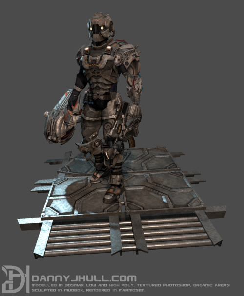
Cyborg/Soldier Character
Hi 
This is my first post here so I'm gunna give a bit of background info on myself and then post the character.
Hi im Danny, im a Game Artist with a FD and BA Degree in Game Art.
I live in north west england, and am currently looking for work within the industry. I am currently part of a few app teams and do some freelancing but currently do not have work in a studio.
Iv been doing 3d art for 4 years now, and this is my 3rd ever character i am posting now.
This character was based on a concept I did awhile ago, not got loads to write about it other than its took me about 2 months as iv been working on a number of projects at the same time and its been a really fun character to do.


I am looking for some feedback on what you think of the character, how I could improve him, anything I can add/change and just any advise you have on creating a better finished render.
Thanks for looking
If you are intrested in any of my other work please visit my website here dannyjhull.com
Danny H
This is my first post here so I'm gunna give a bit of background info on myself and then post the character.
Hi im Danny, im a Game Artist with a FD and BA Degree in Game Art.
I live in north west england, and am currently looking for work within the industry. I am currently part of a few app teams and do some freelancing but currently do not have work in a studio.
Iv been doing 3d art for 4 years now, and this is my 3rd ever character i am posting now.
This character was based on a concept I did awhile ago, not got loads to write about it other than its took me about 2 months as iv been working on a number of projects at the same time and its been a really fun character to do.


I am looking for some feedback on what you think of the character, how I could improve him, anything I can add/change and just any advise you have on creating a better finished render.
Thanks for looking
If you are intrested in any of my other work please visit my website here dannyjhull.com
Danny H
Replies
The ground is a good thing, but more importantly your lighting needs to be right.
The whole character is like evenly lit. Theres no highlighting any side, no highlighting silhouette or real shadows. Also your background is really lame and drags the whole thing down. Get a really subtle gradient in a complementary color which is very desaturated or something along these lines.
Also your DH logo is too big. Align it at the rest of your text, will have a lot more style.
Also too small image, I cant see any detail. you probably have too much detail as whole. The eye need places to rest, you just have detail everywhere.
Did a fast paintover to show contrast (platform doesn't have corresponding light tho there)
Your light will look a lot better than my round brush highlighting
A blue like that would be perfect complementary. You can always turn down saturation if its too flashy for your likes, but it beats the grey any day any saturation
Moving the character more to the right would be justified aswell. Why keep free space there where he dosnt look (+ more space over his head)
I had originally done it so over lit because I had done a darker moodyier lit one and the feedback was that it was to dark and the detail wasn't visible.
This is my next version:
Iv changed the lighting as you suggested and added a background.
Did a bit of a touch up in photoshop and iv increased the size of the image by x4.
Sorry just realised why they are so small, its where I am uploading them to. Tumblr seems to decrease the size of the image. I'l start uploading elsewhere.
I agree the pose isn't very dynamic, the main reason was I just wanted a relaxed pose the show of the model so everything can be seen.
But I will look into doing some extra renders with alternate poses