The BRAWL² Tournament Challenge has been announced!
It starts May 12, and ends Sept 12. Let's see what you got!
https://polycount.com/discussion/237047/the-brawl²-tournament
It starts May 12, and ends Sept 12. Let's see what you got!
https://polycount.com/discussion/237047/the-brawl²-tournament


Replies
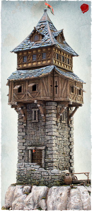
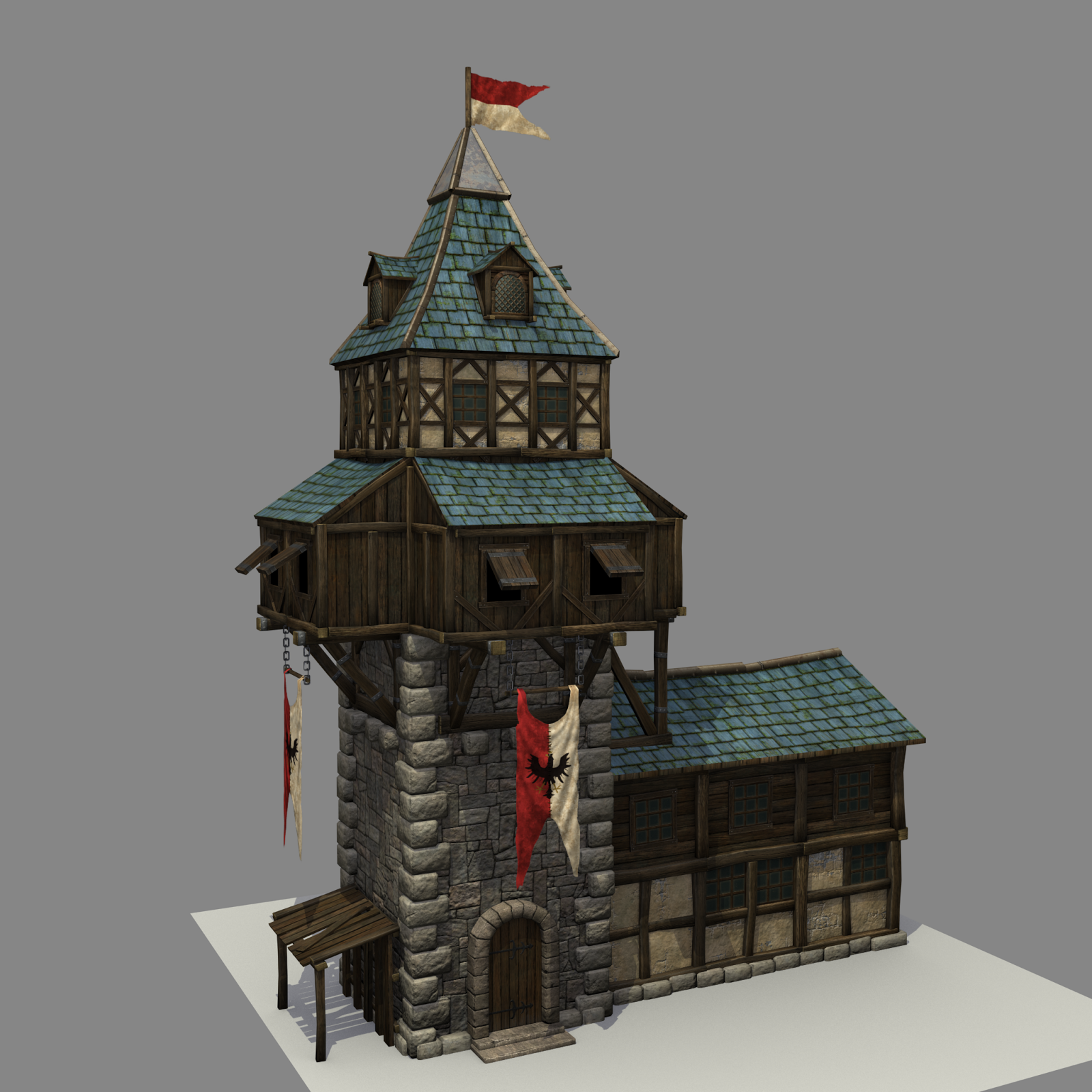
I think your normal map on the bricks is a bit blobby and could read better with some sharper detail. The bricks themselves look very round, almost soft, given how defined and sharp they are in the reference.
Where the roof tiles end and there's timber, I don't think that it's really working. Maybe model in a few wooden support beams and have the roof tiles texture wrap around there instead?
Maybe you could try making the banners a bit more dynamic instead of having them hang completely straight.
i think for the roof i will try something like this on here from romys Pirate Castle (amazing work btw)
The corners of the wooden portion are 2 45 degree sections, rather than a single 90 degree bend.
The attached building doesn't really fit the style of the reference, especially the wooden portion built from horizontal boards.