The BRAWL² Tournament Challenge has been announced!
It starts May 12, and ends Sept 12. Let's see what you got!
https://polycount.com/discussion/237047/the-brawl²-tournament
It starts May 12, and ends Sept 12. Let's see what you got!
https://polycount.com/discussion/237047/the-brawl²-tournament
[UDK] Stargate scene
Hey guys, this is something I've been working on the last few weeks.
An old cliffside entrance to an underground temple of sorts
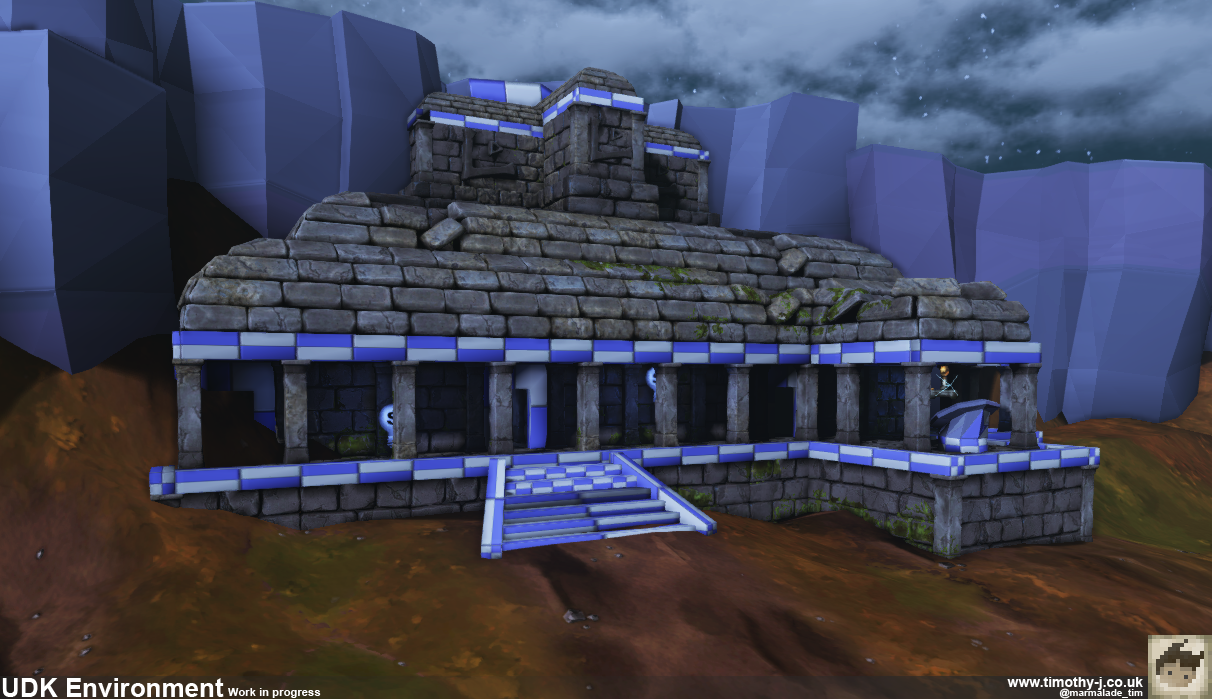
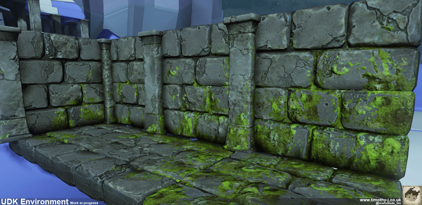
I'm really enjoying vertex blending, having only really used Source before vertex blending is entirely new and fascinating. Closer shot of my mossy wall blends:
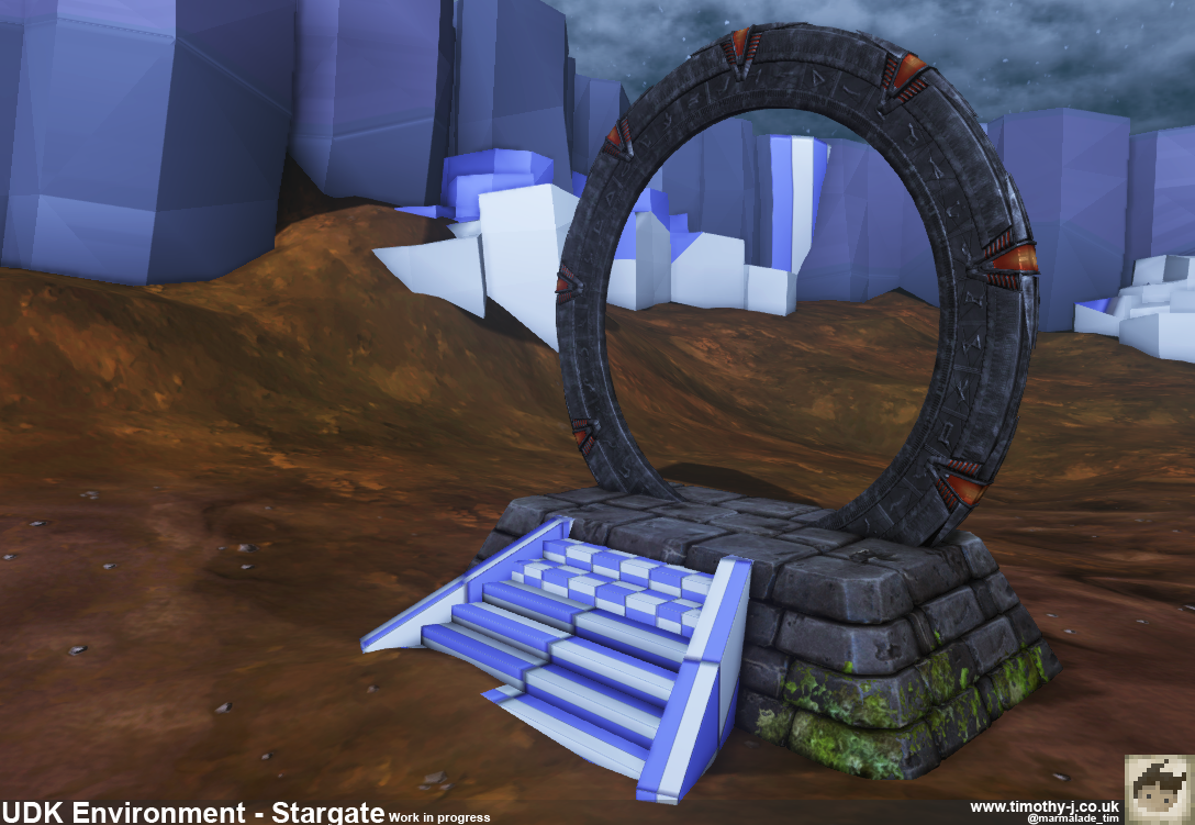
The gate itself:
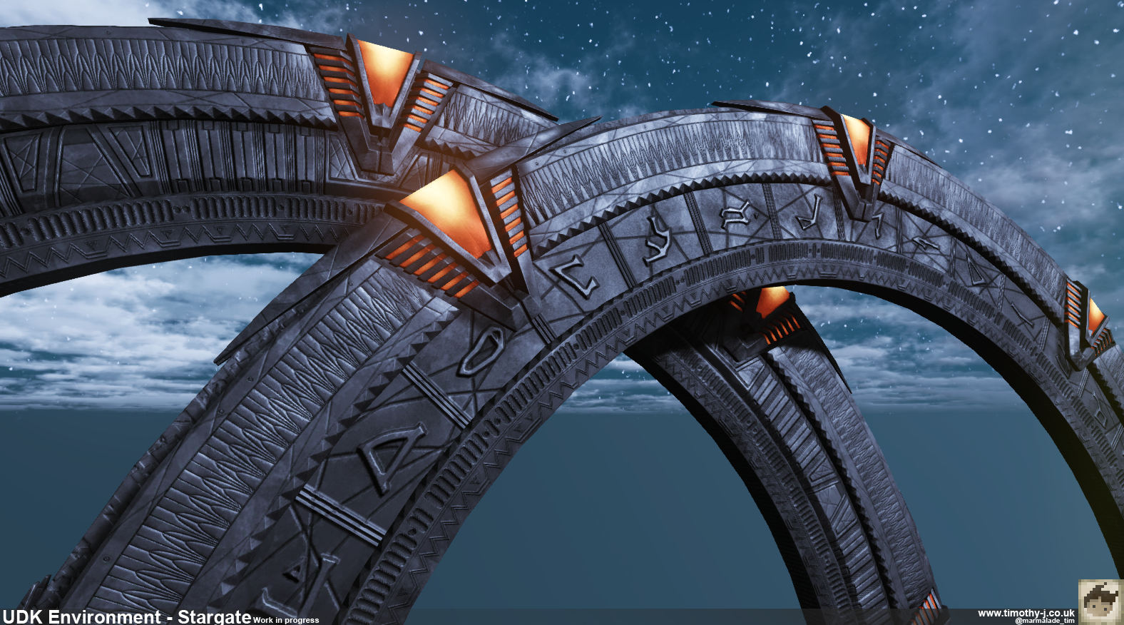
And a close up of the gate front and back with the chevrons lit:
With some diabolically bad grass below it.
That's something I'm struggling with quite a lot, everything I try for the grass just seems to look terrible.
I want it to look a lot like these photos here and here where the grass is very orange and mossy. It doesn't feel right to put in grass cards which is leaving me floundering with the texture.
Any advice RE getting good looking mossy grass would be greatly appreciated!
An old cliffside entrance to an underground temple of sorts

I'm really enjoying vertex blending, having only really used Source before vertex blending is entirely new and fascinating. Closer shot of my mossy wall blends:

The gate itself:

And a close up of the gate front and back with the chevrons lit:

With some diabolically bad grass below it.
That's something I'm struggling with quite a lot, everything I try for the grass just seems to look terrible.
I want it to look a lot like these photos here and here where the grass is very orange and mossy. It doesn't feel right to put in grass cards which is leaving me floundering with the texture.
Any advice RE getting good looking mossy grass would be greatly appreciated!

Replies
Maybe you should post some screenshots of the grass u got so we can crit it
Earlier on I was experimenting with grass more like this:
Also got around to some cliffs too:
Something is bugging me about these grass cards though, I'm using the foliage tool which is pretty neat but I'm getting small clusters of cards which have a dark line in the lightmap. I could increase the scale, but it's already 16 per card and more seems excessive (The line is actually still visible at 32 too).
You can see it a little in the second picture but it's more visible from below the landscape here:
Does anyone have any ideas on how I can avoid this?
I think the scale of your stone work is a little bit off and too uniform to me. Both the bricks and cliffs looks like they've been scaled up. The size of the individual bricks (while honking big) isn't really the issue. The size of the details like the grout and cracks is what throwing it off.
For example, looking at the screenshot with the pillars and brick wall you can clearly see the scale of the cracks from the pillar and wall don't match. Cliffs is the same thing. The size of them isn't the issue, but the size of the details are.
Brick layout definitely could use a randomize pass over it.
As for the lightmap foliage issue, I'm pretty sure I've seen this come up before. Search around polycount or google, I think you'll find a solution for it.
Keep it up though! I'd love to see this finished.
Indeed.
This sentence scares me slightly; are you adding emphasis to loving the style or the stone scale comments?
As for the grass lighting, it was only chance that I found out I should be using transmission to get the backfaces lit and I'm not actually certain that's the correct method. All I'm finding on the topic is that the foliage tool used to be broken but has been fixed recently.
Jack O'Neil used to say "for crying out loud" quite a bit in the show, which btw is one of my all time fave scifis.
Bring back Universe! >:|
I'm not keen on the style myself, only because stargate was brilliant IP for a gritty realistic fps, and I hate the iphone game they're releasing.
Anyway, its good work nevertheless.
I love it, top to bottom. I can already imagine the SG team walking around the temple and trying to solve its mysteries. Great work mate and thank you for reminding me of Stargate, it was such a good show.