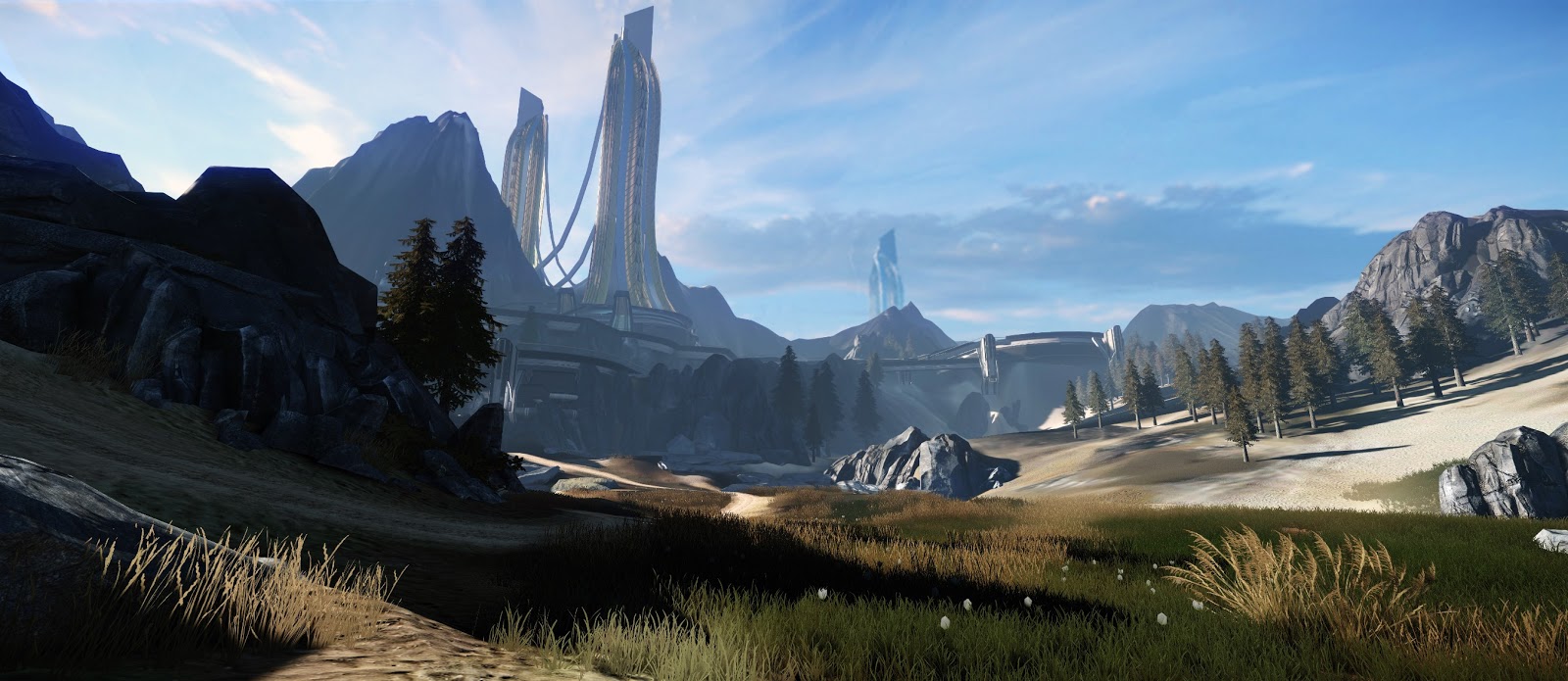
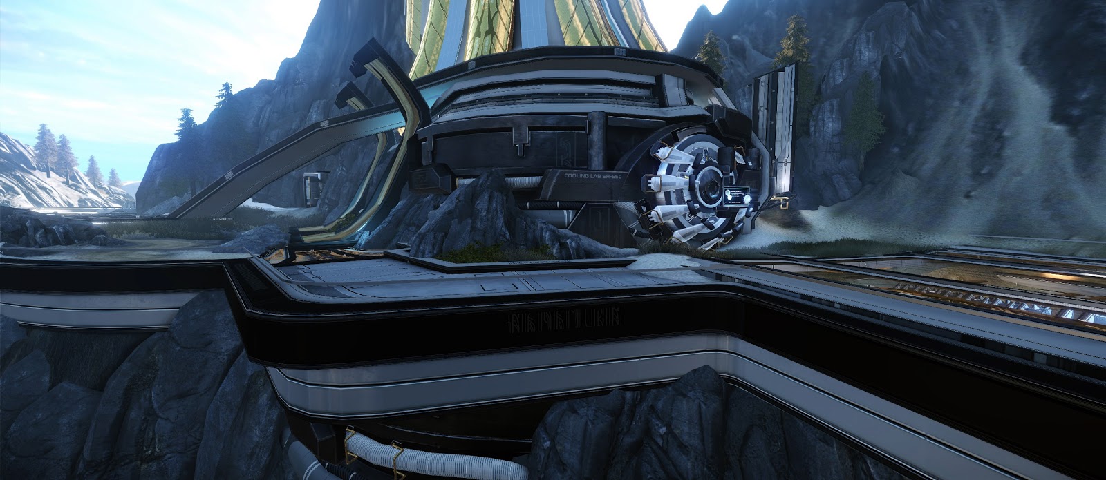
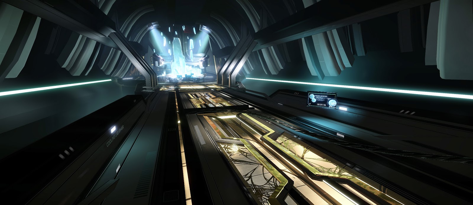
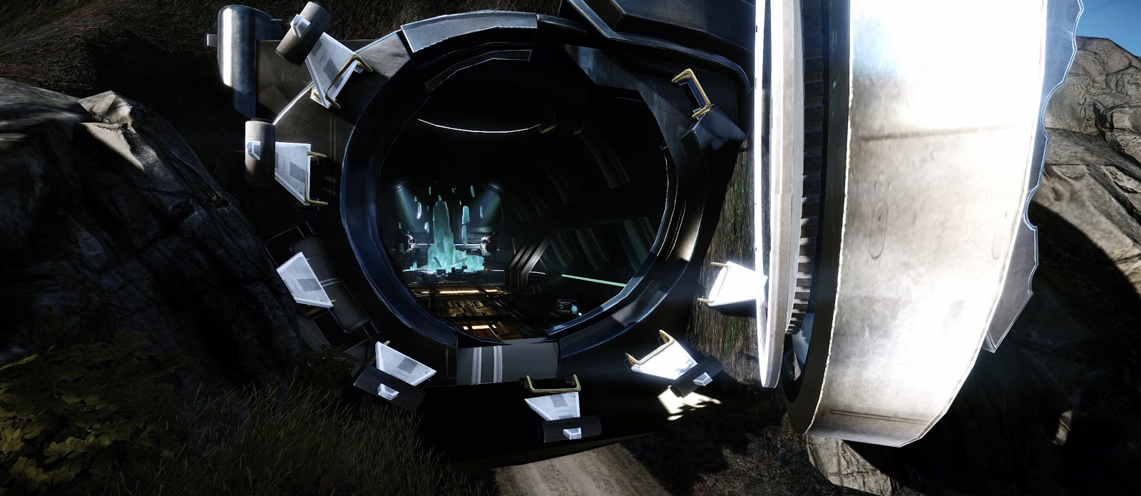
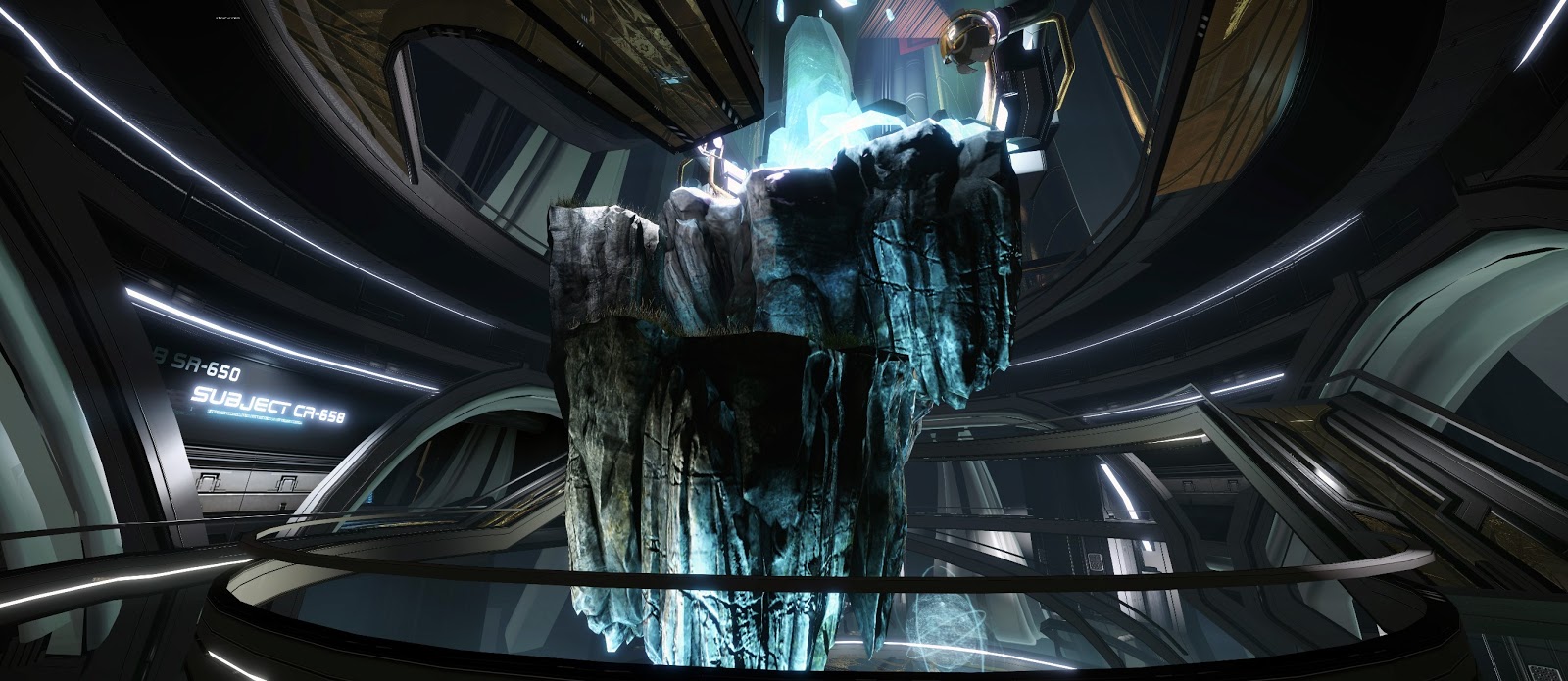
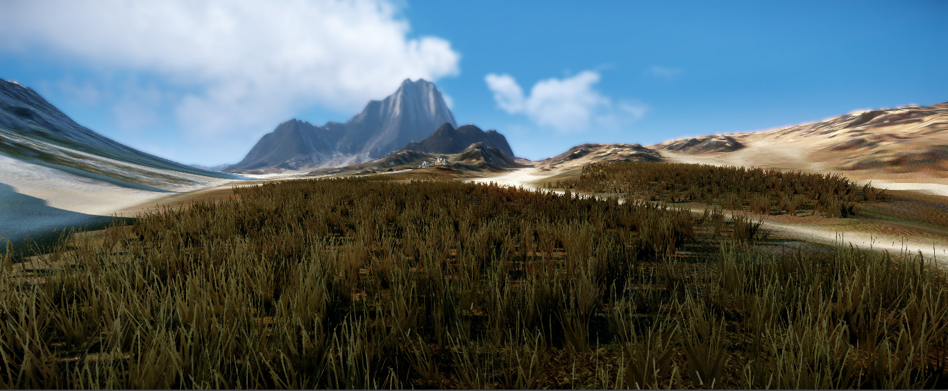
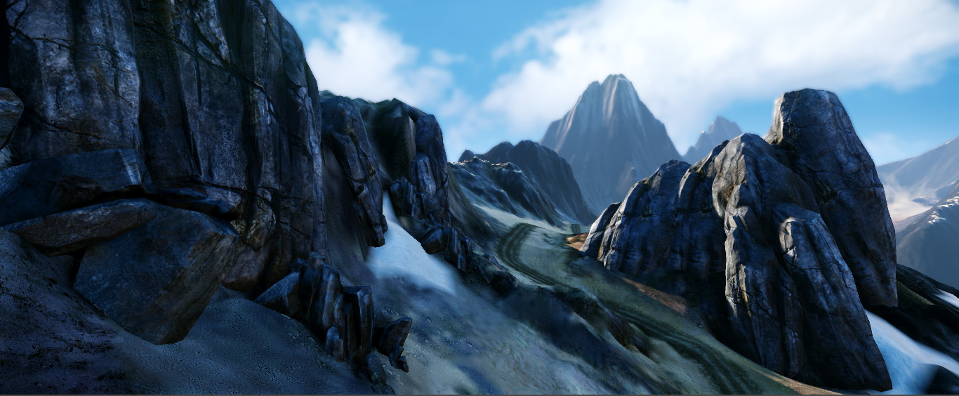
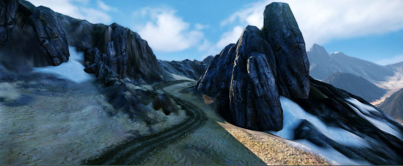
Project is finished now so Thought I would share the final renders,
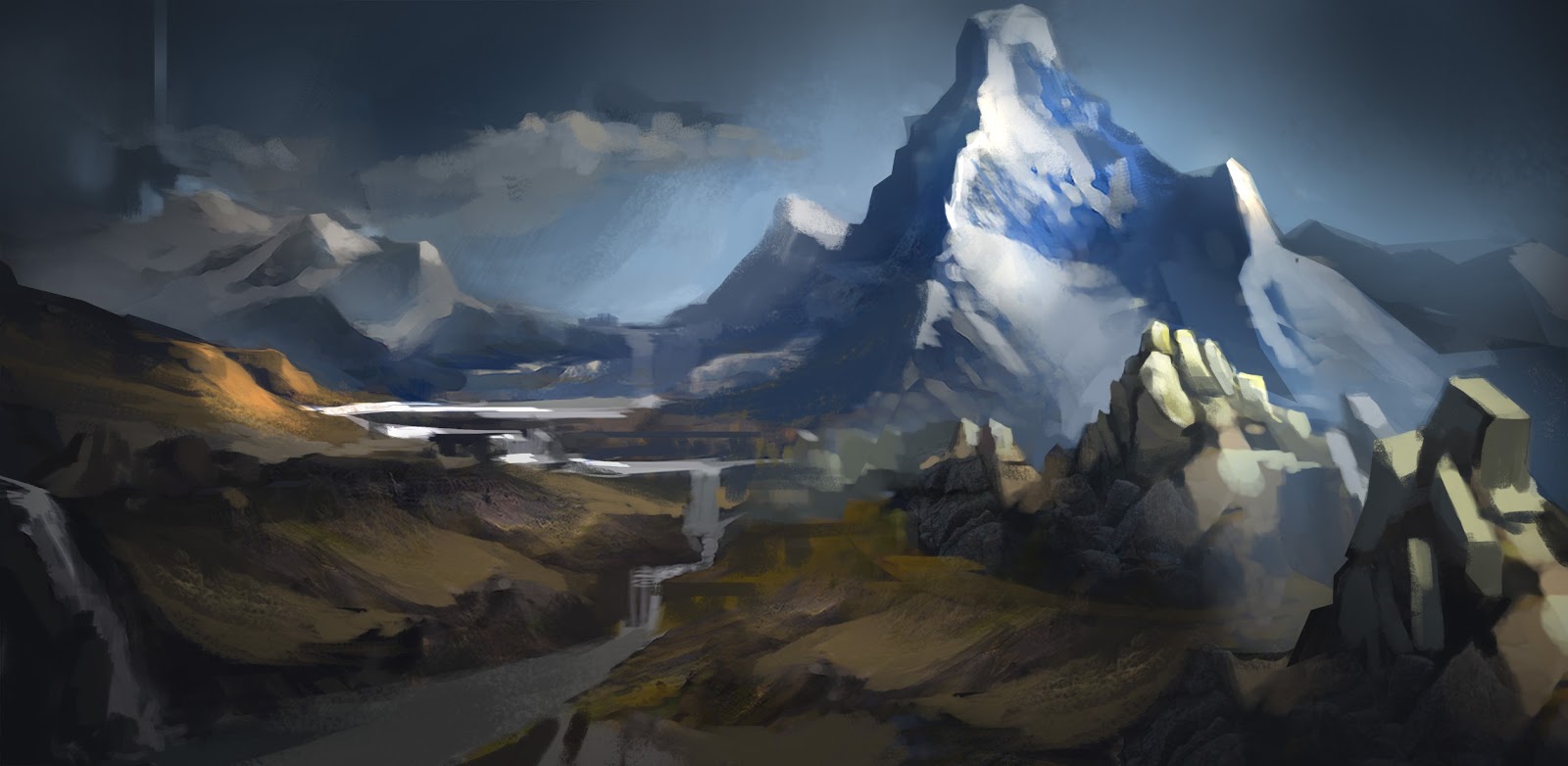
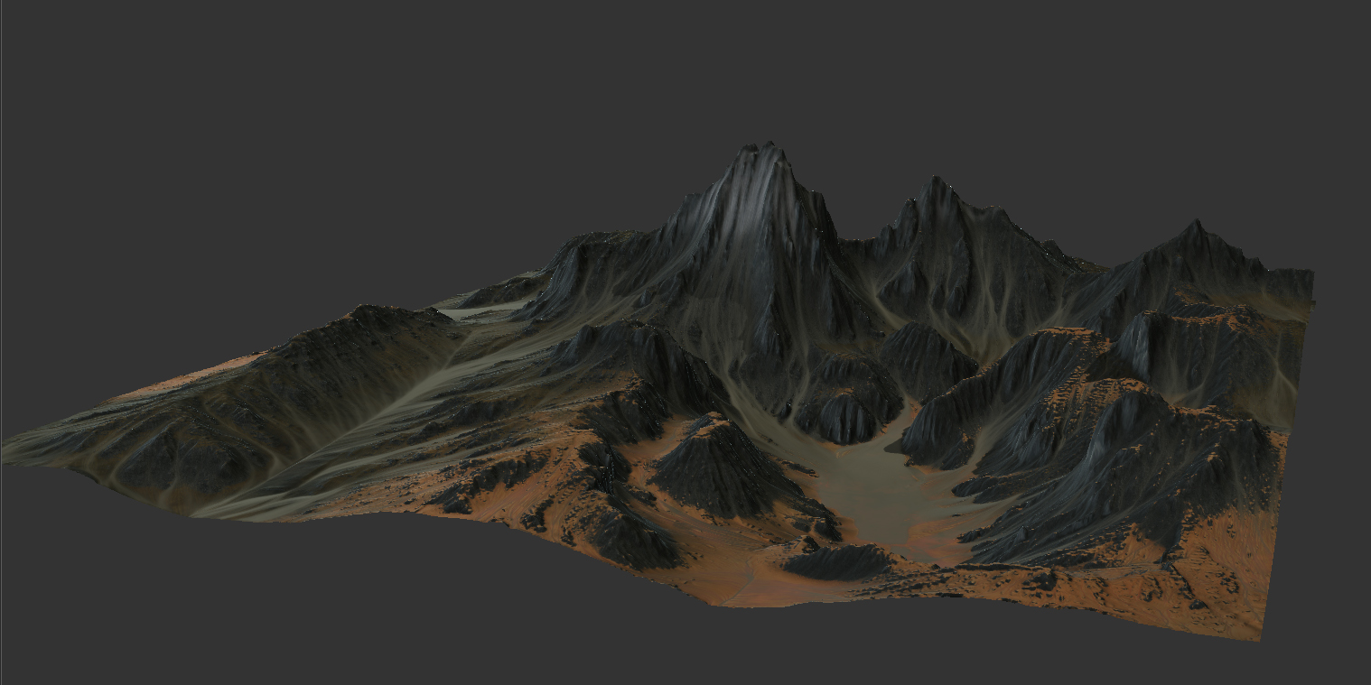
Hey guys thought I would kick some stuff off with my Final Major Project that I be doing over the next few months. I was hoping to post some work as I go along for some crits and feedback. I am creating a rocky mountainous enviroment loosely based on New Zealand's Fiordland National Park and Mount Titiroa. This will serve as a basis for a Futuristic Sci Fi Base so I can demonstrate both Organic and Hard Surface high poly work for portfolio. Here is the initial proof of concept
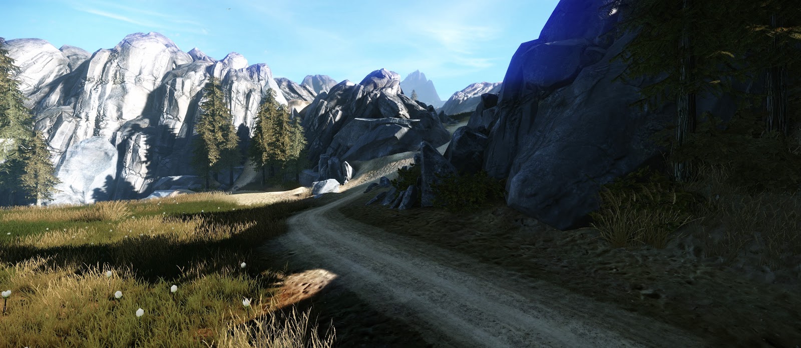
Here is where I am at the moment. Crits welcome
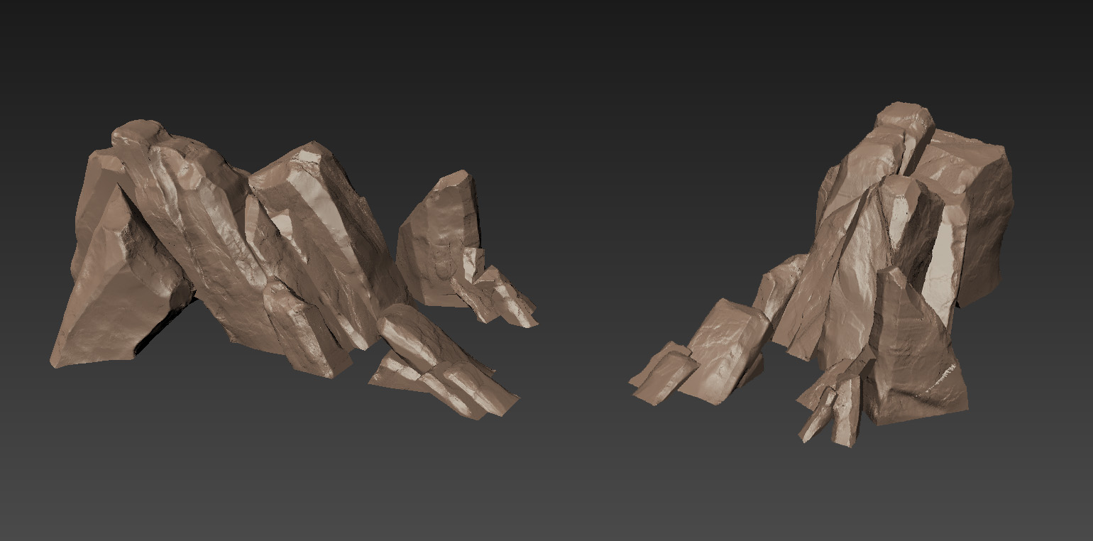
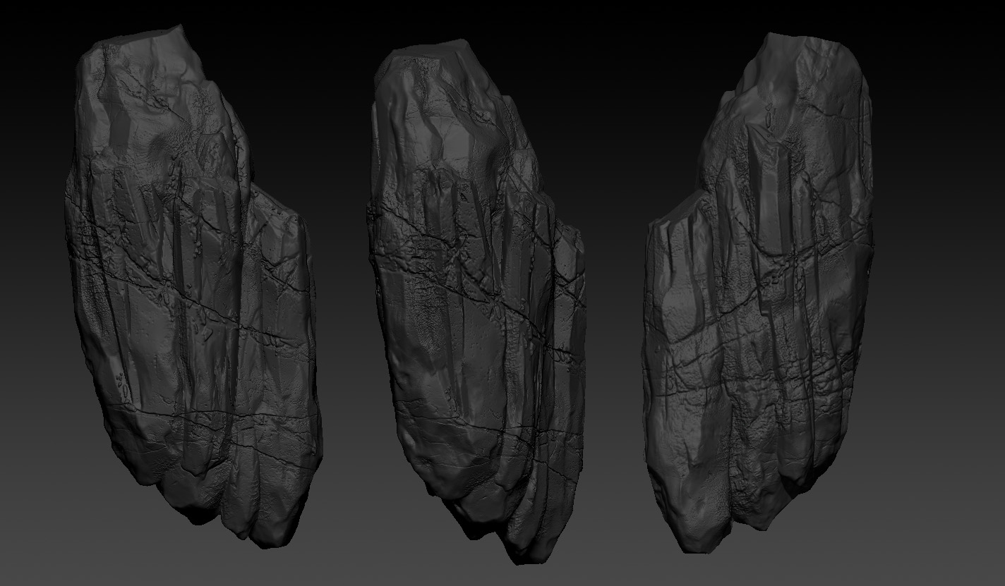
Here are some of the Rock High Poly stuff and the Terrain itself:
Still got some more Landscape stuff to make and continue with the population. But now I am moving on to working on the base.
Hey, I'm learning CE3 so this caught my attention. I can't vouch for accuracy, but your pictures show up on Google Images for "Mount Titiroa" so I guess that's pretty good.
Looking at the screenshots, I think you should try turning off the shadows on the grass. The hard shadows don't fit the small tufts of grass.
Your landscape assets look quite nice already, maybe close to finished. My only concern is that there might be a wenda rock/terrain tutorial "look" emerging. If it wasn't on your checklist already, you could try using a blend layer to hide the seams where the rock meshes meet the terrain.
The concept piece has a nice loose feeling to it. Are you going to continue to add to it?
Altogether this is really nice work so far. Looking forward to the rest of it.
Already subscribing :P. Wonderful concept and sculpting of the rocks imo. The best part is how well the colors work together. I've never used CE3 so I'm not sure what and how much control you have but the grass I feel is holding the piece back the most.
@jdvi - I give turning the shadows off a go see what I think, but I have a feeling it looked a little odd. I will be adding moss and flowers to break up the repition of the grass so hopefully this will help. Yer I have seen the Wenda tutorials but I am planning on getting a sci-fi base in there and adding a lot more to the terrain and that so hopefully that will push it away from that as essentially it is only rocks and terrain for the meantime. I did have the plan to put some concepts in for the Base in the concept but may do that as a seperate concept.
@maximumsproductions - Cheers, yer I will be working more on the grass to add more variety with tussock grass, flowers and moss so hopefully that will bring it up a little
So I have been working on the environment for a few weeks now and I thought It was due an update on here.
I have addressed some of the critique mentioned so far, first of all the grass as this was one of the weakest areas.
I lowered the grass, thickened it up and gave another model which I coloured with a more yellow hue. It was also taller and a lot thinner to give a nice variety. Think it looks a lot more natural now. but I let you guys be the judge
Also planning on adding some of red's in there with heather to break it up colour wise at the moment.
It was mentioned I should vertex paint the rocks to blend more into the terrain but I think I am going to do this with decals cause the rocks are rotated and positioned in different ways so this wouldn't work I don't think.
I then moved on to working on the main base area, which initially I thought should be a moving base with legs that would drill itself into the landscape, the player would enter the building through the leg. This wasn't feasible once I got it in game as it proved to linear and the interior space of the leg didn't work
I then moved on to a base more set in the mountain as this gave more of the feel I wanted. (quick paintover of solids below)
I wanted the player to enter this base behind the mountain through a separate interior which would house some crazy alien artefact thing. I made a series of circular levels and painted over them to get a rough plan view
I wanted a fairly epic view looking up at this artefact, so this is the progress so far on the interior, its inspired but some of the environments from the John Carter film. Obviously ignore the fact that I haven't unwrapped a lot of stuff but this is just under a weeks progress on the interior
Fairly happy with the general shapes and style of the environment but I think it still lacks some atmosphere, so I would appreciate any help/critique/paintovers. Also if you want to read more about stuff you can visit my blog http://benkeelingfmp.blogspot.co.uk/
@AkiRA Cheers I have been following your Sci-fi room Thread actually, I really liked what you were doing had some really tight high poly work and some nice textures.
Would appreciate any help/critique and tutorials on improving the lighting and atmosphere, still a bit of a noob to this whole Cryengine Stuff
Hey guys thanks for the kind comments, here is this weeks process, been working on some lighting in the interior and some more meshes, as well as some animated sections (first image) which look a lot better in engine I promise! placed in a rock mesh for focal point which is purely place-holder for some lighting tests.
Again I still need some pointers on lighting as it is one of my weakest points. Fairly happy with the direction this is going, also added a new rock mesh to outside and some decals to blend off moss and snow.
As always any crit and helpful advice would be super helpful, is always nice to get good comments but in my opinion things are never perfect, cheers
Hey there guys, thought I would post some more WIP shots of how its going so far, been working on the exterior base that sits on the outside which will eventually link to the Interior. Also been working some more on the landscape, modelling some more vegetation, textures and decals here and there. Crits welcome
This is looking awesome, very Halo-esque. The updated lighting looks great, especially the yellow area. The red lights are a little too opaque though, in my opinion. Also, are you using a sky light/ambient light outside? The shadows are really dark right now.
I'm sure you've probably seen some of these, but have you looked at any Halo 4 images for reference? There's a few concepts that I think may be useful for the rock area. This is one by Sparth
Some of the in-engine shots of Halo 4 by Chris Durso may also be useful too.
@leleuxart Cheers man thanks for the comments, Yer I give increasing the ambient light a go, I had noticed the shadows were a little dark in sections. Yer I had seen Sparth's concept stuff tis really awesome. Chris Durso's stuff is really impressive, especially the lighting, will try and replicate something along the same lines for the interior section. Cheers for that.
@radiancef0rge Cheers, I sculpted the terrain in Mudbox, Bought it into world machine for some erosion effects, using Coastal Macro which I just edited the Colours of and then combined a load of other maps such as Ambient Occlusion, cavity etc to get the final diffuse.
@MaxMead Yer I agree will try tweaking the ambient light, It did break it actually cryengine crashed every time I opened it. so I had to do a completely fresh install but got it working in the end.
Not sure you need any advice on lighting an interior, that look amazing in it's own way! Halo 4 looks messy, tons of point lights. Loved the giant exterior crazy sci fi painting stuff in Halo 4, but the interiors were rather boring.
I'd much rather play through your understated, spartan, almost tron like thing than just throwing orange and teal point lights everywhere and calling it good.
Your exterior is something different though. The shadowed areas look too dark for what seems to be a bright daylit sky, the sun also appears to be at too much of an angle for broad daylight, looking more like it's edging towards sunset.
Which is good! Personally I'd just switch it to a near sunset type of lighting EG:
Took some of your comments into consideration with the lighting, boosted those shadows from the blacks, cause I definitely agree with them being too dark. Here is some shots from the same-ish places so you can compare. Let me know if thats more along the right lines.
@locater16: Cheers man yer I am inclined to agree about the point light stuff in Halo some of it doesn't make a lot of sense, I wanted to try and put lights in where you would have them like on the walkways as if this place was a functioning facility, obviously you wouldn't have lights running up random panels like in Halo.
I shall try and push the lighting a little more sunset, Will replace the sky with something a bit more closer to the end of the day which hopefully will help. But I appreciate the critique very helpful thank you.
Not updated in a while but thought you guys would appreciate a bit of an Update. Warning this one is going to be Image Heavy!
Here is some shots from the exterior landscape and the base, been working on fixing up textures and defining materials and new meshes such as a big vault style door.
Also been working on the transition from the outside to the interior with the big animated door. previously struggled with the vis areas and portals as cryengine tends to be a bit buggy but thats all seamless now.
Here are some shots of how the Interior is looking now, Finally nailed down the centre piece as this giant power emitting crystal which pulsates and animates in engine, but for now you will have to do with just some screenshots. Got some little robots that fly around and scan the crystal as well
So I have around 2/3 weeks until this is handed in so if there any crits or advice for this then please feel free to chip in :P
Great work. Personally, I think you could push the exterior lighting further. I'd love to see a little more ambient lighting, your shadows are looking really dark. Also introducing some more colour in your directional could add a lot.
@snow perfect advice agree with it all, I will give making those changes a go as they should be relatively easy fixes. Thank you for taking the time to write this
@andybozo: Cheers man thanks for the kind words, saw that you worked at 343, put in a good word for me I am currently working a new scene at the moment in my spare time so will be sure to share that on here when its done!
Anyway here is a Fly-through, thought you might find this interesting. Make sure you watch in HD
Good job! pretty cool it had a bit of everything in the video. lighting,vfx , animation, modeling, etc. really like the big picture of the it all. Couple things really stood out is how clean the surface of the metal was( texture and geo ) and pixelation on the rocks( especially when comparing between the clean lines and the cracks on the rocks.
Flipping fantastic work!
I hate to be like Fix this but there where just 2 things in the video I noticed that where off. #1 alfa poping on the grass. I think your texture is too high res and I'm pretty sure if you just make the texture size smaller the alfa poping won't be so noticeable. #2 your grass on the floating rock was also floating.
That's it man Great work! Like holy balls you shot for a style and nailed it on the head. Congrats.
@MDSchee: Yer I agree with the comments on the rocks, cause I set myself a pretty small budget with the rocks only used 3 in the end it was pretty difficult to get a consistent resolution. I worked with UDK and I think there is something in the CryEngine exporter that just compresses the textures a lot lower than in max and UDK. Could never fix that tbh. I do agree with the metal, purely down to time, would of loved to model in a few cracked and broken bits.
@dudealan2001: Yer the alpha popping is a bug, its something to do with painting in the grass using terrain layers, could not find a fix for that. Good spot with the grass on the rock, will fix that!
Are you generating 'sky accessibility' on your terrain? It will give you a distance normal map based on the highest tessellation and make your terrain look better from a distance.
Amazing job and I always love to see a video. You just can't appreciate the work as much without one. I'm curious as to what program(s) you used to sculpt out the base?
I really like the piece, but the grass and trees feel out of place for me. I'm not sure why, but it feels like the other parts belong on a different planet or something. Certainly don't follow my vision if it's not where you're going with it, but I would do something different with the vegetation. My only other comment would be to add a vehicle or something so that the tracks in the dirt paths make sense. I'm in awe in how you did the paths, etc. I hope I'm not coming off harsh.
@IchII3D: I did do the sky accessibility thing but it probably wasn't done when i recorded the video. Cheers for that I actually had no idea what that did!
@RaventhePirate: If you read the previous thread stuff it should give you a little bit of an insight, not really sure which bits you mean? do you mean the Sci-Fi stuff or the landscape stuff. I can write up a quick tutorial if you need?
@alvordr: yer well its kinda set on earth in the future for the sci-fi stuff to make sense. I do have a vehicle in the environment that I made and is drive-able. Just not featured here.
The landscape stuff I am more familiar with. I'm guessing you used a mix of Mudbox, World Machine, and Photoshop right?
What I'm more interested in learning about is the sci-fi stuff. If you could take the time to explain your programs and workflow from placing it onto the terrain to putting in the robot and smaller details with the interior I would be eternally grateful.
Absolutely gorgeous! Actually reminds me more of the environments in Section 8:Prejudice. Do you have an online portfolio anywhere yet? And what company are you working for cause there's no way you're not working professionally already.
Sorry I took so long to Reply been super busy with stuff. Just been settling into new job and starting some new personal work as well.
@RaventhePirate: Yer for the Landscape I used all the programs you mentioned, but it was blocked out first in Mudbox then run through World Machine re-sculpted and tweaked. The Rocks and detail meshes are sculpted retopo and a lot of it was placed by hand except the Vegetation which was procedurally placed using Cry Engine and assigning the meshes to different painting layers, which basically allows you to place them and rotate them randomly. I started off by placing it by hand but it took too long. The inside is a about 3-4 meshes and everything was done in max pretty much cause using Cry Engine is real time there is no need for light maps and things like that so could keep it as one Mesh. Things like the Robots where concepted the modelled using textures I already had and then exported separately and Track Viewed for the animations. But they also had an animation from Max as well. Anything Animated was exported separately such as doors and moving floor parts. The animation was just Key framed simply in Max. I hope that is some help in answering your questions. If you need any more help I could do a kind of quick photo bash together on how I went about a particular Asset as an example if you like. Just let us know which one if thats any use to you.
@TorQue[MoD]: Ah cool thanks for that, not played it but has a nice Sci_fi Vibe to it so thats Great. I do have an Online Foiio, The link is:
Yer this is my Graduate Final Project but I got picked up by Criterion Games who make Need for Speed over at EA which is cool. Working on that and some personal stuff at the moment so hopefully can post some of that once its done.
Replies
Looking at the screenshots, I think you should try turning off the shadows on the grass. The hard shadows don't fit the small tufts of grass.
Your landscape assets look quite nice already, maybe close to finished. My only concern is that there might be a wenda rock/terrain tutorial "look" emerging. If it wasn't on your checklist already, you could try using a blend layer to hide the seams where the rock meshes meet the terrain.
The concept piece has a nice loose feeling to it. Are you going to continue to add to it?
Altogether this is really nice work so far. Looking forward to the rest of it.
@maximumsproductions - Cheers, yer I will be working more on the grass to add more variety with tussock grass, flowers and moss so hopefully that will bring it up a little
@PhoenixWolf - Cheers for the kind words
I have addressed some of the critique mentioned so far, first of all the grass as this was one of the weakest areas.
I lowered the grass, thickened it up and gave another model which I coloured with a more yellow hue. It was also taller and a lot thinner to give a nice variety. Think it looks a lot more natural now. but I let you guys be the judge
Also planning on adding some of red's in there with heather to break it up colour wise at the moment.
It was mentioned I should vertex paint the rocks to blend more into the terrain but I think I am going to do this with decals cause the rocks are rotated and positioned in different ways so this wouldn't work I don't think.
I then moved on to working on the main base area, which initially I thought should be a moving base with legs that would drill itself into the landscape, the player would enter the building through the leg. This wasn't feasible once I got it in game as it proved to linear and the interior space of the leg didn't work
I then moved on to a base more set in the mountain as this gave more of the feel I wanted. (quick paintover of solids below)
I wanted the player to enter this base behind the mountain through a separate interior which would house some crazy alien artefact thing. I made a series of circular levels and painted over them to get a rough plan view
I wanted a fairly epic view looking up at this artefact, so this is the progress so far on the interior, its inspired but some of the environments from the John Carter film. Obviously ignore the fact that I haven't unwrapped a lot of stuff but this is just under a weeks progress on the interior
Fairly happy with the general shapes and style of the environment but I think it still lacks some atmosphere, so I would appreciate any help/critique/paintovers. Also if you want to read more about stuff you can visit my blog http://benkeelingfmp.blogspot.co.uk/
Your stuff looks so good, that I want to throw mine in the bin...
Great so far, I'll follow this closely!
@AkiRA Cheers I have been following your Sci-fi room Thread actually, I really liked what you were doing had some really tight high poly work and some nice textures.
Would appreciate any help/critique and tutorials on improving the lighting and atmosphere, still a bit of a noob to this whole Cryengine Stuff
Again I still need some pointers on lighting as it is one of my weakest points. Fairly happy with the direction this is going, also added a new rock mesh to outside and some decals to blend off moss and snow.
As always any crit and helpful advice would be super helpful, is always nice to get good comments but in my opinion things are never perfect, cheers
Really inspiring stuff
I'm sure you've probably seen some of these, but have you looked at any Halo 4 images for reference? There's a few concepts that I think may be useful for the rock area. This is one by Sparth
Some of the in-engine shots of Halo 4 by Chris Durso may also be useful too.
@radiancef0rge Cheers, I sculpted the terrain in Mudbox, Bought it into world machine for some erosion effects, using Coastal Macro which I just edited the Colours of and then combined a load of other maps such as Ambient Occlusion, cavity etc to get the final diffuse.
@MaxMead Yer I agree will try tweaking the ambient light, It did break it actually cryengine crashed every time I opened it. so I had to do a completely fresh install but got it working in the end.
I'd much rather play through your understated, spartan, almost tron like thing than just throwing orange and teal point lights everywhere and calling it good.
Your exterior is something different though. The shadowed areas look too dark for what seems to be a bright daylit sky, the sun also appears to be at too much of an angle for broad daylight, looking more like it's edging towards sunset.
Which is good! Personally I'd just switch it to a near sunset type of lighting EG:
@locater16: Cheers man yer I am inclined to agree about the point light stuff in Halo some of it doesn't make a lot of sense, I wanted to try and put lights in where you would have them like on the walkways as if this place was a functioning facility, obviously you wouldn't have lights running up random panels like in Halo.
I shall try and push the lighting a little more sunset, Will replace the sky with something a bit more closer to the end of the day which hopefully will help. But I appreciate the critique very helpful thank you.
Here is some shots from the exterior landscape and the base, been working on fixing up textures and defining materials and new meshes such as a big vault style door.
Also been working on the transition from the outside to the interior with the big animated door. previously struggled with the vis areas and portals as cryengine tends to be a bit buggy but thats all seamless now.
So I have around 2/3 weeks until this is handed in so if there any crits or advice for this then please feel free to chip in :P
@snow perfect advice agree with it all, I will give making those changes a go as they should be relatively easy fixes. Thank you for taking the time to write this
Anyway here is a Fly-through, thought you might find this interesting. Make sure you watch in HD
[ame="http://www.youtube.com/watch?v=t2Ef_-Ox6uI"]Mount Titiroa Sci-Fi Base - YouTube[/ame]
I hate to be like Fix this but there where just 2 things in the video I noticed that where off.
#1 alfa poping on the grass. I think your texture is too high res and I'm pretty sure if you just make the texture size smaller the alfa poping won't be so noticeable.
#2 your grass on the floating rock was also floating.
That's it man Great work! Like holy balls you shot for a style and nailed it on the head. Congrats.
@MDSchee: Yer I agree with the comments on the rocks, cause I set myself a pretty small budget with the rocks only used 3 in the end it was pretty difficult to get a consistent resolution. I worked with UDK and I think there is something in the CryEngine exporter that just compresses the textures a lot lower than in max and UDK. Could never fix that tbh. I do agree with the metal, purely down to time, would of loved to model in a few cracked and broken bits.
@dudealan2001: Yer the alpha popping is a bug, its something to do with painting in the grass using terrain layers, could not find a fix for that. Good spot with the grass on the rock, will fix that!
@RaventhePirate: If you read the previous thread stuff it should give you a little bit of an insight, not really sure which bits you mean? do you mean the Sci-Fi stuff or the landscape stuff. I can write up a quick tutorial if you need?
@alvordr: yer well its kinda set on earth in the future for the sci-fi stuff to make sense. I do have a vehicle in the environment that I made and is drive-able. Just not featured here.
What I'm more interested in learning about is the sci-fi stuff. If you could take the time to explain your programs and workflow from placing it onto the terrain to putting in the robot and smaller details with the interior I would be eternally grateful.
Sorry I took so long to Reply been super busy with stuff. Just been settling into new job and starting some new personal work as well.
@RaventhePirate: Yer for the Landscape I used all the programs you mentioned, but it was blocked out first in Mudbox then run through World Machine re-sculpted and tweaked. The Rocks and detail meshes are sculpted retopo and a lot of it was placed by hand except the Vegetation which was procedurally placed using Cry Engine and assigning the meshes to different painting layers, which basically allows you to place them and rotate them randomly. I started off by placing it by hand but it took too long. The inside is a about 3-4 meshes and everything was done in max pretty much cause using Cry Engine is real time there is no need for light maps and things like that so could keep it as one Mesh. Things like the Robots where concepted the modelled using textures I already had and then exported separately and Track Viewed for the animations. But they also had an animation from Max as well. Anything Animated was exported separately such as doors and moving floor parts. The animation was just Key framed simply in Max. I hope that is some help in answering your questions. If you need any more help I could do a kind of quick photo bash together on how I went about a particular Asset as an example if you like. Just let us know which one if thats any use to you.
@TorQue[MoD]: Ah cool thanks for that, not played it but has a nice Sci_fi Vibe to it so thats Great. I do have an Online Foiio, The link is:
http://benkeeling.carbonmade.com/
Yer this is my Graduate Final Project but I got picked up by Criterion Games who make Need for Speed over at EA which is cool. Working on that and some personal stuff at the moment so hopefully can post some of that once its done.
@Meteora: Cheers for the kind words
And the portfolio looks great! Can't wait to see you next piece.