Tale of Marconi - 3D Game Environment
Hi Polycount,
Me and two other friends (Wolver and Jan_U) are working on a game environment project, and would love some crit.
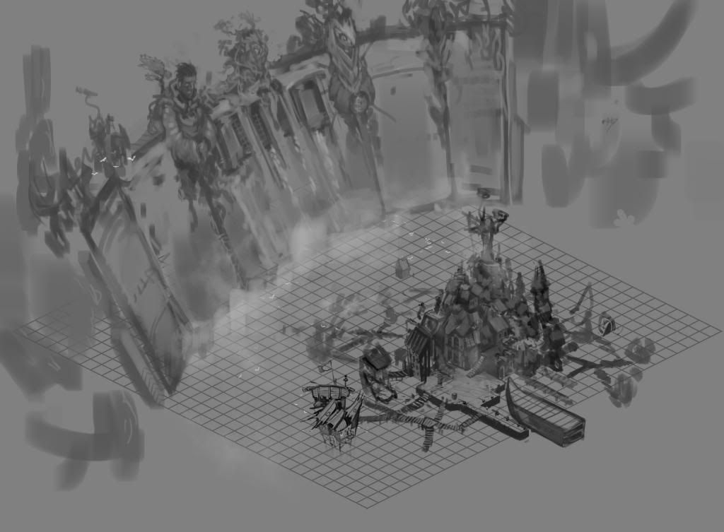
The environment we're working on set in a 1500's, and consists of a large water filled gorge with a dam at one end, and a village built on top of the water, but in front of the dam.

Environment Concept by Wolver
The idea behind this location is that the inhabitants have moved down here for safety and protection from the dangerous environment surrounding them, so its kind of 'safe haven' type of environment.
We are working in a painterly style, reminiscent of bastion, but are trying keeping the environment as 'believable' as possible while still being interesting and striking.
We look forward to hearing all C&C. and hope that we can push this project as far as possible.
Me and two other friends (Wolver and Jan_U) are working on a game environment project, and would love some crit.
The environment we're working on set in a 1500's, and consists of a large water filled gorge with a dam at one end, and a village built on top of the water, but in front of the dam.

Environment Concept by Wolver
The idea behind this location is that the inhabitants have moved down here for safety and protection from the dangerous environment surrounding them, so its kind of 'safe haven' type of environment.
We are working in a painterly style, reminiscent of bastion, but are trying keeping the environment as 'believable' as possible while still being interesting and striking.
We look forward to hearing all C&C. and hope that we can push this project as far as possible.
Replies
thought i would get the ball rolling here is some AO renders of some of the items im working on just trying to get out a textured version from cryengine of the boat and also the shack that i have been working on.
Town Tavern WIP
Players Boat WIP
Cryengine Screenshots
Shack Cryengine Screenshots
things to edit:
Boat -
Create another texture for the hull and vertex paint
Different texture for some of the sails
Shanty house -
Make some of the planks strut out more in places so the front isnt completley flat
I look forward to hearing from you
so heres the update so far.
The image is abit blurry because its a straight screenshot from Maya
The texture plan to make another version to break it up more and just make it more interesting
Can you show flats and wires on the boat? I'm trying to think how you did the UVs and textures for an asset this big
sorry about the delay been kind of busy learning little things in Cry like camera cutscenes and what i thought would only take a little while to learn took me about half a day :poly122:
anyways no more excuses heres the wireframe sorry its been triangulated going to work on getting a quad version out soon the main bit that took the most polyies is the hull the curvature kinda slapped me in the face initially i had the hull decking and masts all layed out on a uv set but ran into the problem of having it all alot lower textile density compared to other stuff like the cannons so i ended up replacing all the textures for those and making tileable textures and mirroring as much as i can.
while i was messing around in Cry i also took a shot of what the textures look like in game on the tavern
Overall quite pleased with the turnout on the bricks though still need to work in a detail layer the floor decking is still being worked on to so much love will be given there.
@MisterSande hehe dont worry ill be posting up alot of highpoly stuff soon just the only bit on the tavern i have to show is the roof really but yer promise to get out some fairly soon
Crate Texture Map
There quite different so any help in how to match cry to the texture would be awesome though i have the feeling it is primarily down to the lighting in Cryengine
High Poly stuff
Wireframes
oh and i found a colour concept for the inn giving a general idea of where i was going colour wise
any help much appreciated
Unlit and screenshotted from Maya plan to get more done before taking it into cry also think i will dirty up the textures once i have got a nice base for the entire inn.
The UV's theres a gap in the middle for either the iron rings around the entrance pillars or the inn sign.
Any feedback is greatly appreciated really want to make this as good as i possibly can
just a progress update on the tavern
still need to finish off everything white in the image so quite abit :P after that im going to start breaking up this mass of brown and grey with some ropes, canvas, plants, lanterns and crates basically going to make it look more lived in and start work on an alternate wall texture to to just make that one grey more interesting have to admit it is alot bigger and taking alot longer then i had anticipated :P
i decided to go with wood on the outlet buildings just so that i can keep a sort of continuity (think thats the word) rather then introduce plaster i dunno probably wrong but i just felt wood would
if anyone knows what that shadow parsams means in the corner please help
oh almost forgot i took your advice dudealan and started adding variation to the wood i just need to be a bit more bold with doing it was just testing to see how much it would come out in cry and yer i need to boost it alot lol you can sort of see the variations in i think the first image but just wanted to say cheers will def keep pushing colour values
but yer its only a small update have been pretty dam busy since the last post and would have liked to have done more if im honest
The plant itself i am going to revise i want to make it more recognizable it was based off the following image but i want to make it more narrow leafed like the second image as that would be more typical in warmer climates where plants do not have to compete for sunlight.
Current
Ideal
OTher than that, lookin strong!
A small problem is i quite easily go full styalised and keep checking with the group to sort of pull me back to where we want do you think i should tone back the textures on the tavern im just worried if i do that i might lose some of the charm in the model.
New version of the shack previously just redrew some ideas and then started building
Maya viewpoint screengrab currently sitting at 4k triangles or 2k poly
Wireframe
ended up putting metal onto the door just to bring the door out from the walls i also plan to add a few things to break up the wood just abit more though not trying to takeaway the fact it is a wooden shack that is built above water
planning to add plants to the windows and make some grass blades around the base ooo and some pots basically lived in stuff :P
a small update on the tavern made more variation in the wood and got round to vertex painting the walls and deck personally think it just adds abit of variation to the walls , just missing lots of beer kegs and some plants the grey building on the side is by Jan_U.
i'm not sure about that small triangular window sticking out of the big chunk of roof of the ground floor - looks a bit disconnected from the roof - it's like an extra piece just sitting there and not being part of the roof
also - what are them gray/black stripes going across the bottom floor's roof??
cheers
f.