Search
-
Re: Old Weaving Building - WIP
 Your textures are looking a bit too cartoony. Try to add more depth and more surface details. All your edges are also very round. I've never done handpainted textures so maybe someone else can give you some good pointers. It might be a good idea to try sculpting a texture in zbrush. Some good tuts here:…
 -
Re: [WIP] UDK TF2 Style Building
 In terms of the actual assets i think they look cool. Did you model straight from the texture sheet? In terms of looking like tf2. I dunno. I mean they use a very specific colour palette for the maps. This is just the texture diff. They use with normal and height maps and their own mix of shaders and stuff. You should go…
 -
Re: Tormentum - indie game (2D game art)
 Today our game has been greenlit !!! After 23 days! Tnx for support! We still have to finish our indiegogo campaign. If you like our game and want to help pleaseee share link to Tormentum campaign: http://igg.me/at/Tormentum/x/7378278 Thanks ^^. PS. Everyone who buys the game through our Indiegogo page for 9$ will get a…
 -
Re: Helenek - DOTA 2 Thread
 [vv]73029666[/vv] The Visage ward I worked on with Plant is now uploaded on the workshop, this ward was so much fun to work on, probably the most fun! The death animation was my favorite though! I also did some work on Plants Enchant ward as well, but due to life's random wonderful acts of stressful events, I was only able…
 -
Re: New project, fantasy anatomy study
+1 for the beard! Next stop, Zangief :) It sounds like you want to increase his bodyfat % which will make him look bigger, but less defined or "cut". Here's a few pics of Hafthor Bjornsson (aka Thor aka The Mountain from Game of Thrones) with higher bf %:… -
Re: Sketchbook: Catzcratch
 starting off . working on this cute little guy aiming for a hand painted style . which i'v been avoiding :poly122: based on a concept by min woo ki http://media-cache-ak0.pinimg.com/736x/7b/18/b5/7b18b51853f06f3a33c63a497b3bc348.jpg
 -
Re: Resume critique request
 I don't know how far you are willing to take the typography on the resume, but the leading and spacing between the headings and body copy could use tightening up a bit. There isn't enough spacial contrast between elements vertically and my eye doesn't rest on the page very well. They sort of blur across a grid or red and…
 -
Re: BeccatheRose: 2D Art Thread

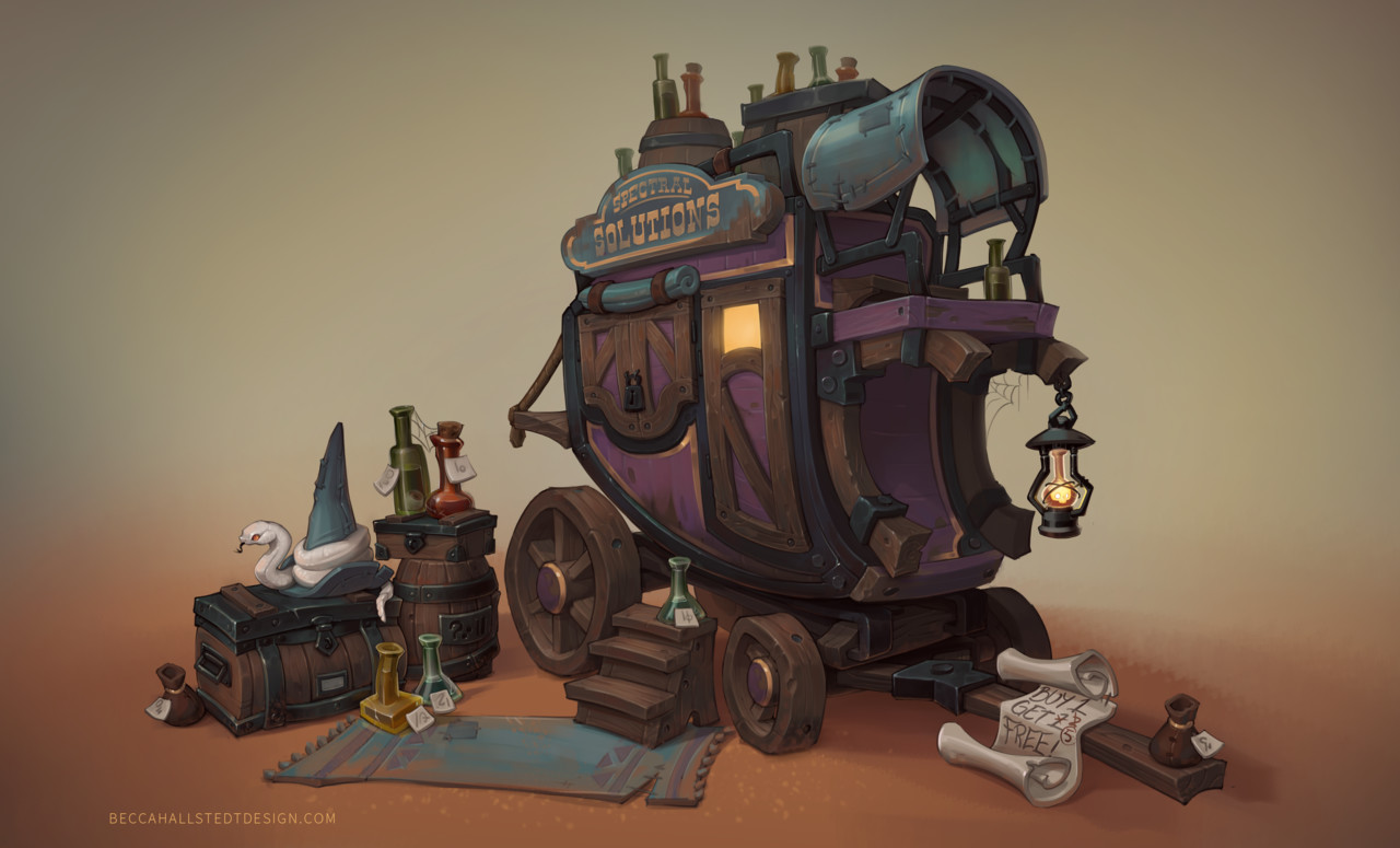 https://www.artstation.com/contests/wild-west/challenges/47/submissions/28276#discussion-post-73515 Finished the Artstation challenge! I'm really itching to do a polish pass on it (make the gradients and highlights pop more, adjust the lantern quite a bit) but I'm pleased with how far it came in how little time I had. <3…
 -
Re: Sci-Fi Corridor
You have some interesting shapes going on at the moment, there's a lot of potential right now. I think the biggest thing I see with these 'Sci-Fi' corridors done well is focusing on modularity. It's a whole lot easier to make one asset look fantastic and have that fill up a room than to have to make hundreds of assets at… -
Re: Beautiful Men
 [ame] http://www.youtube.com/watch?v=73AR4m6XkC8[/ame] Hands down.
707 results