Search
-
How to activate 4D modeling in Maya

 Not sure if this is the right place to post as this place is for 3D art, but hopefully it's fine. Today Autodesk released a new update to Maya, and with it came a strange hidden feature my buddy and I managed to dig out: 4D modeling. It is not mentioned in the release notes and there is no documentation of it (so far). I…
 -
Re: Canyon Crash Site - WIP
 Yea I just haven't gotten to the waterfall mesh yet but definitely switching out the fake particle one, just a place holder to get a better feel. I'll get to the water tomorrow i swear!
 -
Re: AEON [First-Person Indie Horror]
 Bluer was better i think. It was colder, like you wernt supposed to be there type feel it gave a good sense of fear and alone. The orange is too warm takes away your horror edge i think
 -
Re: [Riot Art Contest] - CapableWizard
 Reply by slosh · · Home› Contests & Challenges Archives› Riot Art Contest› Riot Art Contest - Character ArtOh man! That's super unfortunate bro. The sculpting was looking top notch. I'm sure you'll be able to crank something out before the deadline that will be much better than whatever fodder I make :D
 -
Re: Spiffy Chaps - Webcomic
 hmm yes use those guys at the top, but mix em up like sectaurs says. maybe a cigarette holder on one?. mutton chops?. and give them some saucers for their tea, what kind of ruffians are they??
 -
[UE4] Basement Workshop WIP

 Trying to iron out the workflow for PBR from Substance Painter to Unreal. Eventually rig for interactivity in VR Floor and wall textures are place holder for figuring out the lighting. Unreal setup model Any CC would be greatly appreciated. Thank you, Philip
 -
Camera Head Robot enemy

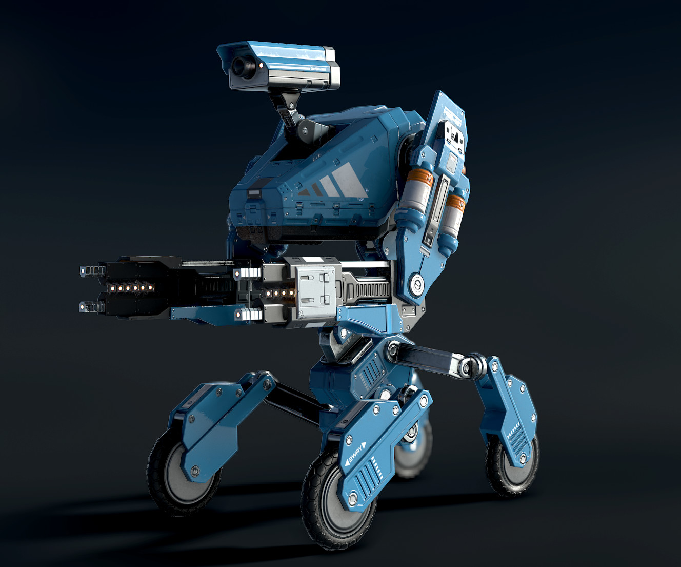 Hey PC, here's a robot I made for a game I'm working on with a friend. He's a "normal" cannon fodder type who tries to roll up and shock you. Alternate versions will have laser guns and flamethrowers and whatnot. A few more shots here.
 -
Re: Red Warrior Illustration
 For a second I thought Matsuura joined polycount, so good recreation on the style! Can't give much critique though, maybe your linework could use some more variety, with more bolder and thinner lines.
 -
Re: Need new mouse
 hardcore peope open the mouse and solder in a new switch as i did several times with my first optical mouse XD if the ball was only for scrolling i would recomend this but this is a normal trackball and makes me angry
 -
Re: deeccK workshop
 The values could be done better judging from the blurry presentation. Try to increase the contrast, bring in more brightness for a better clarity to your design! Meanwhile, your typeface should be bolder and brighter from this shade of red. :)
>11649 results