Search
-
Re: Hard Surface - 1963 Fishing Pole

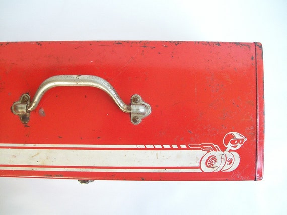 usually this type of cork gets a coat of varnish, so that's why it's shiny. I would say though, that the scratches on the red box are very gamey. Too soft and not defined at all. Make them more sharp and with proper form, or tone them down. Something to be realistic doesn't need to be covered in wear.
 -
Re: Ciri Overwatch/Witcher Mashup

 This was posted on polycount a couple years ago the RGB map near the end that just has R and G channel, I think is the flow map for her hair. We have a similar set up at my job, though its for realistic looking hair. normal, spec, flow, ao, albedo.
 -
Re: Sunset in Amsterdam
 Thank you for you comment DWalker as you say its a bit over-exposed, for a final touch mix realistic/dramatic. I think is to much vignette too. About water i used several references , that reference is the only one that water was calm , hehe. Thanks for you critic and Regards.
 -
Re: Asking for advice about career paths.
 Yes very unrealistic due to the volatile atmosphere, you are not competing with other students only, but also with other professionals that are coming off the constant layoff present in the industry. Most realistic situation for fresh graduates involves either freelancing or finding low end jobs and work on the portfolio…
 -
Re: Another Modular dungeon you say?
 As Nosslak said, you need to build the walls with a stacked bond. But as it's modular you can also create wall pier or a stone column elements to snap between the walls and hide the half-blocks. This would also look more realistic as this is the way long walls with no perpendicular supporting walls are actually built.
 -
Re: Building a Free Library of Images for Everyone
Hi Folks, New realistic seamless textures are ready here: TXR – GROUND https://soundimage.org/txr-ground/ TXR – ROCK/STONE 2 https://soundimage.org/txr-rockstone-2/ TXR – WOOD https://soundimage.org/txr-wood/ As always, more new music tracks will be posted on Wednesday. :-) Enjoy! -
Re: Hard surface edge baking - how to improve?
Yes, the edges of your high are too tight. For edge baking the general rule is to go softer/more round than the edge is realistically. Tighter edge=less pixels=bad mipping and less readability. For your first problem with the curve just add another edgeloops to the low to better represent the silhouette. -
Re: Jumper Mech
 Gorgeous model ! i agree with Sneakymcfox about scratches and paint being too similar in color. Darker paint , or maybe an halo of primer coat between the 2? (but that's always hard to do without messing up and making it all less realistic and painterly) I'll follow the next steps of texturing with interest..
 -
Re: Popeye Vi
 Nice mix of cartoony and realistic proportions. One suggestion I can think of is putting cotton or foam on the inside of the gloves so that the transition in the silhouette from the gloves to her arms doesn't look abrupt or harsh, makes it soft and fluffy. Or pull it up a bit so that the opening lines up with the joints
 -
Re: chun li_first character_[WIP]
 Well, that looks like a 'realistic' render of her, I seem to recal in game she has pretty beefy legs. [img]http://www.racketboy.com/images/chun-li-1.jpgi/img]Didn't see a game shot, the images seem to be all over the board.And yes Buns is butt[/img]
>13114 results