Search
-
Re: [Riot Art Contest] - Ashe
 Reply by Chimi Jimi · · Home› Contests & Challenges Archives› Riot Art Contest› Riot Art Contest - Character Arthey dude nice progress i think you should be more bold with the creases on her skirt though your prob already know that :P and personally for me i think her face was more similiar on the first piccy in the concept the features look more defined hope any input i can give helps :D
 -
Re: The Human body
 i'm certainly no expert, but i spent ages agonizing how to form body shapes in low poly so i thought i'd try and help. the foot needs more volume and maybe define the ankle bone more (i don't know anatomy so i hope the paint over makes sense). hope its a little help :)
 -
Re: Female portrait
 Suuuper nice work! Really lovely bust. My main crit would be that she feels like shes sucking in her bottom lip and also, this might be your personal preference but her face is very bottom heavy, defining her brow bone might balance her face out quite a bit. Keep up the good work! :)
 -
Re: Ninrod sea lady

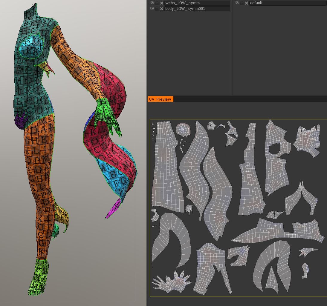 UPDATE UVs are done! A screenshot of the process in 3D-Coat: I finished them up in 3dsMax. Then I did a Normal Map bake with xNormal and fixes + detail defining in 3D-Coat again. This is the result so far in Marmoset Toolbag3: I am quite happy with how things are going; faster than I thought! Next step will be texturing.
 -
Re: UE4 Fantasy enviroment - feedback needed
 Blockout is looking good, the main thing that bothers me is the grass texture, it looks way to noisy compared to the concept. Depending on how stylized you want it to be, I would suggest working on material definition a bit more, I think broader brushstrokes and more defined edges could help. Can't wait to see the final…
 -
Re: Portfolio Critique Please.
 I think he means stylized as in everything that is not Realistic or Photo-Real. Altought you make a good point, "stylized" is kinda hard do define, even Naughty Dog Artists say that Uncharted is stylized, Realistic but with their own style. I would say that the only thing that can't really be stylized is if you're aiming…
 -
Re: Maya scene won't load CgFX
 Glad it worked out. The CGFX shaders can use different profiles for the Vertex Shader and the Pixel Shader. They are defined at the bottom of the .cgfx file. Sounds like your second mate didn't have a GFX card that would support the profiles used in the shader. You might be able to use different profiles without any major…
 -
Re: May I get some critiques for my model?
There's some really, really, nice painting here, but I think you might have tried to do too much in the texture without enough geometry to support it, which makes it look a bit wonky seen from an angle. I think having geometry define those big plates on the front would make it look much better. -
Re: AkiRa's Environment Art Thread
 Basically what leleuxart said, pillars are too soft and lumpy. Try to get some harder edges in there and tighten things up a little. I'd suggest not having those large spaces between all the bricks on the pillars, looks really fake/drawn on. Make some really deep cracks and cuts, define your forms/shapes more.
 -
Re: Stylized viking I made for class
Thanks for the replies! Now that you've pointed it out, I can see as well that it's too much black in it. I did want to tweak the textures a lot more before submitting, but due to time limitations I had to just get on with lighting and rendering. I'll definately use those art guides for the next stylized model I make!
>35311 results