Search
-
Re: Edge Artefacts in SP2
 Looks like an isue with your curvature. I guess you don't have a high poly mesh, in this case, you may want to switch the curvature baker setting to per vertex rather than the default per pixel.
 -
Re: New Macbook Pro.
 Actually, can someone give the layman's version of why the retina display would make existing images look bad? Isn't it just double the pixels packed into the same visual space? That should just look ... the same, shouldn't it?
 -
Re: Baking problems.
 I´m afraid I cannot give you proper advice since I don´t bake with max. But padding does not smooth your pixelated edges. But I think it is the global supersampler setup in the RTT menu.
 -
Re: Draw - Assinscreed unity
 Is it a work in progress? Nice first draft anyway, just be careful to maintain the same pixel ratio on all your objects or some of them will seems to be blurred. Maybe this feeling is reinforced form your powerful DOF at the same time :) .
 -
Re: Strange Normal Map... Please help!
 Quickie lunch time unwrap. The model: http://www.vigville.com/forum_images/lymiller_model01.zip There are a few areas that could be finessed a bit more but I ran out of time. Hopefully that gives you a few more pixels here and there to work with.
 -
Re: [portolioliolio] Nizza_waaarg
 Spacing looks even to me? Am I missing something? Judging by the page source, it's auto spaced by the table layout with a 5 pixel width. Lovely work man, a real pleasure to look at. Good luck with the job hunting!
 -
Re: MODO - how to adjust UV grid size for lightmaps?
 UV space is setup in ratios. 1:1, or 2:1, etc. The default is always 1:1. Pixels don't matter until you export a texture map. I don't think you can snap to the subgrid.
 -
Re: jade texture / material how to
 Can you adjust the color of the environment map? ( Alternatively, can you edit the text of the pixel shader? ) You really need some way to adjust glossiness and specular color. It could be a slider, or a texture, or a variable in a text file.
 -
Re: Sktchbook : blinkdog

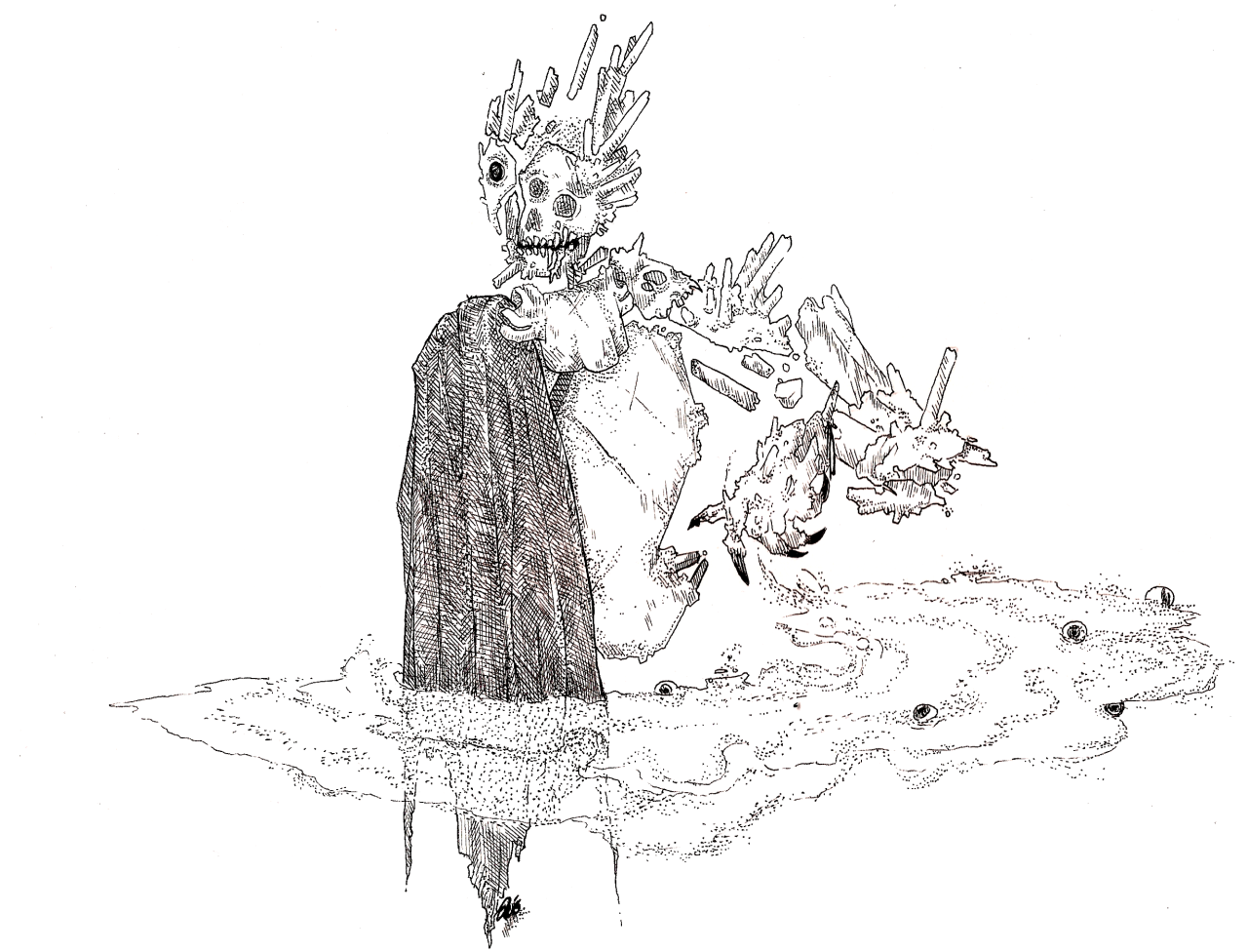 did another inktober sketch for helix saga; i dont usually have the time to sit and do stippling, but with all the pixel dithering I've been doing I guess I was like alright let's just do it
 -
Re: First hand-painted texture, looking for crit and tips
 Shape is too repetitious of the bricks as is the shade, you've got all those pixels, use them for different brick variations. Green needs a bit of shading, it's too light in value compared to everything else. Nice start though.
>8819 results