Search
-
Re: [Portfolio] Tory Miles
 I agree with sltrOlssen that the environment should be the first thing you see on your home page. Also, the beauty shot of the bike on the home page could really use a better lighting set up. Here's a nice resource on lighting: http://bensimonds.com/2010/06/03/lighting-tips-from-the-masters/ The blurred out lights in the…
 -
Re: [Feedback] what to change
 Hey Anarcy! For someone starting out, this is looking pretty good - Bounds above where I was when I started. Just a couple suggestions to help push things further: I like the idea that you're trying to get across in this first environment, though I feel there's a few things you could do to make it feel more alive. A good…
 -
Re: Unreal scene - underground complex lobby

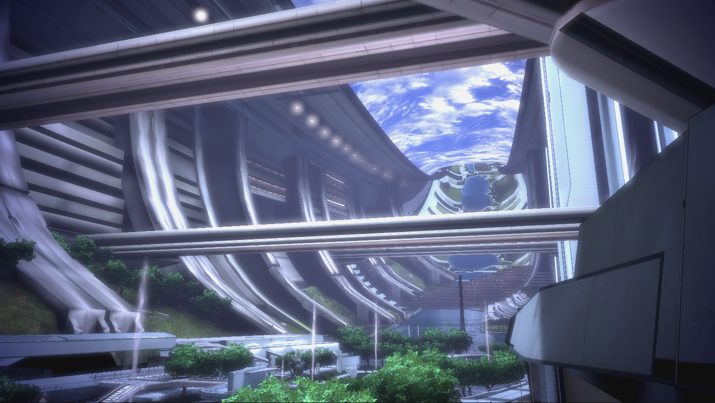 Great setup. It's looking quite noisy right now. Definitely needs some work on the lighting. I would recommend looking at some of the environment work on Mass Effect for reference. Looks like a lot of work went into your piece. With some polish and heavy work on the lighting you might have a fantastic piece. Good luck :)
 -
Re: Balamb Garden from Final Fantasy VIII
 Lookin good! I think the lighting could use some work. Right now its all really yellow. I think a blue color might help out a little bit. Especially since the whole floor is basically a pool of water with walkways on it..all that water would reflect the light and add a blue tint to it.
 -
Re: Soul Eater Alleyway ^^
 Hey thanks guys! Yeah maybe I can tweak the lighting a bit....you're right Paulewog I did lose some of that cool lighting...I think I might have to tweak the world property settings a little bit. I'll see what I can do with that, shouldn't take too long.
 -
Re: Shader fiddling (getting rid of blue)
Yeah it isn't too pretty right now :poly124:. Basically what I'd like to do is add the x and y values stored in a map to the x and y values (ndotl) of the surface and have them multiplied together to equal some type of lambert bump shading. Right now I'm sort of fudging that for various reason and need to iron things out.… -
Re: AO, Lightmaps, and the problem of too many big textures.
I think that might actually work! I watched this video, and it looks about perfect for what I want. Now I just have to figure out how to get it to work right. I tried it out on my mesh with my current lighting setup, and the end results weren't exactly as smooth as I hoped. In fact, it was kinda janky. Way too dark, and… -
Re: [WIP] Demon Hunter (Feedback/Critique Appreciated)

 So I upped the map to 8K and that helped a little, I added a roughness map (pic included), and refined the facial hair more. What helped move me forward alot was playing with lighting (switching from point lights to area lights) and getting a better three point setup. I wanted to see how much more realism I could get…
 -
Re: (UDK) Mirror's Edge Inspired Hallway
 Cool little scene, I love the simplicity and style of Mirror's Edge! Drew posted a great reference image, it offers some insight into some major things you're missing. The image doesn't look very grounded and there's little to no directionality in the lighting. Two major things you can try to help you: * Motivate your…
 -
Re: Advice on my accomplishments
 WARNING: WALL OF TEXT The school I went to was a lot like what you described. The students are taught the basics of a software and the rest is up to them. Often the only way to get real critique or learn new skills was from other students or online. Most of what I have learned is from tutorials, trial and error, and…
>90501 results