Search
-
Re: The Bi-Monthly Environment Art Challenge | November - December (93)
 Note: Sorry if this post is somewhat duplicated, for some reason it didn't post and disappeared! Not sure if the original post will reappear in the future. Hi all! This is my 2nd attempt at doing as art challenge, and I'll be creating a 3D environment in Unreal Engine 5 based on Marius Villard's "Work and Live There //"…
 -
Re: 🎅🏻Rudolf 🦌🎄Real Time Character
 Hey Eric! I don't plan to add a Marmoset viewer for the project the scene looks very different mainly because the viewer does not support omni lights sadly
 -
Re: [FINISHED] Scifi Antenna

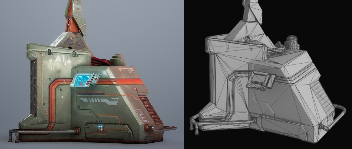 I would suggest softening the shadows from the red light, so it's easier to see what shading is coming from the lighting. It would also be great to see a couple closeups with wireframe vs final render. Something like this maybe, but better quality, matching angles, you know the drill.
 -
Re: Failed
 I think the slight flair in the background suggest light source coming from that direction instead of upper left. It feels a bit contradictory at the moment. You may want to add a little brightness from the upper left to make light direction more convincing. Kind of like how the Sun is clearly in the center in this piece.…
 -
Re: Gothic 2 scene problem
I think you just need to emulate the Gothic II lighting better, if you want to match the original look and feel. Looks like they used very simple shaders, with only diffuse and specular, and some baked low-res shadow maps. This was fairly common for games in the early 2000's. -
Re: How I reduced eye fatigue
I'd say, get tons of indirect light on your workspace as much as possible. If you have a bright window, perfect, but still get a overhead warm led light against the wall your monitor is in, and another one behind you. I work on a hybrid company and just attend to the office once a week. They have a kinda "gamer vibe"… -
Re: [UE4] Abandoned Asylum Ahs
 This would benefit a lot from some slight volumetric lights and mid-air dust particles for sure! Also here's a good site for ref of this kind of thing www.opacity.us and like vincent said: there could be more "transitions" for certain materials. Suddenly going from carpet to wood with no "transition" can really break the…
 -
Re: What Are You Working On? 2011 Edition!
 I like the shapes going on in the background and buildings, but she is a little lost in it, mostly due to the distance and also the blackness of the shadows. I think the signs you have are a great opportunity to add some warm or dimmer light sources in that you could play with, it might work great for getting softening…
 -
Re: Haunted House for my horror card game Desecrated Deck
Nice. There might be some layout savings, depending on what the texture looks like. You should be able to reuse the same sheet for all your trims that are for props with a material that has peeling paint. What does the 2d texture look like? And are you using a roughness texture too? This would help a ton with lighting… -
Re: Normal Map seams
So I'm faced with a new problem. I just created this log and when moving around I see this slight white seam in it. I checked my maps and they seem to be ok. Could it be a lighting issue? middle picture shows it, towards the end/bottom by ground. A slight white line it appears. EDIT: I found out what my problem was. When…
>36284 results