Search
-
Re: Iron Horse
 Overall very nicely followed on the concept, the particle effects really bother me, it looks like you used the magazine type filter on all of them or whatever it is that creates those dots, comic book like look to them. It looks to me you used the varga hair tutorial for the fur and it looks okay but too rough and thick…
 -
Re: What do you nerd out about?
 Huge explorable environments like Uncharted 2 or really interactive games like Shenmue, oh man did I fall in love with that game world, it was so realised and ahead of it's time, we still don't have anything comparable yet... Anything that reminds me of the world in Bladerunner. 50's era horror/sci-fi comics they have such…
 -
Re: ATI Youtube video contest *Warning Shamless plug inside*
 You've spelt Radeon wrong twice in the video, which might work against you in the competition stakes. Aside from that it's pretty solid. The explosion seems a bit "sprite-y" if you get what I mean, but the general standard of work is good. You might wanna work on the anatomy of the guy on the bike a bit more, though, as at…
 -
Re: 3D-Palace and DVD
 This is the first time I've modelled a character in this pose actually. I created the reference based on some comic and fantasy fiction sheets I saw. It gave me a nice sense of bulk to the arms and shoulders which was fun. Whether or not it deforms / operates in the same way a traditional arms out pose does is really up to…
 -
Re: SPIKE TV VGA's...what a crock (of course)
 [ QUOTE ] I just want games to be recognized for the complex artform that it is. [/ QUOTE ] It's too new for that, yet. Movies took about thirty years before they were taken completely seriously. Comics were around at least forty years before anyone made any strides toward any legitimately 'respectable' content (Miller's…
 -
Re: Criticism: Games and Modern Escapism
 [ QUOTE ] now a days there is so little to inspire people that at times you get a feeling of despair and cheap forms of escaping reality will become even more popular. [/ QUOTE ] Despair can be a source of inspire. I personally have never really been interested in most forms of "escapism." I've never like comics or any…
 -
Re: Need critique for my prop

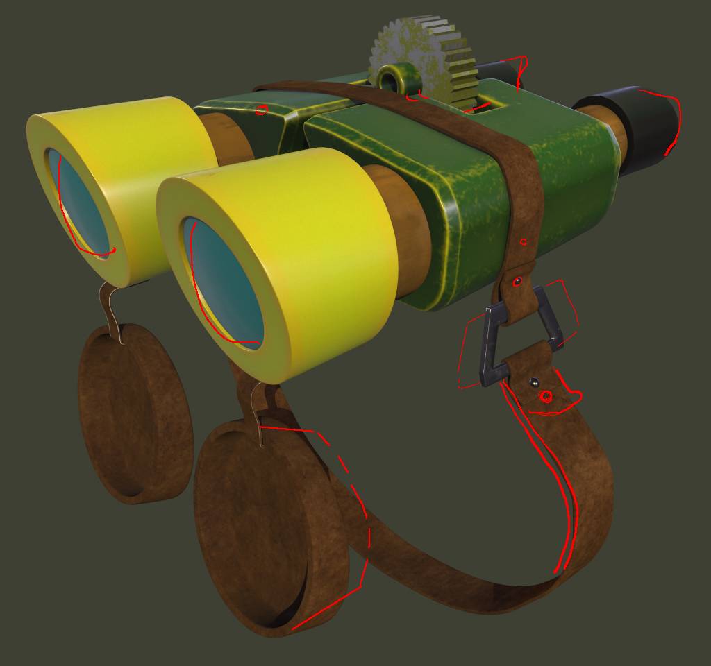 I may not have been proven yet to be qualified enough but here are my two cent: The original has more the exaggerated comic style look which do depend on shape form to read.. (it may also be the differenet camera position). The green part looks best (with some nitpicking 😉 ).. see here: The occular caps also seems to be…
 -
Re: The Bi-Monthly Environment Art Challenge | January - February (94)

 Nice blockout @nurichez. I think from some angles the shape could be tweaked slightly to support the conical look and flow of the design (red). To make it look even more cartoony/ expressive, some lines could be pushed past the original blueprints (yellow), so they're less straight horizontal/ vertical. Personally, would…
 -
Re: Just graduated and looking for some feedback on my portfolio
 Your pencil work is rustic and charming. I can feel the texxtural quality of it almost through a PC screen. The one handpainted asset you have works well, suits a comic-focused style. I want more pieces to figure out what else you can do. Your paintings could use more vibrancy; it almost feels like your value changes occur…
 -
Re: Attack on Titan: a reclusive artist and his man-eating giants
 Naah bro, it's precisely the other way around. It's because of its reputation that it got an adaptation. These days studios don't take too many risks, they either make stuff that's designed to sell or adapt manga that's already a hit. Shingeki no Kyojin got very popular right away, a few years ago it caused quite a stir.…
>3665 results