Search
-
Texturing Practice
 hey fellows, So, i got this concept from warhammer universe and i tried to make it, just for practice.I Made this asset from scratch within 72 hours.It had to be as lowpoly as possible.But i genuinely feel that this can be improved further.(I hate making patterns in Photoshop :P) Also it has just a defuse map of…
 -
Re: Can you help track down "the story of a delivery boy" ?
 Thumbs up for tracking them down. Illustrations are definitely cool alongside humorous anecdotes depicting a thankless task which I do recall feeling sorry for these dudes during those covid curfews when everyone was lockedown but they had to keep going as essential workers, imho pretty much then were unsung heroes.
 -
Re: Have you ever fully raged at a game? If so, what game?
 never actually smashed anything, but got pretty angry when I had almost completed tombraider 1 and then win 95 destroyed itself for the umpteenth time and I had to go through it all again. I was much angrier in my teens as I played a lot of competitive sport and hated to lose. I used to throw things at people lol.…
 -
Re: Anyone miss the old RE style
 I still have a lot of sympathy for those 15 + years old horror titles (early RE scared the shit of me, and their successors/clones like Silent hill, Clock Tower and Parasite Eve were awesome too) but I hated their control system than, will hate it now too :D Echoing someone itt, those games had pretty much perfect…
 -
Re: Opera..
 Internet Explorer. Nothing forced me to use it. And anyone about to tell me to switch to Opera or Mozilla or anything can fuck right off. I've never, ever had any problems with IE, and I just HATE it when people think they know what I want. PS. I had Firefox installed before I formatted last week. I noticed no difference…
 -
Re: Horrible as Dell
 Cant be arsed/dont have time to make my own pc. Always bought Dells for the last 5 years. Never had a problem. I hate the dumb casing design that has the USB port at the bottom of the front of the machine angled down, making it really annoying to access, but other than that, 'tis all good. And hate to rub it in 'cos I feel…
 -
Re: [Portfolio] Sean Moallem/Environment Artist
 well your 3d is awesome but if i had to crit something i'd say your site could use a bit of work. i personally hate the metal texture with the yellow writing. i'd keep it plain and simple, like blacks, greys and whites with one colour in the mix. also maybe some thumbnails would help. namaki and operation avalanche aren't…
 -
Playstation 3 Giveaway and Games
 If your interested in supporting a small independent game developer please check out this giveaway at chillsters. We are offering a playstation 3 and 4 games, Beyond Two Souls, Little Big Planet 1 and 2, and The Last of Us as a late christmas present to those who are interested :) All we ask is that you support our team by…
 -
The Gameboy ate my TF2

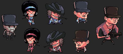 Well, if it were really the case that a Nintendo Gameboy ate my TF2, then we'd have something along the lines of the artwork below. We stumbled onto this over at facepunch.com and immediately had to share it. It has a good collection of the classic Team Fortress 2 character designs, mixed in with some the 1800's designs…
 -
Re: "We named the dog Indiana"
 Awesome work! Only minor complaints: The nose is a tad to wide (but that might be just me) and the hat is a bit too low (hat-line to eye-line): http://www.google.com/search?q=Indiana%20Jones&oe=utf-8&rls=org.mozilla:en-US:official&client=firefox-a&um=1&ie=UTF-8&hl=en&tbm=isch&source=og&sa=N&tab=wi&biw=2560&bih=1469 it's…
>56726 results