Search
-
Re: Castle Environment
 I've been fiddling with getting the mountains more into the right shape. I'm getting close I think. It's actually only a small slice of mountain range that needs copying from the concept. The others arent shown so I can pretty much make those look however I like. I also did some experimenting with the foliage painting in…
 -
Re: Medieval Knight WIP
 Well its not bad for a WIP. But like mojo pointed out he needs work. The proportions are closer to a child than a warrior. He needs; - A smaller head - A larger torso - Longer biceps - Longer thighs - Shorter shins - bigger hands Also when posting it helps to crop out white space. Or use all of the scene by showing side,…
 -
Re: Stylized Game ready backpack
 Very nice. In terms of finest details, the fabric elements could perhaps be further differentiated from one another for instance by giving one of them a visible texture (like a mesh fabric) - but only if the resolution/target art style allows of course. Also, more elements could benefit from graphic weathering similar to…
 -
Re: Advice with secondary forms
 @DustyShinigami, ah, too bad these posts are not numbered. The image is from March 24. The options to flag/quote/like are on the left side now. The site seems to experience April 1st joke gone completely out of control XD Check General Discussions, I guess.
 -
Re: Duplicate Polygons in max ala XSI
 Sage you can type into the sliders in XSI to go beyond the default ranges. I tend just to highlight the value in the slider, then roll my mouse wheel.
 -
Re: Simple Crate (Everyone starts somewhere)
 the biggest problem i see here is the UV layout. in this case, you only need 3 long sides and 1 short side on the texture page. in the unwrap, take the long side on the very top, move it over to the same spot as the bottom one. select everything and scale up uniformly and refit the texture to match the new UV layout. for a…
 -
Re: Bridge of Sighs
 Lighting is inconsistent, looks fake. The top towers or whatever they're called have a dark side away from the main lightsource but the bridge and building on the right side have a secondary light (probably a point light to fake some ambient/bounce light). Fake lights are great but dont overdo it. Try to keep it…
 -
Re: Orc Warrior - Warcraft style cinematic - feedback for my first portfolio post
I think it looks great! Some things I noticed, and keep in mind that I'm not super-familiar with your references, so some of that might be due to those. The front of the lower legs is very hard to read, the shapes get lost there a bit. The leather cloth feels like it was meshshmoothed. The borders are very clean and have… -
Re: Reallusion Character Design - KPCA
 Reply by KPCA · · Home› Contests & Challenges Archives› Reallusion's 3D Character Design Contest 2016Default Female After playing around some of the sliders Default Female face Morph sliders and slight tweaking inside Zbrush now that im done with the body edits onward to cloth creation in
 -
Re: Hominid Project

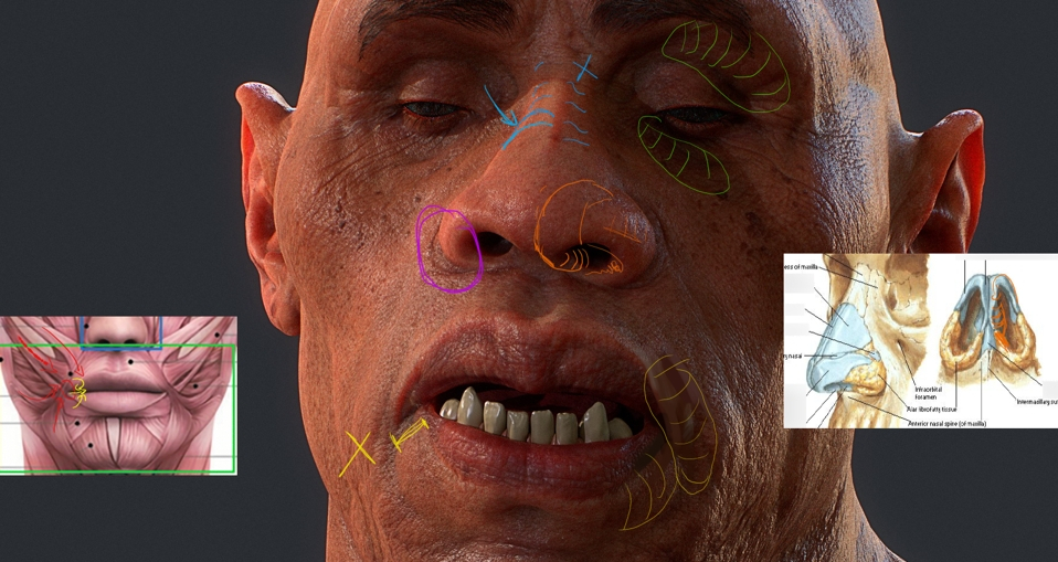 Okay! First I want to compliment you again on how good it looks! I wouldn't be writing a critique this if your work wasn't this nice, and I'm looking forward your to next pieces. I've got pretty much only anatomy pointers. I tried to color-code so they're easier to read but the text colors are changing once posted, haha.…
>30791 results