Search
-
Re: Crysis 2
 positive: visually, the game is amazing. and the story is not bad for a video game. new suit perks are great too. neutral: the gameplay is much more linear and CoD like (regarding enemy placment and map structure). I preffered the free roaming crysis 2. bad: PC controls SUCK! (no on/off toggle zoom or crouch options?). I…
 -
Re: Am I right for hating bloom?
 Vasaline on a lens is similar, but you don't see the "bloom" like effect in all situations. From the same site, with more neutral lighting the effect is much less pronounced, whereas with bloom, it's pretty much always on. Bloom is a very simple effect and can't account for the direction of light rays/flare which is a…
 -
Re: Pimping my portfolio - please destroy me in a wave of critiques!
 I agree with what has been said already, so allow me to offer some other advice. You need to work on your values and story direction. Story in illustration is paramount, everything you paint has to be in service of it. In Shaming of the king, my eyes go first to the elf's torso armor, is that what you want me to look at…
 -
Re: CHUN_LI [WIP]
 well, i learnt a lesson on forum posting, stick to 1 thread :) early on i had made a mistake of thinking a new thread was the only way to keep any progress updated on the thread list and just delete any old ones later (it's not possible to delete a thread?). and now i've seen my past threads appear again with comments on…
 -
Re: Chaun Soldier
 Raider, you got a nice costume design going there! You might want to check out pipe wrinkles that form on sleeves and trouser legs. They kind of loop around the form and often cross each other. Also where stuff is tightly wrapped over like a belt, you get creases emanating from under the article which gives an impression…
 -
Re: Zinedine Zidane
 diZzyWalnut, cheers once again fella. Nice of you to do that. Most of that looks better except for the eyes, in my opinion what gives Zizu his identifiable look is his frowning brow and focued eyes. That front picture of him is not only when he was younger, but he's posing neutrally (which unless you have pinups of his…
 -
Re: 2D chain texture
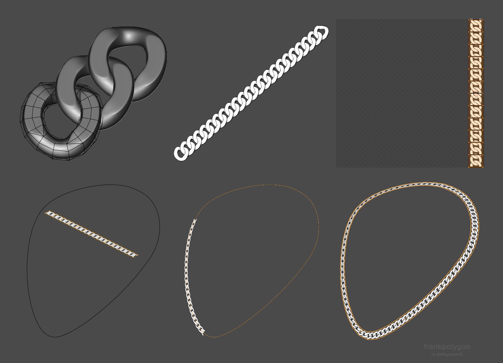 @5rettski Observation and speculation can be informative but sometimes the best way to learn is to actually recreate the effect by starting from first principles. It may be helpful to break this problem down into it's constituent parts then work through solving each of them individually to build up an understanding of the…
 -
Re: Question for texture artists.
 CGTextures has great advice on this subject. You can cross reference that with Tuts+. I use these techniques quite often and it works well. I do my best to avoid shooting during sunny days as I feel that the ambient light from a cloudy day is far easier to work with in my textures. I'm not a big fan of removing highlights…
 -
Re: [Portfolio] - Andrew Dyksterhouse
 This is a big improvement, but there's still so much you can do. Yes, this new background distracts from your content, I'd simply remove it. Nevertheless, it's a neat image. It also breaks and stops halfway down the page. Not sure if that's the intended look but it just looks like a web site bug. You see how you laid out…
 -
Re: Female Knight
 looks nice man, here's my crits. i've labeled them on the image: 1. due to the design of the armour, from this angle it reads as though the ribcage just juts inward suddenly for no reason. i'd look at changing your background colour, or the colour of the armour to something less neutral. 2. you need to make the leather…
>1745 results